
Old Glory.
New Tricks.
Visual answers to one loaded question: what does it mean to be American?
Bicentennial Redux
Before The Merch, There Was A Flag.
Endless interpretations.
Congress fixed the country’s visual palette in 1777: thirteen alternating red and white stripes, with thirteen white stars on a field of blue. The original resolution described the flag, but did not explain the colors.
That meaning arrived with Charles Thomson’s 1782 description of the Great Seal: white for purity and innocence, red for hardiness and valor, and blue for vigilance, perseverance and justice. By 2026—America’s 250th anniversary—those colors carried two and a half centuries of history before we placed a single mark on a shirt.
Historical reference: the 1777 Flag Resolution and Charles Thomson’s 1782 Great Seal report.
Patriotism moves a lot of apparel, so familiar symbols have to keep feeling fresh. Sometimes we revive an older idea. Sometimes we collide two styles that should not work—but do. Gyms make the challenge tougher: Murph lands less than 30 days earlier, so red, white and blue fatigue is real. For the Fourth, we lean more playful. In 2026, America’s 250th birthday gave us permission to push even further.Connor Simon / Primary Graphic Designer
Everyone Knows The Symbols.
Flags, stars, eagles and 1776 are immediate. The work is making them feel owned again.
Murph Just Happened.
Less than a month after Memorial Day, gym audiences have already seen a lot of red, white and blue.
Then America Turned 250.
The milestone opened the door to heritage, humor, nostalgia, strength and stranger ideas.
The palette stayed familiar. The visual language did not. Athletic, painterly, distressed, playful, military, retro and strange all earned a place.
Bicentennial Redux
Heritage / Reworked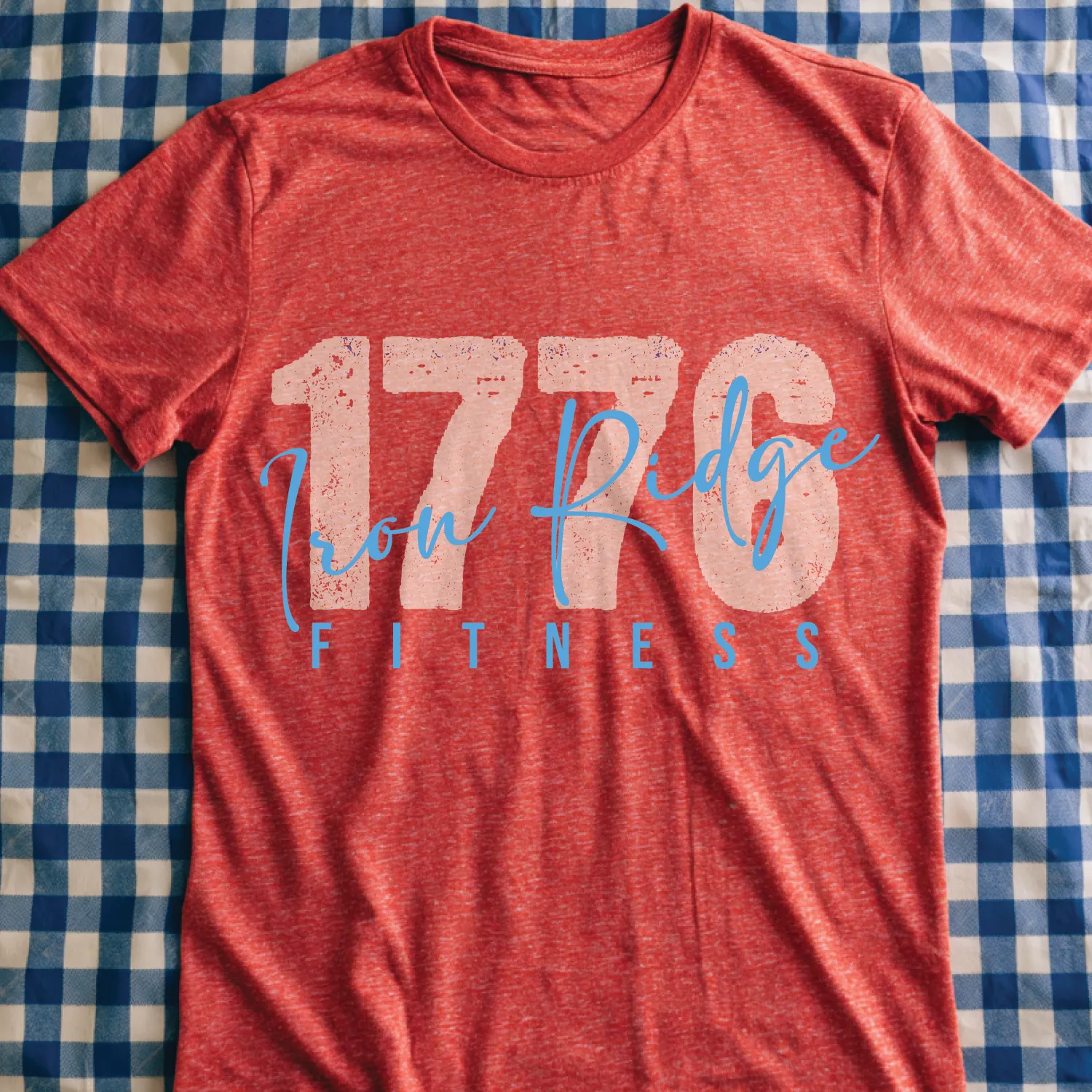
Quarter-Millennium
Anniversary / Monumental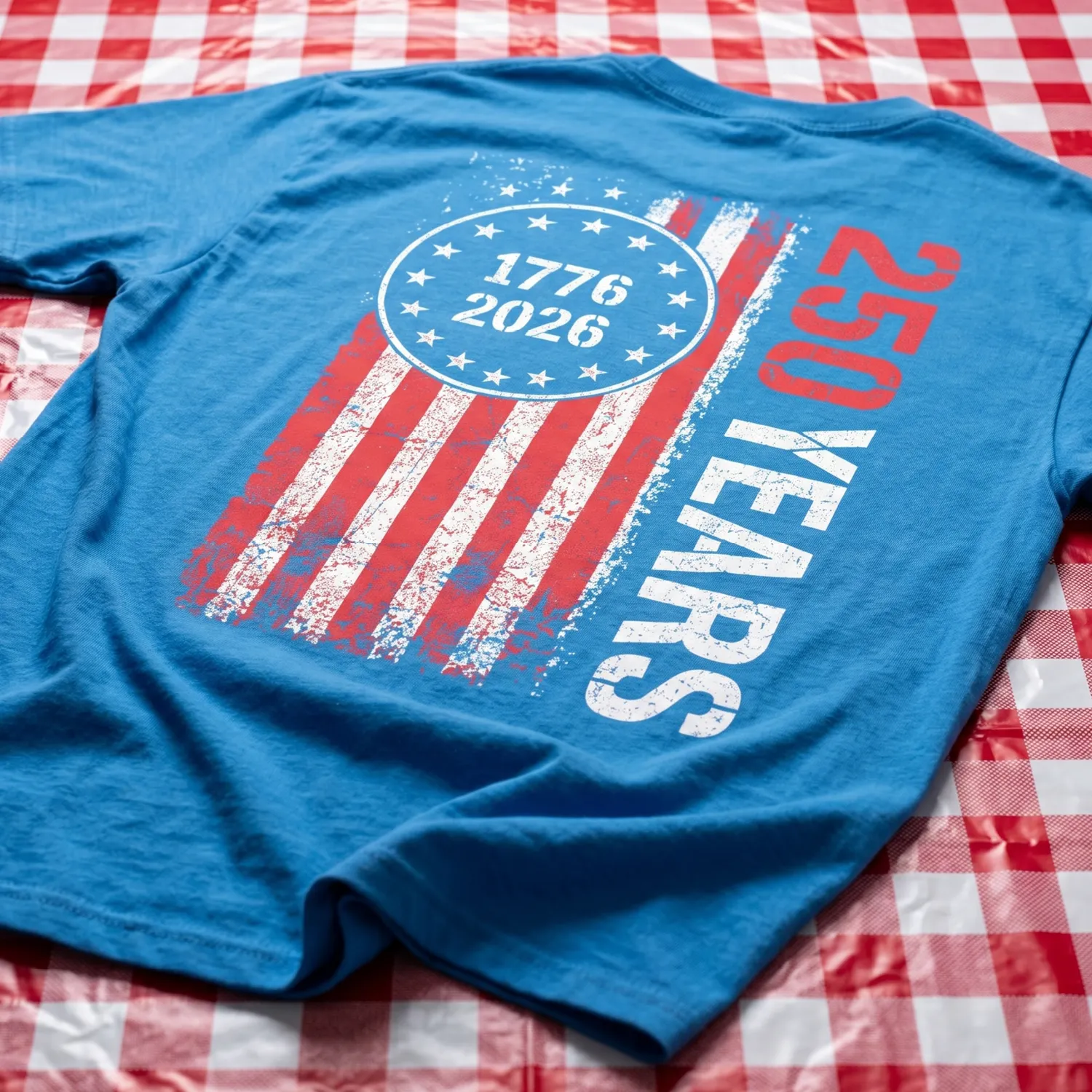
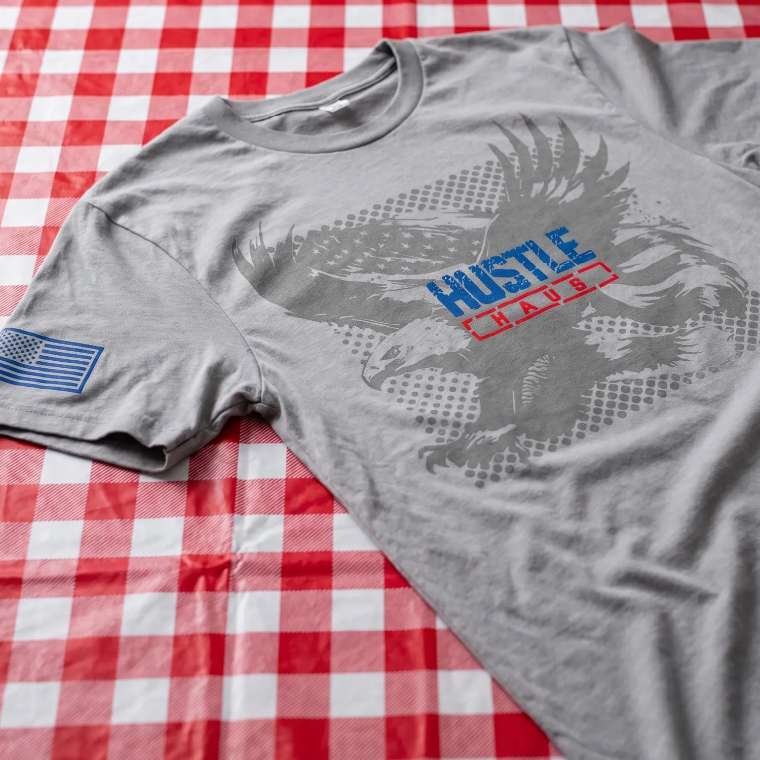
Halftone Eagle
Americana / Printed Texture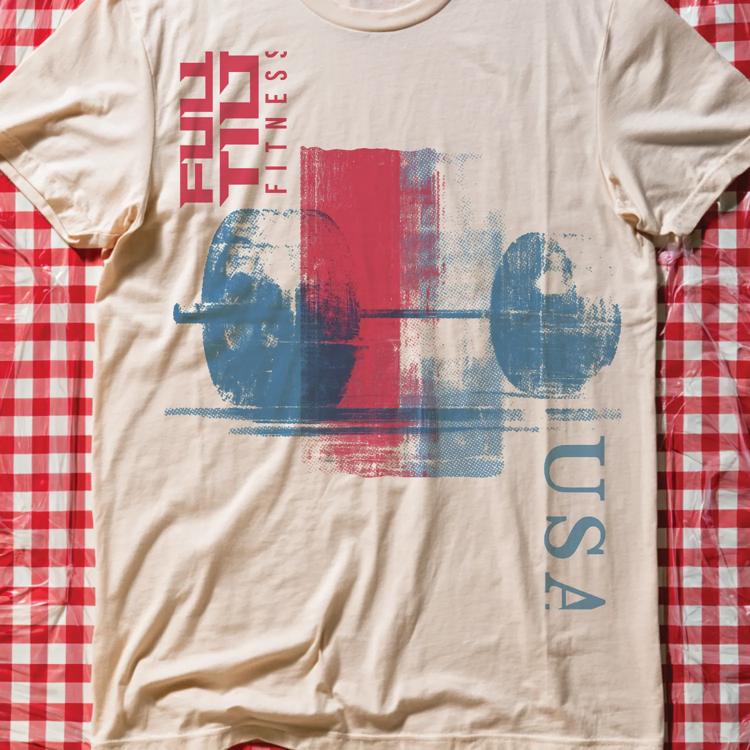
Heavyweight 1776
Strength / Industrial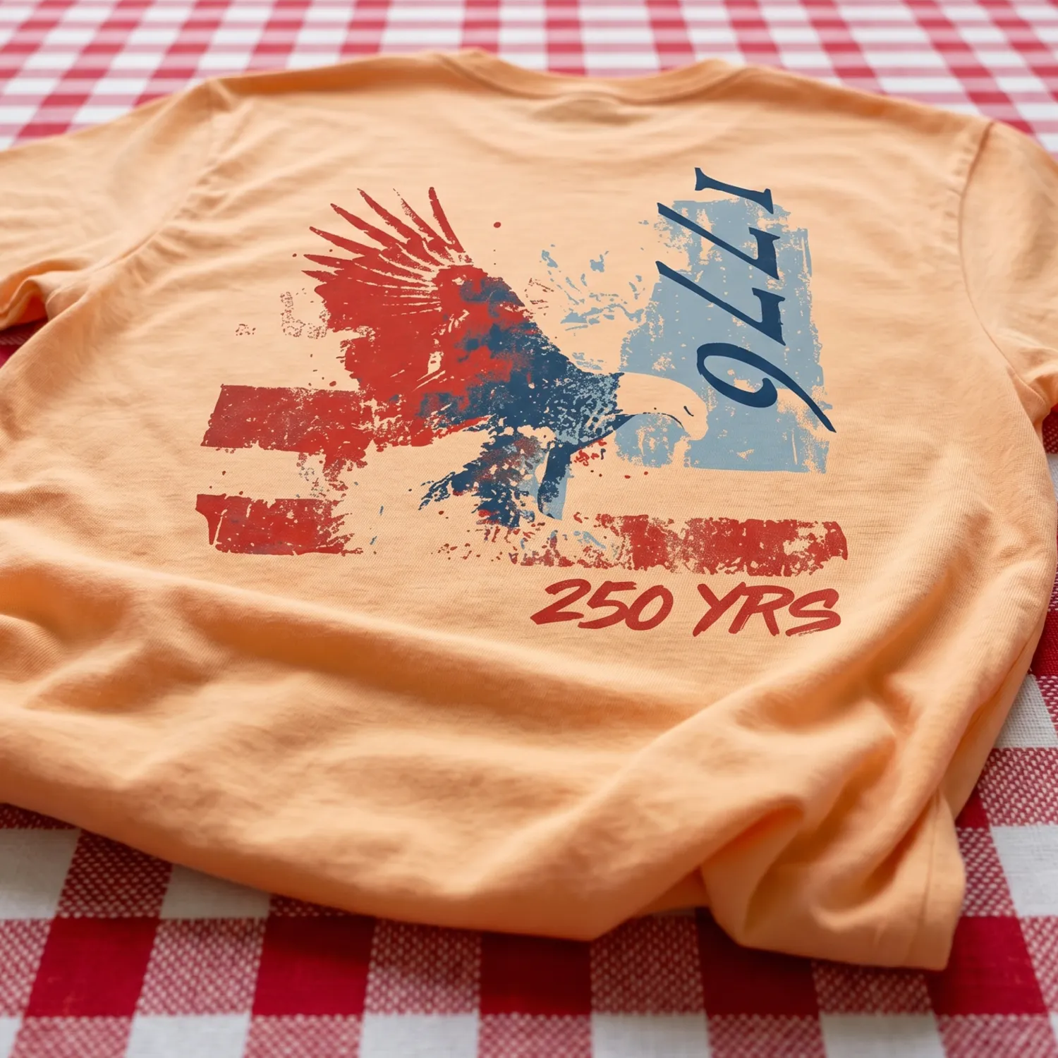
Painted Republic
Painterly / Weathered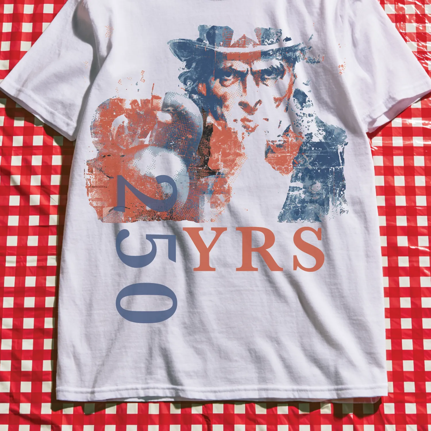
Liberty Or Death
Grunge / Editorial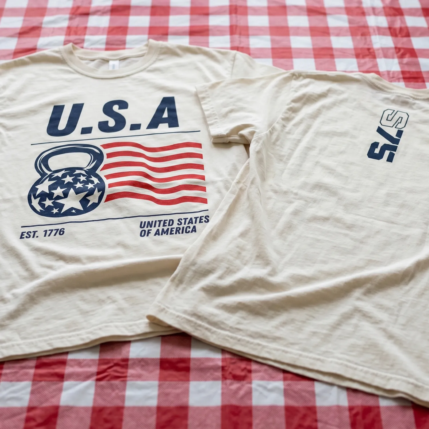
Heritage USA
Varsity / Team Kit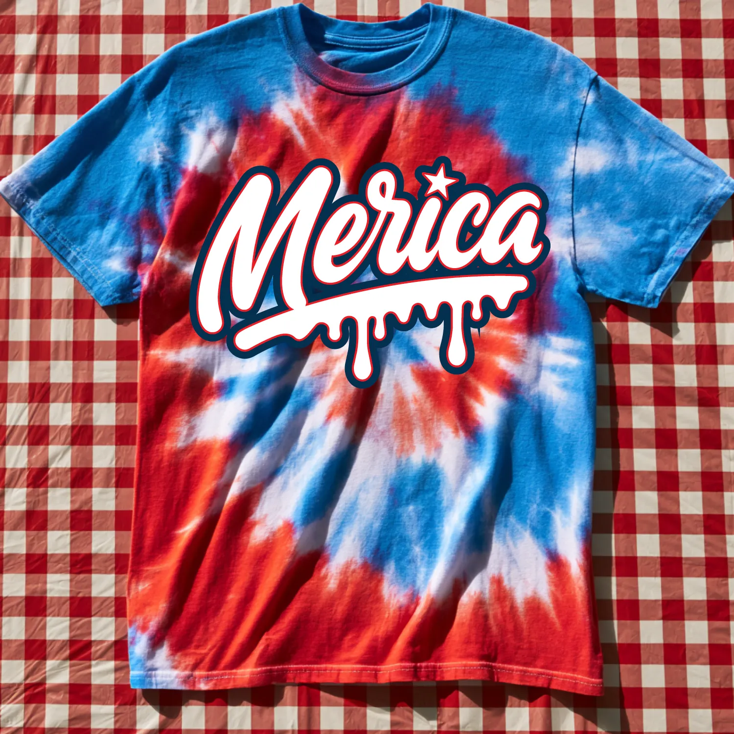
Merica Script
Seventies / Playful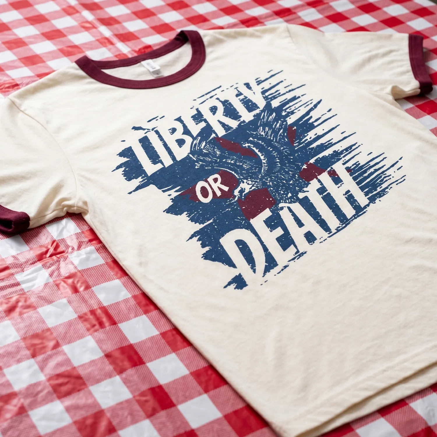
One Nation
Military / Emblem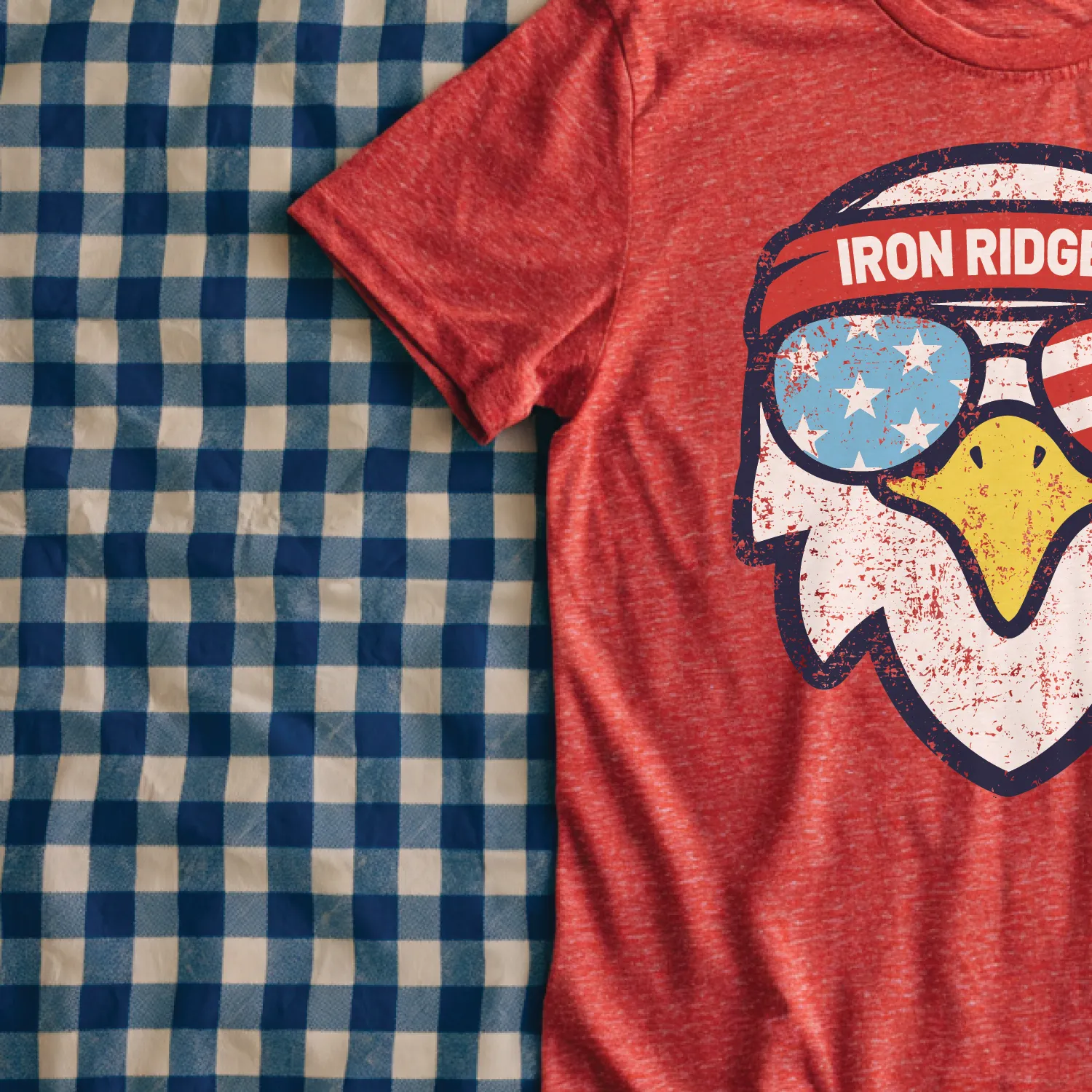
Star Field
Allover / Pattern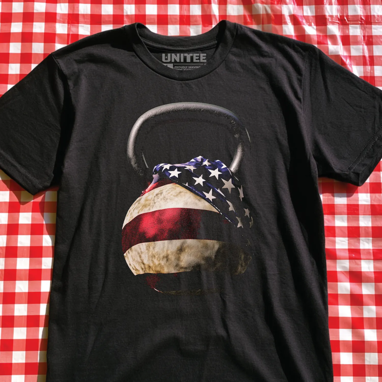
Flagline Athletics
Minimal / Stripe System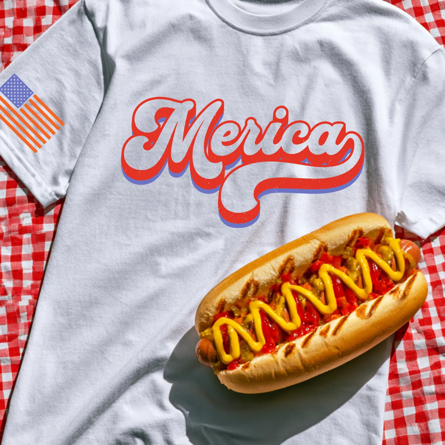
Founding Stripes
Distressed / Horizontal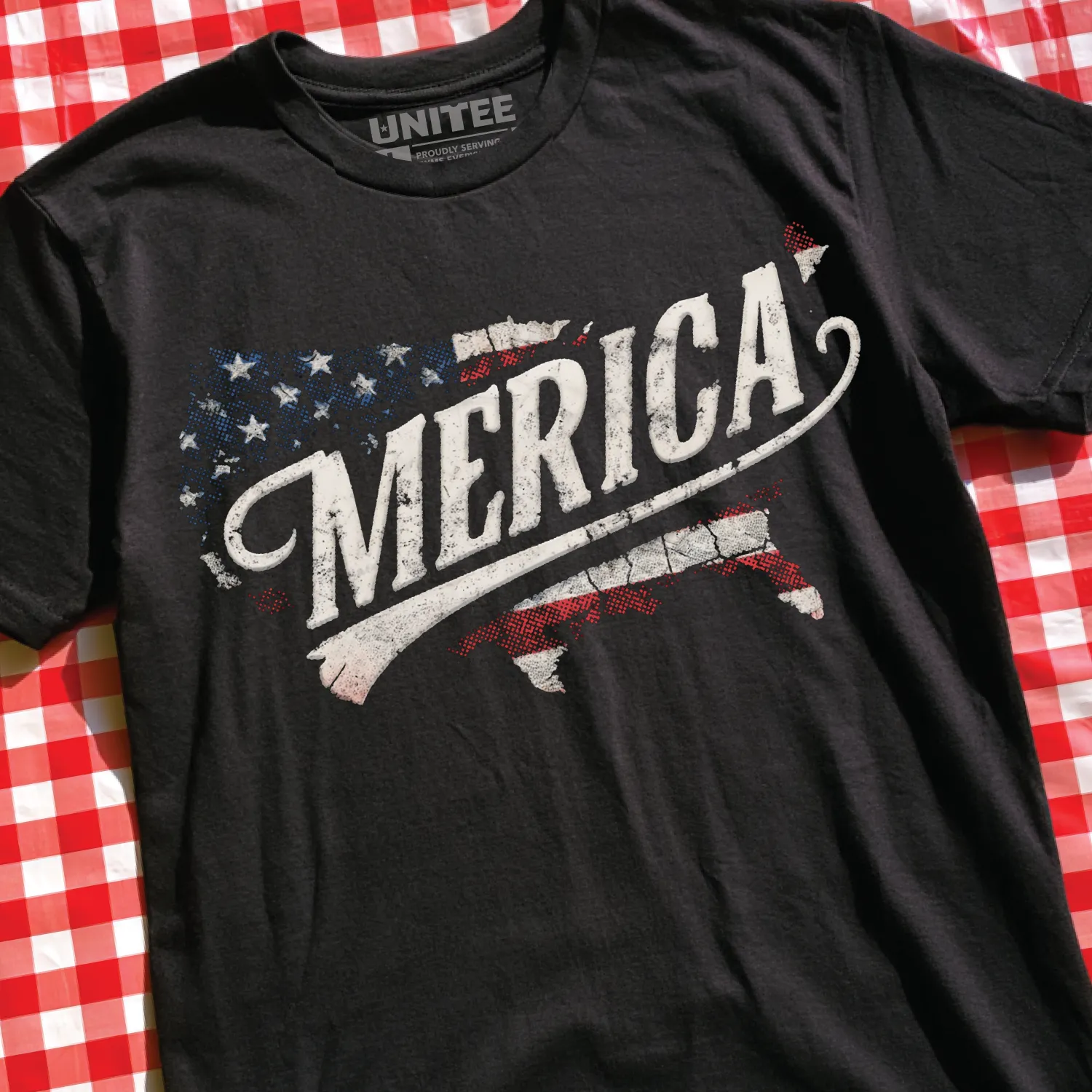
American Varsity
Collegiate / Clean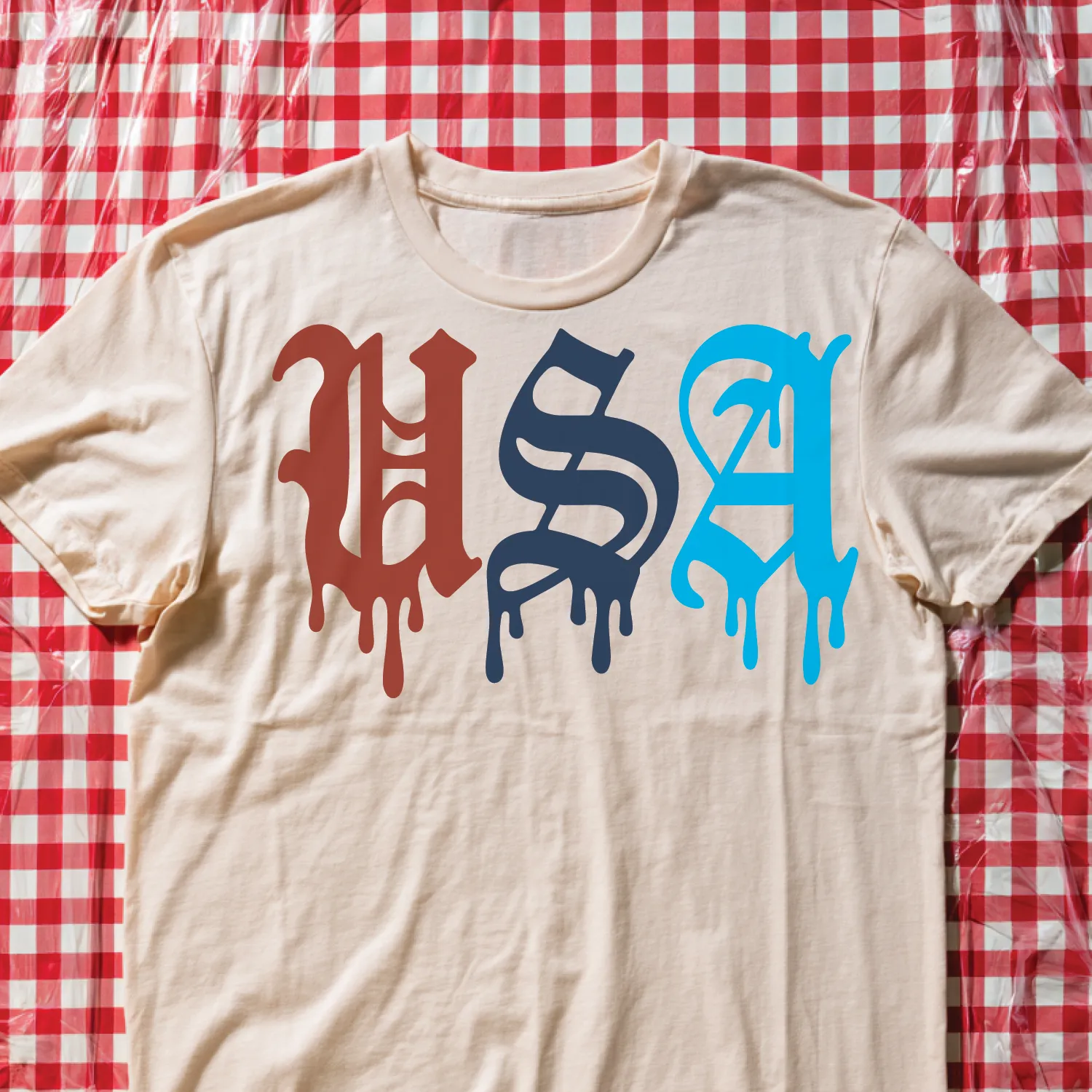
Firecracker Type
Pop / High Energy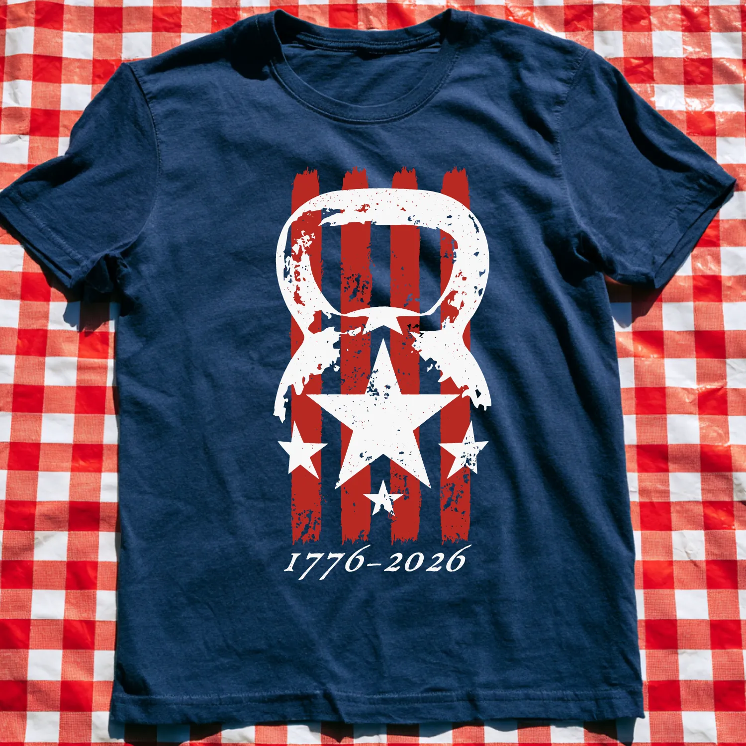
1776 Iron Bell
Fitness / Icon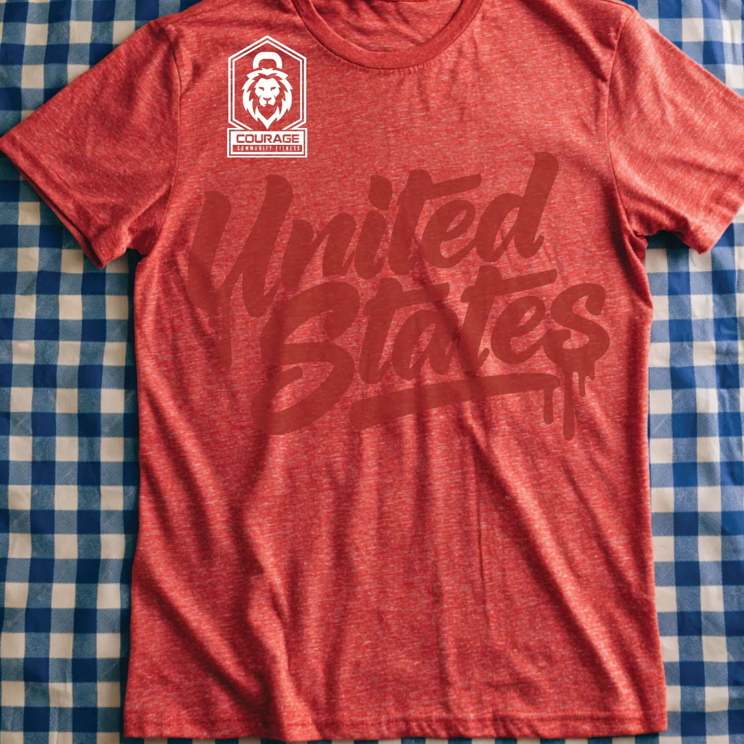
Spirit Of ’76
Poster / Heritage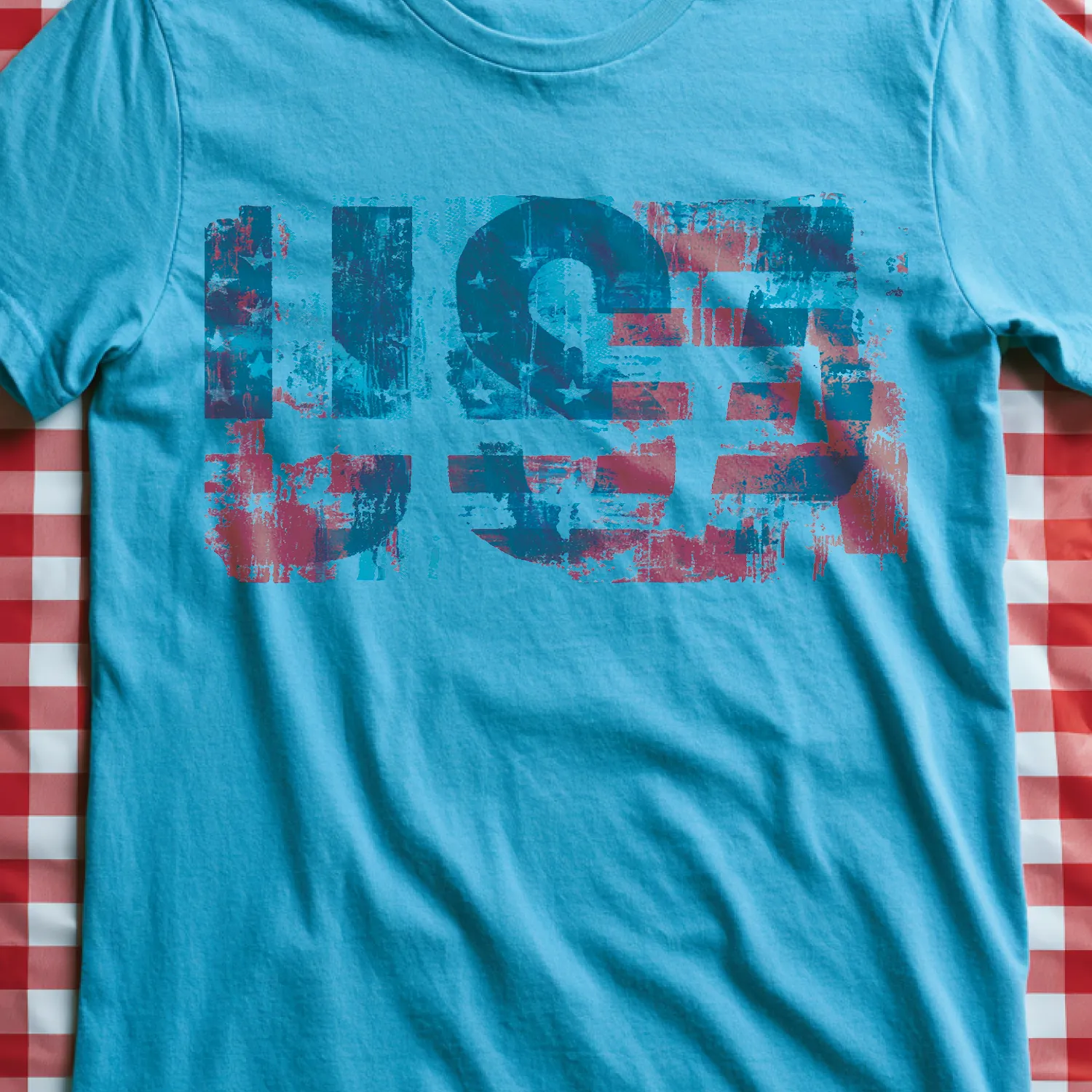
Eagle Standard
Traditional / Bold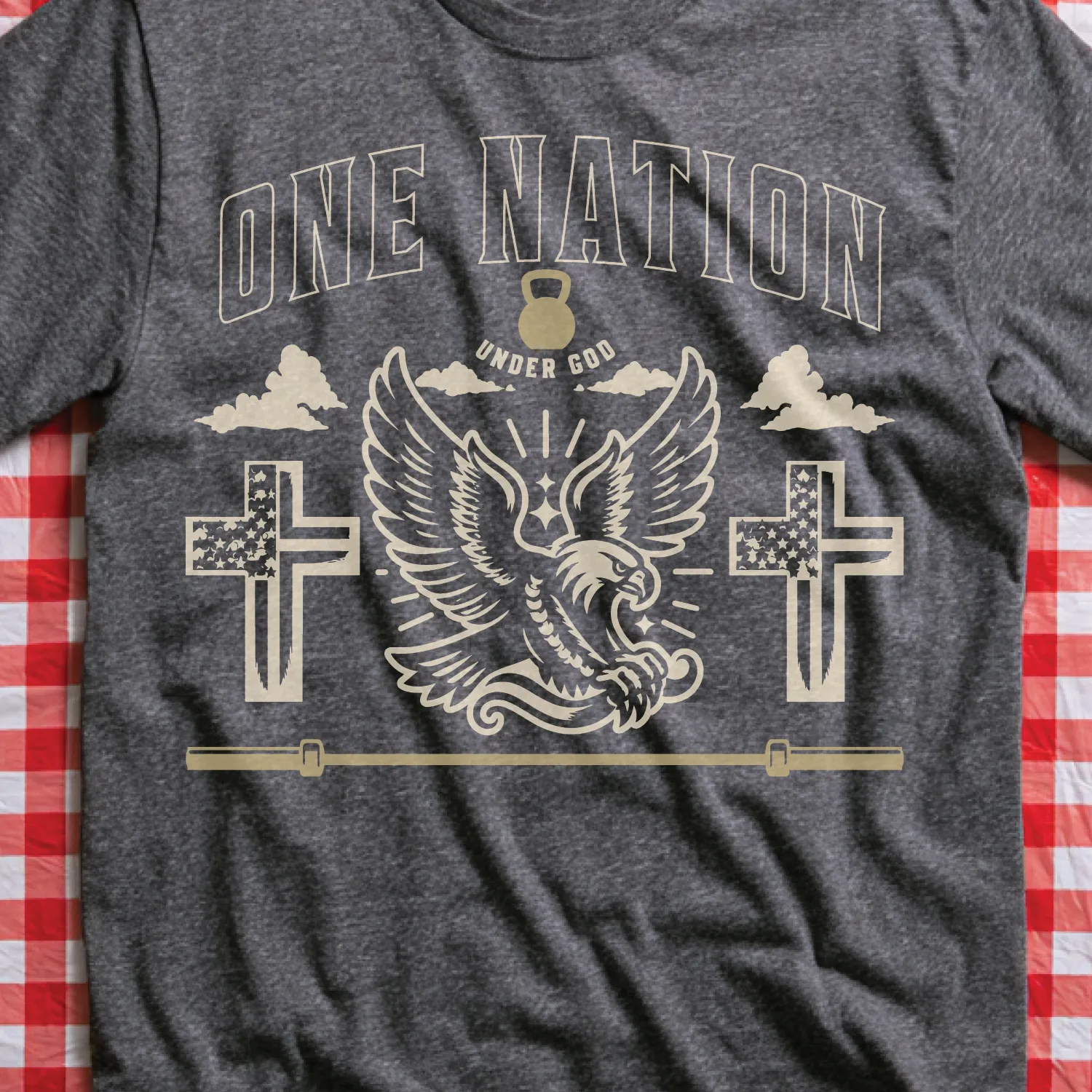
250 Years Strong
Anniversary / Athletic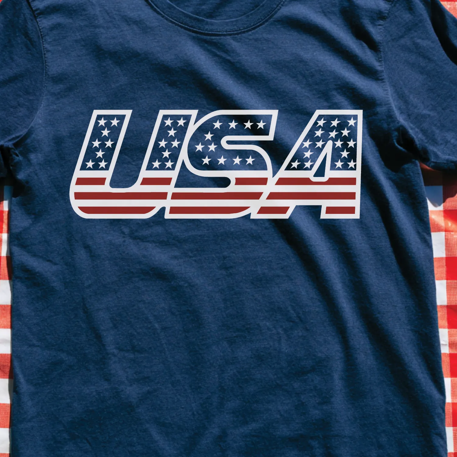
Retro Republic
Motorsport / Nostalgia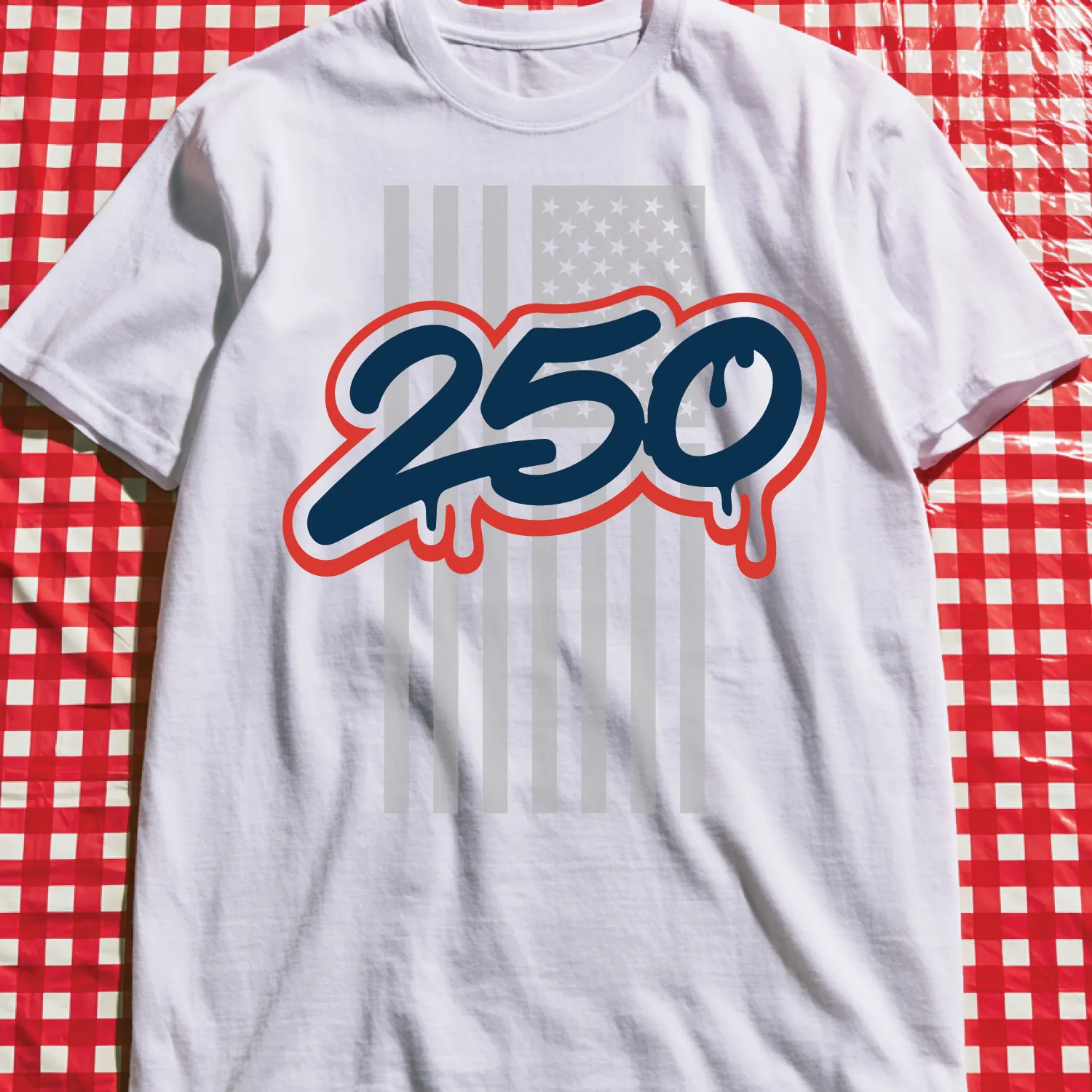
Liberty Barbell Club
Strength / CrestPatriotism is not one look. It can be historic, irreverent, athletic, hand-painted, restrained, loud, proud or funny. This collection works because every concept begins with the same national palette—and refuses the same solution.
Concept names are editorial titles created for this case study. Artwork and apparel shown remain the property of their respective owners and clients where applicable.
