The Story
The exchange floor and the training floor.
Wall Street did not start as shorthand for global finance. The name traces back to an actual wall from Dutch New Amsterdam. More than a century later, in 1792, twenty-four brokers signed the Buttonwood Agreement, helping bring order, rules, and trust to a young market.
That history gave NY S&C a stronger starting point than a typical gym acronym. An exchange and a gym both run on pressure, numbers, repetition, confidence, and long-term return. You show up, put something in, track the result, and come back again before the payoff is obvious.
UNITEE treated the project as a translation exercise: market language into training apparel, Wall Street confidence into wearable marks, and New York color memory into a collection that feels local without becoming a souvenir.
“When you’re dealing with a place this rich in heritage and culture, the better move is often to build from the existing language instead of pretending it is not there.”
Joel Hebert / UNITEE Project Lead
Collection Overview
Naming as the hook. Color as the memory.
The NY S&C name creates an immediate echo of NYSE, so the identity could start with a real New York idea instead of a generic strength symbol. The blue and orange palette was chosen for the same reason. From the city flag’s Dutch-rooted colors to the familiar athletic language of the Mets and Knicks, the combination already belongs to New York.
The design challenge was restraint. We wanted the collection to carry Wall Street pressure, civic color, and gym utility without looking like a finance costume. The result is a flexible apparel language built for members, coaches, product drops, and future extensions.
Mark + Market Language
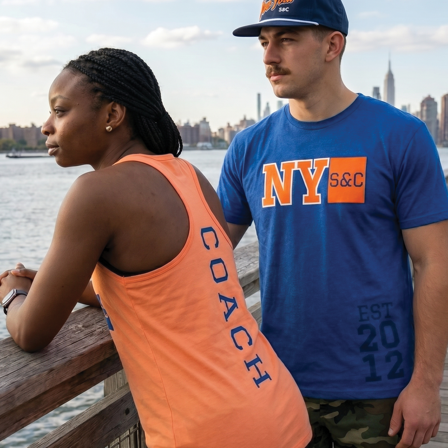
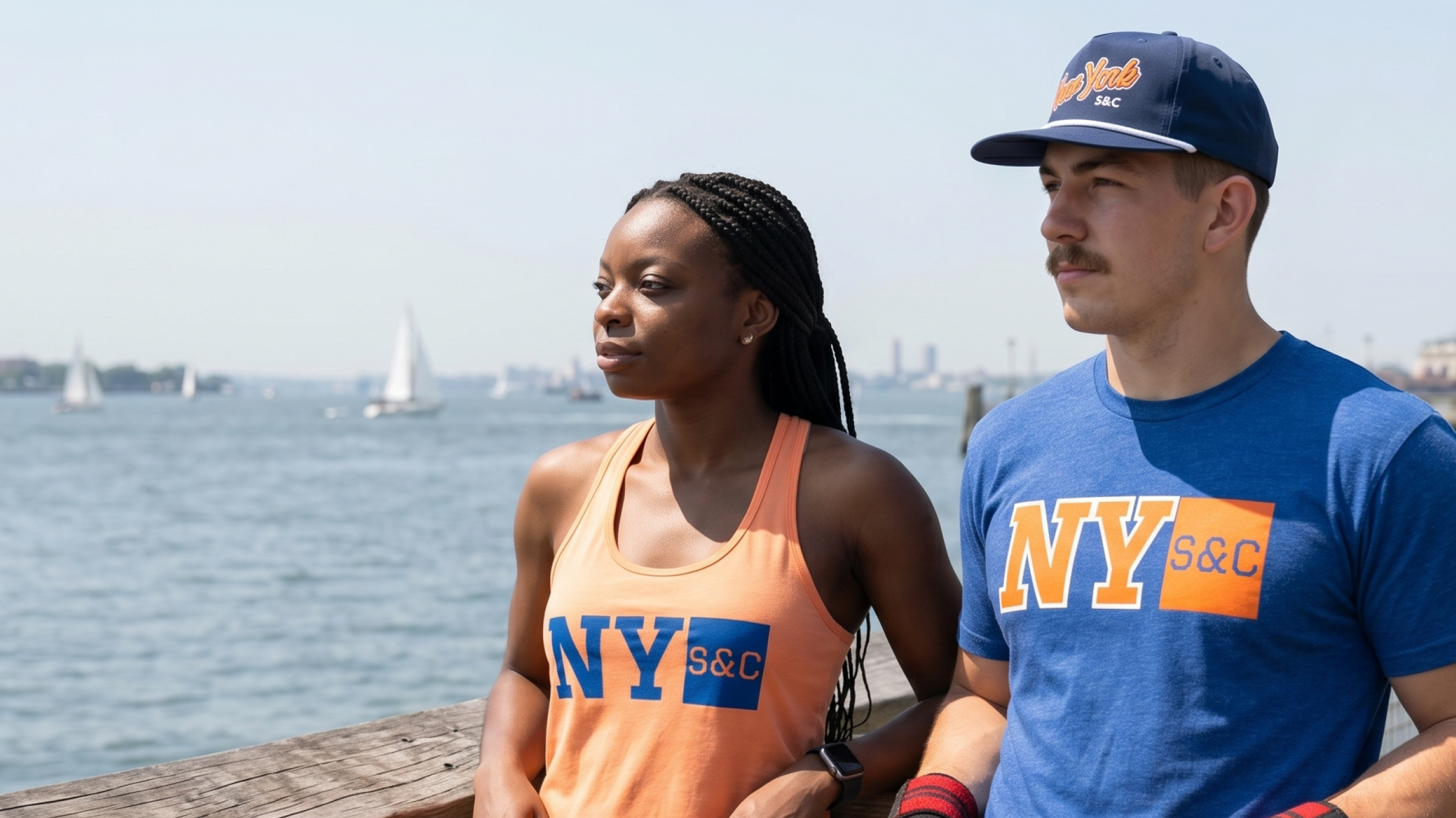
The waterfront imagery gives the collection breathing room and keeps the apparel tied to New York without leaning on the most obvious skyline shot.
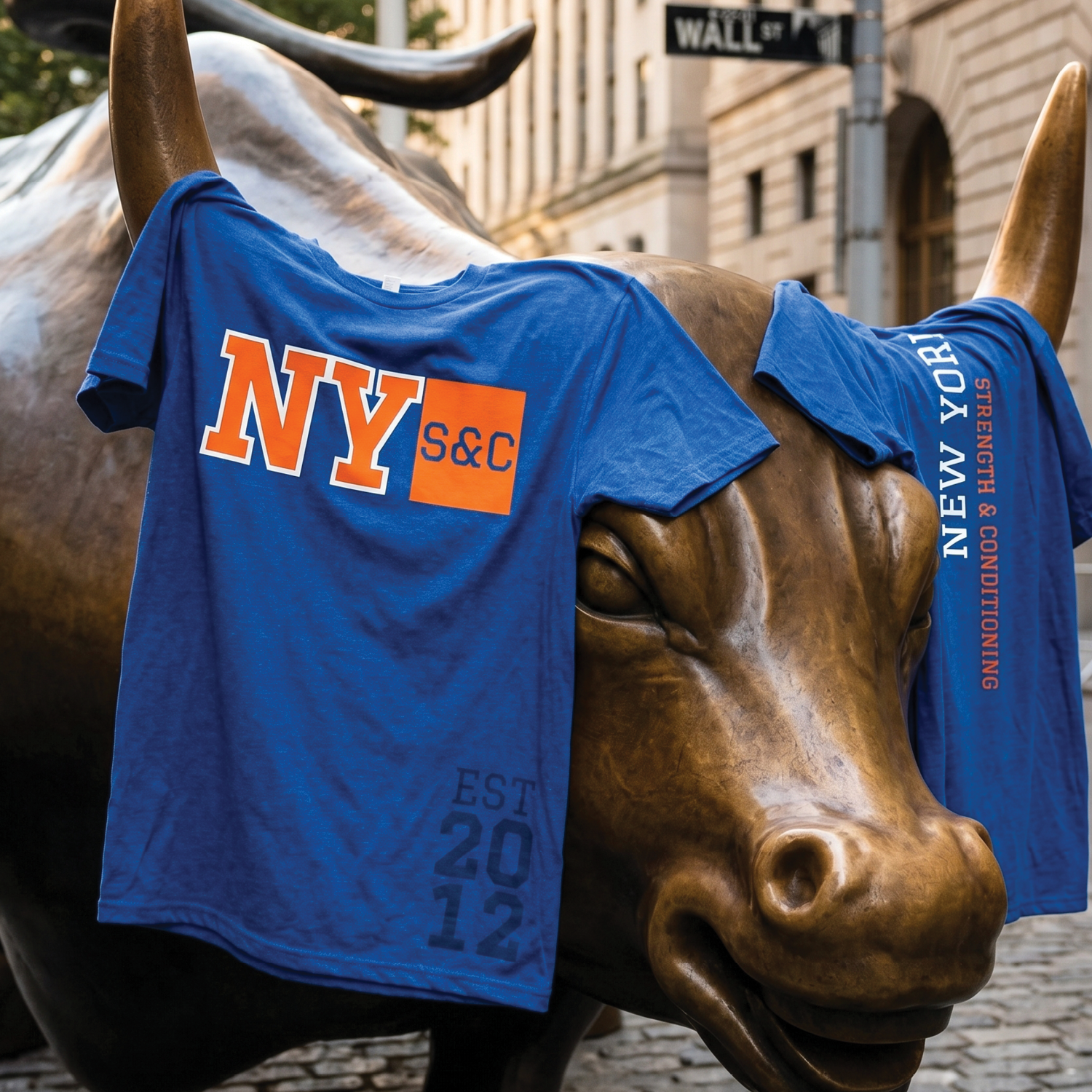
The bull placement connects the project back to force, risk, confidence, and forward motion. Those ideas sit naturally beside a strength and conditioning brand built around measured progress.
Athleisure Essentials
Training apparel shaped by exchange-floor energy.
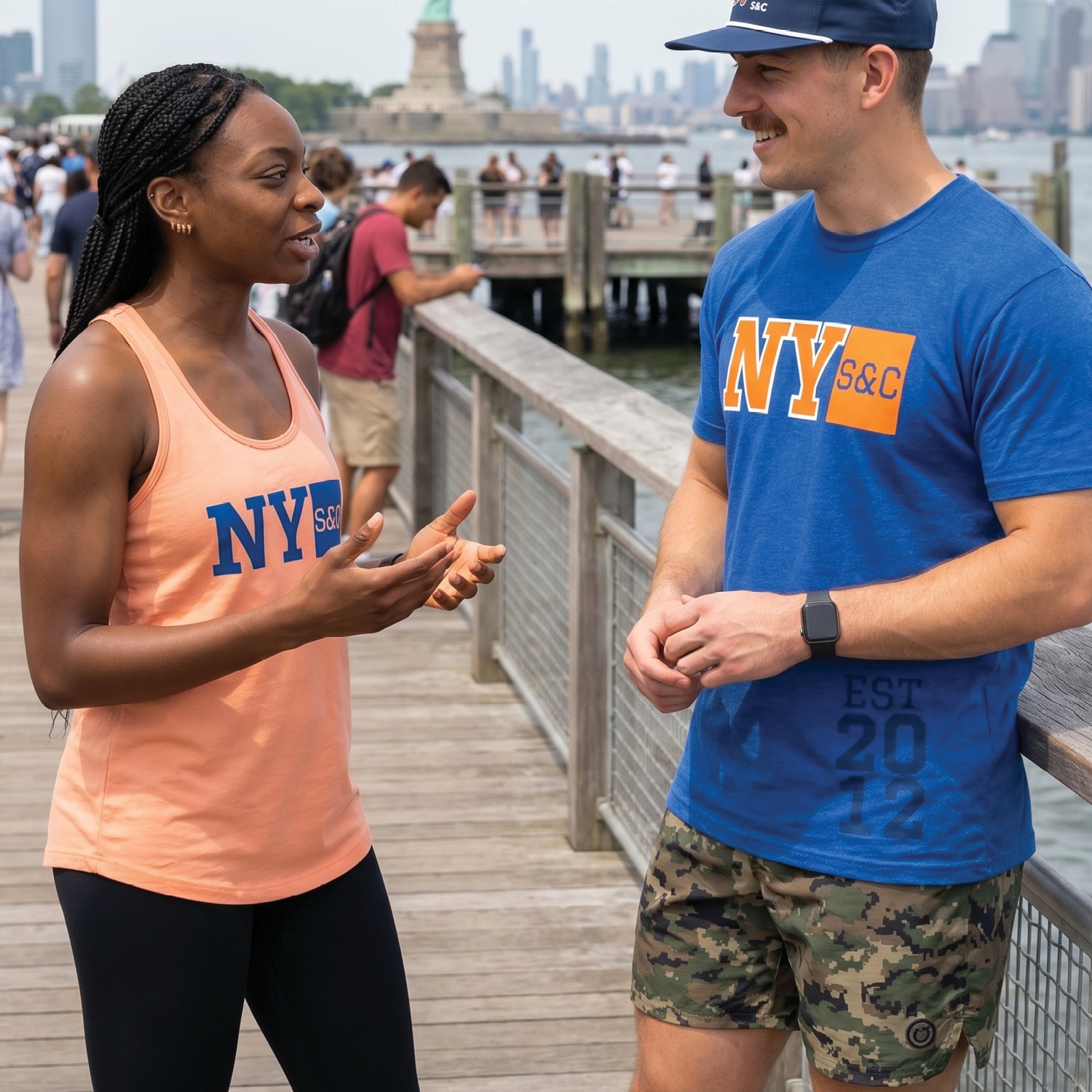
Primary Tee
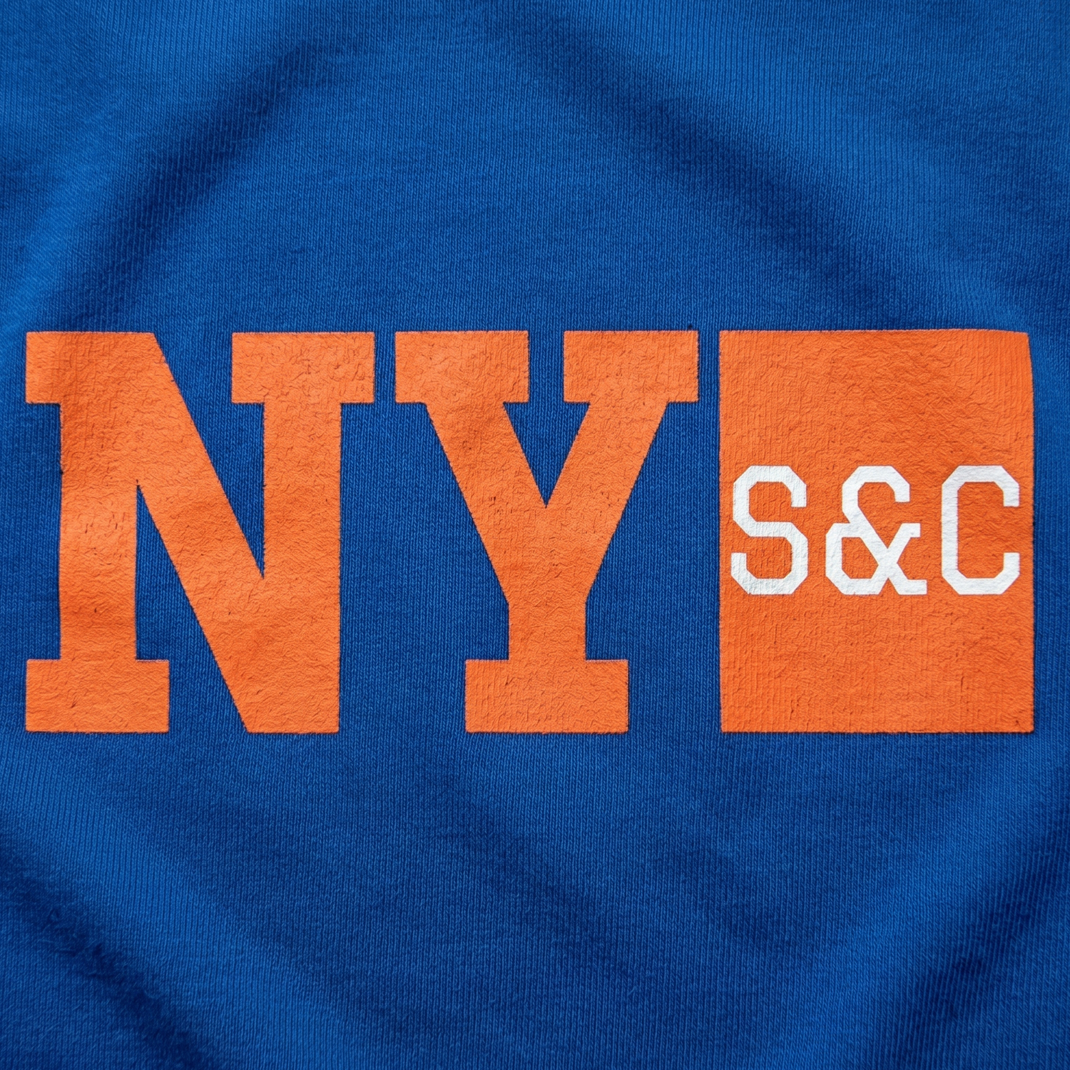
The primary tee carries the clearest NY S&C lockup. The stacked letters give the piece a market-board directness while still reading like athletic apparel.
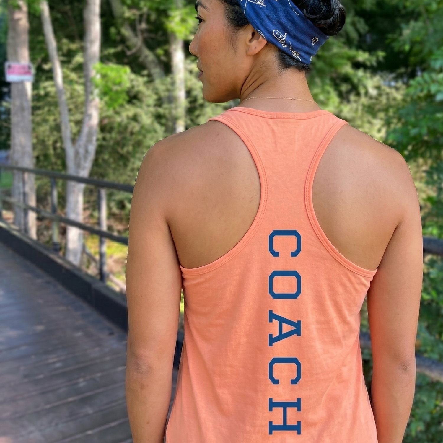
Coach Tank
The coach tank keeps the front clean and lets the back detail do more of the work. That restraint helps staff apparel feel connected without repeating the same logo treatment.
Campaign Fit
The fit strategy keeps the collection practical for real gym ordering. Members, coaches, and event staff can all wear the same visual language.
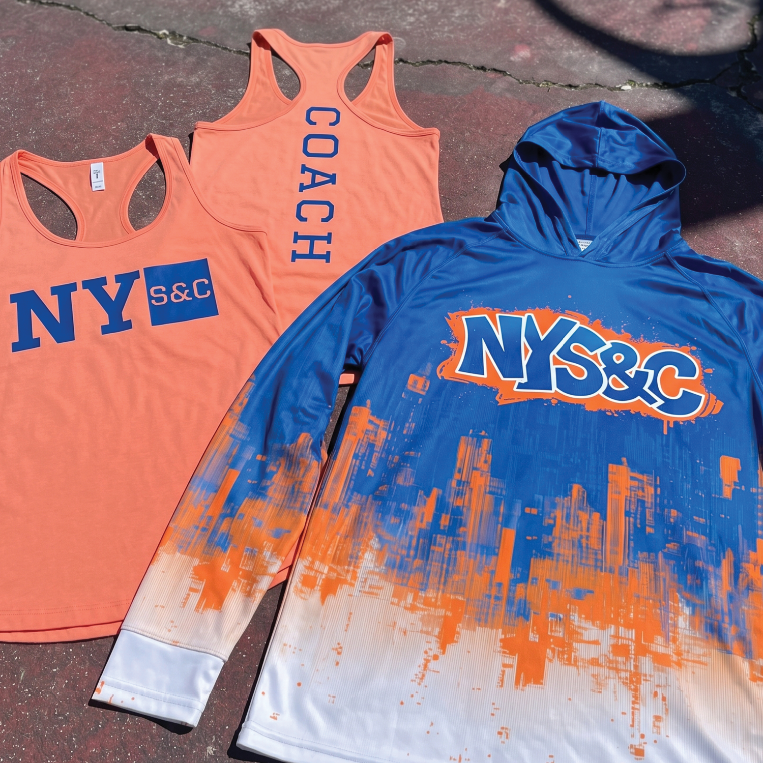
Collection Set
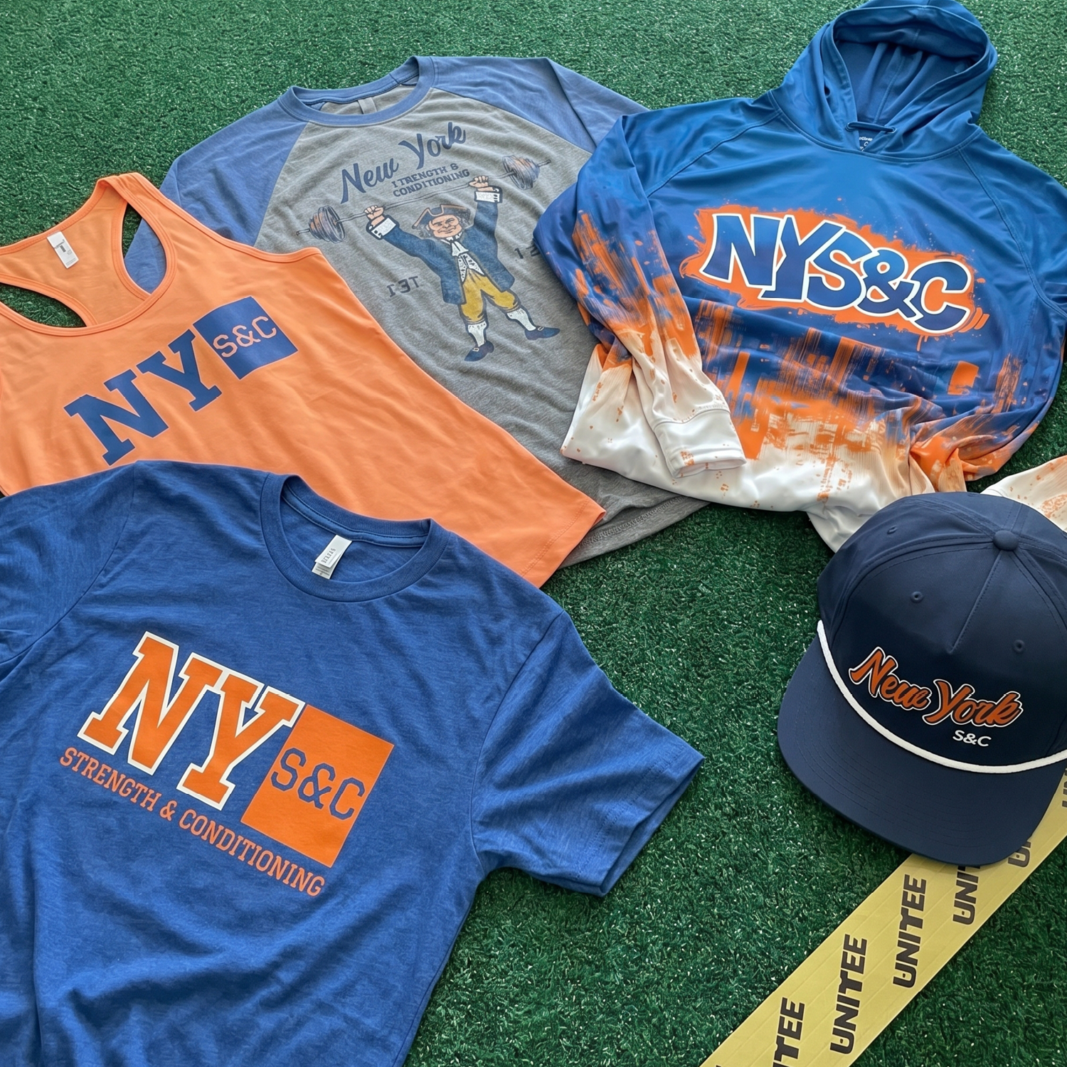
The drop was planned as a family, not a single shirt. Tees, tanks, headwear, joggers, and performance layers give the identity more places to live.
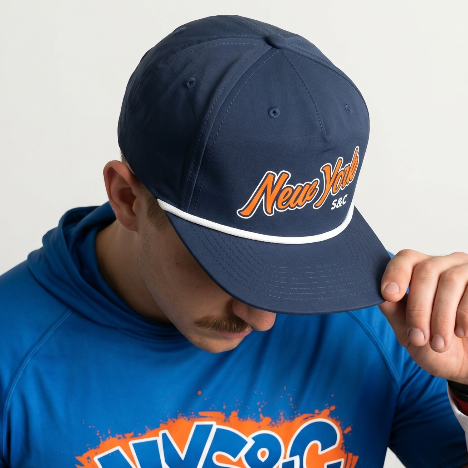
Cap Detail
A small-format mark with Wall Street confidence.
The cap brings the identity into a format that feels classic, wearable, and immediate. Script embroidery softens the harder block marks, while the navy structure, white rope, and orange detail keep the piece tied to the larger New York palette.
A small item with enough character to sell on its own while still strengthening the full collection.
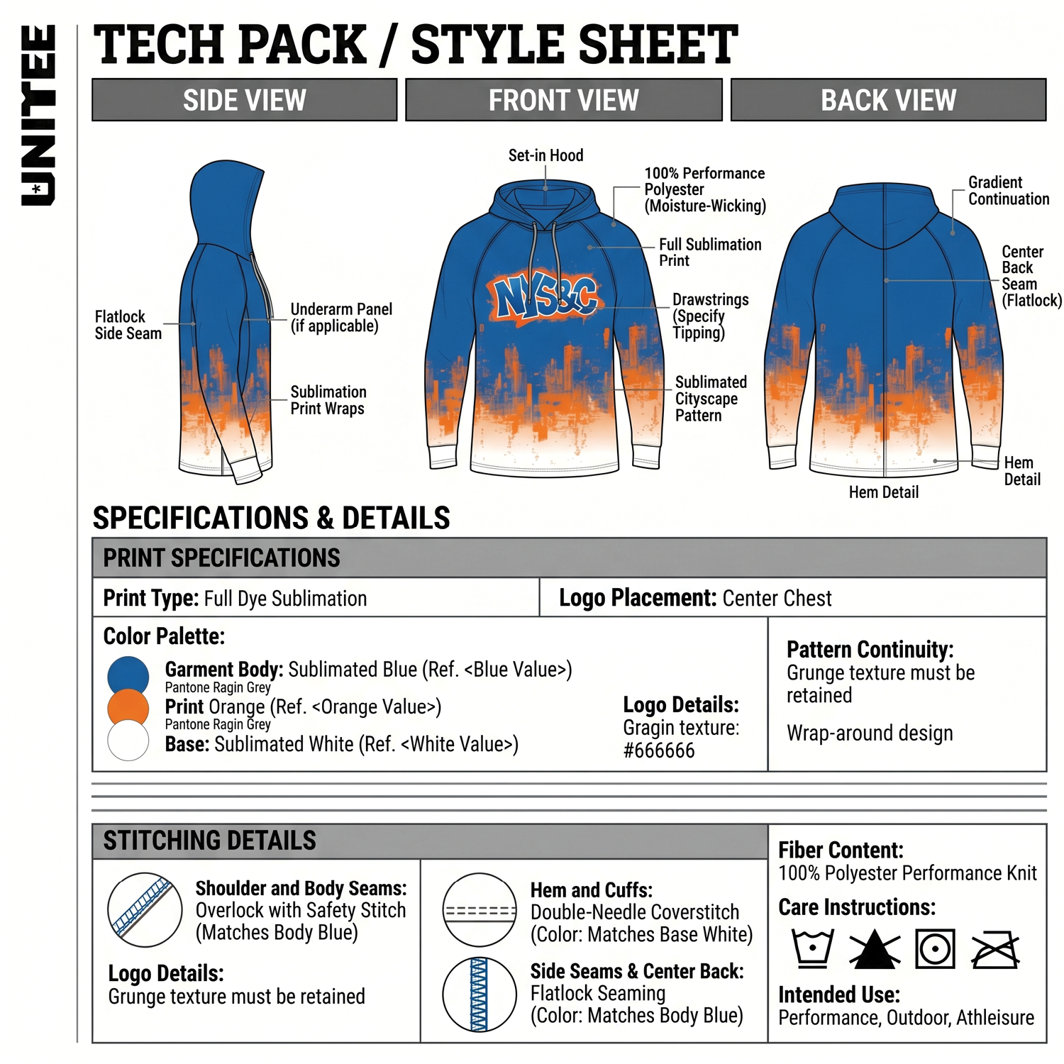
Performance Hoodie
A performance layer with city movement built in.
- Full sublimation cityscape treatment
- Performance layer for warmups, travel, and daily wear
- Blue/orange identity translated to a larger canvas
- Production layout built for clean repeatability
Concept Development
Finding the line between reference and restraint.
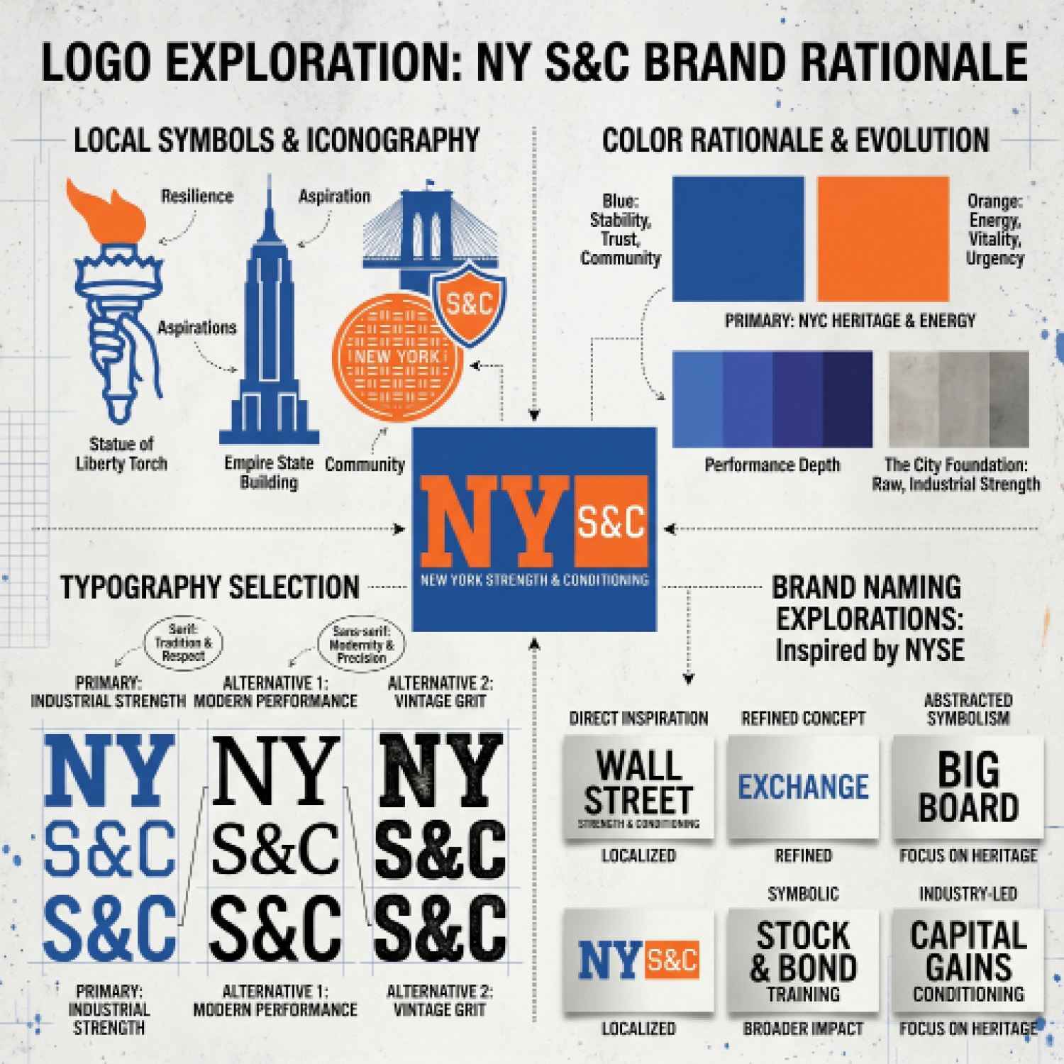
Early concept work tested how far the NYSE reference could go before it became too literal. The strongest direction kept the idea embedded in structure instead of shouting it.
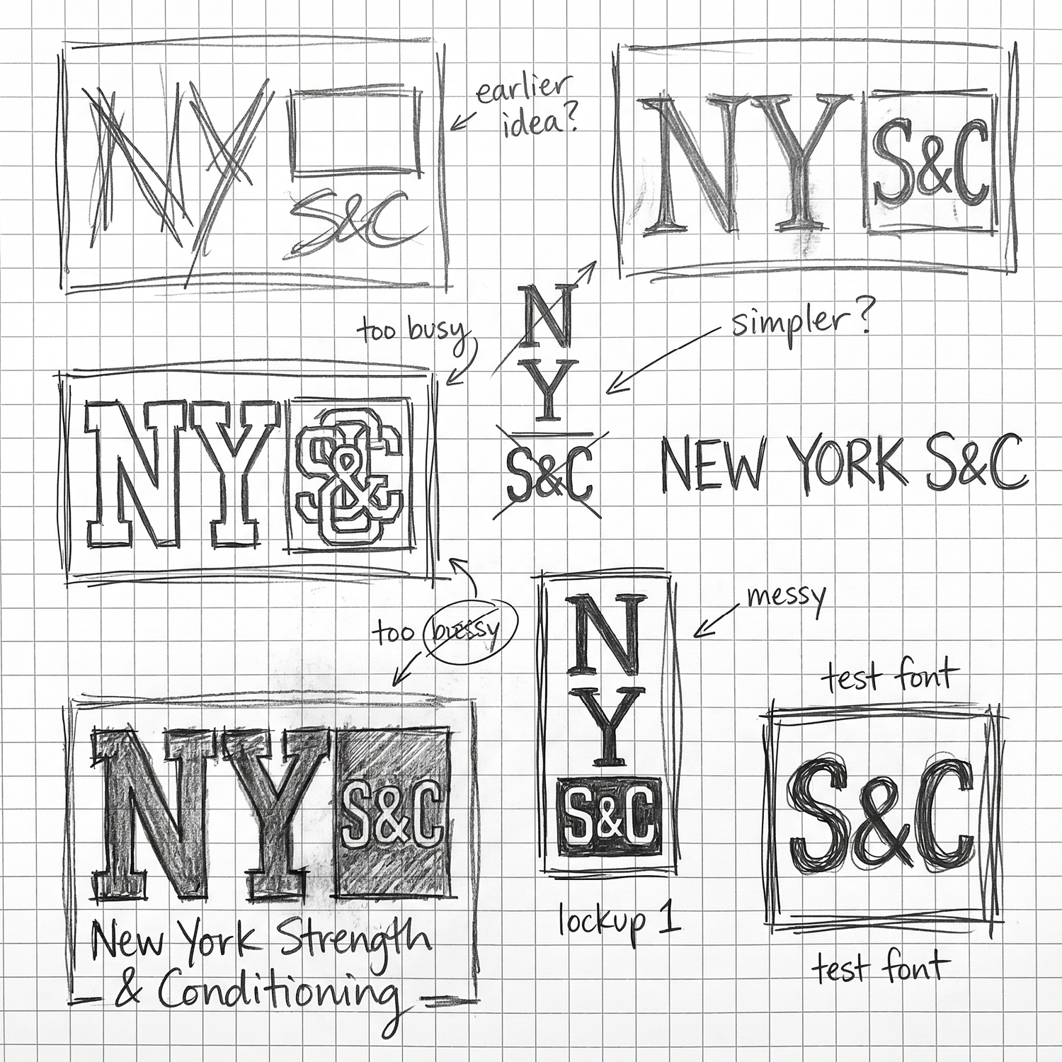
The sketch phase explored stacked marks, compact lockups, athletic blocks, and more corporate-feeling structures before narrowing the system into something that could print cleanly and wear naturally.
Once the visual direction was approved, the artwork was translated into production language so scale, placement, garment color, and decoration method stayed consistent across the full collection.
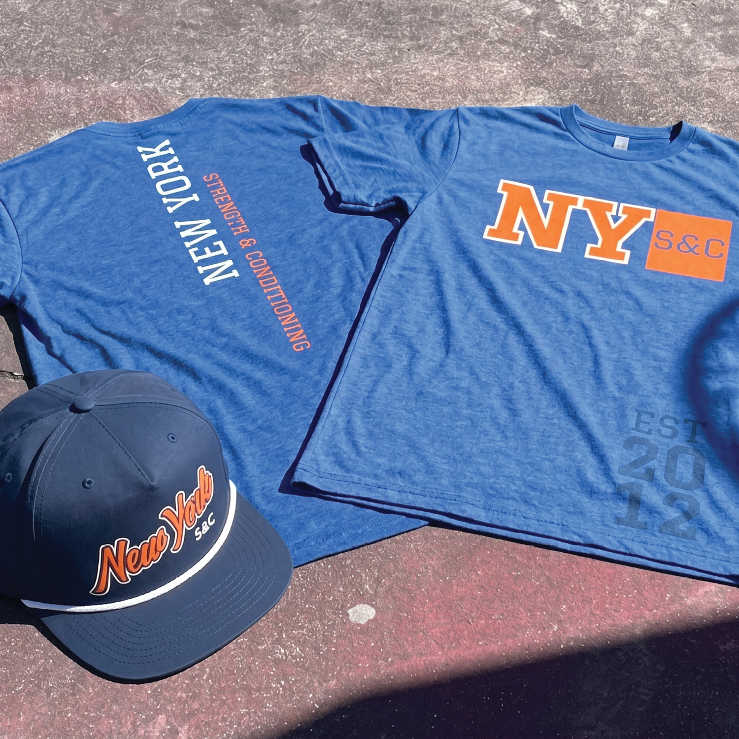
Every placement was treated as part of the identity. Large front graphics, cap embroidery, jogger marks, and supporting apparel details needed to feel related without becoming repetitive.
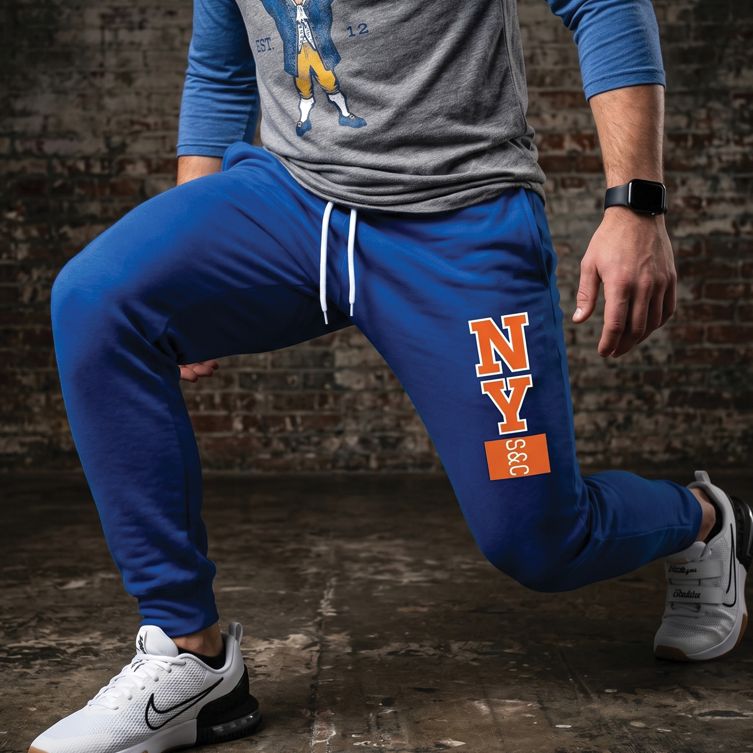
The vertical leg mark borrows from ticker movement, stacked information, and athletic utility without overcrowding the main logo system.
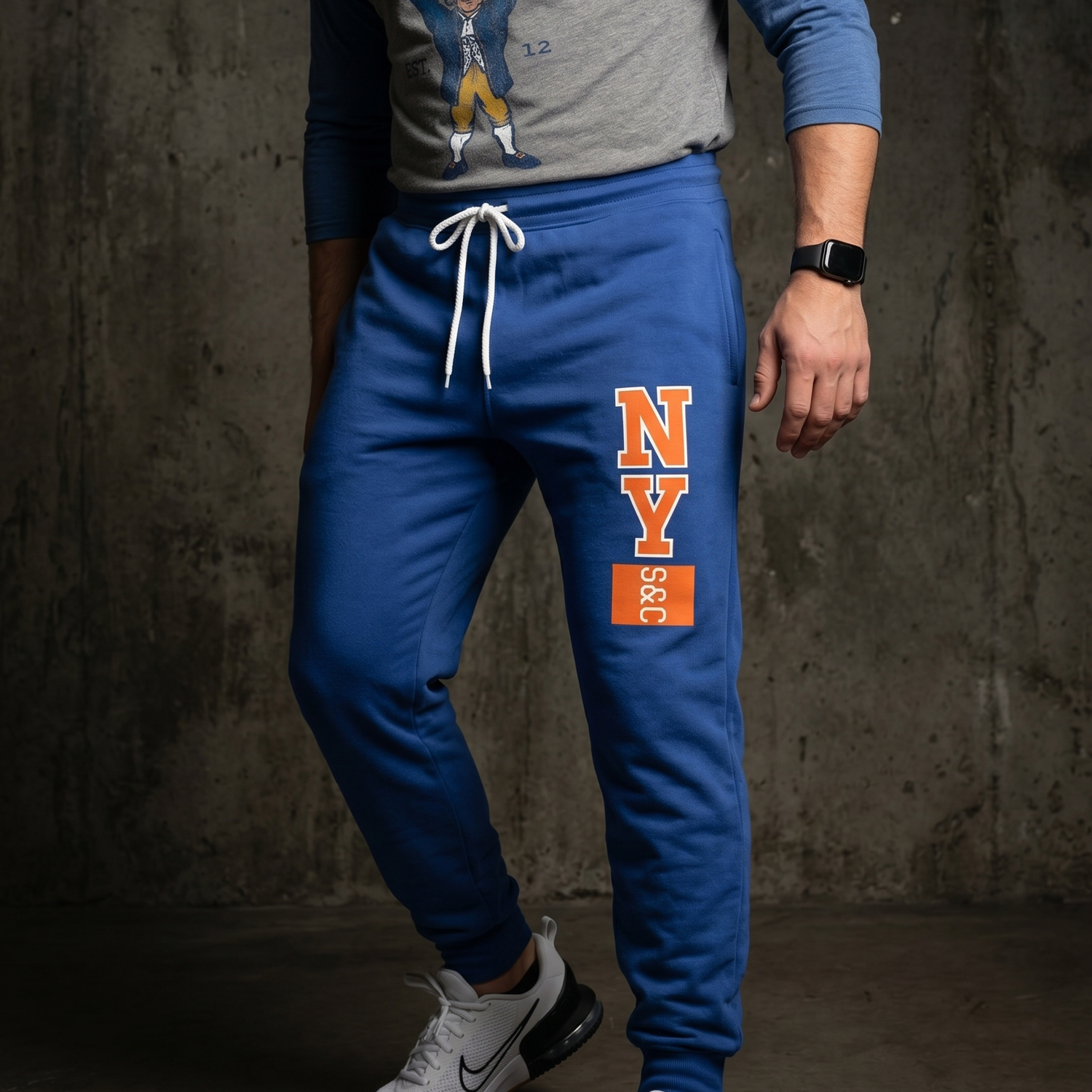
The jogger placement gives the identity another point of contact when the apparel is seen in motion.
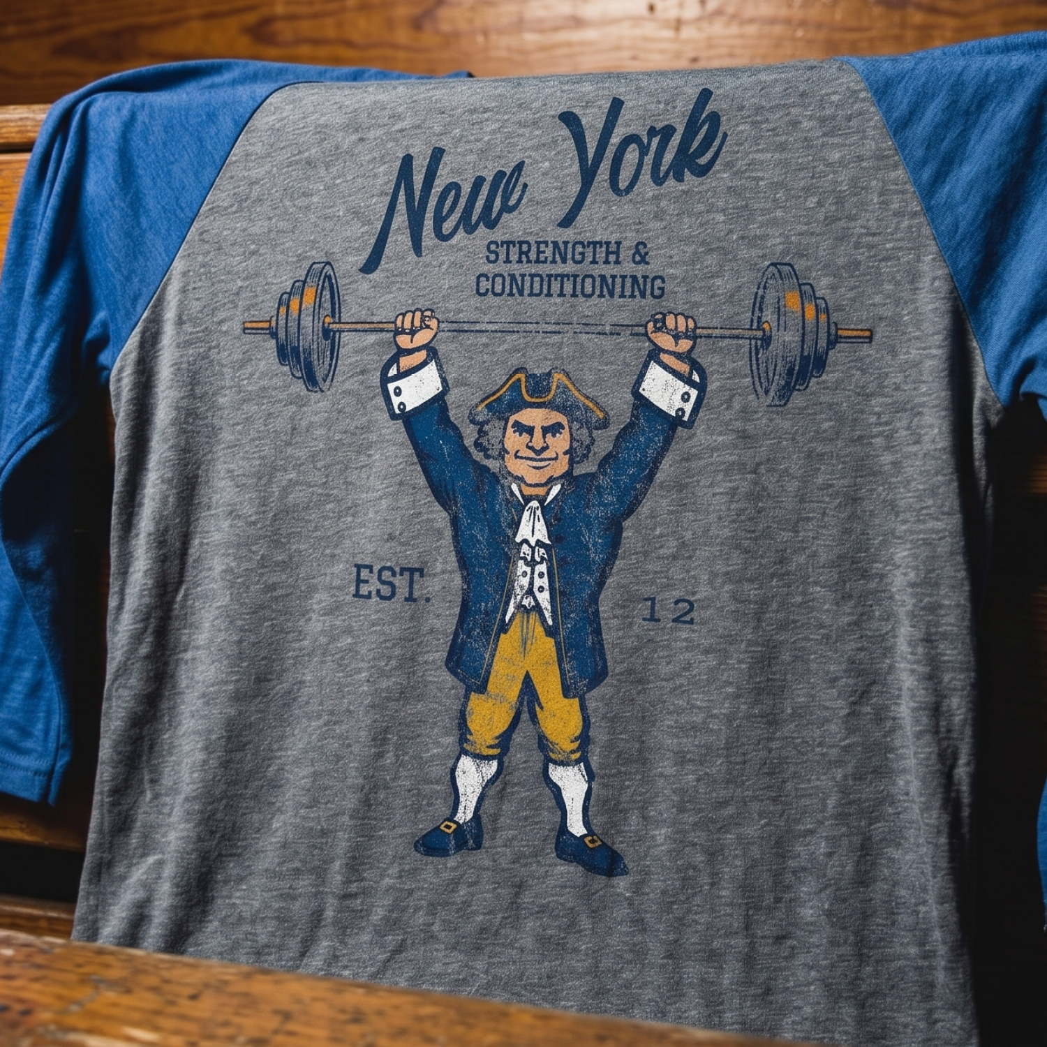
Old New York, put to work.
The raglan introduces the collection’s most historic character: a classic Knickerbocker in training. Long before the word was shortened into a familiar New York sports nickname, a Knickerbocker referred to old Dutch New York, the early settlers, and the knee-length pants associated with that era. Over time, the name became shorthand for a certain kind of New Yorker: civic, stubborn, proud, and built with a little old-world grit. We used that history as the foundation for the mascot graphic. Instead of treating the Knickerbocker as a museum piece, we put him to work. The result is a heritage-inspired training character that ties New Amsterdam, New York athletic color, and modern strength culture into one apparel piece.
The Collection
New York Strength & Conditioning
The final collection brings the story back to where it started: investment, pressure, repetition, and return. NY S&C does not try to out-New-York New York. It uses the pieces the city already owns visually, Wall Street tension, civic blue and orange, public ambition, and everyday motion, then turns them into apparel that can live inside a gym.
From the primary tee to the rope cap, hoodie, joggers, and illustrated training piece, the system gives the gym more than a launch graphic. It gives New York Strength & Conditioning a retail-ready language with room for members, coaches, events, and future drops.