
International Gym Coalition
Building Community Across Borders
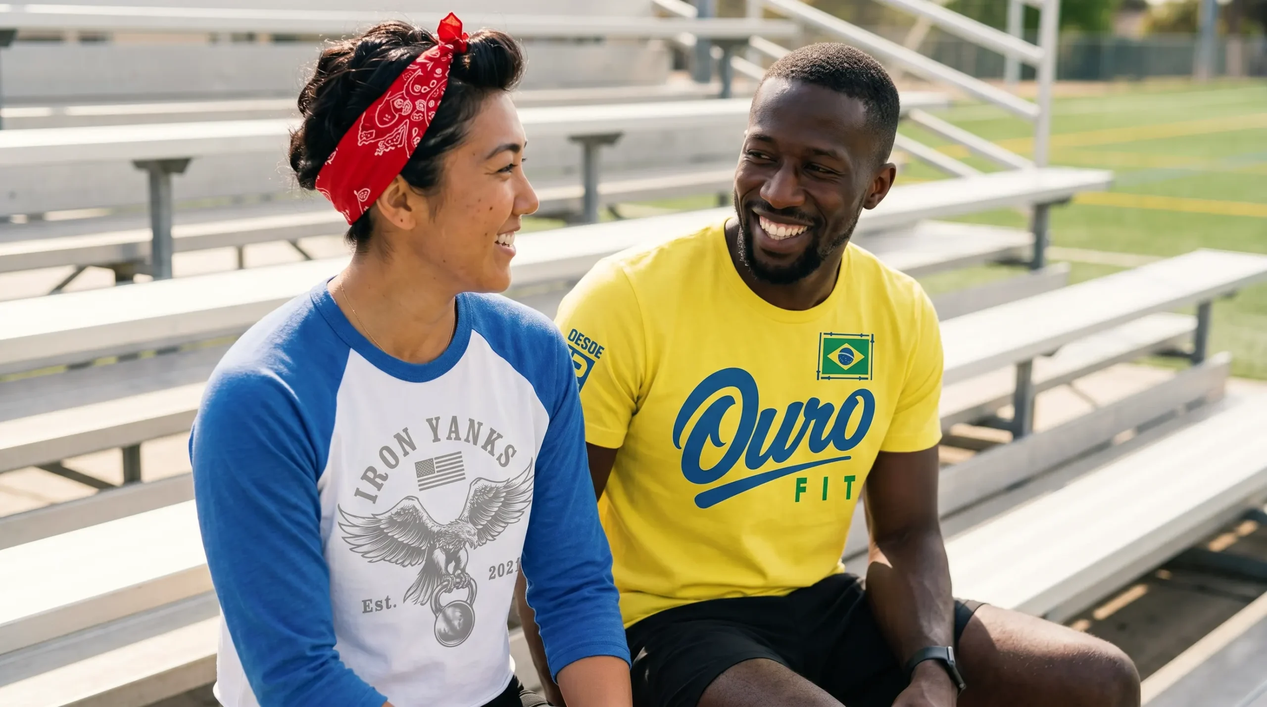
Before the sun burns through the morning air in Brazil, a gym can feel like a small country of its own. The doors roll up. Rubber meets concrete. Someone laughs in Portuguese while chalk blooms in the light. The yellow on a shirt is not just yellow anymore. It carries heat, rhythm, pride, and the kind of work that turns strangers into the people you expect to see tomorrow. That is the quiet power of a gym: the work is personal, but the room makes it shared.
That same beauty shows up everywhere, only in a different language. A South African nickname can become a barbell mark. A Canadian maple cue can turn into cold-weather training gear. Croatia can bring checkerboard order. Morocco can bring star shapes and old-world pattern. Japan can say more with one red circle than most graphics say with a full page.
International Gym Coalition is our name for that shared room. Not one flag. Not one style. A league of imagined gyms, each built from local language, color memory, symbols, and the simple promise every training floor understands: show up, work hard, and find your people in the work.
“This is a project we’ve returned to more than once. One of my favorite things about international football is the restraint of its visual language. Compared with many American sports identities, a European club can often identify itself with little more than the kit, the type, and a shield—no mascot or novelty illustration required. We brought that same discipline to gym branding and asked: how much identity can we build with less, when we do not have something obvious—like a banana hitting a baseball—to fall back on?”
Joel Hebert, Creative Lead
Force Bleue
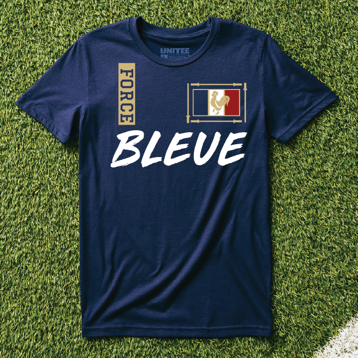
Force Bleue is a French inspired gym. Force Bleue turns a familiar French color reference into a short training name. Our team chose the blue base because it gives the concept a clear national read, while the refined athletic type and crest style layout borrow from classic European sporting marks.
Roja Fit Co.
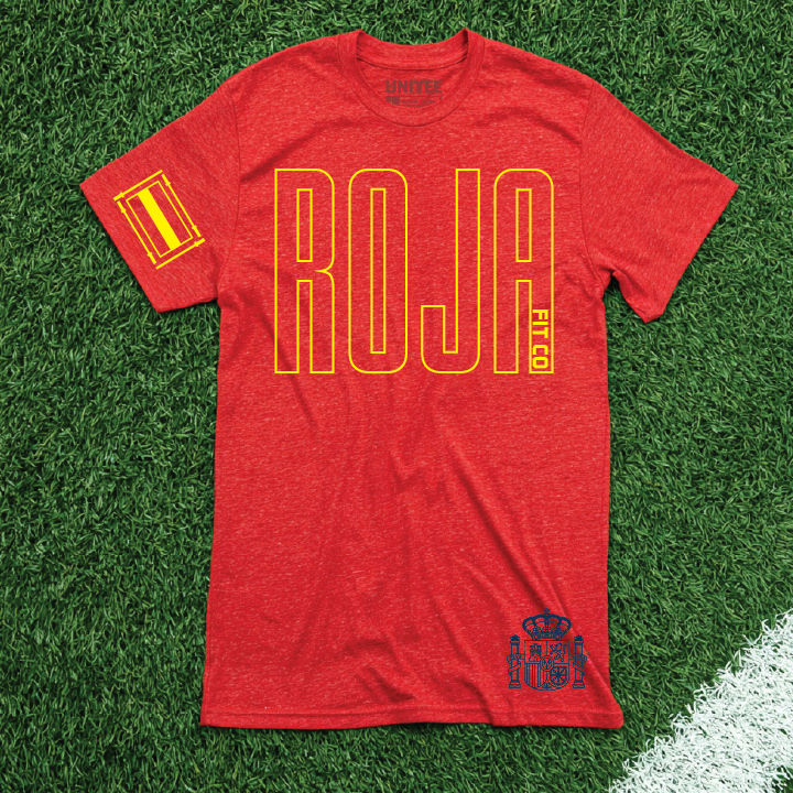
Roja Fit Co. is a Spanish inspired gym. Roja points to the red color many people connect with Spain and keeps the name simple on apparel. Our team chose the red base because it makes the yellow type feel direct, while the compact badge layout borrows from vintage athletic club graphics.
Sky Blue Strength
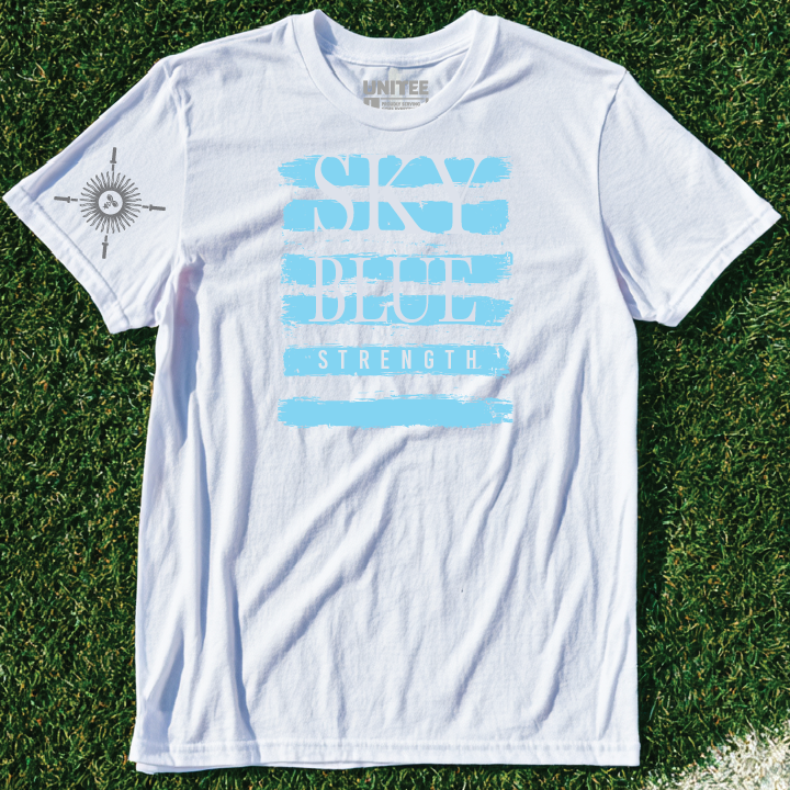
Sky Blue Strength is an Argentinian inspired gym. The name turns a clear country color cue into a training phrase. Our team chose the sky blue base because it gives the shirt an immediate Argentina read, while the clean block type and centered mark borrow from old sports program graphics.
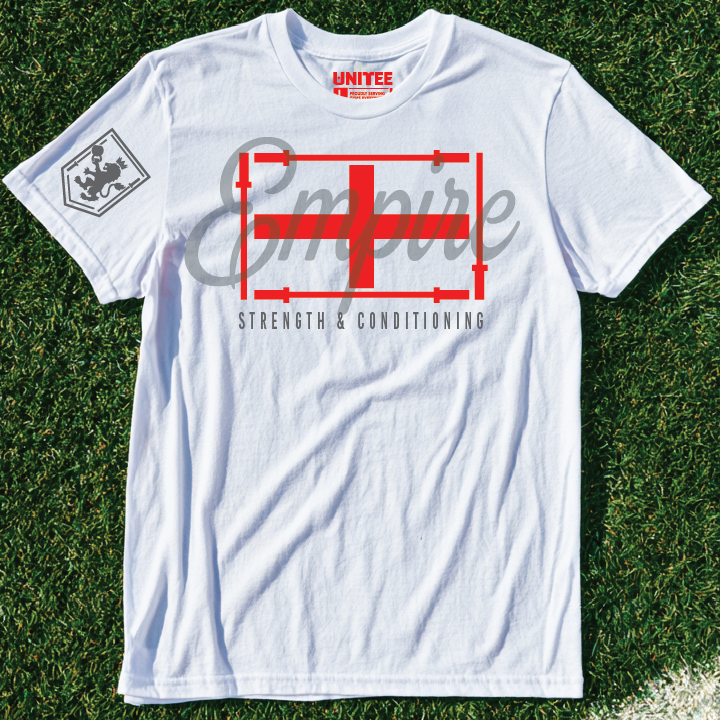
Empire S&C
Empire S&C is an English inspired gym. The name uses a short strength and conditioning format to make the country cue feel like a real facility. Our team chose the white base because it lets the red mark stay sharp, while the formal type treatment borrows from heritage athletic and pub sign lettering.
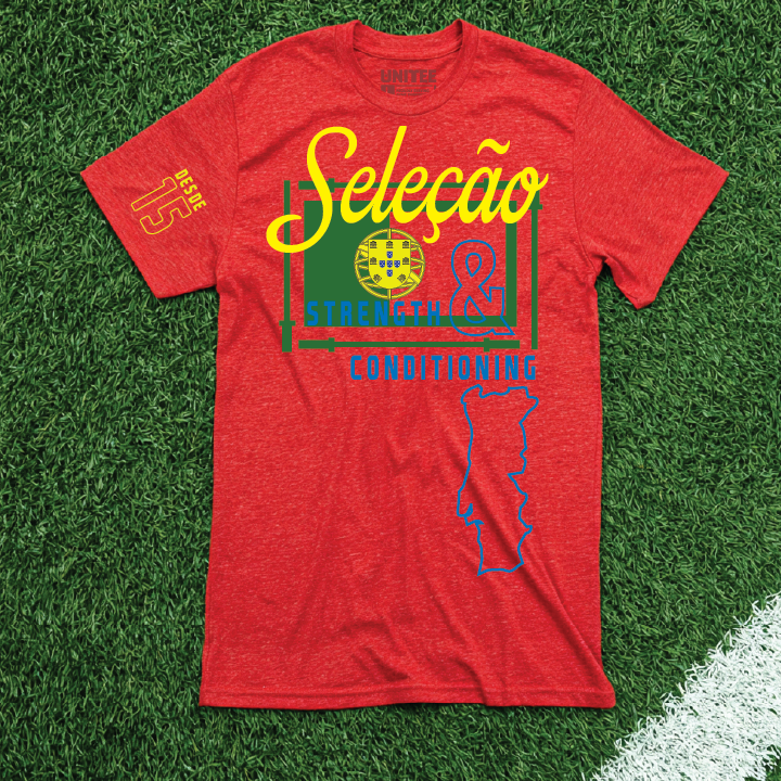
Armada Athletics
Armada Athletics is a Portuguese inspired gym. Armada gives the concept a strong sea linked name with a clear local point of view. Our team chose the green base because it supports the Portuguese color story, while the bold serif type and shield structure borrow from old maritime badge design.
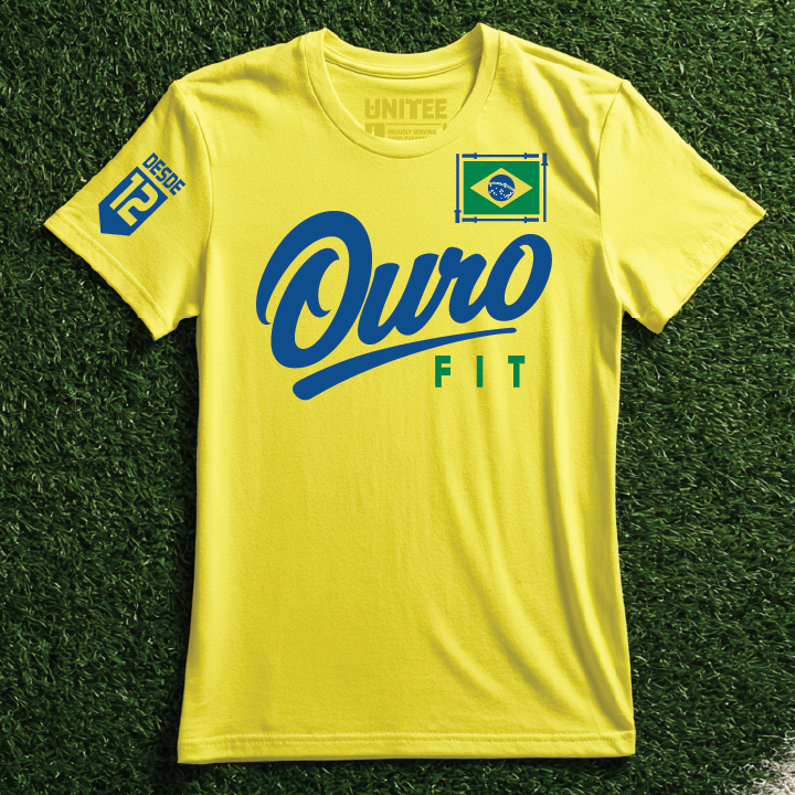
O U R O Fitness
O U R O Fitness is a Brazilian inspired gym. Ouro means gold in Portuguese, so the name turns a color reference into a gym identity. Our team chose the yellow base because it carries the brightest part of Brazil's visual language, while the spaced type and graphic mark borrow from streetwear style sports tees.
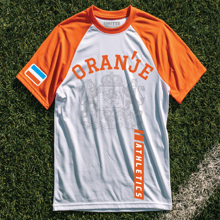
Oranje Athletics
Oranje Athletics is a Dutch inspired gym. Oranje is a direct Dutch color reference and gives the name a clean apparel voice. Our team chose the orange base because it makes the country cue instant, while the condensed type and simple icon treatment borrow from modern training club graphics.
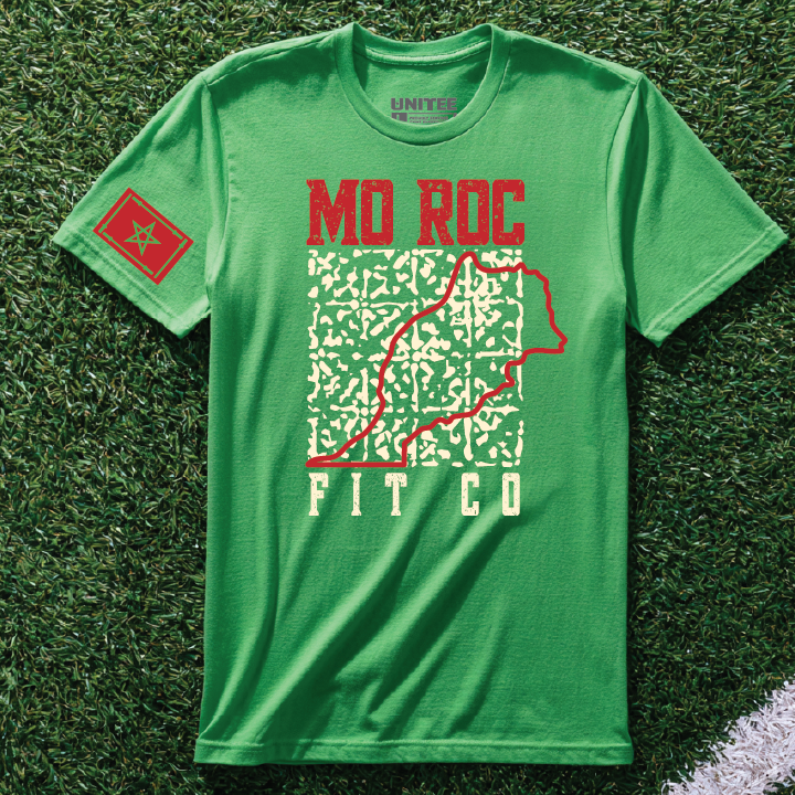
MO ROC Fit Co
MO ROC Fit Co is a Moroccan inspired gym. The name splits Morocco into a short apparel phrase with a training company feel. Our team chose the green base because it gives the red type a strong country color contrast, while the map line graphic borrows from topographic outdoor shirt design.
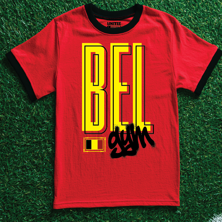
BELgym
BELgym is a Belgian inspired gym. The name folds BEL into gym so the country cue is built directly into the wordmark. Our team chose the red base because it gives the yellow letter stack the strongest read, while the tall block type and loose black script borrow from street poster graphics.
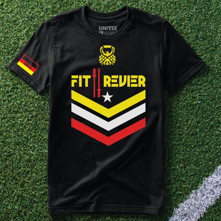
Fit Revier
Fit Revier is a German inspired gym. Revier can point to a territory or home ground, which gives the name a local gym feel. Our team chose the black base because it lets the yellow, red, and white chevrons snap forward, while the shield layout borrows from badge and moto inspired graphics.
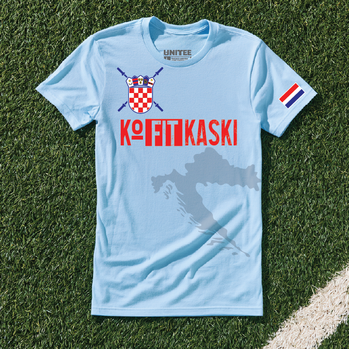
KoFITkaski
KoFITkaski is a Croatian inspired gym. The name turns a Croatian sound into a fitness wordplay that feels made for apparel. Our team chose the light blue base because it lets the red checker crest stand out, while the split type treatment borrows from club shirt graphics and custom gym branding.
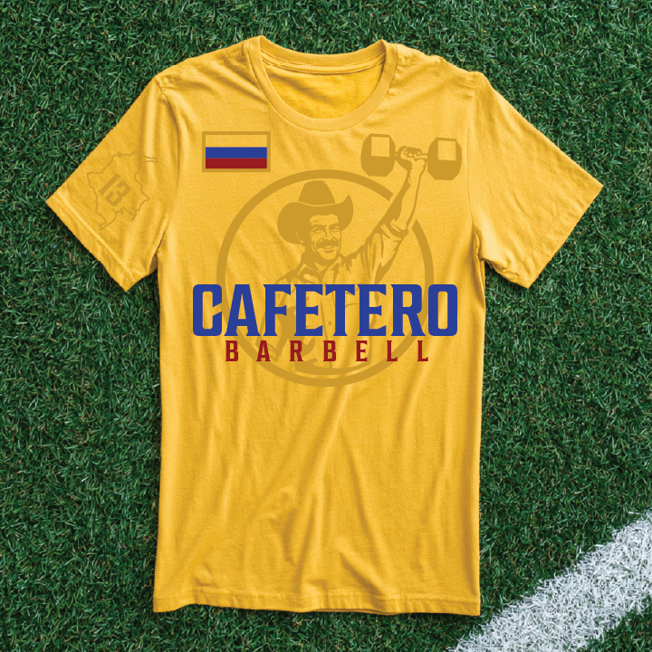
Cafetero Barbell
Cafetero Barbell is a Colombian inspired gym. Cafetero means coffee grower, a reference many people connect with Colombian identity. Our team chose the yellow base because it carries the brightest part of the country color story, while the serif type and coffee figure borrow from heritage label design.
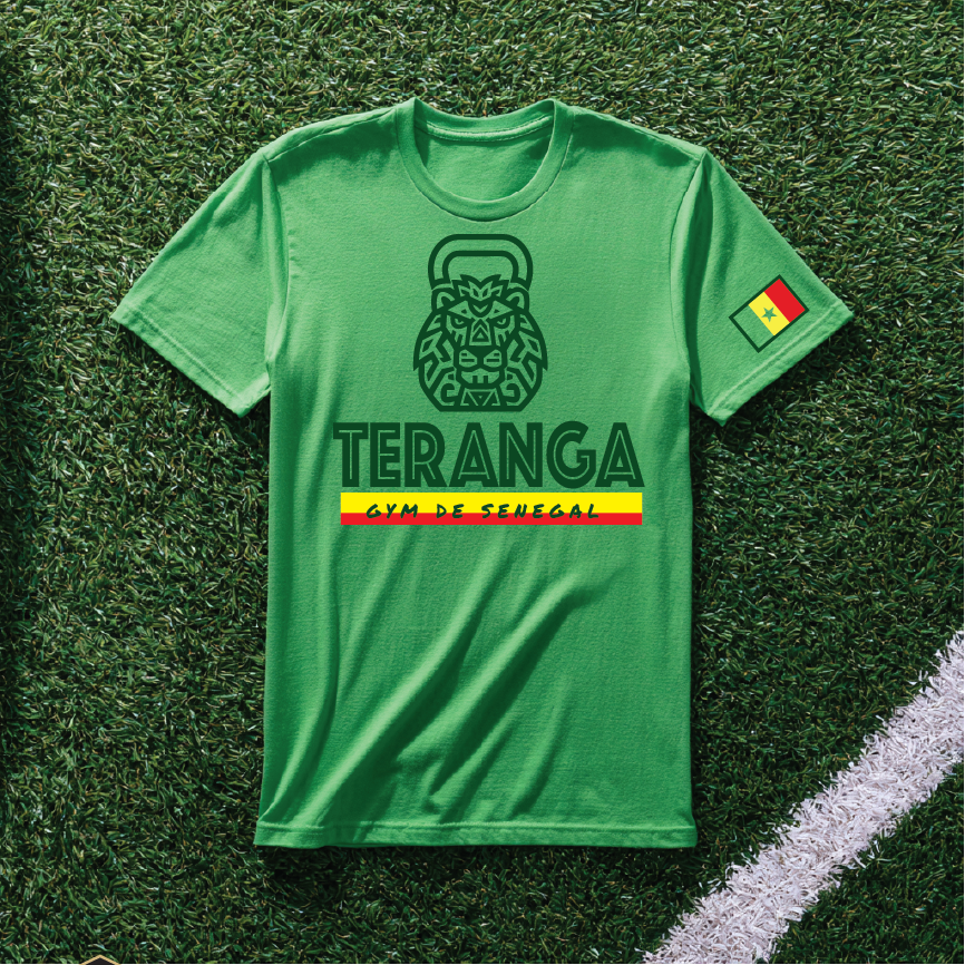
Teranga Gym De Senegal
Teranga Gym De Senegal is a Senegalese inspired gym. Teranga is a word often tied to Senegalese hospitality, so the name gives the gym a clear local anchor. Our team chose the green base because it supports the national color story, while the arched type and simple emblem borrow from community club shirt design.
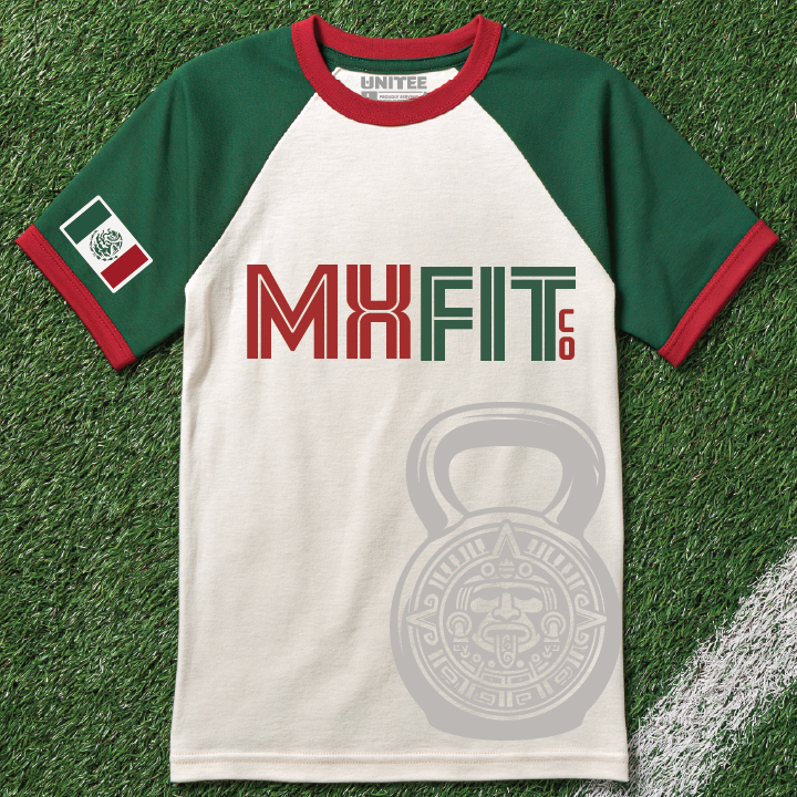
MX Fit Co
MX Fit Co is a Mexican inspired gym. MX is a compact country marker that reads fast on apparel. Our team chose the green base because it connects to Mexican flag color, while the bold athletic type and badge style layout give the concept a clean gym shirt shape.
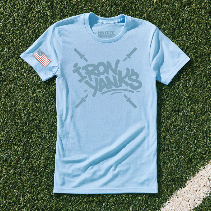
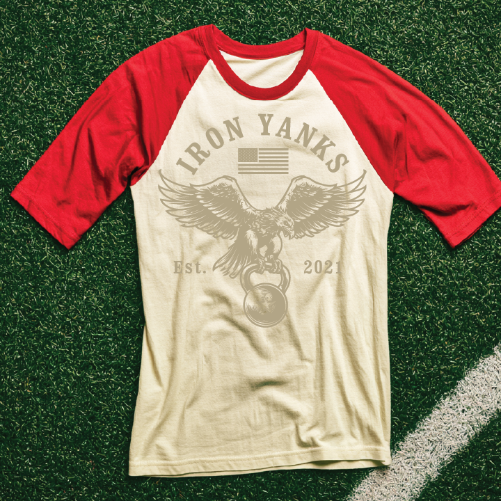
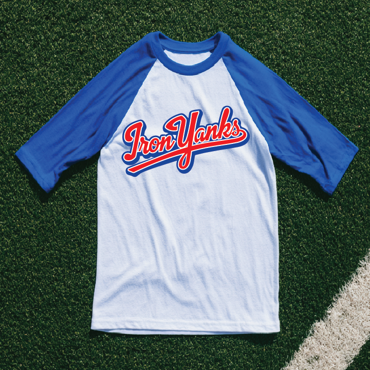
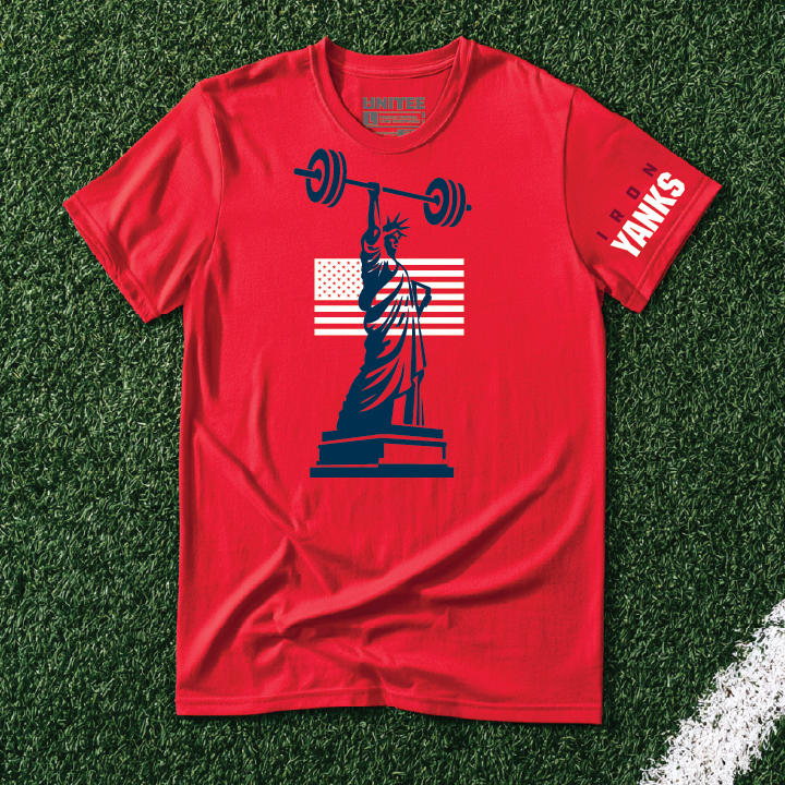
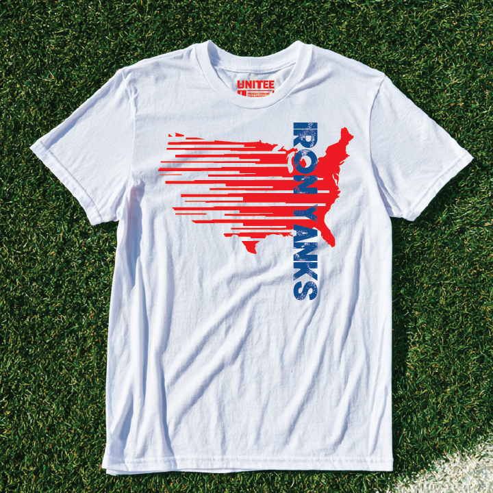
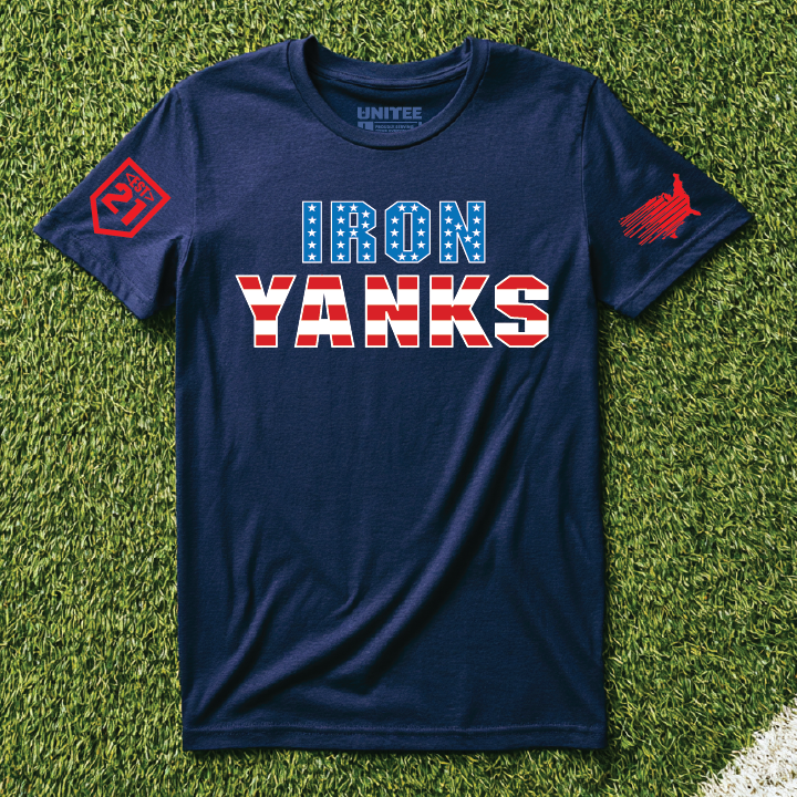
Yank Lift Co
We can never have enough red white and blue gear in this country so here's some more:
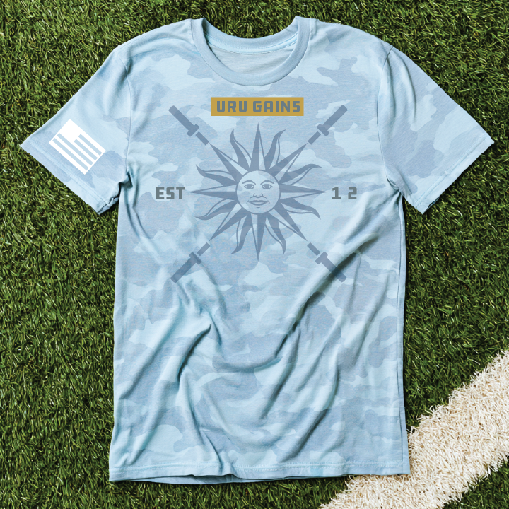
URU Gains
URU Gains is a Uruguayan inspired gym. URU keeps the country reference short, while Gains makes the name feel native to training culture. Our team chose the sky blue base because it connects to Uruguay visually, while the sun crest and aged type treatment borrow from vintage badge graphics.
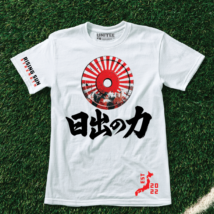
Rising Sun Strength
Rising Sun Strength is a Japanese inspired gym. The name points to a widely recognized Japan reference and connects it to training. Our team chose the black base because it frames the red sun graphic with contrast, while the centered mark and sleeve details borrow from clean streetwear and tournament shirt layouts.
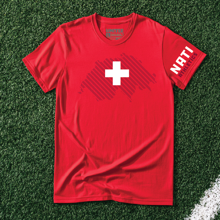
NATI Fit
NATI Fit is a Swiss inspired gym. Nati is a familiar Swiss nickname, so the name turns a local reference into a short gym brand. Our team chose the red base because it gives the white cross immediate clarity, while the quiet tonal pattern and sleeve type keep the shirt clean and premium.
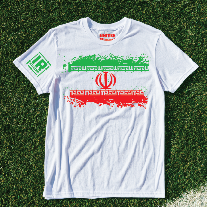
IR Strong
IR Strong is an Iranian inspired gym. The name uses IR as a short country marker and keeps the training angle direct. Our team chose the white base because it gives the green and red pattern room to read, while the ornamental line work turns the shirt into a clean gym graphic.
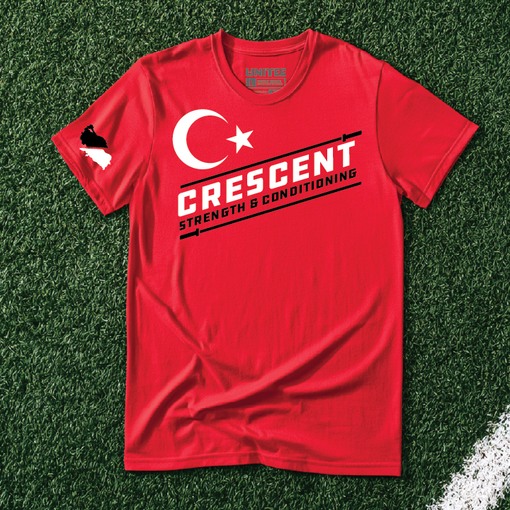
Crescent Strength & Conditioning
Crescent Strength & Conditioning is a Turkish inspired gym. Crescent pulls from the most recognizable national symbol and makes it work as a gym name. Our team chose the red base because it carries the Turkish flag reference clearly, while the angled type and underbar details borrow from performance apparel graphics.
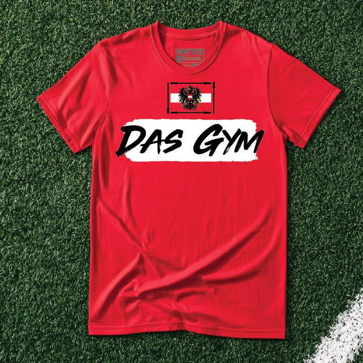
Das Gym
Das Gym is an Austrian inspired gym. Das Gym uses German language structure to make the name simple, local, and easy to remember. Our team chose the red base because it ties directly to Austria, while the brush type and flag panel create a sharp streetwear style gym mark.
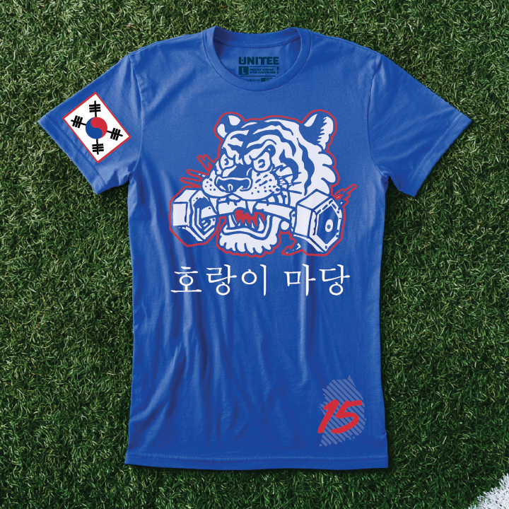
Tiger Yard
Tiger Yard is a South Korean inspired gym. The tiger reference gives the concept a clear local symbol and Yard makes it sound like a training space. Our team chose the white base because it keeps the red and blue mark crisp, while the bold type and emblem structure borrow from modern athletic identity systems.
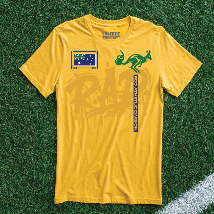
Roo Athletics Division
Roo Athletics Division is an Australian inspired gym. Roo gives the name a short local shorthand and the initials R.A.D. make it feel made for apparel. Our team chose the gold base because it supports the Australian sporting color story, while the rounded athletic type borrows from retro training camp graphics.
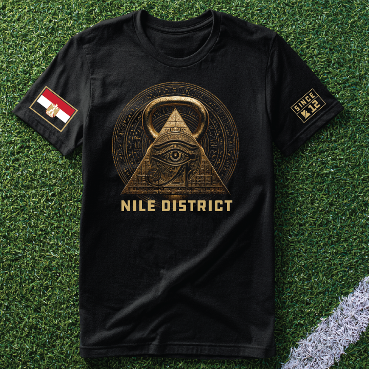
Nile District
Nile District is an Egyptian inspired gym. The name uses the Nile as a local anchor and makes it feel like a neighborhood training spot. Our team chose the black base because it lets the red and gold mark read with weight, while the tall type and line work borrow from vintage destination apparel.
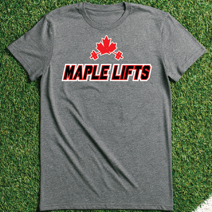
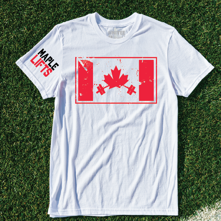
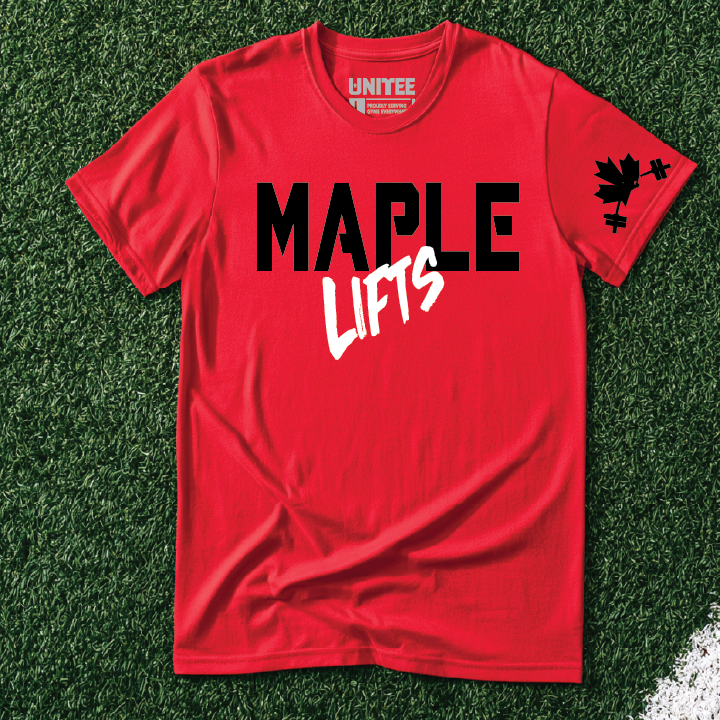
Maple Lifts
This section includes 3 uploaded design variations for Canada. Each one keeps the same country inspired gym idea, but changes the shirt color, type balance, and graphic treatment so the concept can live as a small apparel collection.
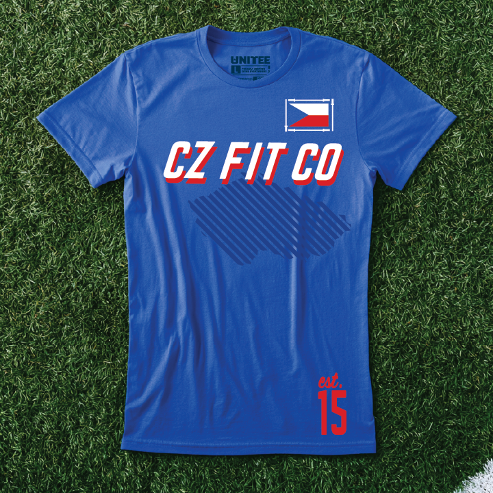
CZ Fit Co
CZ Fit Co is a Czech inspired gym. CZ gives the concept a short country code name that feels right on a training shirt. Our team chose the blue base because it supports the Czech color system, while the italic varsity type and subtle line pattern borrow from modern kit graphics.

Bafana Barbell
Bafana Barbell is a South African inspired gym. Bafana, a Zulu word, means the boys and is a nickname many South Africans recognize. Our team chose the yellow base because it carries South African sporting pride, while the arched type and Africa grid edition graphic turn the country reference into a gym shirt with its own point of view.
