
UNITEE Design Lab / Philadelphia, Pennsylvania
Independence Barbell
Philadelphia gave this collection a name with built-in weight. Independence is not a vague word here. It points to a real place, a real city story, and a set of symbols people already understand before they ever walk into the gym.
For Independence Barbell, the visual system was built from Philadelphia’s strongest signals: the Liberty Bell, 1776, Independence Hall, brick rowhomes, old civic lettering, sports color, neighborhood pride, and the hard-working feel of a city that has always mixed history with muscle.
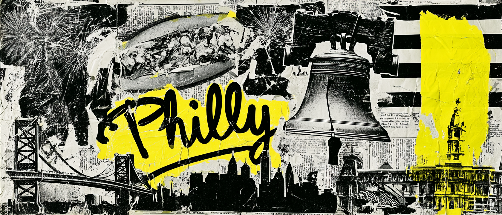
Liberty, Civic Weight, And Neighborhood Muscle
A city where the symbol system was already powerful.
Philadelphia carries some of the clearest civic symbols in the country. The Declaration of Independence and the Constitution were both shaped in the city, and Independence Hall still gives Philadelphia a direct link to the founding story of the United States.
That history made the gym name feel unusually strong. Independence Barbell does not need a forced concept. The name already connects to Philadelphia’s role in American independence, then adds a training object that makes it physical. The barbell turns the idea from a history reference into a gym identity.
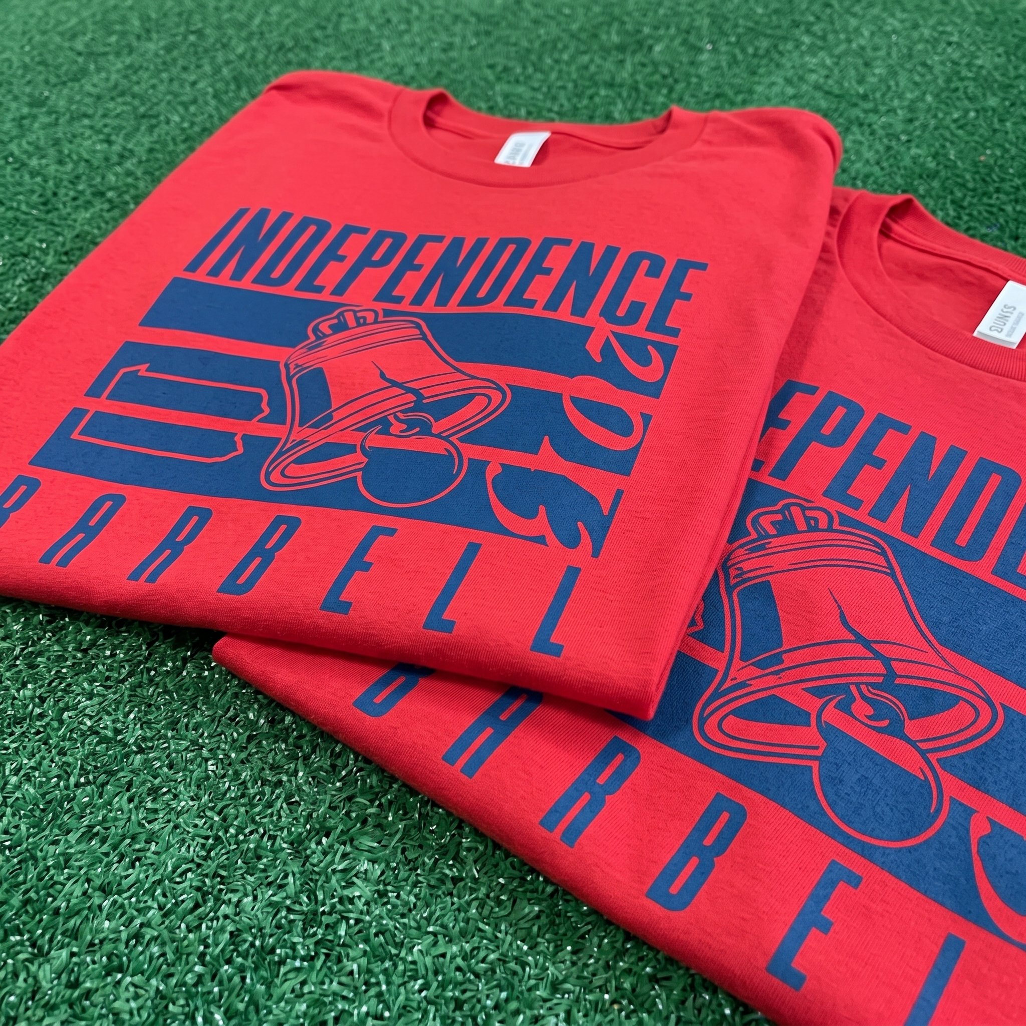
The Liberty Bell became the core graphic anchor because it is instantly readable and deeply local. Its crack is part of the symbol’s power. For the apparel system, the bell was designed to work with bars, plates, coach marks, and collegiate typography so it could live inside fitness apparel without feeling like a tourist logo.
Philadelphia is also a city of neighborhoods. Brick rowhomes, corner stores, old signs, ringer tees, workwear colors, and local sports culture all shaped the look. That is why the collection uses navy, red, cream, charcoal, grey, and worn metallic tones. The palette feels civic, athletic, and slightly industrial.
The visual system was built around that mix: founding-era references, city pride, neighborhood sportswear, and weight-room utility. The bell gives the collection meaning. The barbell gives it purpose. The type system gives it the old Philadelphia sports feel.
The result is a gym apparel line that feels rooted in the city without becoming costume history. It uses the symbols people know, but rebuilds them for coaches, lifters, members, and everyday wear.
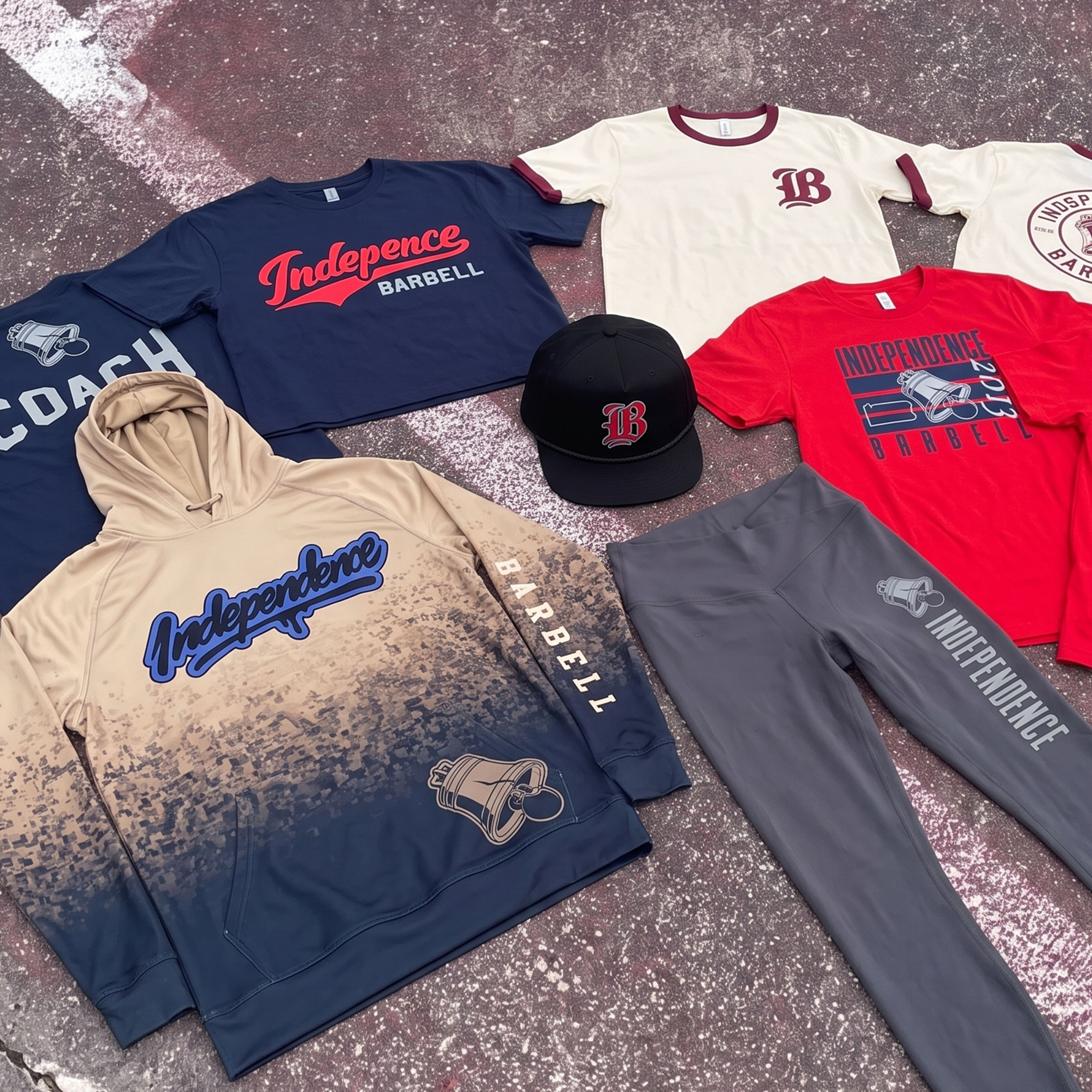
The Collection brings the Independence Barbell system together: Liberty Bell graphics, collegiate type, script marks, ringer tees, coach apparel, a black rope cap, grey training leggings, and a navy-to-tan performance hoodie built around Philadelphia’s civic and athletic palette.
Concept + Design Rationale
The concept started with the bell. Philadelphia’s Liberty Bell is one of the few local symbols that can carry both place and meaning at the same time. It points to the city, but it also points to independence, grit, and civic weight.
The main logo was designed to merge that symbol with the gym’s training purpose. The bell becomes a mark. The barbell language turns it into a fitness identity. The crack, heavy outlines, and block type give the system a strong read from distance.
Typography does a lot of the work. The script “Independence” mark creates a vintage athletic lane, while the collegiate “BARBELL” treatment gives the collection weight and structure. The blackletter “IB” cap mark adds an old city sports feel.
The apparel mix was built to feel like a real Philadelphia gym drop: coach tees, ringer shirts, red statement tees, grey training bottoms, a performance hoodie, and headwear. Each piece uses the same visual foundation, but each one serves a different member, coach, or retail use.
Color System
Founders Navy
Primary structure color for coach pieces, outlines, and city-sports contrast
Liberty Red
High-impact color used for statement tees, script marks, and athletic emphasis
Ringer Cream
Vintage base tone that gives the collection a softer old-sport feel
Rowhome Charcoal
Training neutral used for leggings, shadows, and industrial balance
Bell Steel
Metallic-inspired grey for Liberty Bell marks, coach graphics, and utility pieces
Old Stone Tan
Warm neutral pulled from historic buildings, sidewalks, and worn city texture
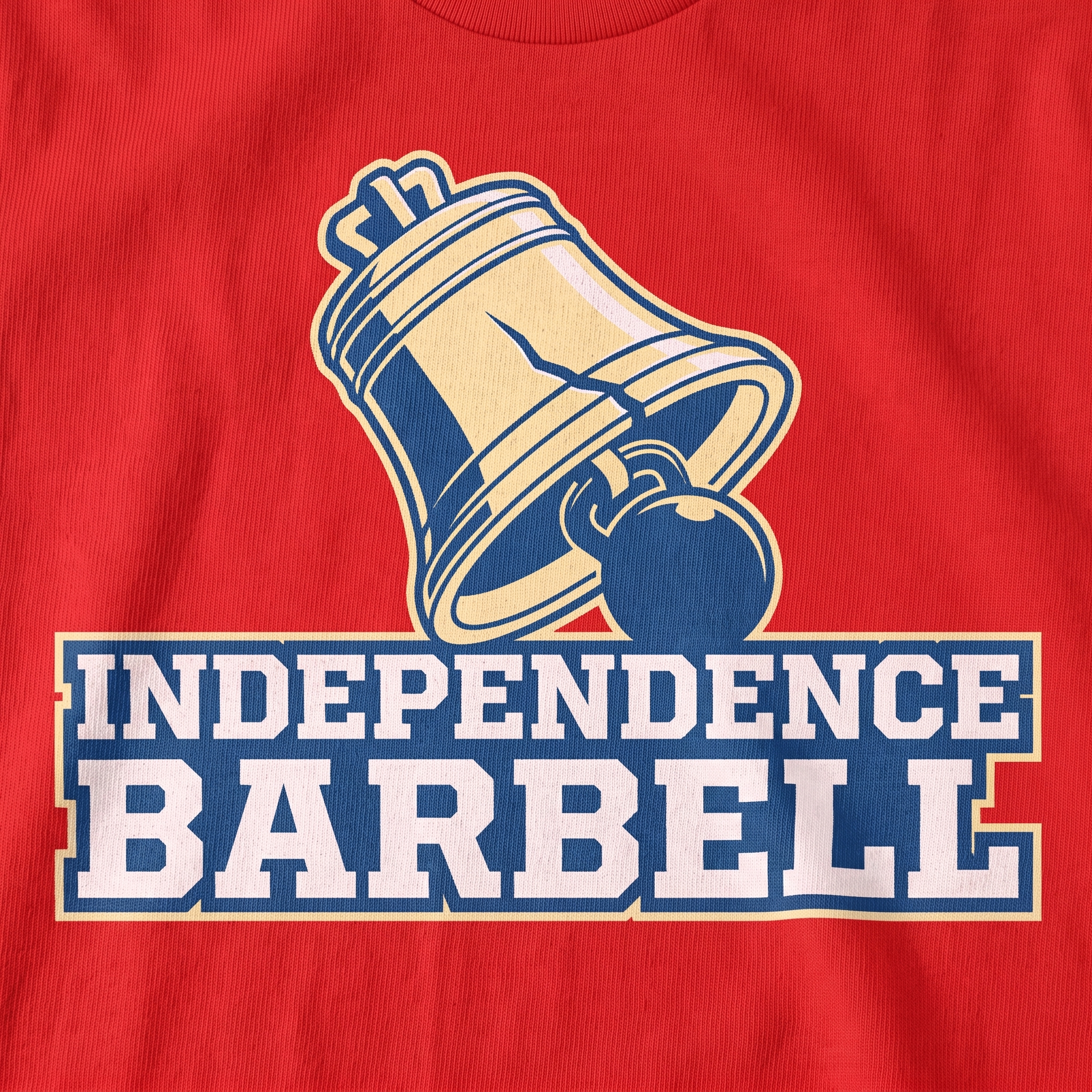
The screen-print system uses the bell as the central symbol, then locks it into heavy athletic type so the mark reads as Philadelphia first and barbell gym second.
Independence Barbell Full Drop
The full drop shows the system at scale: ringer tees, coach apparel, red statement graphics, grey training bottoms, black headwear, and a gradient hoodie all built from the same Philadelphia bell-and-barbell identity.
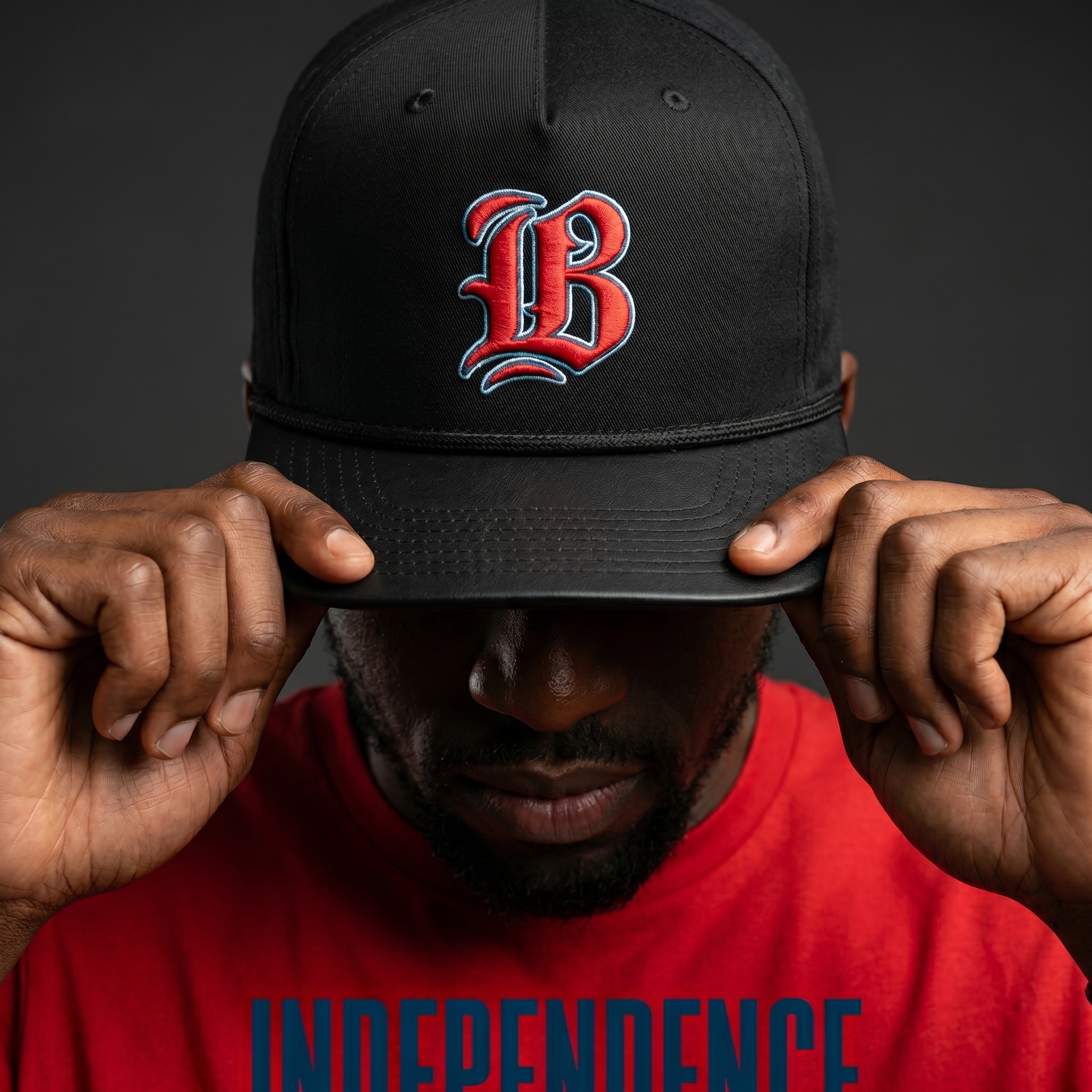
Blackletter IB Rope Cap
The cap turns the gym into a tight monogram, using blackletter-inspired “IB” embroidery to give the collection a sharper old-city sports feel.
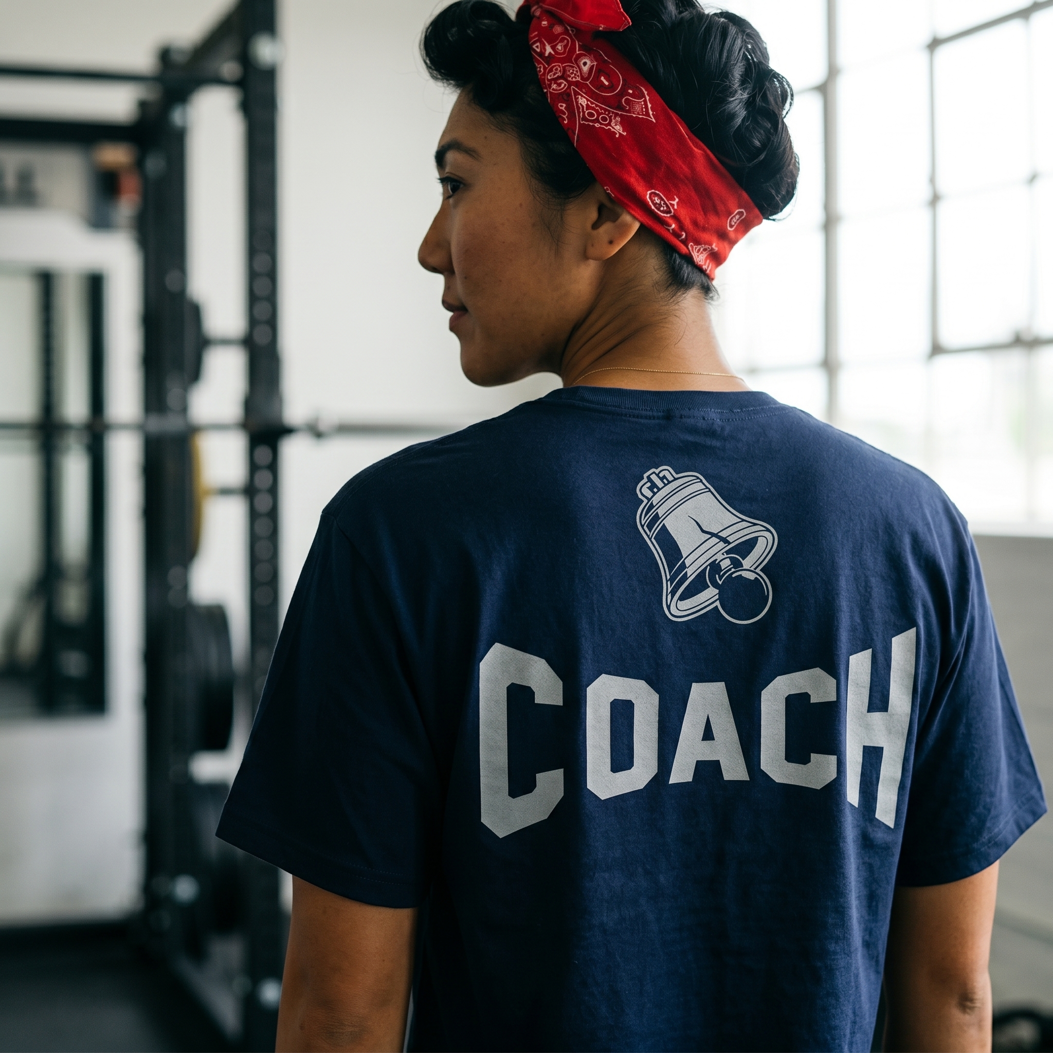
Liberty Bell Coach Tee
The coach tee uses large block lettering for clear staff recognition, then places the Liberty Bell above it so the role mark still carries the Philadelphia identity.
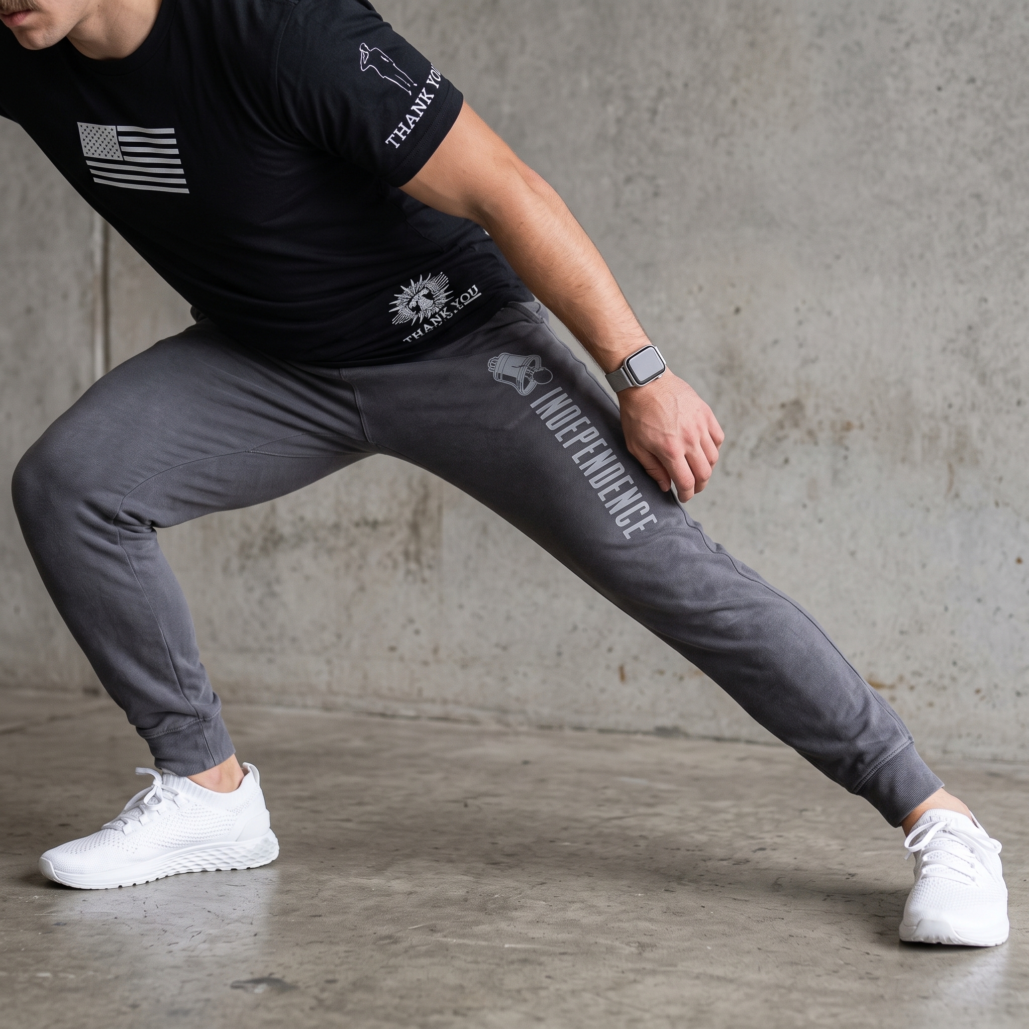
Independence Training Tight
The training tight keeps the lower-body branding vertical and direct, pairing the Independence name with the bell icon for a piece that feels functional, not overdecorated.
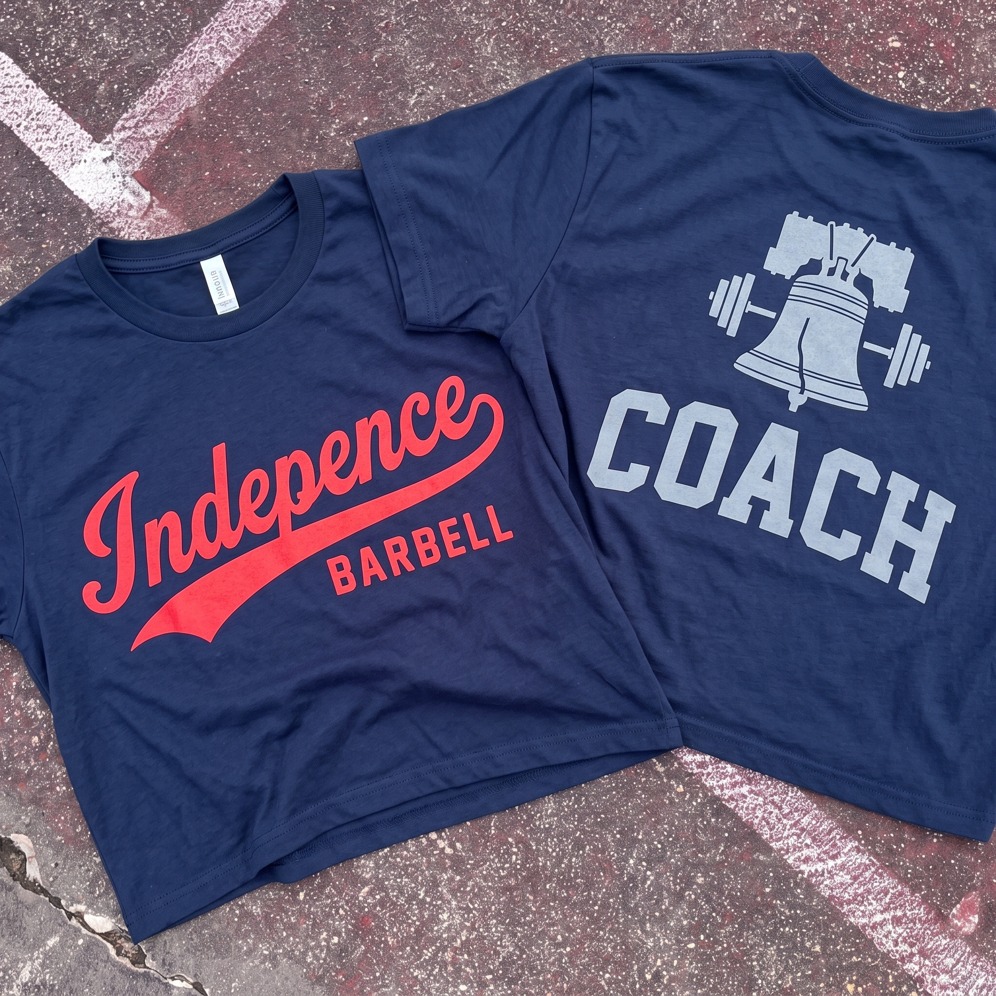
Navy Coach Bell Tee
The navy coach tee gives the collection its clean staff piece, with a red script front and a silver bell-and-barbell back graphic that keeps the coach mark tied to the full system.
UNITEE Design Lab
Concept cars for custom gym apparel.
The UNITEE Design Lab works like concept cars for gym apparel. We start with an idea, then turn it into a real concept people can see: a shirt, hat, hoodie, uniform set, or full merch drop. Then we explain the thinking behind it. Why this garment? Why this graphic? Why this placement? Why this kind of finish? The work is built to inspire, test new ideas, and give our clients better custom gym apparel before they ever place an order.
For larger fitness brands, multi-location gyms, event groups, and enterprise clients, the Design Lab is where brand kits and full merch programs take shape. We build the look, then we print the gear. That means the same team can help shape the brand story, plan the apparel, design the graphics, and produce the final pieces.
For an independent gym owner, the value is simple: you get the benefit of our research and development without needing to buy a full brand package. Your order may be a small run of tees, hats, hoodies, or event shirts, but the thinking behind it comes from a team that studies gym merch every day.
Need better gym merch?
Tell us what you are trying to make. We can help with one shirt, a full drop, or a larger apparel program.
Start a Design Lab Conversation