
UNITEE Design Lab / Portland, Oregon
Rose City Community Fitness
Portland gave this collection its name before the first mark was drawn. Rose City is not just a nickname. It is tied to the city’s climate, its gardens, its civic pride, and the way Portland has used roses as a public symbol for more than a century.
For Rose City Community Fitness, the idea was to turn that local symbol into a strength system. The rose became more than a flower. It became a barbell. It became a stacked back graphic. It became a small coach mark, a cap logo, a sleeve hit, and a full apparel language built around Portland’s red, black, green, grey, and rain-washed visual world.
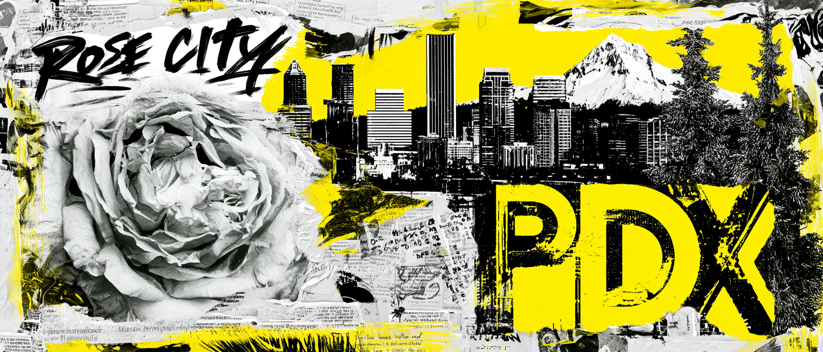
Roses, Rain, Bridges, Hood, And Portland Grit
A city symbol grown from climate, civic pride, water, steel, and mountain air.
Portland’s Rose City identity started with the land itself. Roses grew well in the city because of the mild climate, wet winters, dry summers, and long growing season. What could have stayed as a garden detail became a civic symbol through public gardens, civic pride, and the Rose Festival. The rose gave Portland a softer public image, but it was never just decoration.
In 1915, rose hobbyist Jesse A. Currey pushed for a public rose test garden in Portland. During World War I, the idea became more urgent as European rose varieties were at risk of being lost. Portland created a place where hybrid roses could be protected, tested, and preserved. That history gave the collection its main idea: the rose is something tested. It survives weather, gets cut back, grows again, and keeps blooming.
Portland also has a harder visual side. The city is built across the Willamette River, where bridges connect neighborhoods, commerce, bikes, transit, and daily movement. A bridge carries load. It has structure, steel, tension, and repeated use. Mount Hood adds the distant anchor: cold, high, steady, and tied to Portland’s skyline and outdoor identity.
The final system pulls those references into one visual language. The rose brings history. The barbell brings purpose. The black outlines bring steel and rain. The red and green keep the floral symbol alive. The grey and white connect to bridges, weather, concrete, and mountain light. The result is not a soft rose shirt. It is a Portland gym system built from growth, structure, weather, and community.
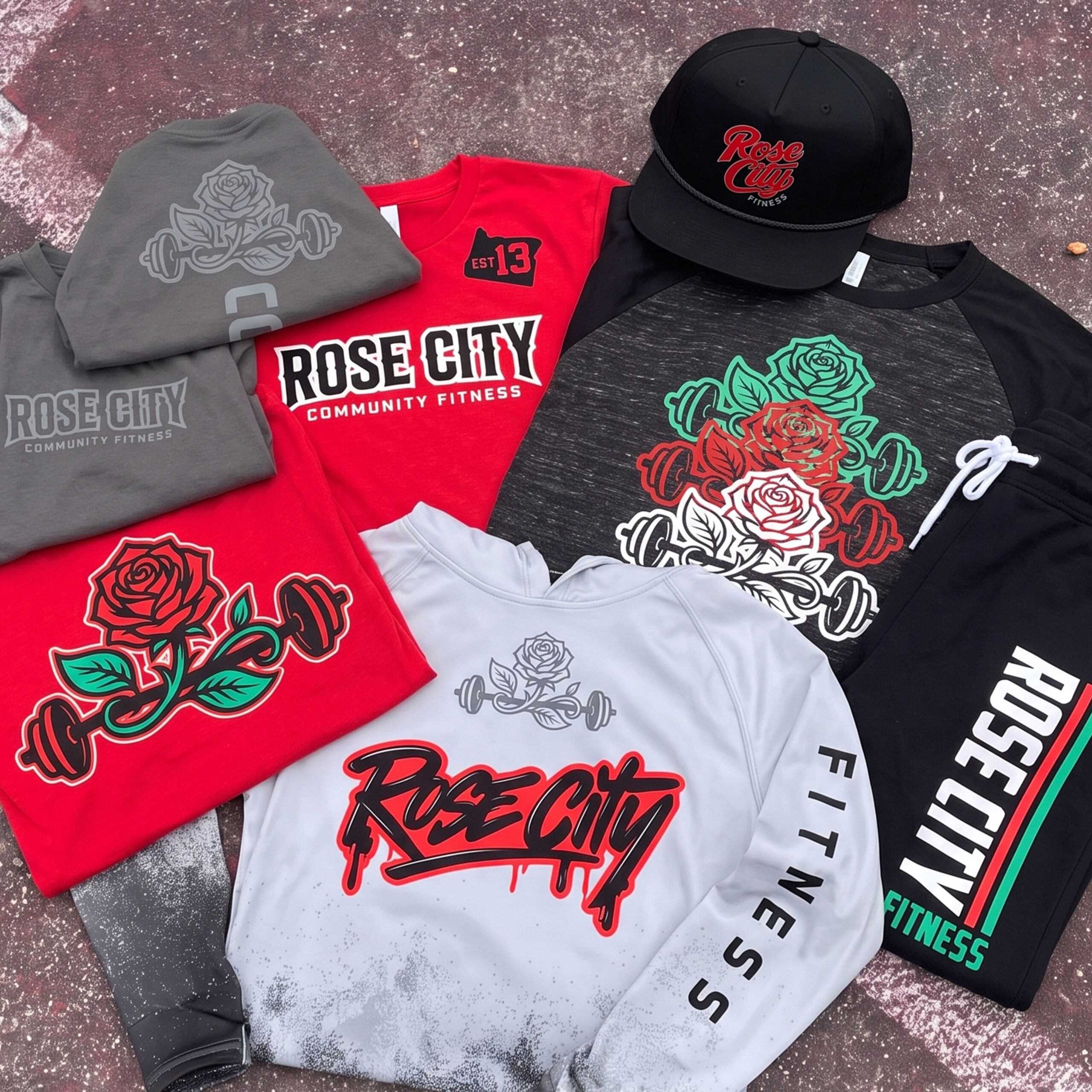
The Collection brings the system together: red Rose City tees, black and grey coach pieces, white hoodie, black joggers, embroidered cap, stacked rose graphics, Portland sleeve marks, and a red / black / green / grey palette built around the city’s rose identity.
Concept + Design Rationale
The concept starts with the rose. It is Portland’s clearest symbol, but it needed to be rebuilt for a gym. The barbell gives the flower weight. The vine shape gives the graphic movement. The sharp black outline keeps it from feeling soft.
The system uses more than one logo voice. The block Rose City wordmark feels bold and athletic. The script version feels more like streetwear. The stacked rose back print adds a larger graphic moment. The small cap mark gives the collection a clean retail finish.
The Portland mark appears in quieter ways too: the Oregon silhouette, the PDX history collage, grey rain-washed apparel, and sleeve details that feel like city tags instead of generic gym logos.
The result is a full local apparel system. It can work for coaches, members, cold-weather gear, streetwear pieces, and everyday training clothes without repeating the same front graphic over and over.
Color System
Rose Red
Primary city color for tees, cap embroidery, and the hero rose graphic
Rain Black
Base color for stronger apparel pieces and streetwear contrast
Stem Green
Leaf color that keeps the rose mark alive and local
Bridge Grey
Neutral tone pulled from concrete, rain, steel, and city texture
Soft White
Clean contrast for coach marks, sleeve hits, and hoodie graphics
Garden Tan
Warm outline color that gives the rose-barbell mark a vintage retail finish

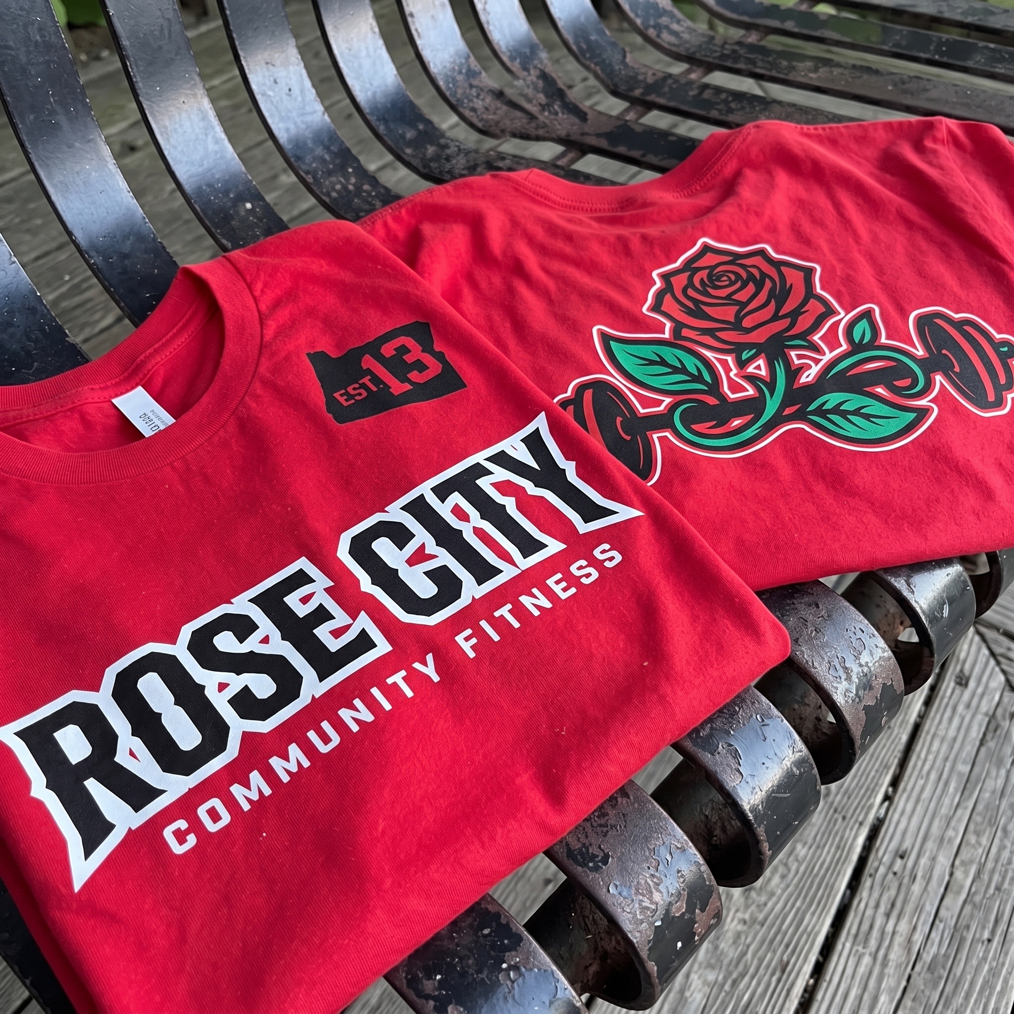
Rose Barbell Statement Tee
The red tee is the loudest member piece, using the Rose City wordmark on the front and the rose-barbell mark as the main back graphic.
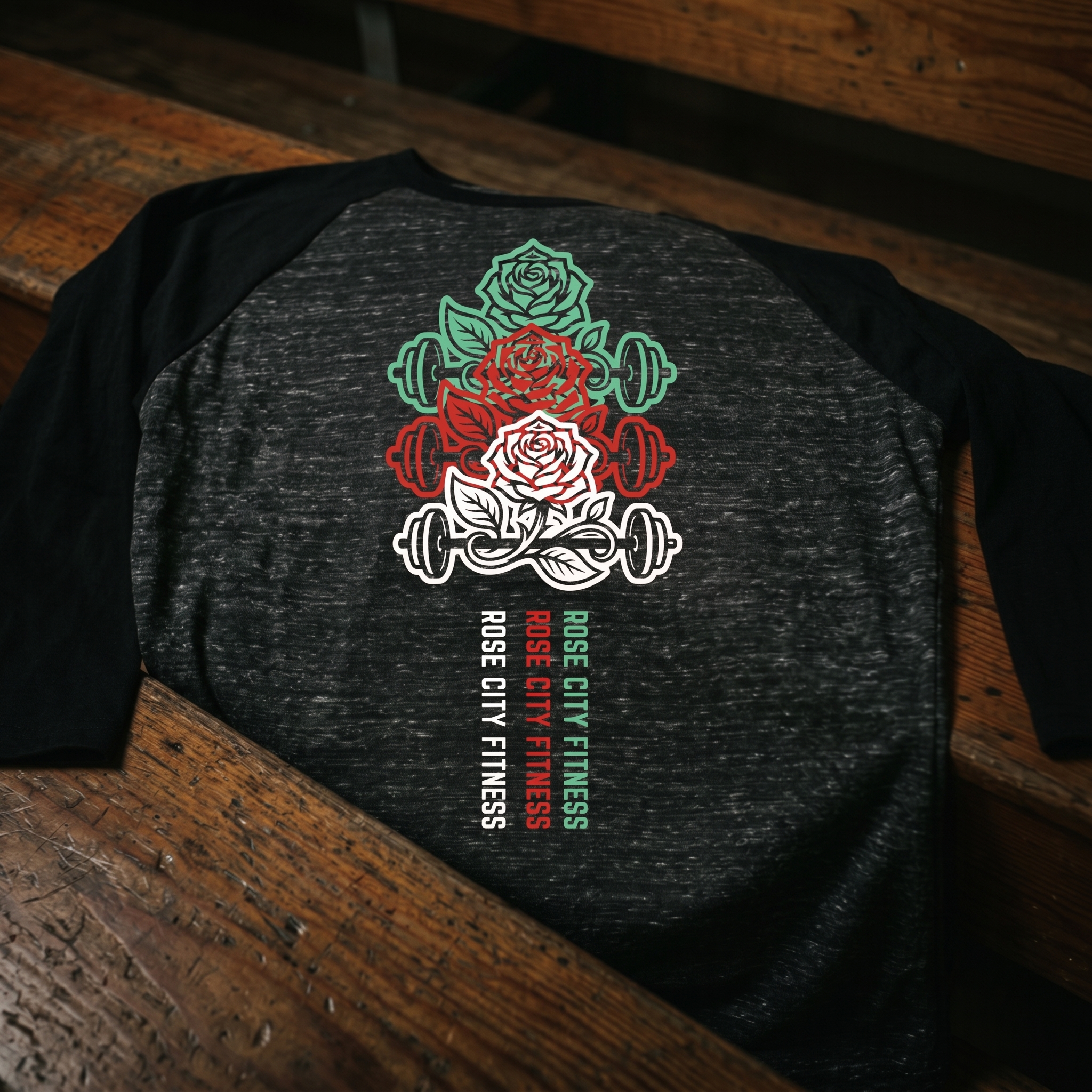
Stacked Rose Training Raglan
The raglan builds the system vertically, stacking three rose-barbell marks so the back graphic feels like a poster instead of a small logo hit.
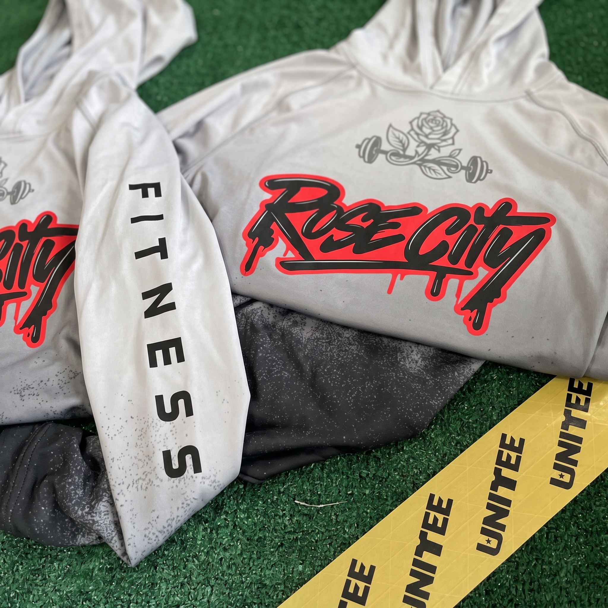
Rose City Script Hoodie
The hoodie shifts the collection into streetwear, using a large script mark, red outline, sleeve type, and grey fade texture for a rainy Portland feel.
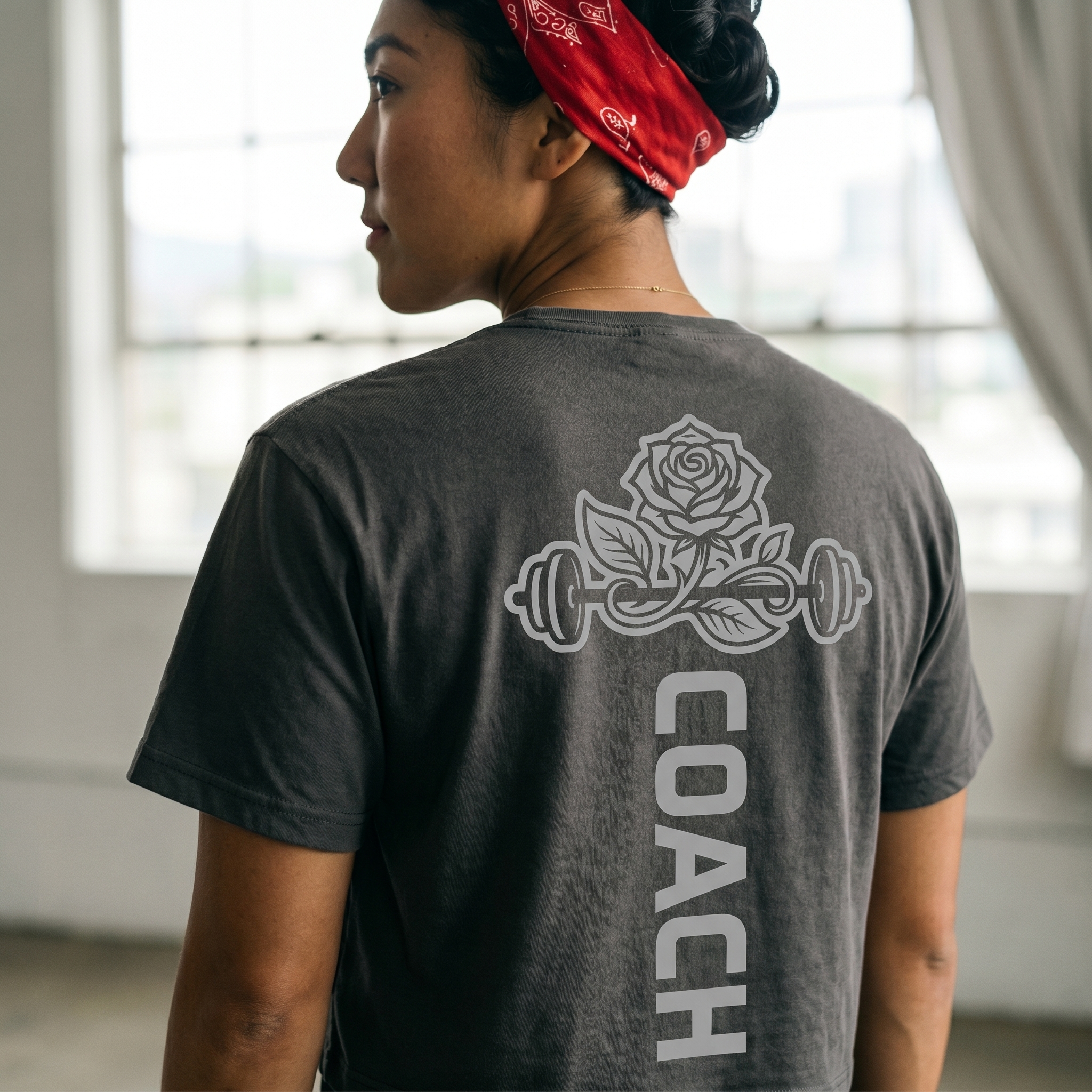
Rain Grey Coach Back Tee
The coach tee keeps staff easy to spot with tall vertical type, while the tone-on-tone rose graphic gives the back a clean premium finish.
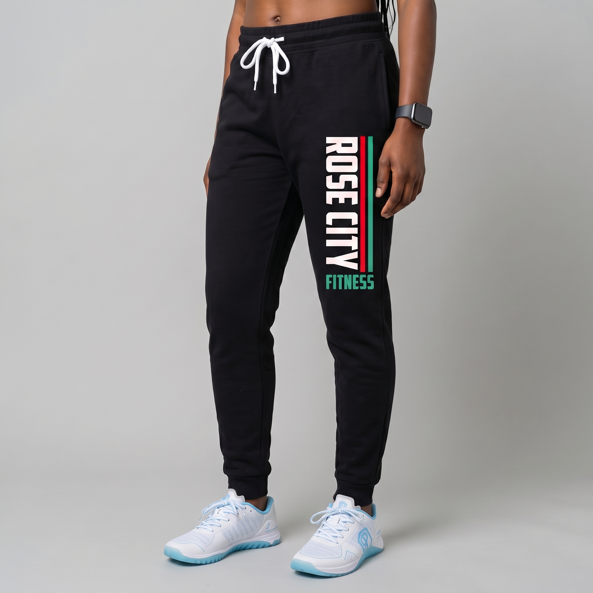
Rose City Training Jogger
The jogger carries the system down the leg with a tall Rose City mark, turning the lower-body piece into part of the full Portland kit.
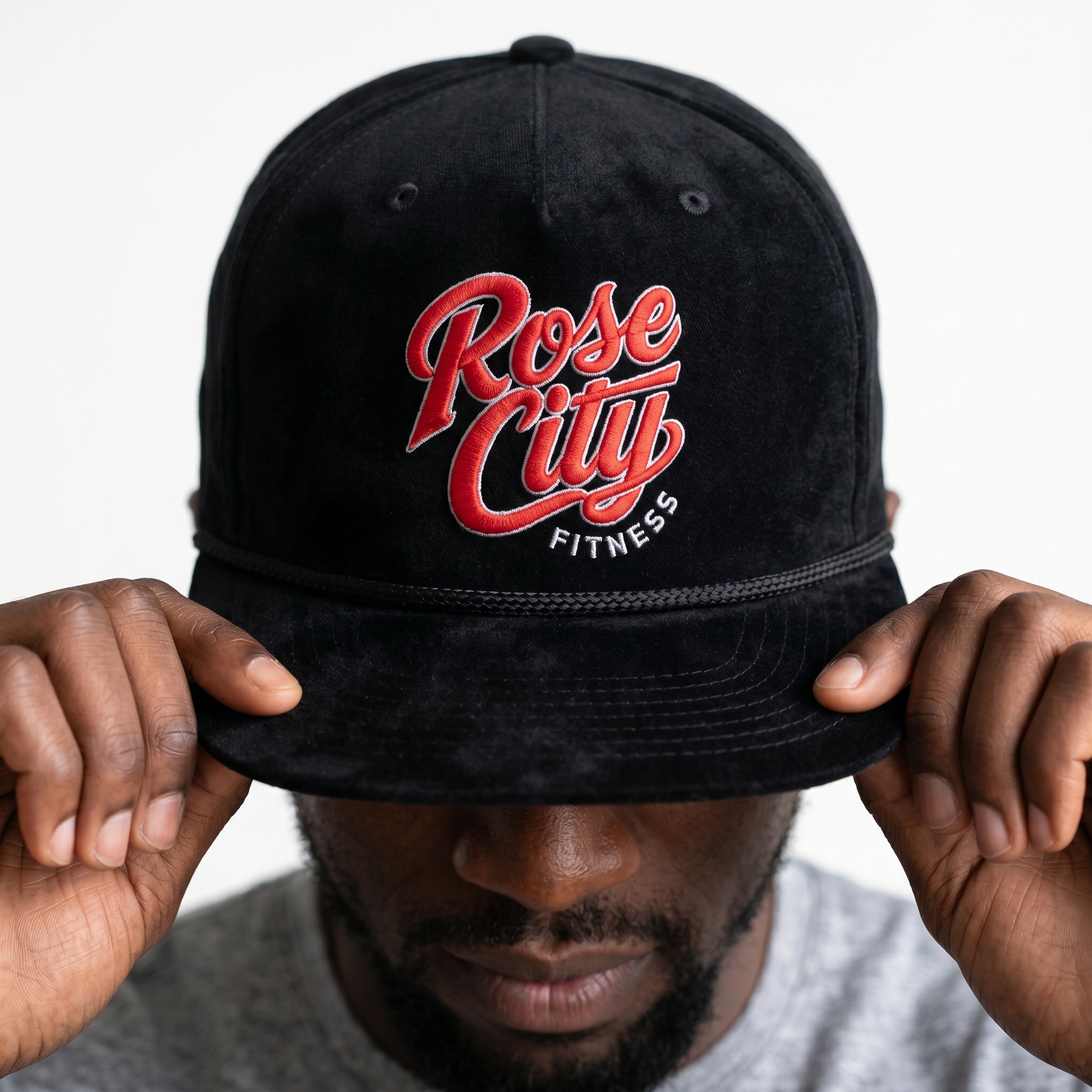
Black Rose City Rope Cap
The cap reduces the system to its cleanest mark, giving members a small retail piece that still carries the full Rose City identity.
UNITEE Design Lab
Concept cars for custom gym apparel.
The UNITEE Design Lab works like concept cars for gym apparel. We start with an idea, then turn it into a real concept people can see: a shirt, hat, hoodie, uniform set, or full merch drop. Then we explain the thinking behind it. Why this garment? Why this graphic? Why this placement? Why this kind of finish? The work is built to inspire, test new ideas, and give our clients better custom gym apparel before they ever place an order.
For larger fitness brands, multi-location gyms, event groups, and enterprise clients, the Design Lab is where brand kits and full merch programs take shape. We build the look, then we print the gear. That means the same team can help shape the brand story, plan the apparel, design the graphics, and produce the final pieces.
For an independent gym owner, the value is simple: you get the benefit of our research and development without needing to buy a full brand package. Your order may be a small run of tees, hats, hoodies, or event shirts, but the thinking behind it comes from a team that studies gym merch every day.
Need better gym merch?
Tell us what you are trying to make. We can help with one shirt, a full drop, or a larger apparel program.
Start a Design Lab Conversation