
UNITEE Design Lab / Minneapolis–St. Paul, Minnesota
North Star Iron
North Star Iron gives the Minnesota concept a stronger center of gravity. Instead of leaning only on the Twin Cities name, the collection pulls from the state’s North Star language, northern utility, old industrial grit, outdoor training culture, and the kind of practical apparel that feels built for cold mornings, hard sessions, and everyday wear.
The design system uses forest green, deep athletic green, lime star accents, khaki fleece, cream vintage bases, tonal embroidery, vertical leg prints, coach identifiers, a wolf mascot, and a sharp North Star mark. The result feels local without becoming tourist merch: part Minnesota, part weight room, part field uniform.
The North Star, Minnesota Identity, And Weight-Room Utility
The state motto became the brand compass.
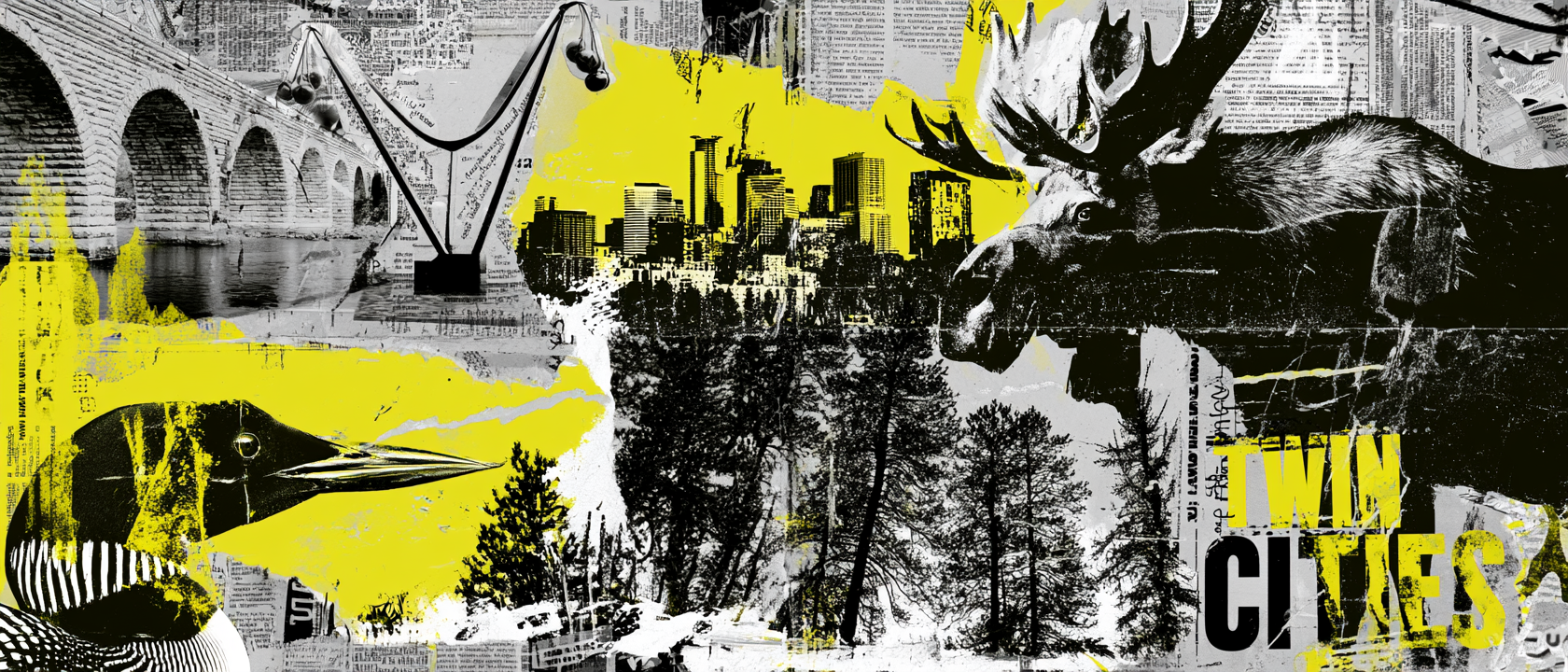
North Star Iron starts with one of Minnesota’s strongest identity cues: the North Star. The state motto, L’Étoile du Nord, means “The Star of the North,” and that idea gives the brand a symbol that feels fixed, directional, and unmistakably tied to Minnesota. For a gym, that is useful language. A star can mean guidance, consistency, discipline, and a point you keep working toward.
Minneapolis and St. Paul still shape the background of the collection, but the North Star gives the whole system a cleaner anchor. Instead of naming the gym directly after the Twin Cities, North Star Iron lets the brand feel broader and more ownable while still staying rooted in the region. The city influence shows up through industrial textures, practical garment choices, street-level photography, and the mix of athletic utility with lifestyle pieces.
The “Iron” side of the name brings the gym floor into the story. Minnesota gives the brand its compass point, while iron gives it weight, work, and training credibility. That combination creates a name that can carry a full apparel system: bold script tees, tonal hats, coach tanks, vertical jogger graphics, a performance hoodie, and a vintage mascot raglan.
The visual choices follow that same logic. The star mark becomes the core icon. Dark green and olive tones connect to northern outdoor culture. Khaki and cream soften the system and make it feel wearable beyond the gym. Lime adds visibility and modern athletic energy. The result is a Minnesota-inspired collection that feels designed around a real regional idea, not just a city name placed on workout apparel.
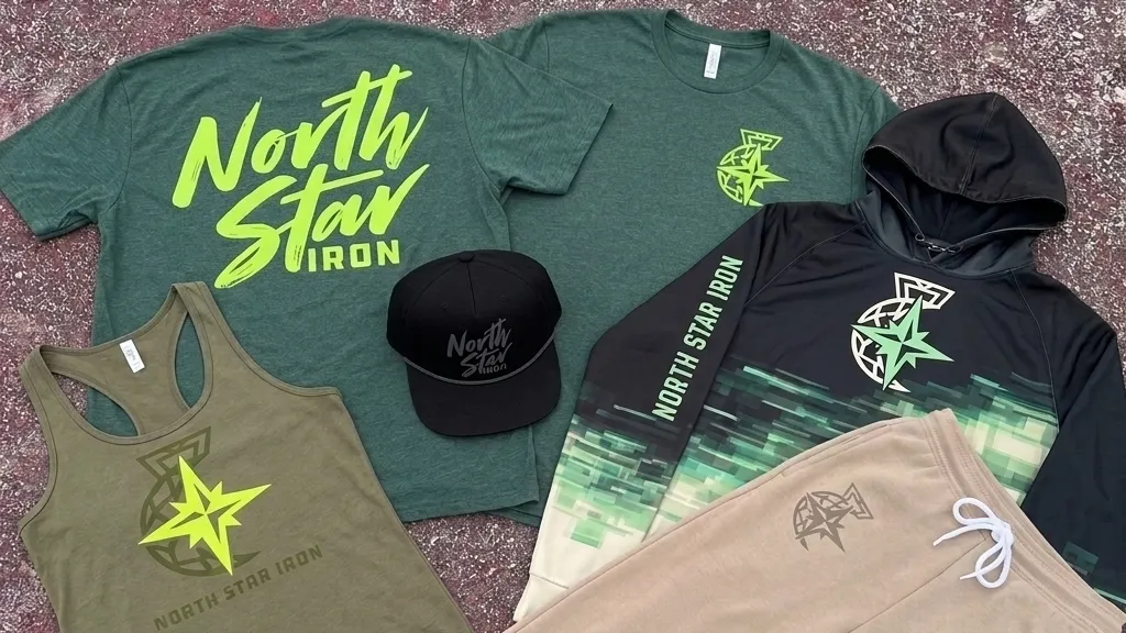
The full North Star Iron collection moves between gym uniform and retail-ready lifestyle apparel: script tees, tonal hats, a performance hoodie, coach tanks, khaki joggers, a vintage mascot raglan, and a sharp North Star mark tying the system together.
Concept + Design Rationale
The shift from Twin Cities Fitness to North Star Iron makes the brand feel less generic and more memorable. It still belongs to Minnesota, but now it has a stronger name, a clearer symbol, and a tougher point of view.
The North Star mark gives the collection a recognizable icon that can work small on a chest, large on a tank, tonal on joggers, or oversized on performance gear. That kind of flexibility matters because a gym brand needs to live across more than one garment.
The script logo gives the collection a retail layer. It feels fast, athletic, and wearable on tees and hats. The block lettering gives the staff and jogger pieces more structure. The wolf mascot adds the throwback piece: a little campy, a little fierce, and very easy to imagine as a limited drop.
The collection works because it is not trying to make every piece do the same thing. Some items are loud. Some are quiet. Some are functional. Some are fun. Together, they feel like a complete gym apparel system.
Color System
Northwoods Green
Primary regional color tied to Minnesota outdoors, training gear, and the core identity
Iron Green
Darker athletic base used for tees and performance apparel
North Star Lime
High-visibility accent used for the star mark, script logo, and athletic contrast
Field Khaki
Utility fleece tone used for joggers and softer lifestyle pieces
Vintage Cream
Old athletic base color used for the mascot raglan and throwback pieces
Smoke Grey
Quiet support color used for tonal marks, embroidery, and muted print details

Coach Back Racerback
The coach tank keeps the staff identifier large but understated. Instead of screaming across the garment, the tonal back print makes the role clear while keeping the piece wearable outside the gym.
Long Sleeve Performance Hoodie
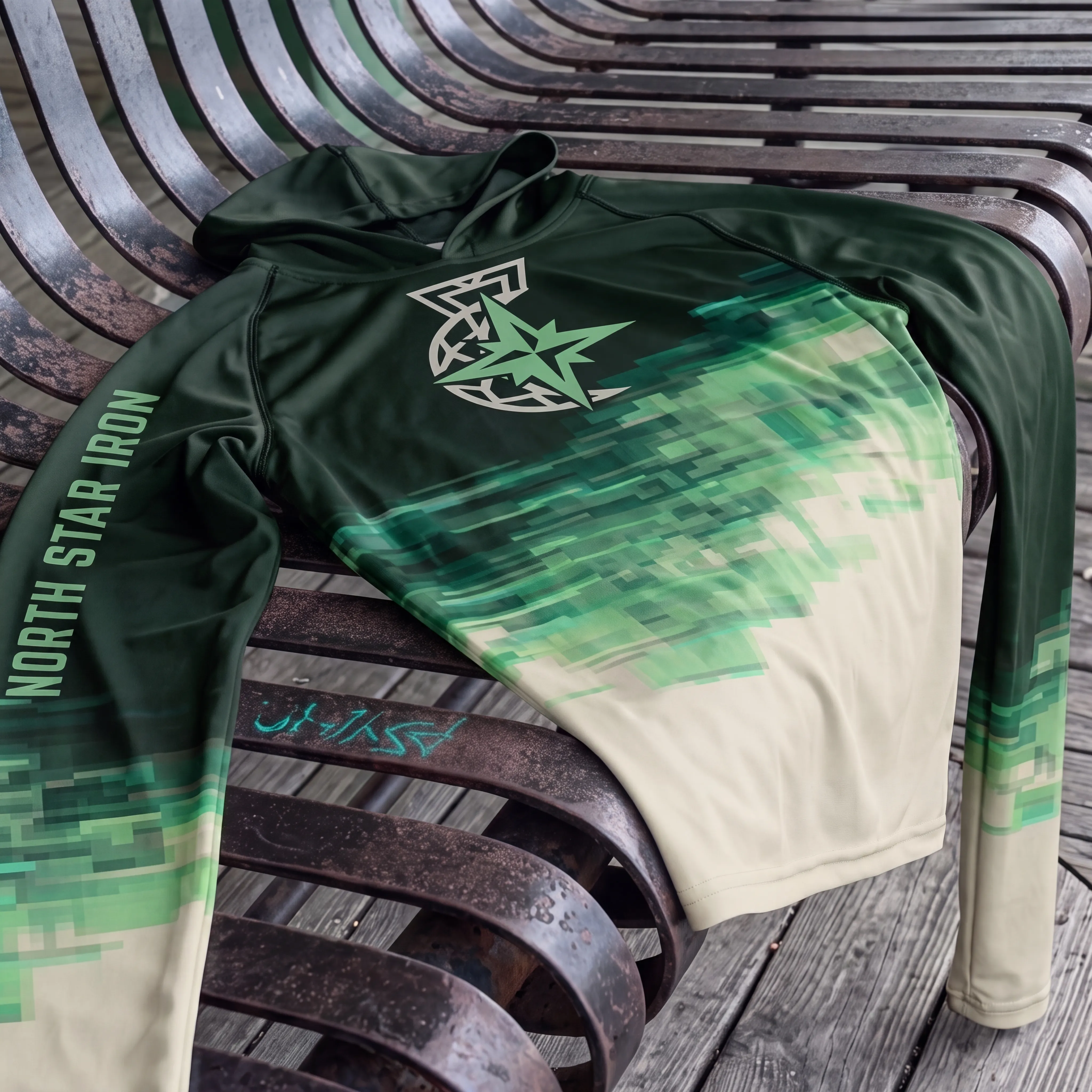
The performance hoodie is the technical piece in the drop. The green-to-cream fade gives it motion, while the North Star mark and sleeve print make it feel like a full uniform instead of a basic logo hoodie.
Vintage Wolf Raglan
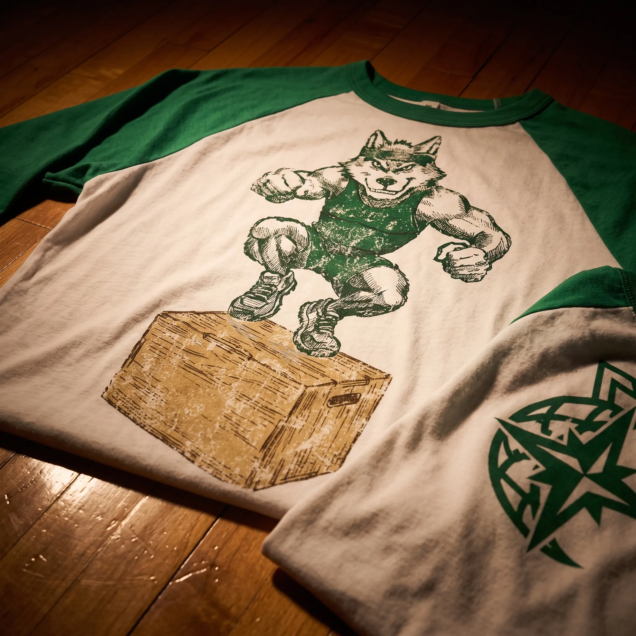
The wolf raglan gives North Star Iron its character piece. The hand-drawn mascot, cream body, green sleeves, and limited color print make it feel like an old gym shirt pulled from a box of local team gear.
Tonal Script Hat
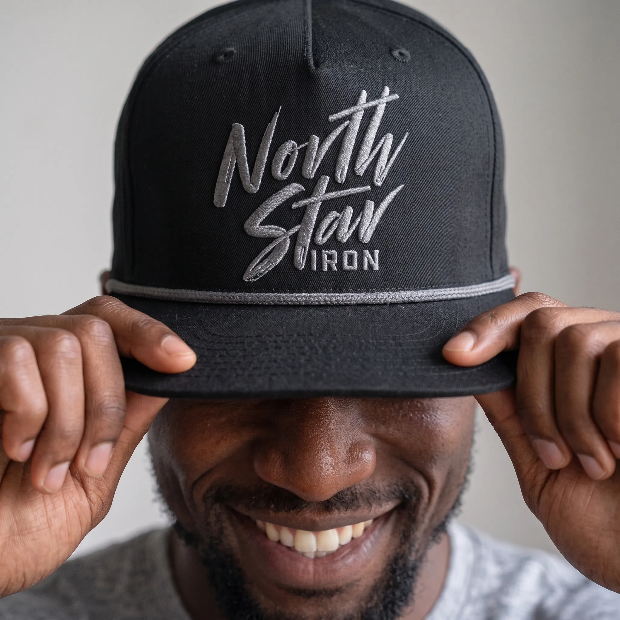
The hat strips the system down to its cleanest lifestyle mark. Tonal grey embroidery on black keeps it quiet, premium, and easy to wear with the rest of the collection.
Khaki Joggers
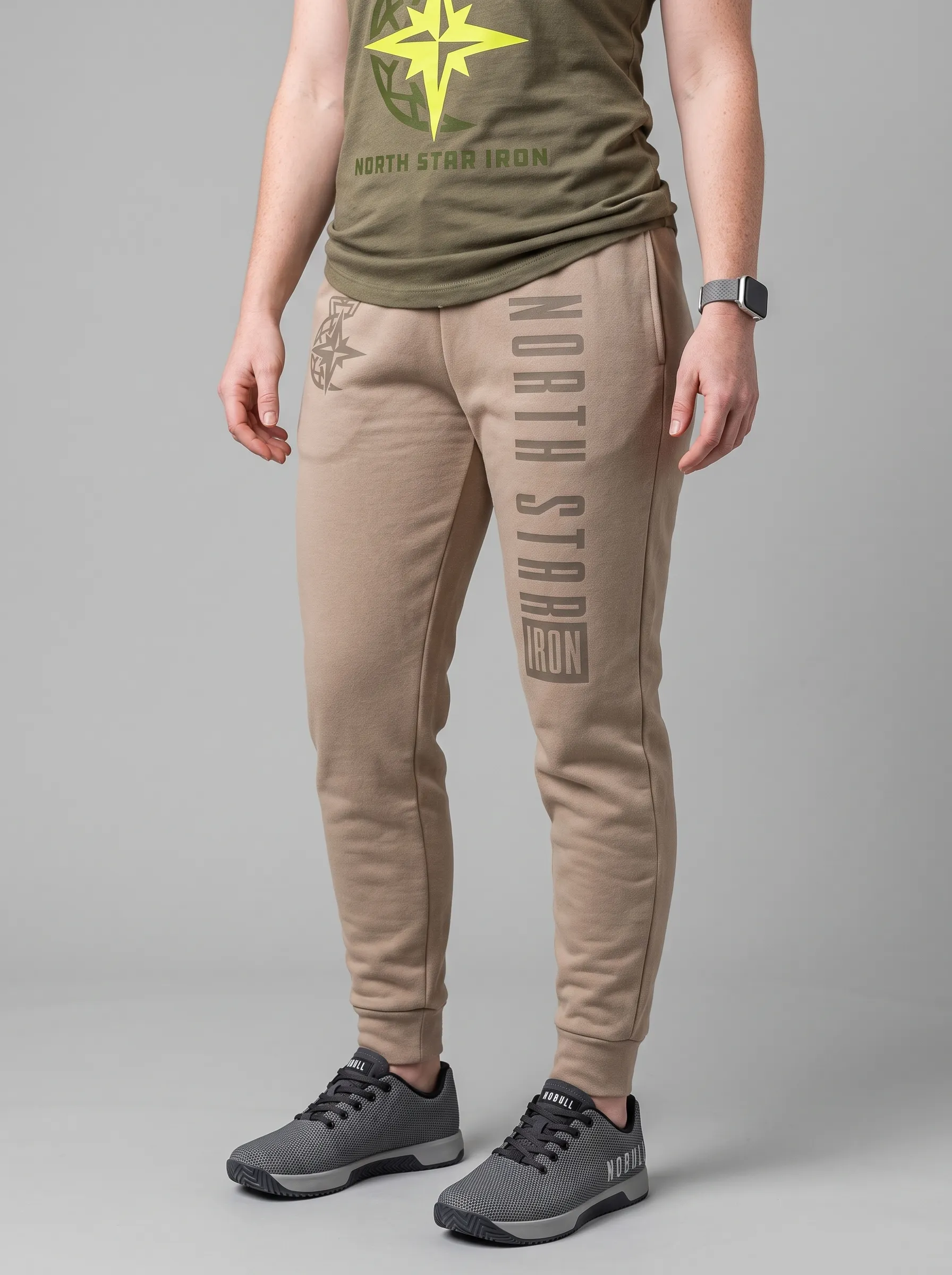
The joggers bring the collection into a full outfit system. The vertical leg print gives the piece movement, while the tonal star mark keeps the branding connected without overpowering the garment.
UNITEE Design Lab
Concept cars for custom gym apparel.
The UNITEE Design Lab works like concept cars for gym apparel. We start with an idea, then turn it into a real concept people can see: a shirt, hat, hoodie, uniform set, or full merch drop. Then we explain the thinking behind it. Why this garment? Why this graphic? Why this placement? Why this kind of finish? The work is built to inspire, test new ideas, and give our clients better custom gym apparel before they ever place an order.
For larger fitness brands, multi-location gyms, event groups, and enterprise clients, the Design Lab is where brand kits and full merch programs take shape. We build the look, then we print the gear. That means the same team can help shape the brand story, plan the apparel, design the graphics, and produce the final pieces.
For an independent gym owner, the value is simple: you get the benefit of our research and development without needing to buy a full brand package. Your order may be a small run of tees, hats, hoodies, or event shirts, but the thinking behind it comes from a team that studies gym merch every day.
Need better gym merch?
Tell us what you are trying to make. We can help with one shirt, a full drop, or a larger apparel program.
Start a Design Lab Conversation