
UNITEE Design Lab / Los Angeles, California
Angels & Iron
Angels & Iron is a direct nod to the name Los Angeles itself. In Spanish, Los Angeles means “The Angels,” but the identity does not lean into soft, expected, tourist-friendly imagery. It pairs that ethereal city origin with the heavy, grounded word “Iron.”
That contrast is the point. “Angels” gives the brand history, lift, and mythology. “Iron” gives it weight, labor, and gym-floor grit. Together, the name skips the overused Hollywood, palm tree, and beach language that fills the L.A. market and instead creates something that feels like an underground lifting club with a premium streetwear edge.
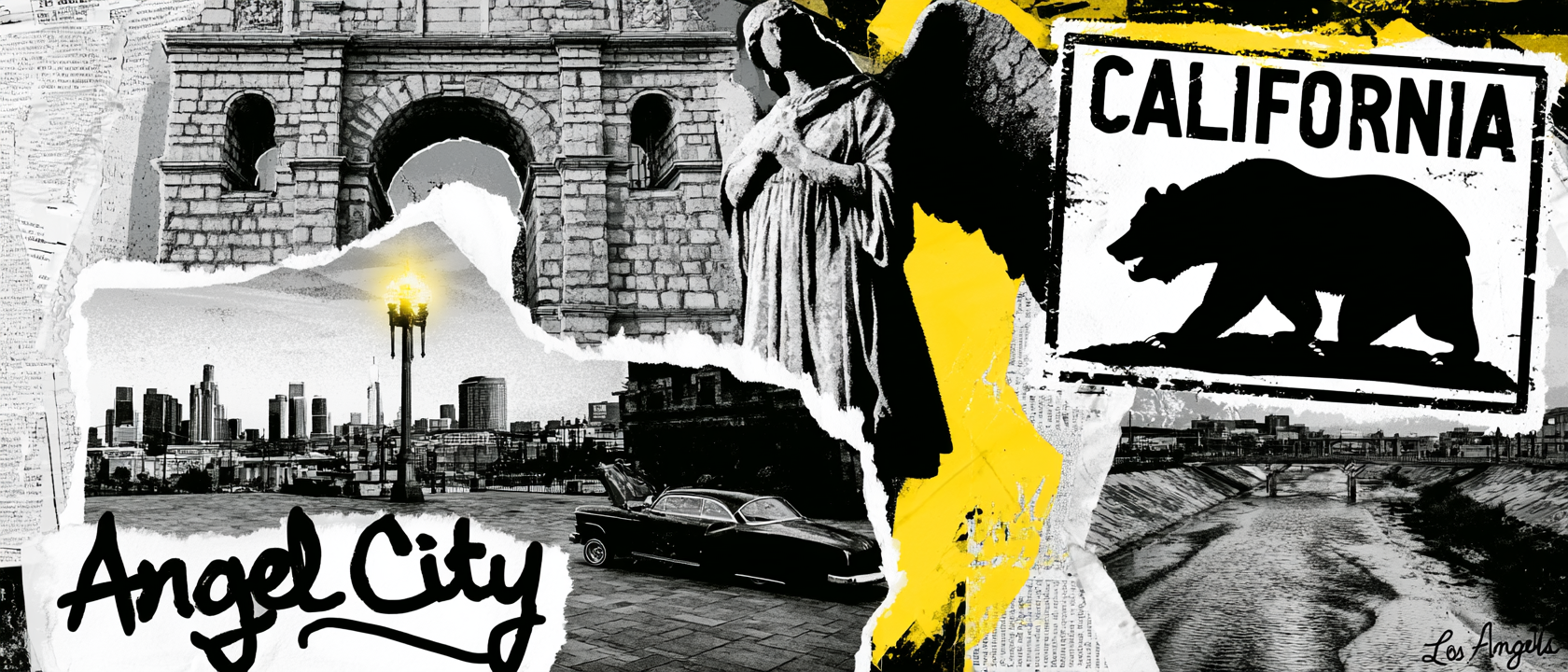
Name Origin, Industry, Flight, And Heavy Iron
The City Of Angels, Rebuilt For Strength.
Los Angeles begins with land, water, and a name. The area was home to Chumash and Tongva Native peoples before Spanish settlement. In 1781, settlers established a farming community called El Pueblo de Nuestra Señora la Reina de los Ángeles de Porciúncula, translated by the City of Los Angeles as “The Town of Our Lady the Queen of the Angels of Porciúncula.” That name origin became the first design key. The angel language is real to the city, but we treated it as symbol, motion, and mythology rather than soft religious decoration.
The second layer is the working city underneath the image people usually sell. Los Angeles grew through rail, roads, ports, oil, and engineered infrastructure. The Port of Los Angeles was officially founded in 1907, and San Pedro and Wilmington became part of the city in 1909, turning the harbor into a major trade and labor engine. The L.A. River was also reshaped by engineering, with the U.S. Army Corps beginning channelization in the 1930s after destructive floods. Those facts pushed the system toward concrete greys, utility hats, black camo, industrial marks, and hard-edged supporting type.
Los Angeles also has a major oil and aerospace history that is often hidden behind the entertainment story. Edward Doheny struck oil in the Los Angeles City Oil Field in 1892, and by the early 1900s, drilling was a visible part of the city’s growth. Southern California also became a center of aircraft and aerospace development, with Mines Field eventually becoming LAX and the region producing a massive share of aircraft during World War II. That is where the winged plate, target shapes, blue flight tones, and “Made in LAX” back hit come from. The graphics point to lift, machinery, and velocity, not movie-lot glamour.
The final system is built on contrast. “Angels” becomes halos, wings, script curves, and sky blues. “Iron” becomes weight plates, heavy outlines, dark navy, concrete grey, camo, and utility placement. The Old English-style lettering gives the name a classic Los Angeles streetwear feel, while the clean support type keeps it sharp enough for performance apparel. The result is local without being obvious: no palm tree cliché, no Hollywood sign, no beach postcard. Just flight, steel, city grit, and a name that belongs to Los Angeles.
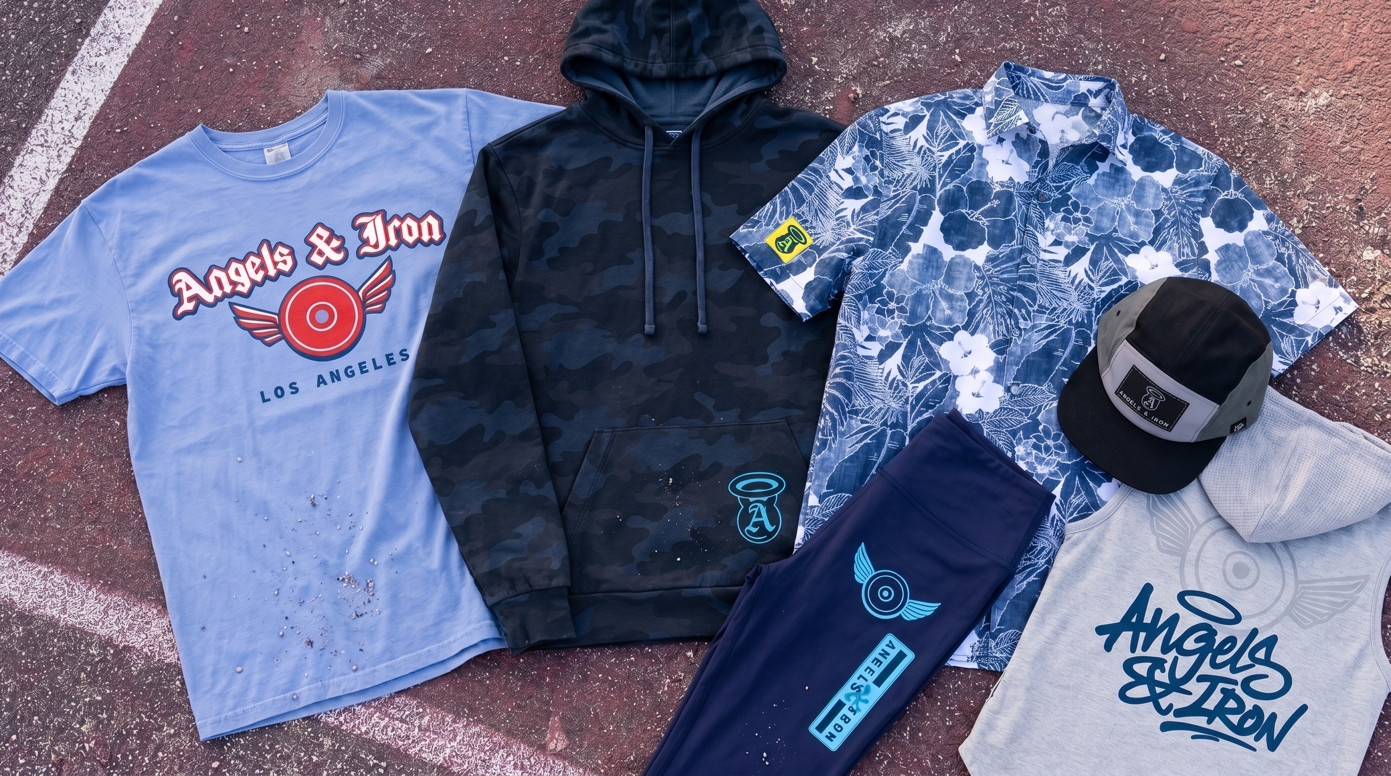
The full Angels & Iron collection mixes sky blue, deep navy, red, grey, white, camo, utility headwear, performance layers, streetwear tees, and a patterned camp shirt into one Los Angeles system built around flight, iron, and city grit.
Concept + Design Rationale
The name Angels & Iron works because it uses Los Angeles’ literal meaning, then pulls it into a heavier gym context. “Angels” gives the brand a local hook and a sense of elevation. “Iron” makes it physical, grounded, and strong.
The visual system was designed to avoid the most common L.A. tropes. We did not want palm trees, beach sunsets, celebrity culture, or Hollywood signage. Instead, the collection leans into old streetwear lettering, aviation references, industrial color, and weight-room symbolism.
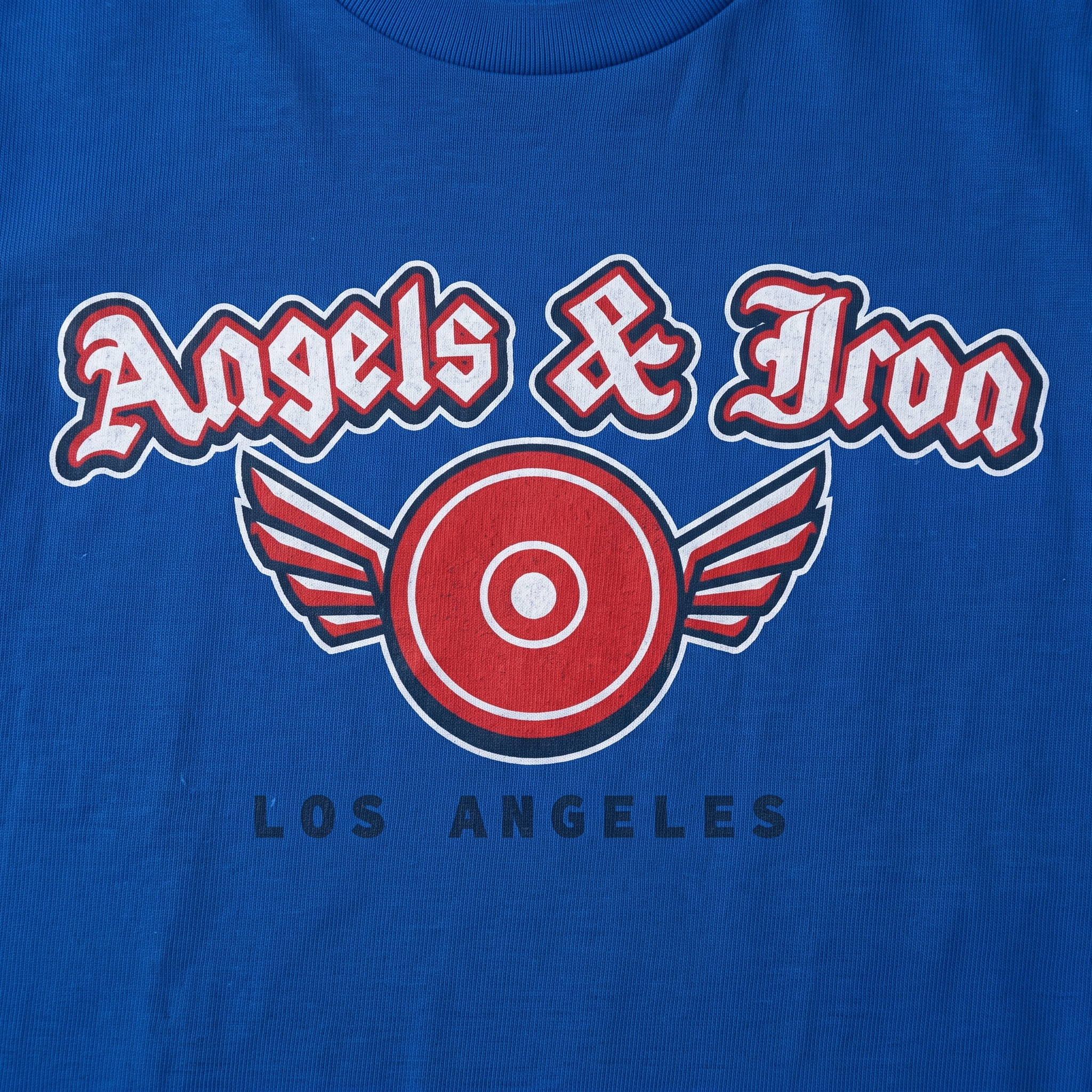
The winged plate mark is the center of the identity. It combines angelic motion with a barbell plate form, making the brand feel both elevated and heavy. The halo “A” gives the system a compact accessory mark that can live on hats, leggings, hoodie pockets, and small woven patches.
The apparel range was built like a full L.A. drop: a soft graphic tee, performance hoodie, dark camo layer, utility booney hat, five-panel patch cap, patterned camp shirt, leggings, and a “Made in LAX” back hit. Each piece carries a different part of the city story while staying inside the same blue, navy, red, grey, and white system.
Color System
Sky Blue
Primary energy color tied to flight, open air, hillside light, and the “Angels” side of the name
Royal Blue
Bold L.A. athletic tone used for high-impact tees, hoodie graphics, and streetwear contrast
Signal Red
Used to give the winged plate mark heat, motion, and an aggressive counterpoint to the blues
Night Navy
Grounds the system in utility, camo, performance gear, and the heavier “Iron” side of the brand
Concrete Grey
Neutral support tone tied to the city’s infrastructure, sidewalks, river channels, and industrial surfaces
Bone White
Used for outlines, patches, and graphic separation so the ornate marks stay readable on apparel
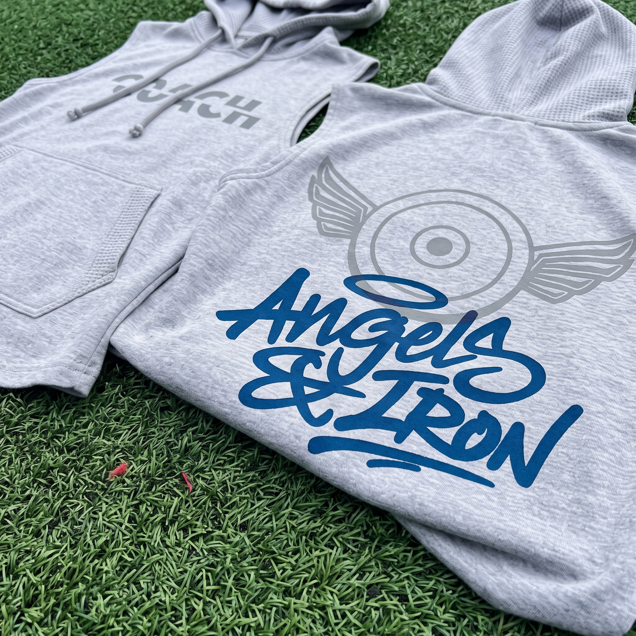
The coach's sleeveless hoodie uses a heather grey base with a tonal front coach mark and a larger Angels & Iron back graphic built around the winged plate system. The quiet grey front print was used to keep the piece staff-driven and understated, while the oversized blue back graphic gives the garment stronger visibility from behind without making it feel overdesigned.
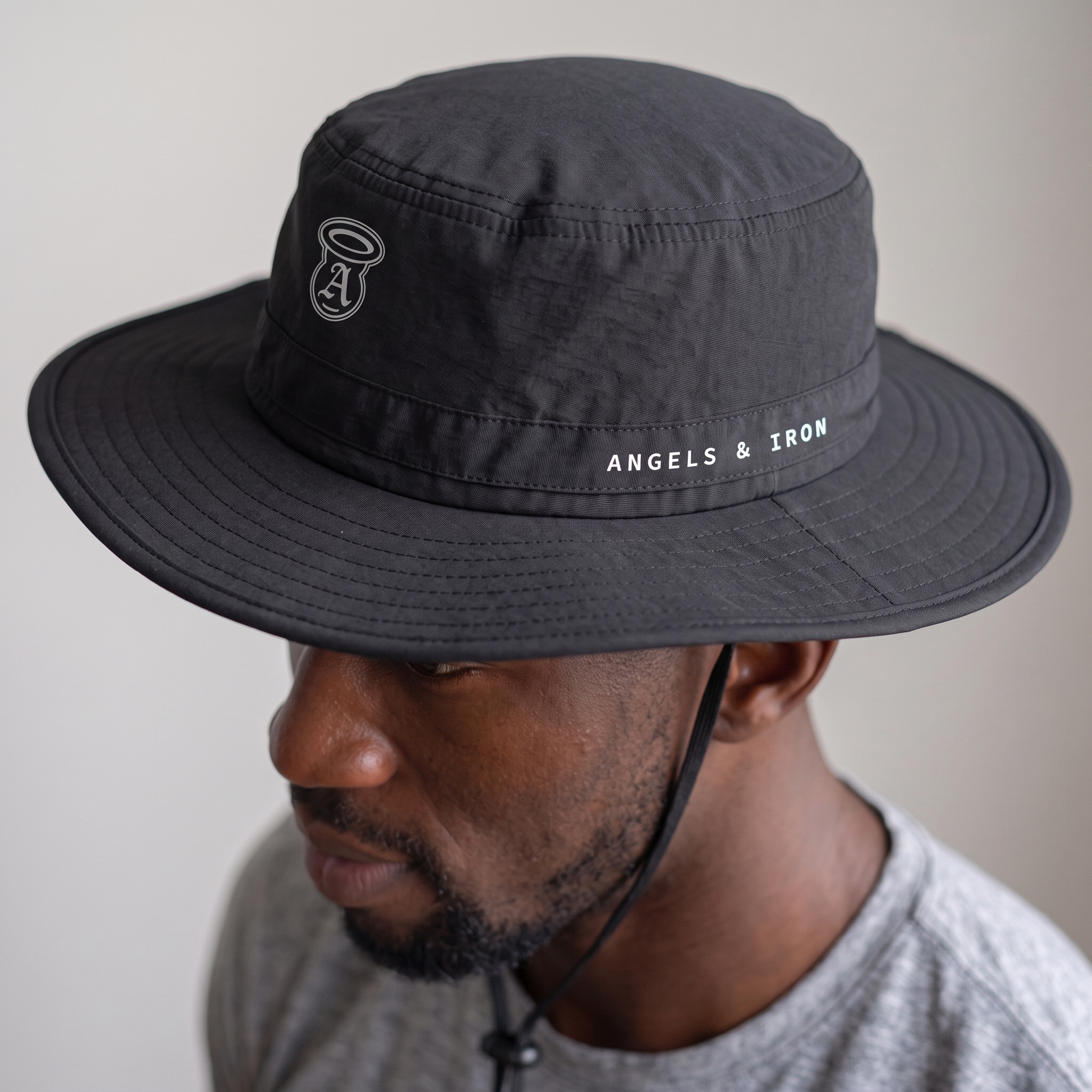
Utility Booney Hat
The booney hat strips the system down to a field-ready accessory, using the halo “A” mark and small Angels & Iron side type. The black nylon body was chosen to push the brand into utility and outdoor training territory instead of a standard gym cap.
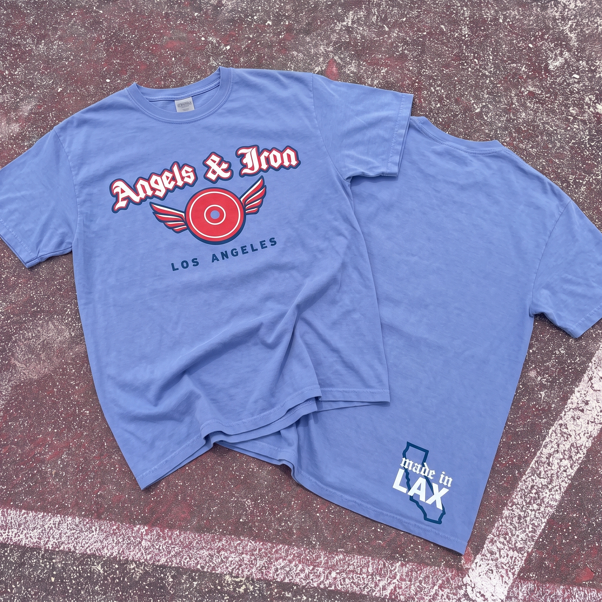
Target Plate Tee
The tee uses the winged plate mark as the main chest graphic, blending an angel wing silhouette with the visual weight of a loaded iron plate. The “Made in LAX” back hit was added to make the piece feel locally coded without using obvious Los Angeles tourist icons.
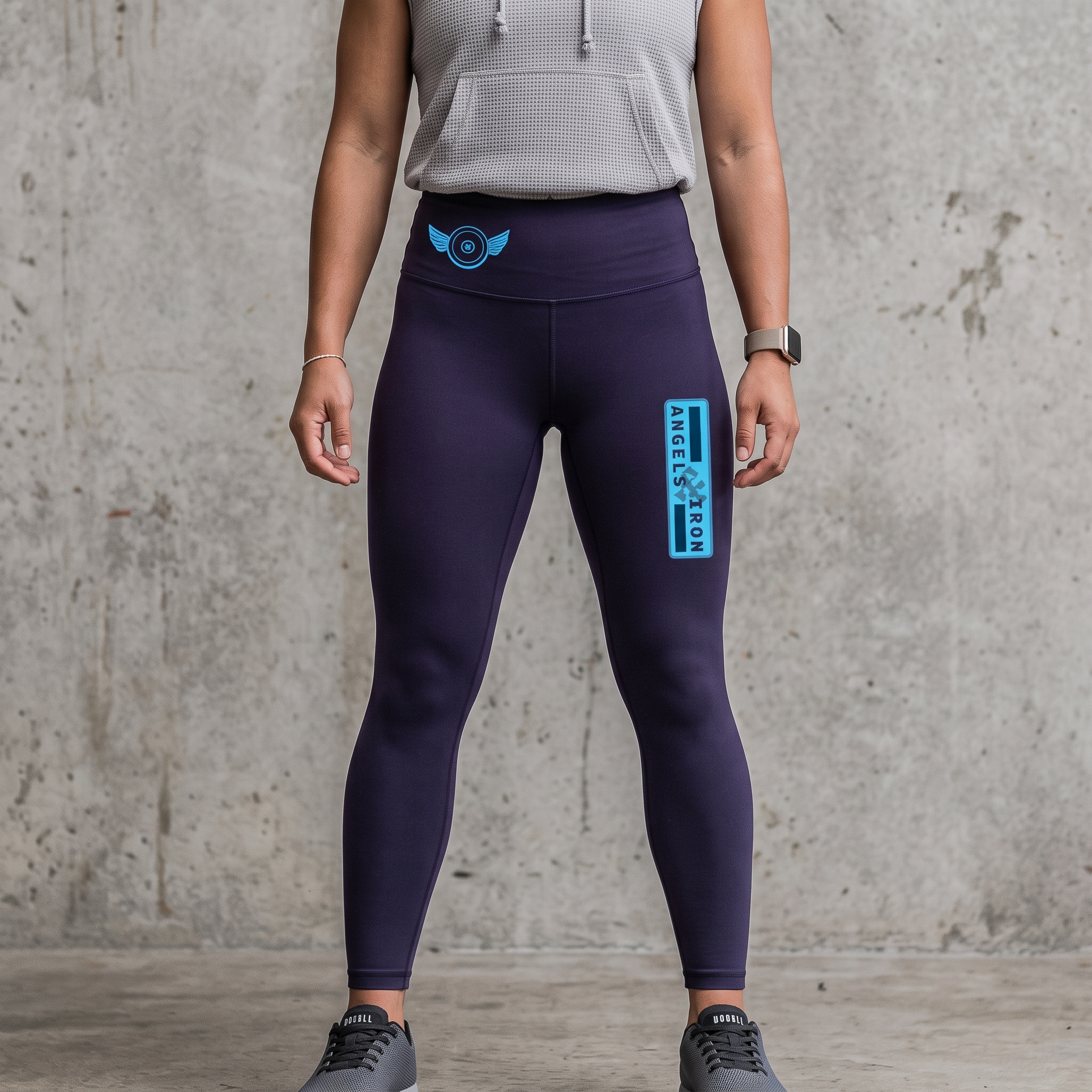
Target Plate Legging
The leggings use the winged plate as a small waistband mark and a vertical Angels & Iron hit on the thigh. The placement keeps the piece performance-first while the blue ink gives the dark navy base a sharp aviation-inspired contrast.
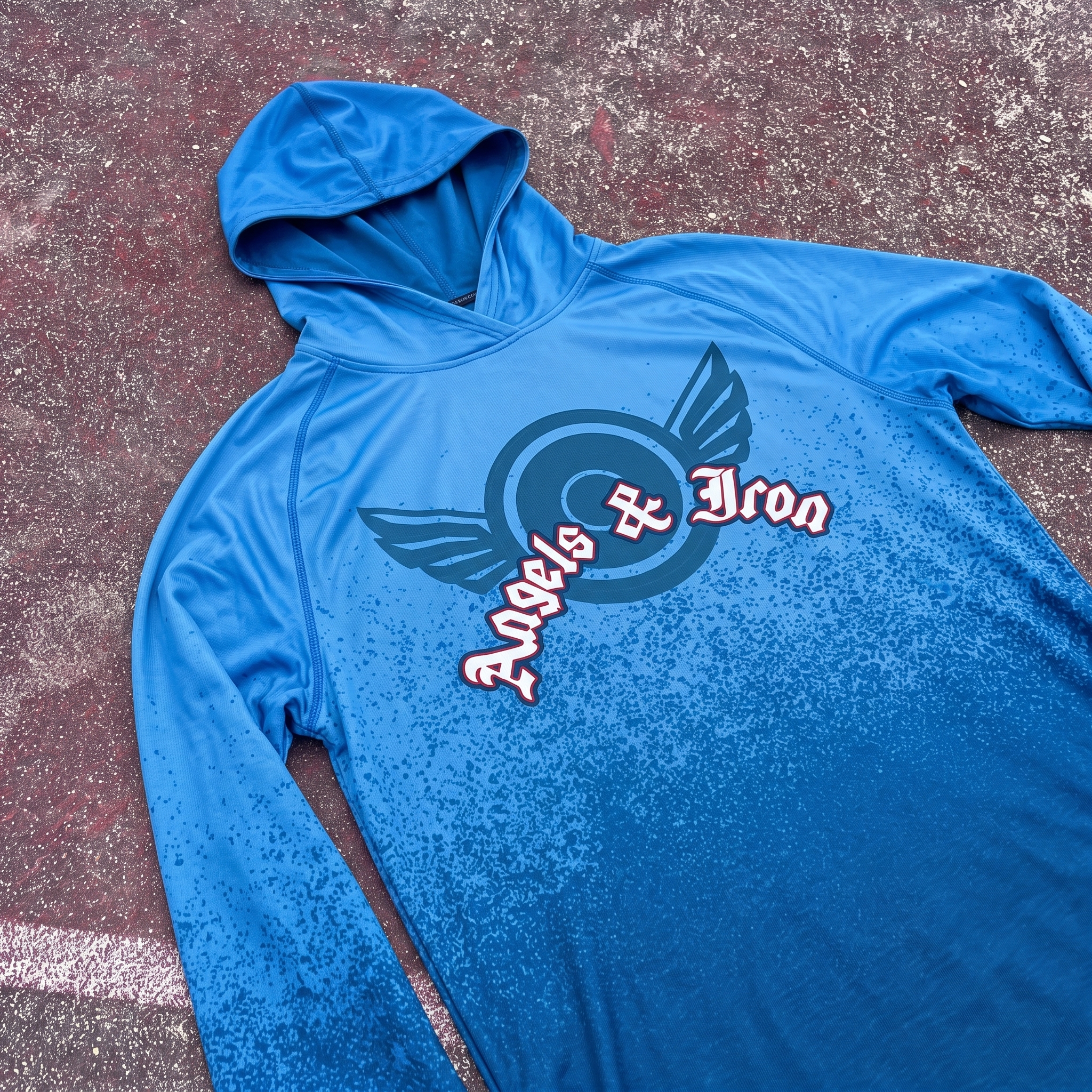
Blue Fade Training Hoodie
The performance hoodie turns the winged plate into a larger moving mark, letting the logo sit across a blue gradient field. The darker fade and speckled lower texture were used to bring the “Iron” side back into the piece so it does not feel too soft or sky-themed.
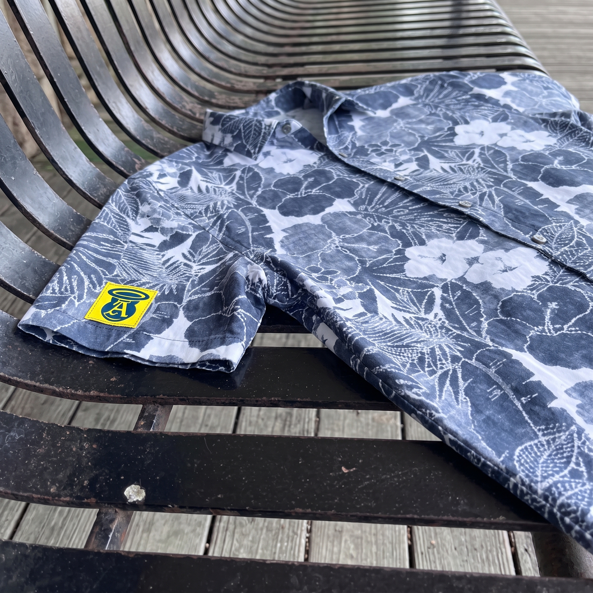
Florals & Foundry Camp Shirt
The camp shirt gives the collection one warm-weather lifestyle piece without falling into beach cliché. The floral pattern was kept in a restrained blue-and-white palette, while the yellow sleeve patch adds a small branded hit that feels more like a streetwear label than a resort graphic.
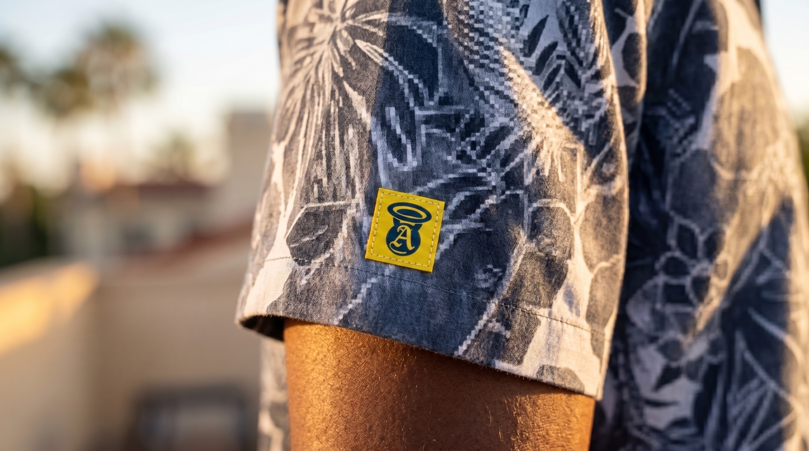
Sleeve Patch Detail
The sleeve patch compresses the halo “A” into the smallest mark in the system. The yellow label was added for visibility and contrast, giving the patterned shirt a clear brand signature without overpowering the garment.
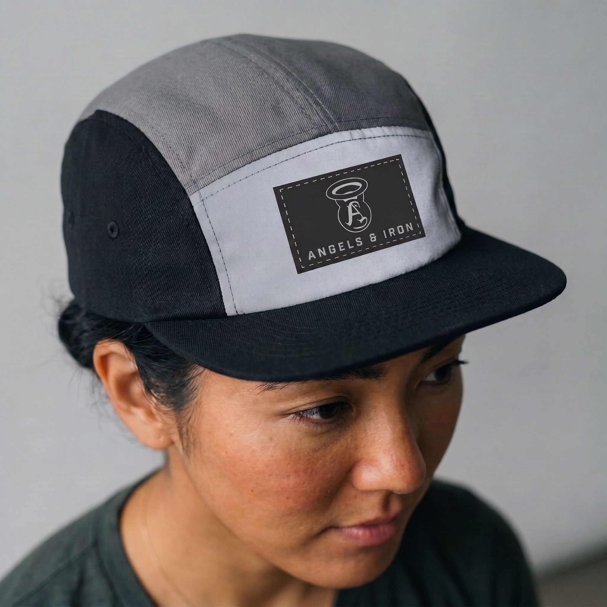
Five-Panel Flight Patch Hat
The five-panel hat turns the halo mark into a clean rectangular patch system. The black, grey, and reflective-looking front panel were selected to connect with aviation gear, utility labeling, and the industrial side of Los Angeles.
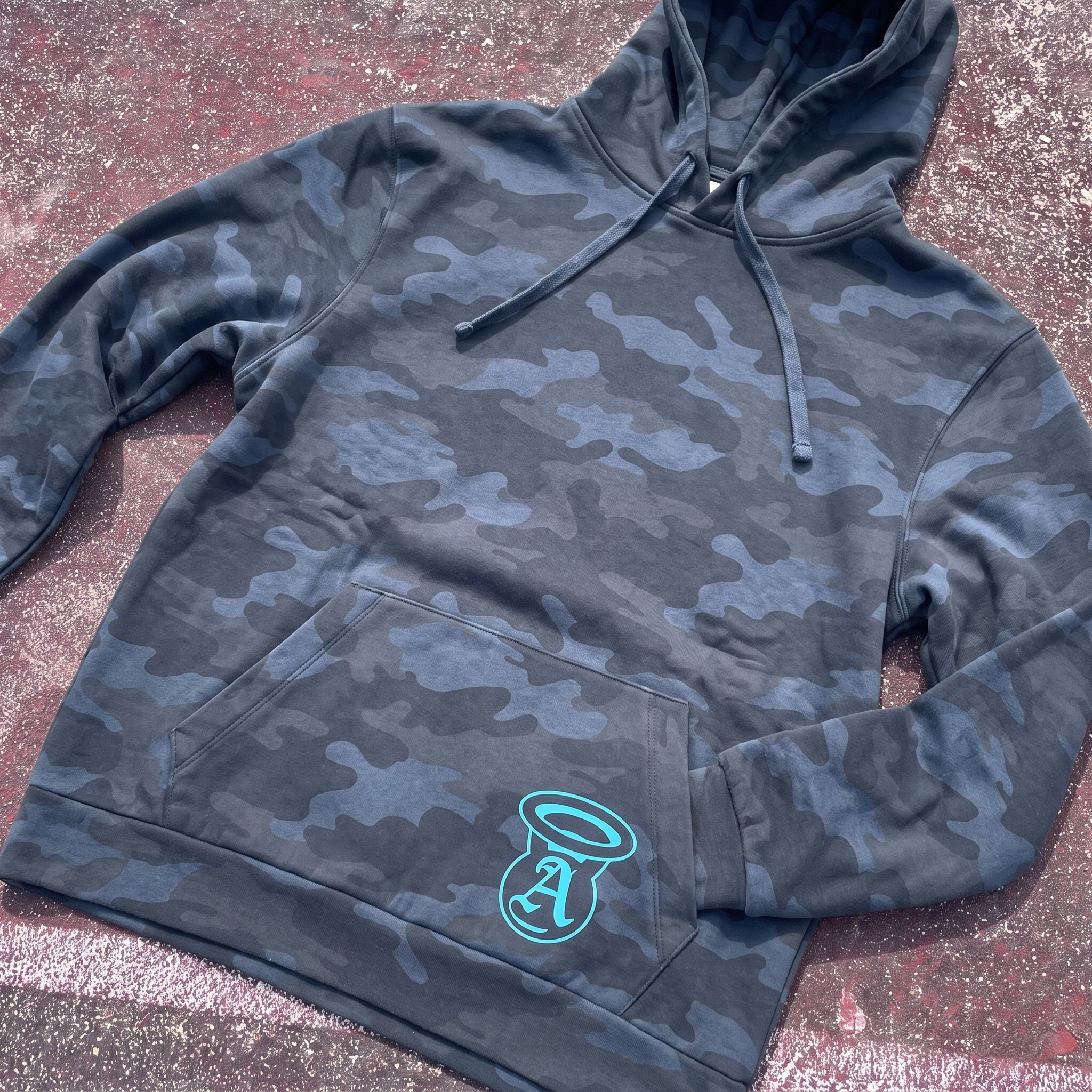
Midnight Camo Hoodie
The camo hoodie gives the drop its most tactical streetwear layer, using a low-contrast navy pattern with the halo “A” placed on the pocket. The mark placement keeps the hoodie quiet from a distance, then reveals the brand when viewed up close.
Collection Field Flat
The collection flat shows the full system working across soft goods, performance gear, headwear, and lifestyle pieces. The asphalt background was chosen to keep the drop grounded in the city, balancing the sky and wing references with a rougher street-level surface.
UNITEE Design Lab
Concept cars for custom gym apparel.
The UNITEE Design Lab works like concept cars for gym apparel. We start with an idea, then turn it into a real concept people can see: a shirt, hat, hoodie, uniform set, or full merch drop. Then we explain the thinking behind it. Why this garment? Why this graphic? Why this placement? Why this kind of finish? The work is built to inspire, test new ideas, and give our clients better custom gym apparel before they ever place an order.
For larger fitness brands, multi-location gyms, event groups, and enterprise clients, the Design Lab is where brand kits and full merch programs take shape. We build the look, then we print the gear. That means the same team can help shape the brand story, plan the apparel, design the graphics, and produce the final pieces.
For an independent gym owner, the value is simple: you get the benefit of our research and development without needing to buy a full brand package. Your order may be a small run of tees, hats, hoodies, or event shirts, but the thinking behind it comes from a team that studies gym merch every day.
Need better gym merch?
Tell us what you are trying to make. We can help with one shirt, a full drop, or a larger apparel program.
Start a Design Lab Conversation