
UNITEE Design Lab / Boston, Massachusetts
Beantown Strength
Boston does not need a soft story.
Old brick.
Cold sidewalks.
Green pride.
Hard work.
For Beantown Strength, we built the collection around Boston’s layered identity. The apparel pulls from Revolutionary history, Irish-American culture, old athletic type, shamrock marks, a lifted leprechaun mascot, and green gym gear that feels gritty without turning into costume merch.
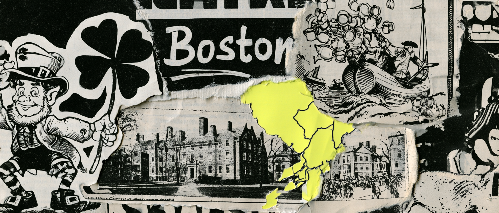
Built From Civic Grit
Boston carries history like weight.
Boston has always been a city with pressure behind it. The streets, the brick, the old buildings, the harbor, and the public squares all carry a sense of history that still feels present.
The city is tied to resistance, work, immigration, sport, education, and neighborhood pride. That gave Beantown Strength a strong design lane. The collection did not need to feel polished or passive. It needed weight.
The word Beantown brings in the local nickname. It is playful, but it is also specific. It gave the gym a name that felt familiar, tough, and unmistakably Boston.
The green system comes from another layer of the city. Boston has a deep Irish-American visual memory, and the shamrock is one of the fastest ways to signal that history. The challenge was using that cue without making the apparel feel like a one-day holiday drop.
That is why the system uses restraint and grit. The shamrock becomes a gym icon. The leprechaun becomes a lifting mascot. The old block type becomes a strength badge. The green hoodie becomes training gear, not parade gear.
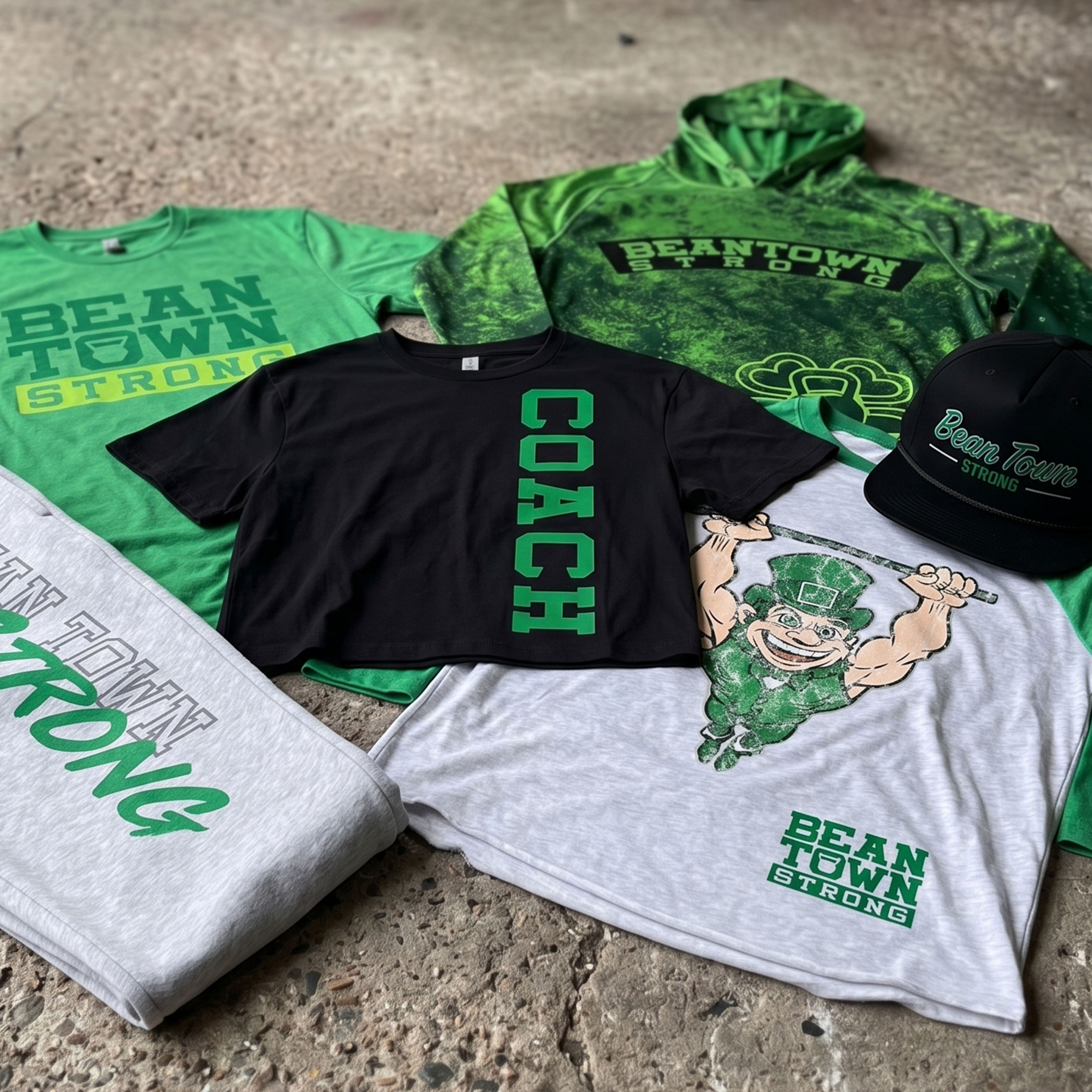
The Collection uses a heavy wordmark, kettlebell detail, shamrock icon, lifted leprechaun mascot, hoodie graphics, jogger print, hat embroidery, and crop tee placement to build a full Boston gym apparel system.
Concept + Design Rationale
Beantown Strength works because the name has two clear parts. Beantown gives the place. Strength gives the work.
The identity system had to hold both. One side of the collection feels old Boston: block type, brick-street attitude, a mascot, and a local nickname. The other side feels like modern gym apparel: crop tees, hoodies, joggers, hats, chest marks, back prints, and high-energy green textures.
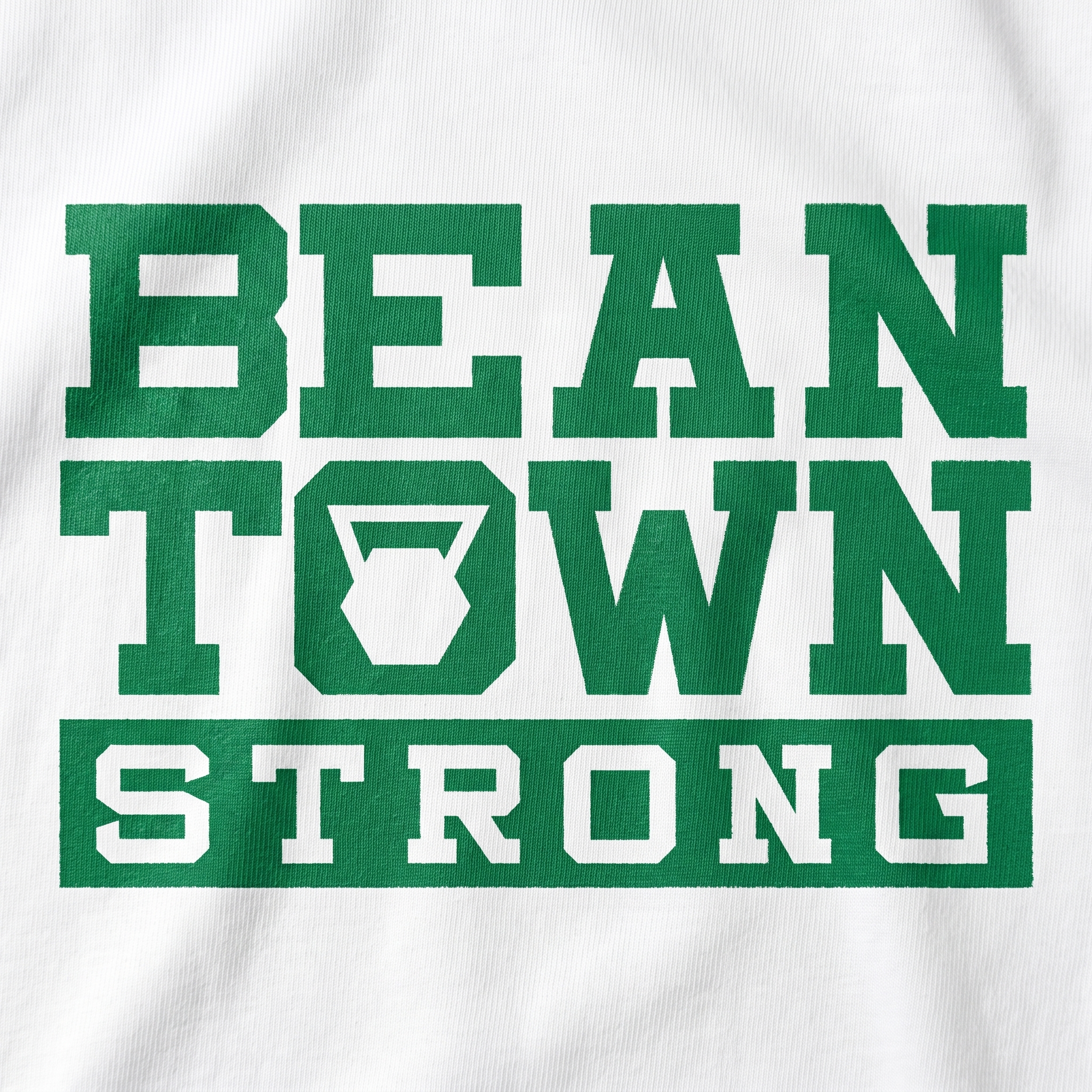
The main mark uses heavy athletic type because Boston does not need a delicate logo. It needs weight. The kettlebell inside the “O” gives the name a gym-specific detail without forcing a full illustration into every piece.
The mascot became the loudest character piece. Boston’s Irish history gave us the source, but the design had to move past the obvious version. The overhead bar, strong pose, and distressed texture make it feel closer to old gym merch than novelty art.
The whole system is built to feel like Boston: local, tough, green, loud when it needs to be, and still wearable outside the gym.
Color System
Southie Green
Irish memory and gym identity
Parade Lime
High-energy shamrock accent
Brick Row Red
Old streets and city texture
Black Coffee Black
Streetwear and contrast anchor
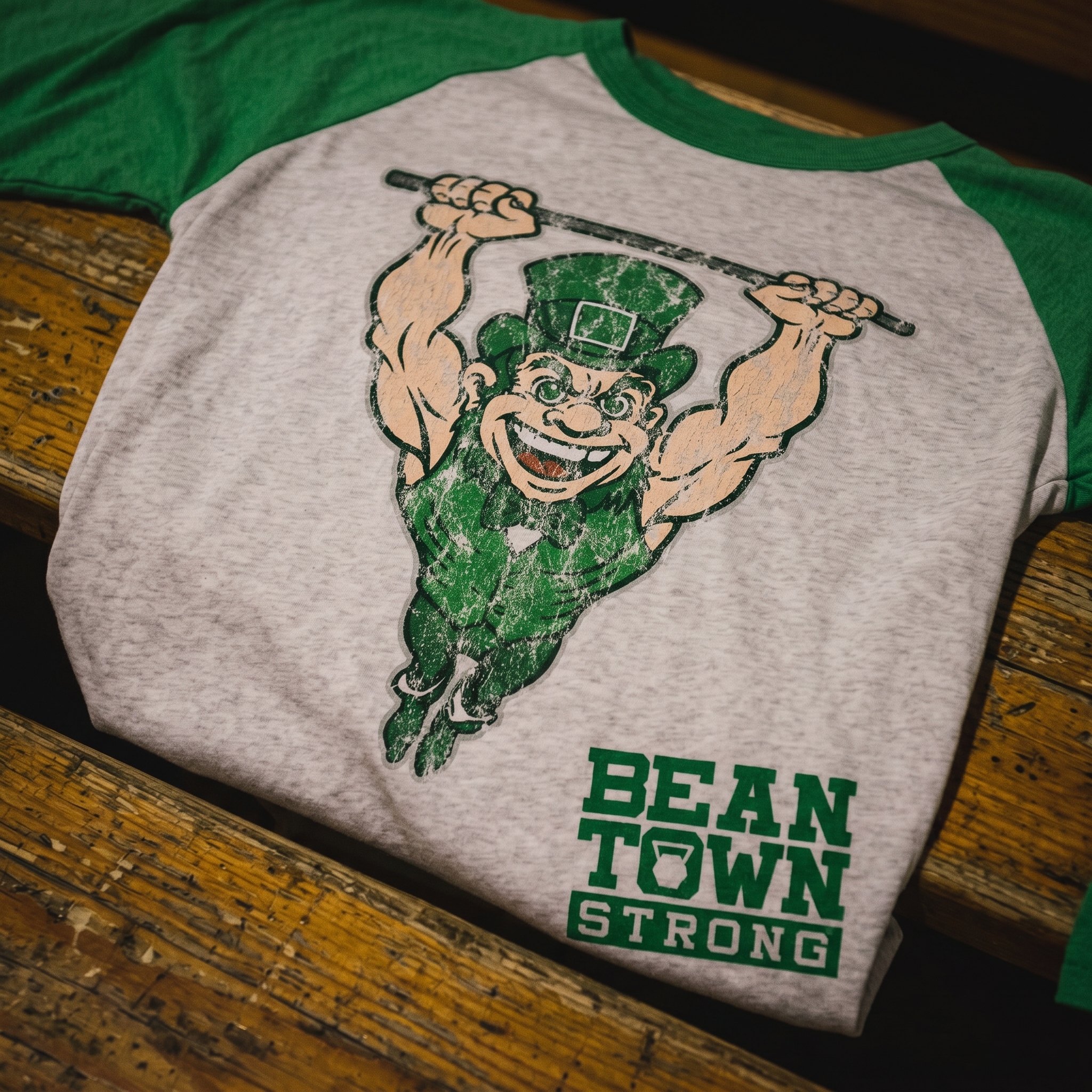
The Mascot Raglan
The mascot raglan turns the leprechaun into a strength character, using the overhead bar and distressed print texture to make the piece feel like gym merch instead of novelty art.
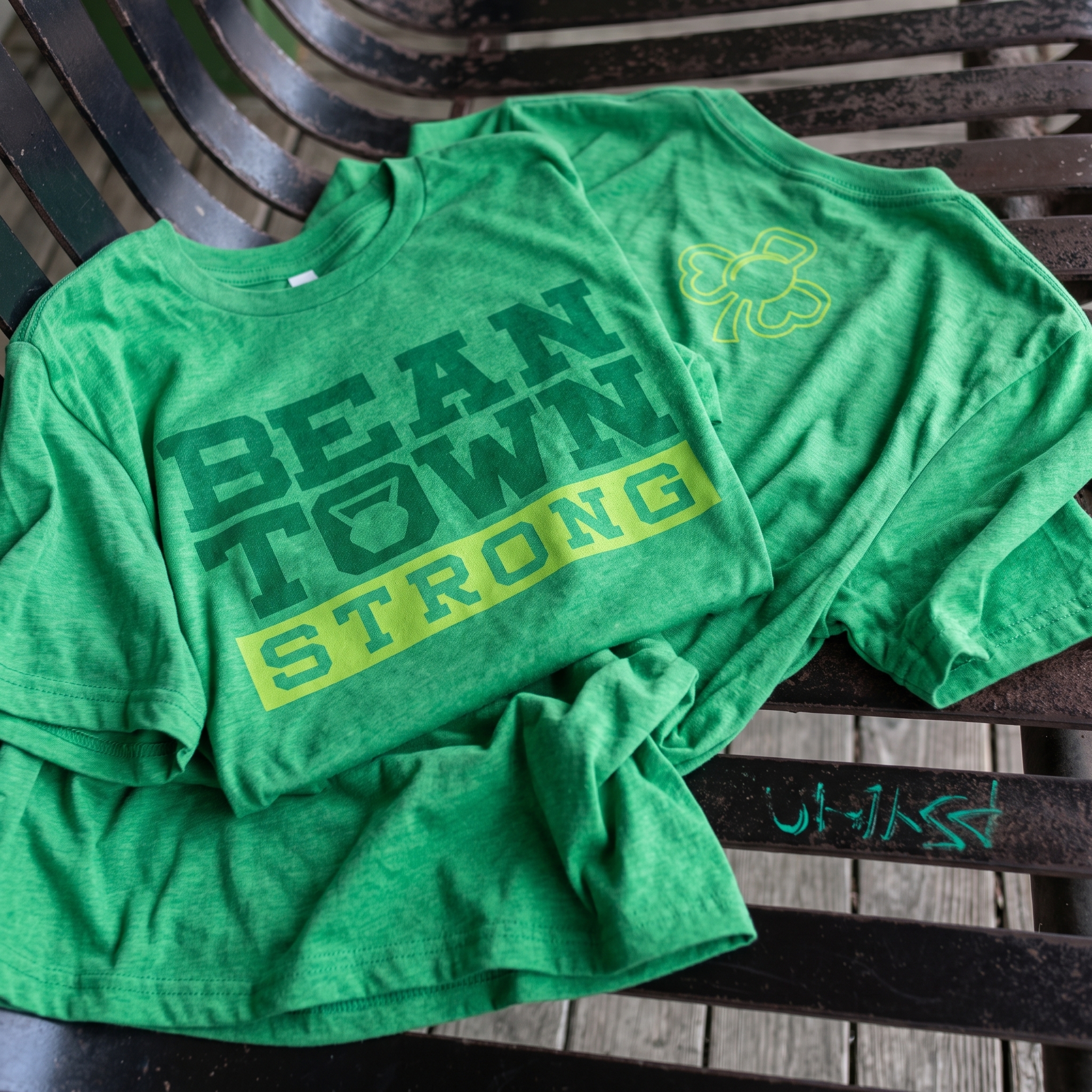
The Beantown Strong Tee
The green tee keeps the system simple with a large block wordmark, kettlebell detail, and tonal green print that feels local without being overbuilt.
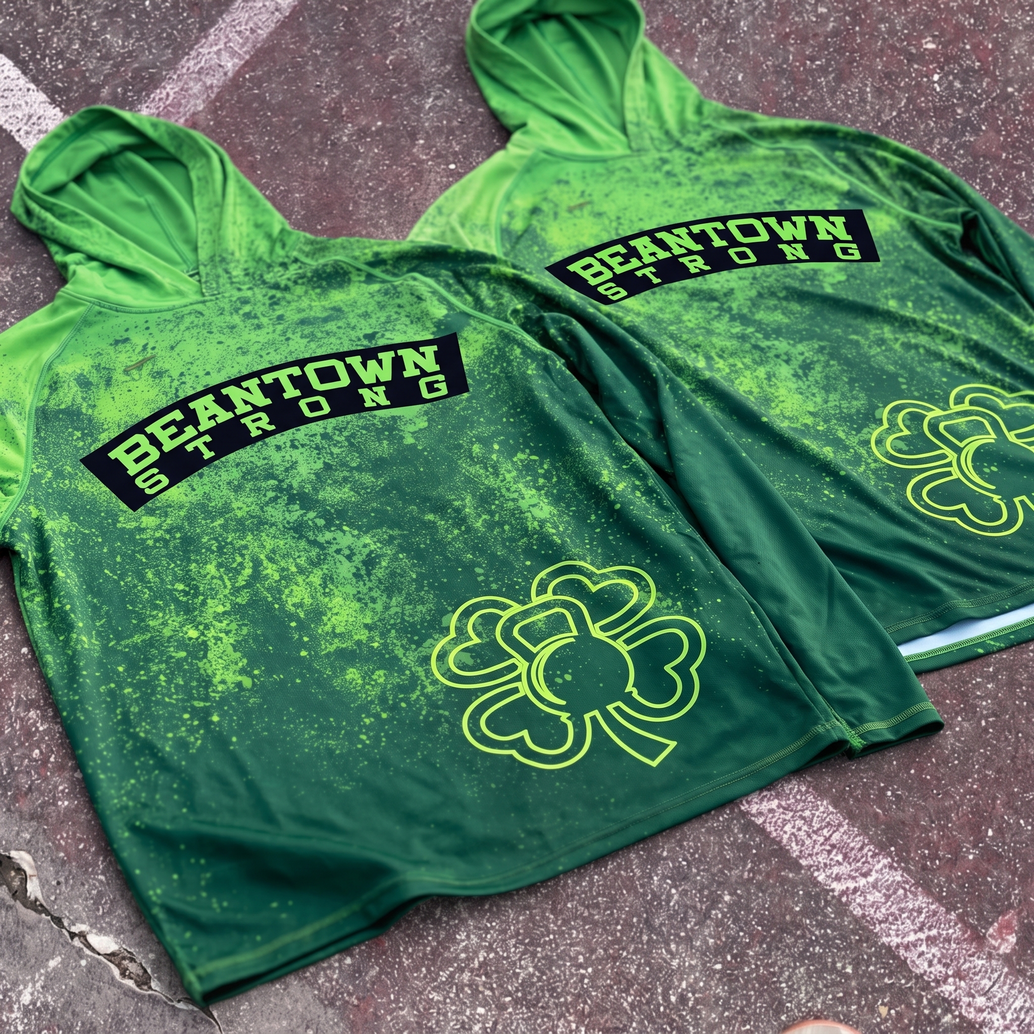
The Splatter Hoodie
The hoodie uses a darker green base, high-energy splatter texture, arched Beantown Strong type, and oversized shamrock mark to create the loudest training piece in the drop.
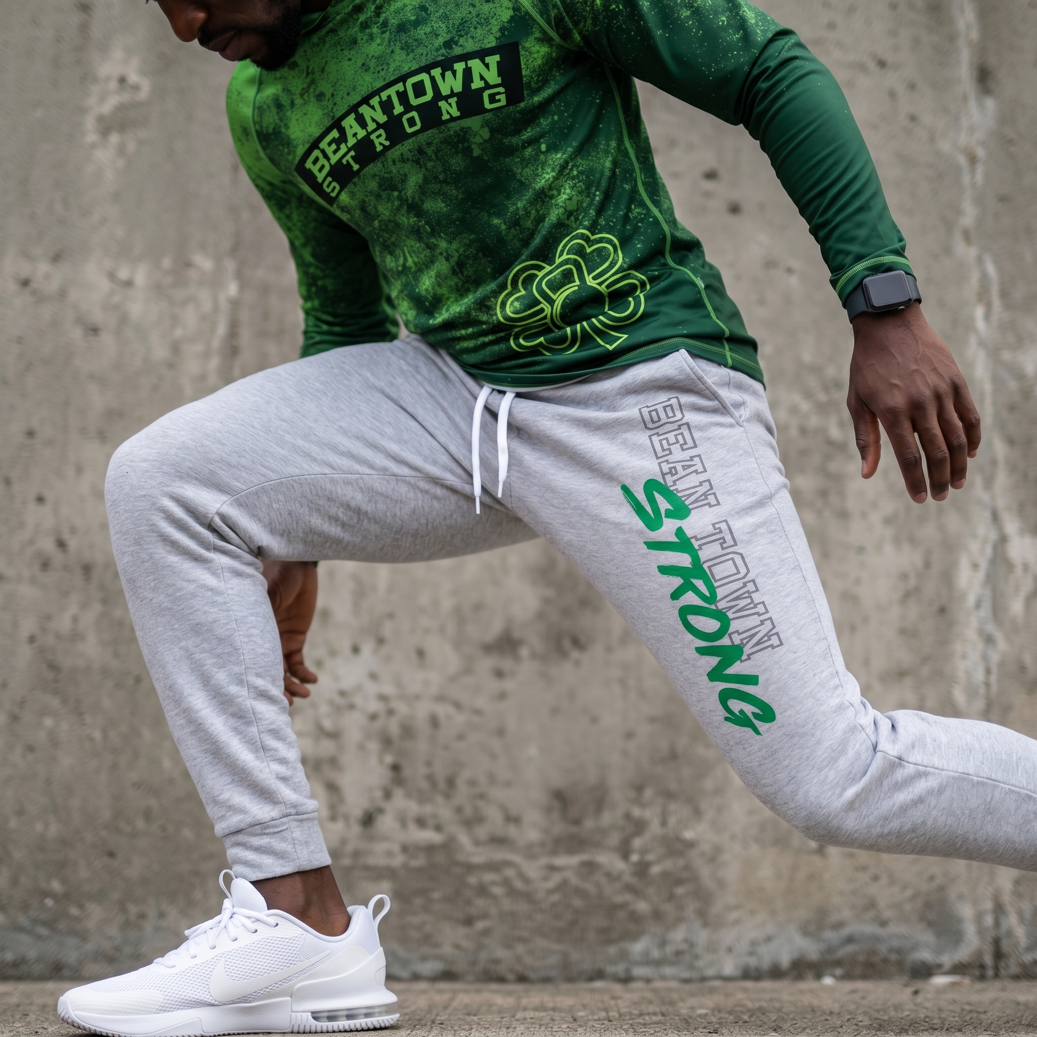
The Jogger
The jogger uses a vertical leg print so the identity moves with the athlete instead of staying locked to the chest.
The Rope Hat
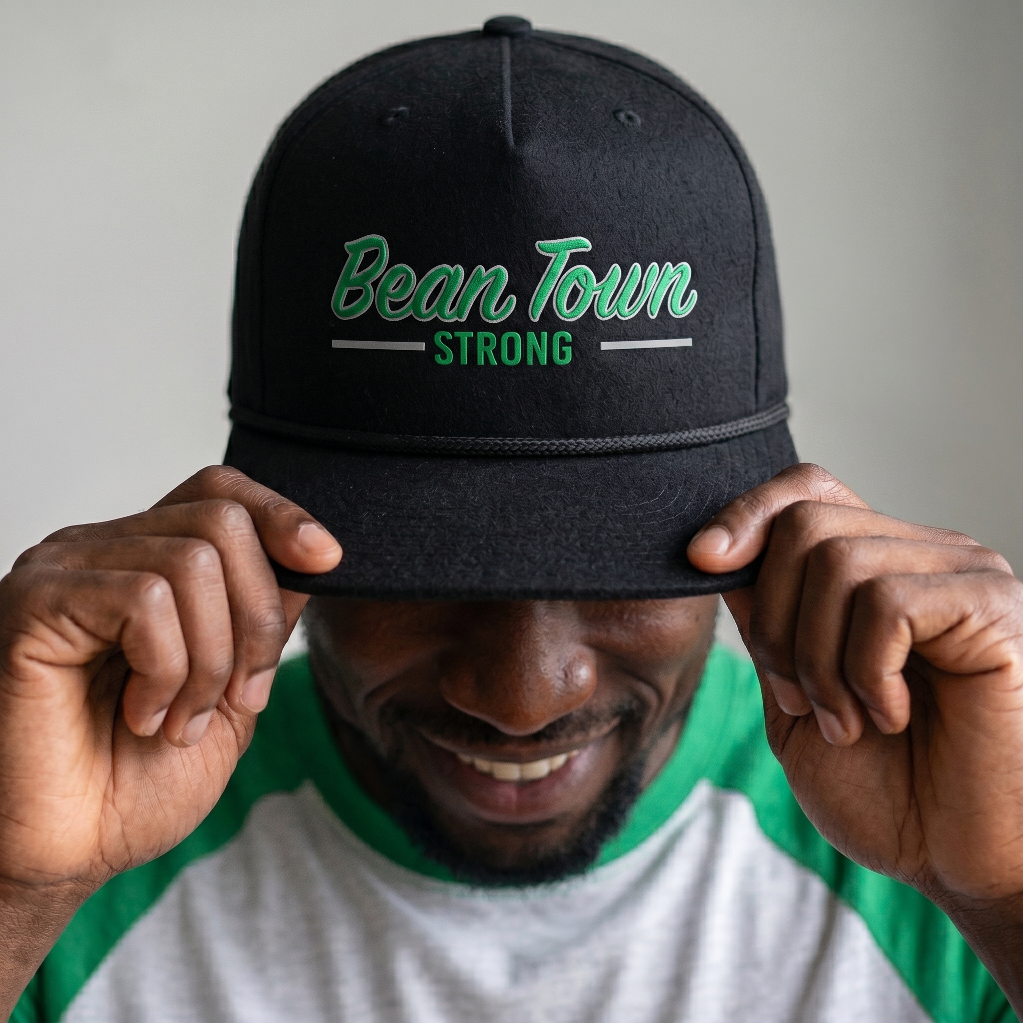
The black rope hat shifts the Beantown Strong script into embroidery, giving the collection a cleaner everyday piece with a stronger streetwear read.
The Black Crop Tee
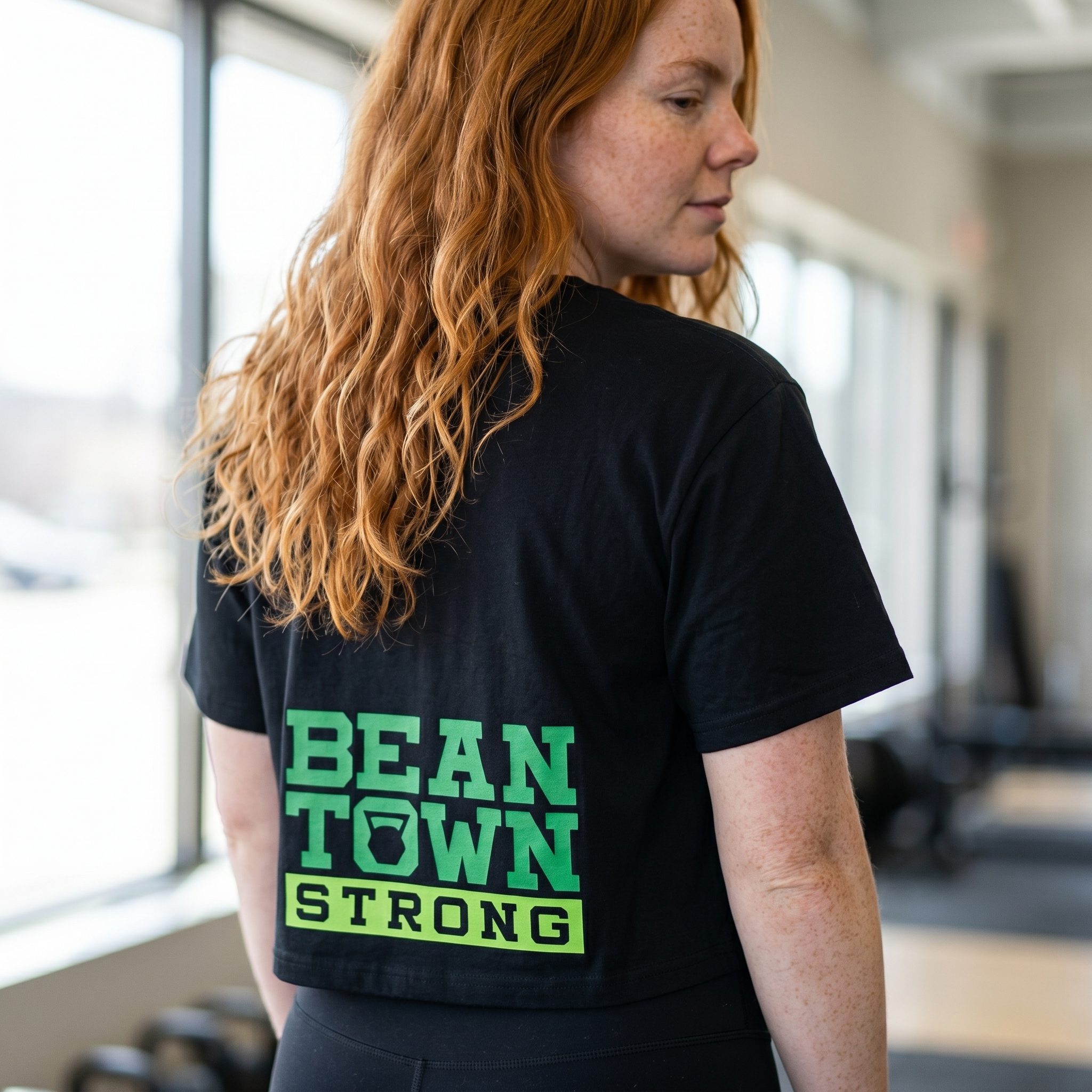
The crop tee uses a back print placement to make the wordmark feel more like fashion merch than a standard front-logo gym shirt.
UNITEE Design Lab
Concept cars for custom gym apparel.
The UNITEE Design Lab works like concept cars for gym apparel. We start with an idea, then turn it into a real concept people can see: a shirt, hat, hoodie, uniform set, or full merch drop. Then we explain the thinking behind it. Why this garment? Why this graphic? Why this placement? Why this kind of finish? The work is built to inspire, test new ideas, and give our clients better custom gym apparel before they ever place an order.
For larger fitness brands, multi-location gyms, event groups, and enterprise clients, the Design Lab is where brand kits and full merch programs take shape. We build the look, then we print the gear. That means the same team can help shape the brand story, plan the apparel, design the graphics, and produce the final pieces.
For an independent gym owner, the value is simple: you get the benefit of our research and development without needing to buy a full brand package. Your order may be a small run of tees, hats, hoodies, or event shirts, but the thinking behind it comes from a team that studies gym merch every day.
Need better gym merch?
Tell us what you are trying to make. We can help with one shirt, a full drop, or a larger apparel program.
Start a Design Lab Conversation