
UNITEE Design Lab / Oklahoma City, Oklahoma
Bolt Fitness
Oklahoma City gave Bolt Fitness a name that already had motion in it. The city’s story is tied to sudden force: prairie weather, lightning, oil derricks, cattle country, bison imagery, and a skyline built from land, energy, and risk.
For Bolt Fitness, the lightning mark became more than a fast icon. It became a bridge between Oklahoma storm culture, the toughness of the plains, and an athletic color story inspired by the electric energy locals already connect with the Oklahoma City Thunder.
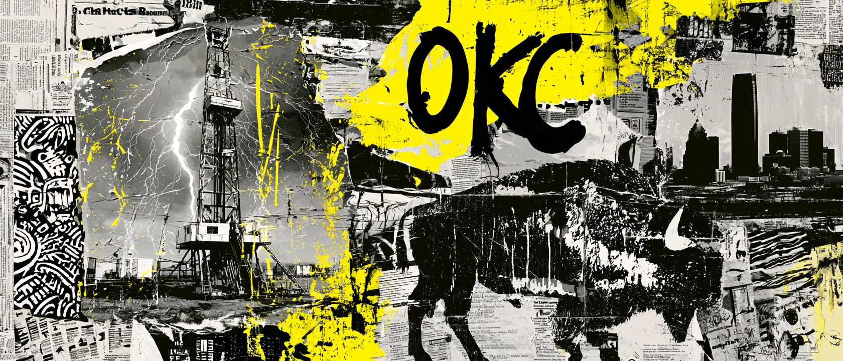
Storms, Oil Fields, Bison, And Thunder Color
A city shaped by pressure from the sky, the ground, and the plains.
Oklahoma City sits in a part of the country where weather is not background noise. Warm, wet air from the Gulf, colder northern air, dry western air, and wide-open plains all meet across the region. That mix helps create the severe storms and sudden sky changes Oklahoma is known for.
That made the Bolt name feel local right away. Lightning is not just a speed symbol here. It is part of the way the place feels: charged, unpredictable, loud, bright, and powerful. For the apparel, the bolt mark was designed to carry that storm energy without becoming a generic fitness icon.
Oil is another major part of Oklahoma’s visual story. The state became deeply tied to petroleum through early oil booms, drilling towns, refineries, and fields that helped shape jobs, wealth, and civic growth. Oklahoma City itself had oil wells and derricks inside the urban landscape, making energy production part of the city’s identity.
The bison brings the collection back to the plains. It is tied to the land, to Native history, to survival, and to the open grasslands that shaped the region long before oil towers or city skylines. As a mascot, the bison gives Bolt Fitness weight. It feels strong, stubborn, fast, and rooted.
The color system adds a modern Oklahoma City layer. Electric blue, orange, navy, and yellow echo the kind of high-energy palette locals already connect with through OKC Thunder basketball. It gives the collection instant local familiarity while still letting Bolt Fitness own its own gym identity.
The result is a system built from real Oklahoma signals: storm charge, oil-field energy, plains strength, bison power, and a sports color language the city already believes in.
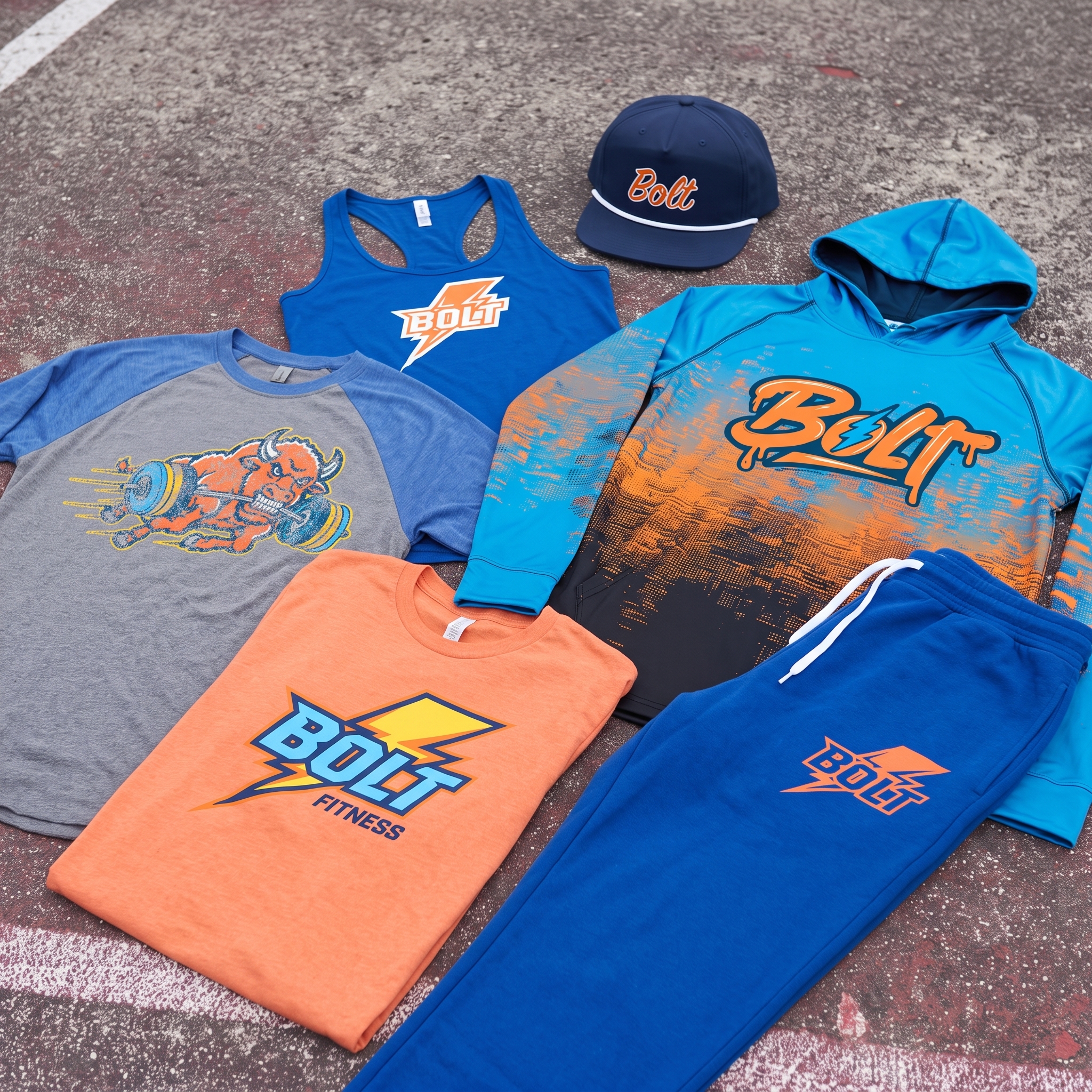
The Collection brings the full system together: Bolt Fitness tees, coach tanks, joggers, performance hoodie, rope cap, and the bison mascot raglan, all tied together through a blue / orange / yellow palette that feels right at home in Oklahoma City.
Concept + Design Rationale
The concept starts with the name. Bolt is short, fast, and easy to remember, which made it strong enough to lead the full apparel system. The challenge was making the identity feel local instead of generic.
The primary Bolt mark uses a sharp lightning structure, stacked athletic lettering, and high-contrast color to create instant read. Blue, orange, and yellow give the brand visible energy, but they also tap into a color identity people in Oklahoma City are already emotionally connected to through the OKC Thunder. That makes the collection feel familiar, energized, and built for the local market.
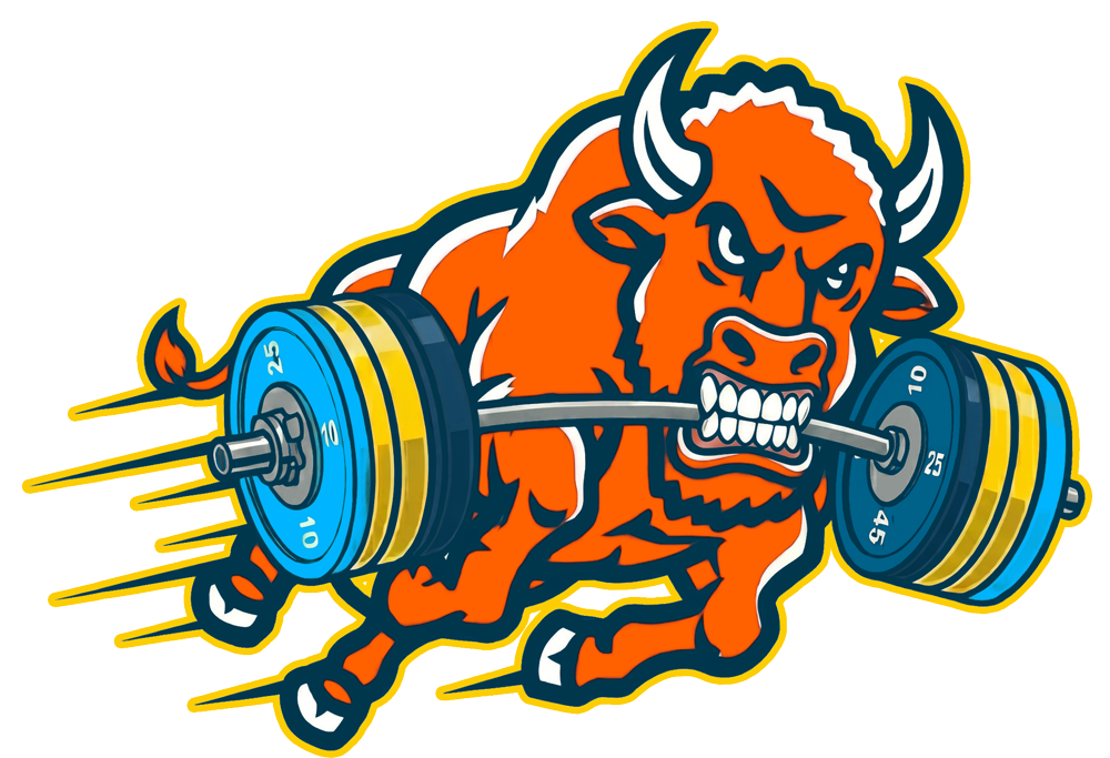
The bison mascot logo gives the system a second lane. Where the main mark is clean and fast, the mascot adds force, grit, and personality. It ties the collection back to Oklahoma land, plains toughness, and the visual culture of the American bison, making the brand feel more rooted and ownable.
The goal was to make Bolt Fitness feel electric without becoming cartoonish: bold enough for the gym floor, recognizable enough for retail-style merch, and local enough to feel like it belongs to Oklahoma City.
Color System
Electric Blue
Primary apparel color and the main anchor of the local sports-driven identity
Heat Orange
High-energy contrast tone used across logos, caps, tees, and coach graphics
Storm Yellow
The lightning accent that gives the system speed and charge
Midnight Navy
Used for outlines, caps, and structure to keep the brighter colors grounded
Industrial Grey
Neutral base for the mascot lane and everyday training pieces
Skyline Cyan
Secondary electric tone that lifts the Bolt mark and performance pieces
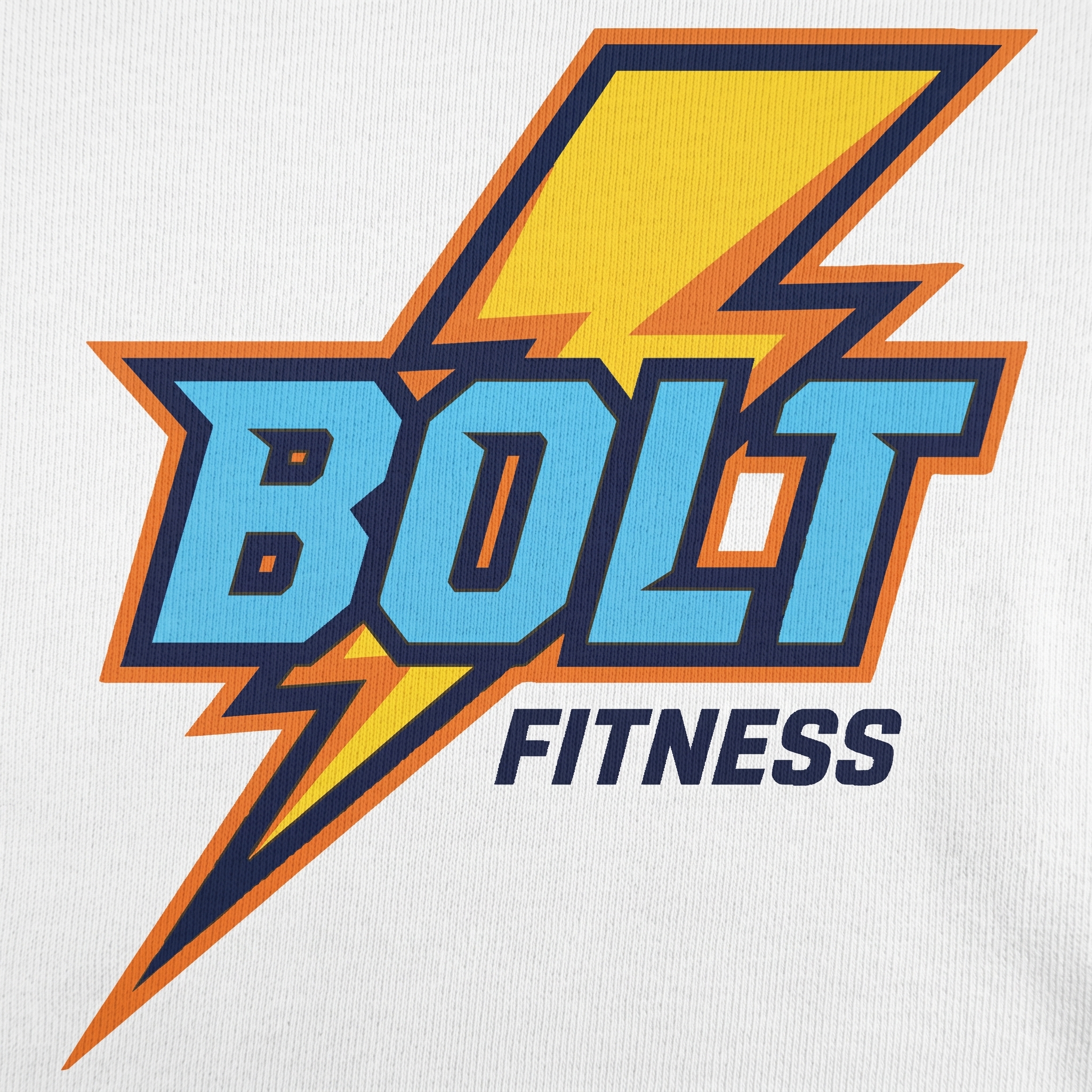
The core logo lane keeps the identity sharp and readable, while the broader collection expands into character graphics, local references, and performance-driven apparel.
Storm City Performance Set
The lay-flat set shows the main training lane: coach tanks, electric hoodie, joggers, and orange tee all tied together through blue, orange, yellow, and lightning-based mark structure inspired by Oklahoma City energy.
Bison Mascot
The bison mascot gives Bolt Fitness its most character-driven piece. Aggressive, fast, and full of motion, the charging bison graphic adds a memorable Oklahoma anchor to the collection while keeping the same electric palette.
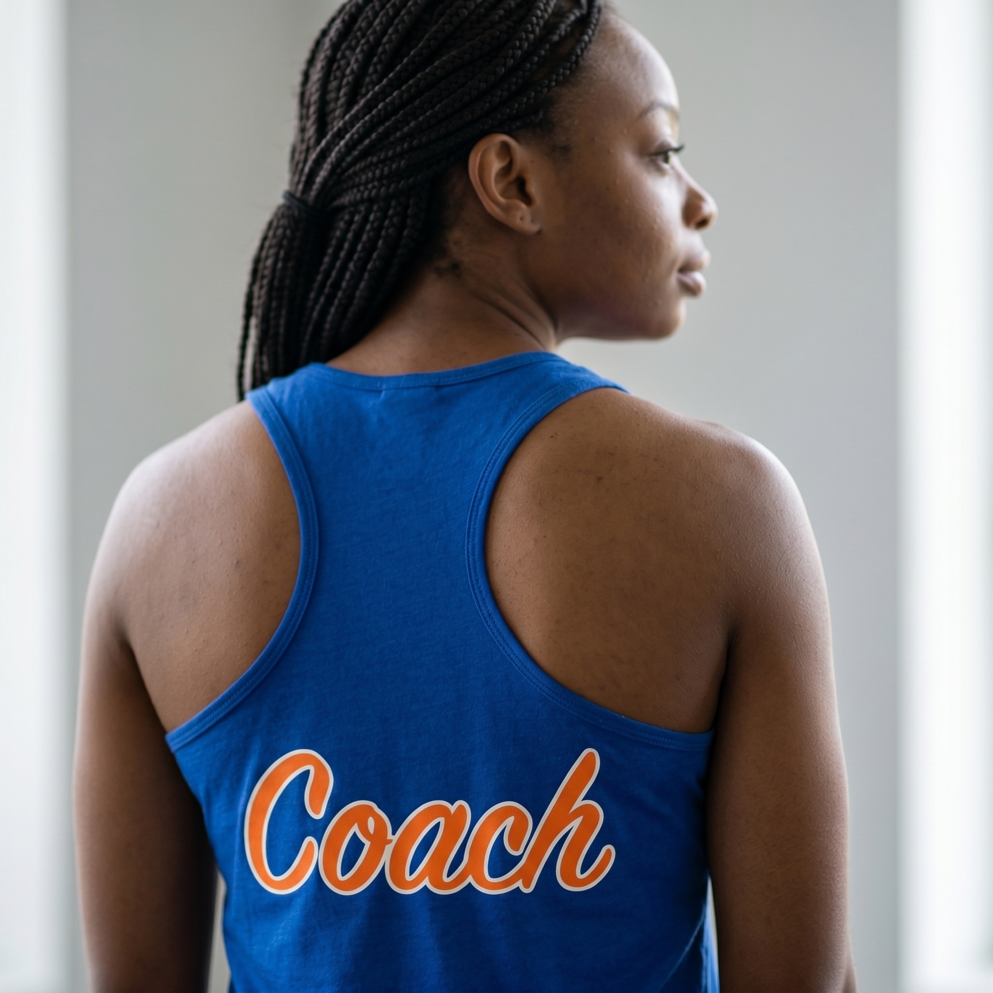
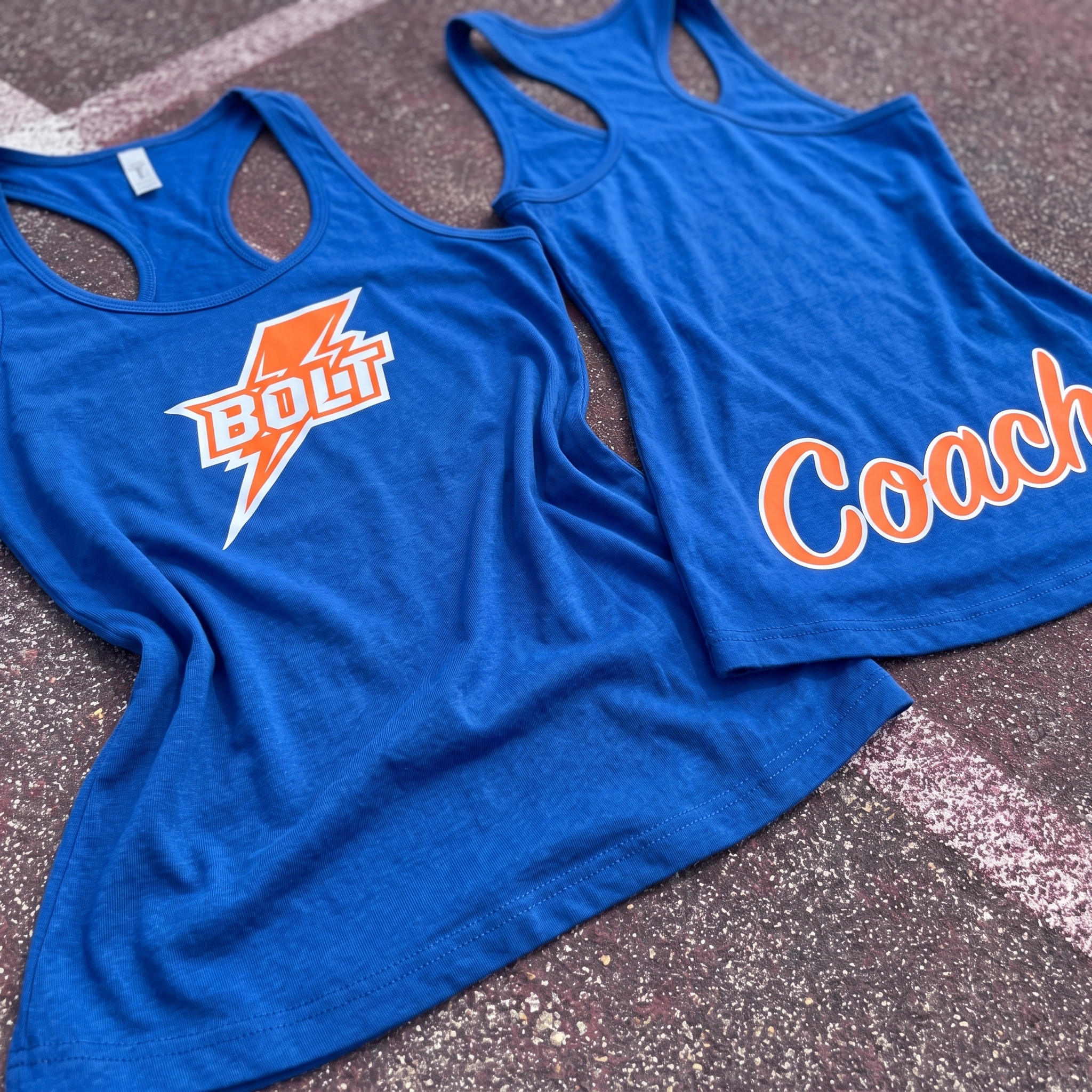
Blue Coach Racerback
The coach racerback keeps the staff role clear with a large back script, using orange and white contrast against the blue base for quick recognition during class and strong consistency with the overall brand system.
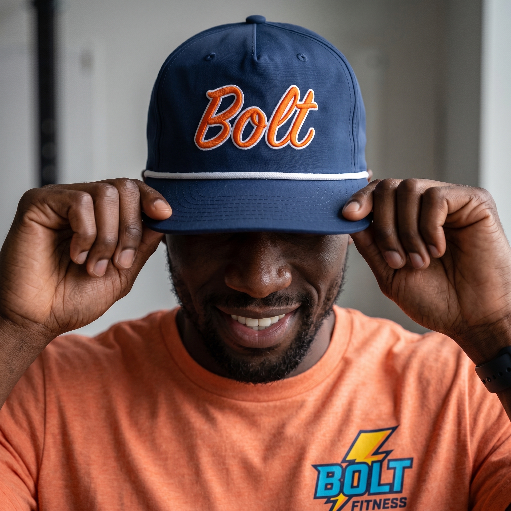
Bolt Script Rope Cap
The navy rope cap turns the Bolt name into an everyday accessory, softening the sharper lightning logo with orange script embroidery and white rope detail while keeping the Oklahoma sports color connection intact.
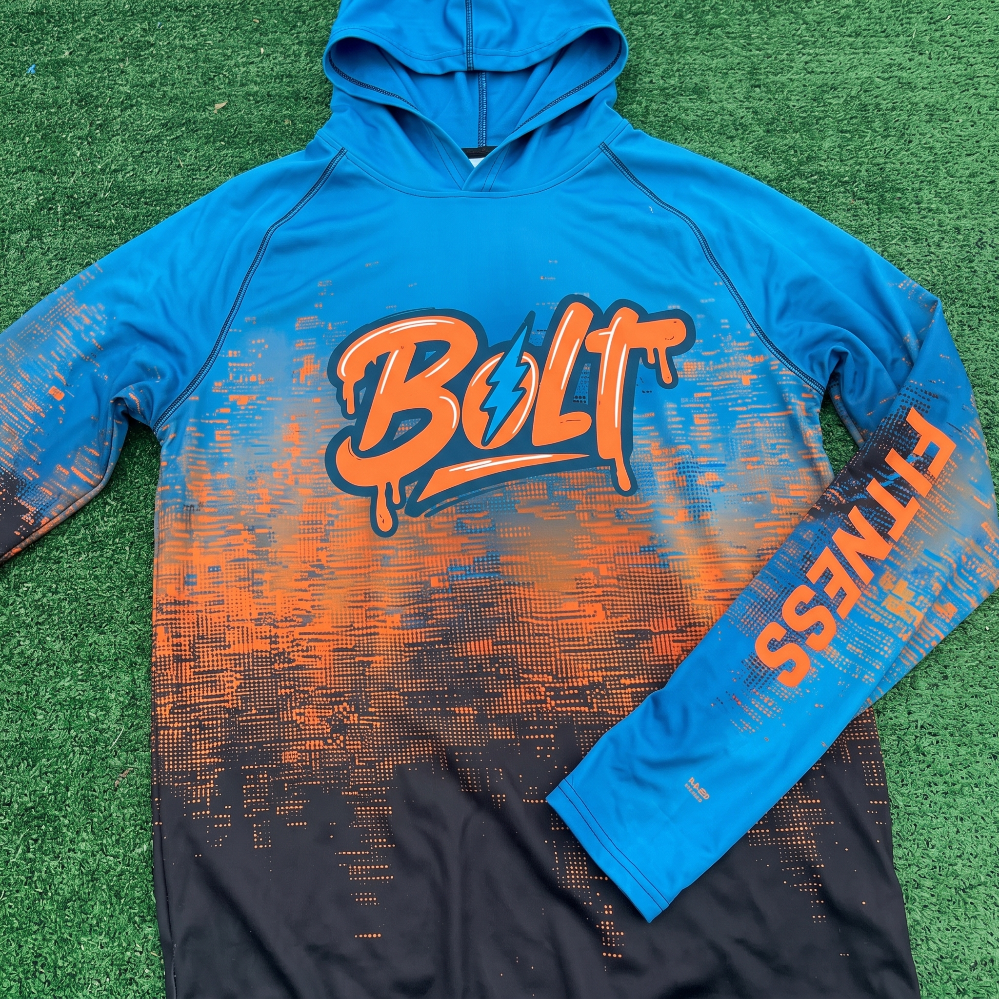
Bolt Performance Hoodie
A lightweight performance hoodie designed to be worn even during the hottest Texas summer days and on windy fall days.
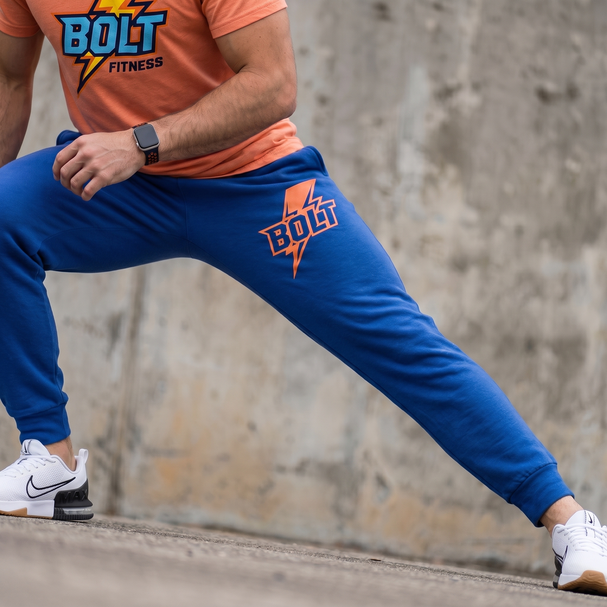
Electric Blue Training Jogger
The jogger carries the Bolt mark down the leg, giving the lower-body piece its own identity while keeping the collection active and visibly branded when the athlete moves.
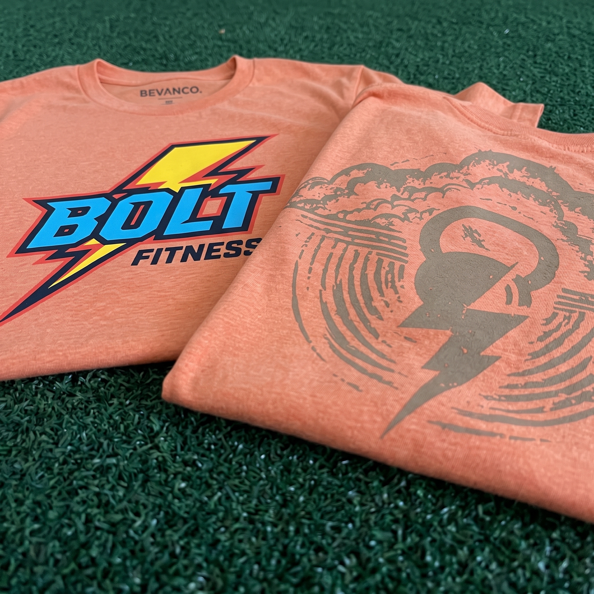
Orange Strike Tee Set
The orange tee set gives the drop its warmest everyday piece, pairing the loud Bolt Fitness front logo with a quieter tonal back graphic built from kettlebell and lightning forms.
UNITEE Design Lab
Concept cars for custom gym apparel.
The UNITEE Design Lab works like concept cars for gym apparel. We start with an idea, then turn it into a real concept people can see: a shirt, hat, hoodie, uniform set, or full merch drop. Then we explain the thinking behind it. Why this garment? Why this graphic? Why this placement? Why this kind of finish? The work is built to inspire, test new ideas, and give our clients better custom gym apparel before they ever place an order.
For larger fitness brands, multi-location gyms, event groups, and enterprise clients, the Design Lab is where brand kits and full merch programs take shape. We build the look, then we print the gear. That means the same team can help shape the brand story, plan the apparel, design the graphics, and produce the final pieces.
For an independent gym owner, the value is simple: you get the benefit of our research and development without needing to buy a full brand package. Your order may be a small run of tees, hats, hoodies, or event shirts, but the thinking behind it comes from a team that studies gym merch every day.
Need better gym merch?
Tell us what you are trying to make. We can help with one shirt, a full drop, or a larger apparel program.
Start a Design Lab Conversation