
UNITEE Design Lab / Brooklyn, New York
Borough & Barbell
Brooklyn was not always just a borough.
It was its own city.
Its own weight.
Its own name.
For Borough & Barbell, we built the collection around Brooklyn’s independent-city past and the bridge that tied it to the larger New York system. The apparel uses boxed marks, bridge structure, borough language, black-and-white contrast, high-signal neon, and barbell graphics that feel built from steel, concrete, and local pride.
Before It Was A Borough
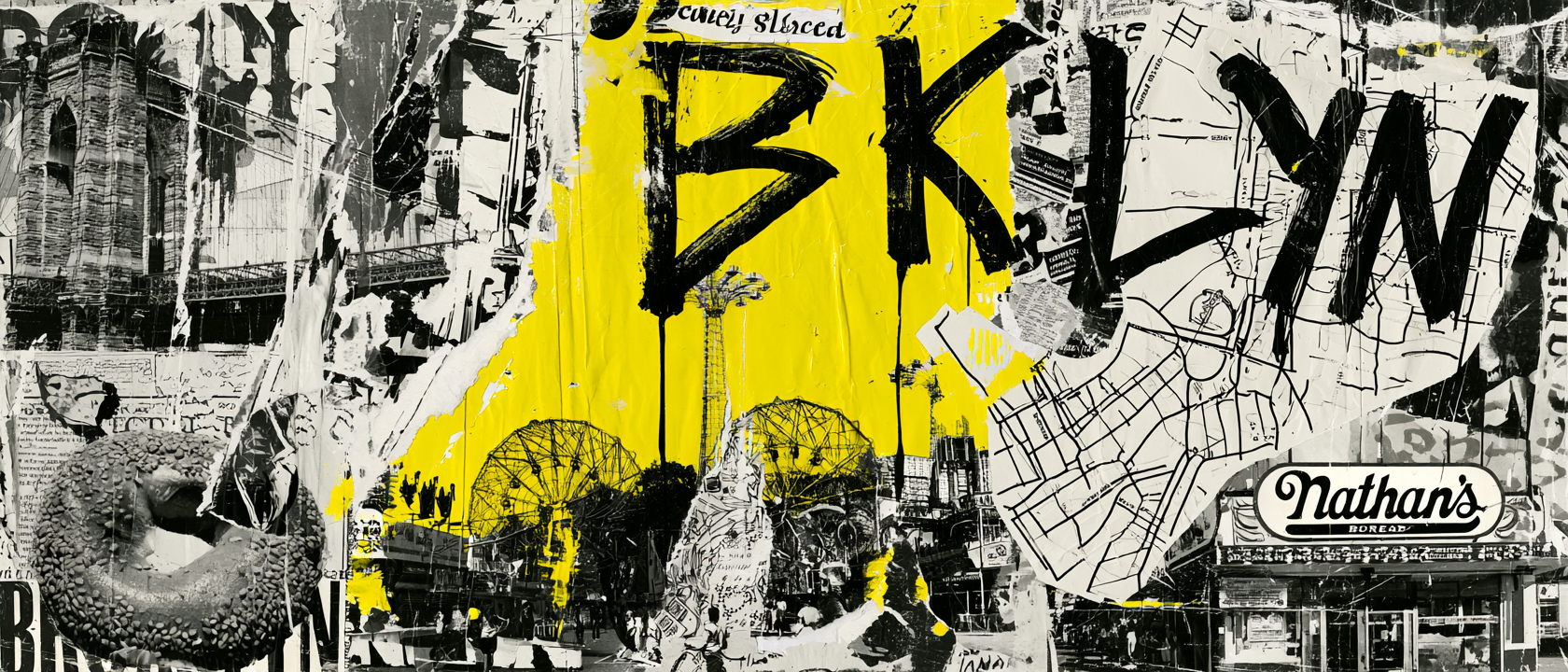
Brooklyn had its own weight before it joined New York City.
Brooklyn was not always one part of New York City. Before the five-borough city formed in 1898, Brooklyn stood as its own city, with its own neighborhoods, docks, factories, streets, politics, and civic pride.
That matters for Borough & Barbell because the name is not just a location tag. It carries the feeling of a place that was built on its own terms before it became part of the larger city system.
The Brooklyn Bridge adds the second layer. Completed in 1883, it connected Brooklyn and Manhattan across the East River. It was not just a route. It was a structure built from ambition, labor, engineering, and pressure.
That bridge gave us the visual logic for the collection. Steel cables, boxed forms, hard edges, vertical lines, black structure, and city contrast all became useful design cues.
The word Borough gives the collection its place. Barbell gives it its work. Together, they create an identity that feels physical, local, and direct.
The apparel system follows that same idea. The neon hoodie carries skyline and bridge energy. The black tee holds the core mark like a stamped piece of city signage. The jogger turns the identity vertical. The rope hat reduces the system to a small bridge-style mark. The coach tank uses a quieter back print so the drop has range.
This is the heart of the project: Brooklyn before it was only a borough, the bridge that connected it, and a gym identity built like something meant to hold weight.
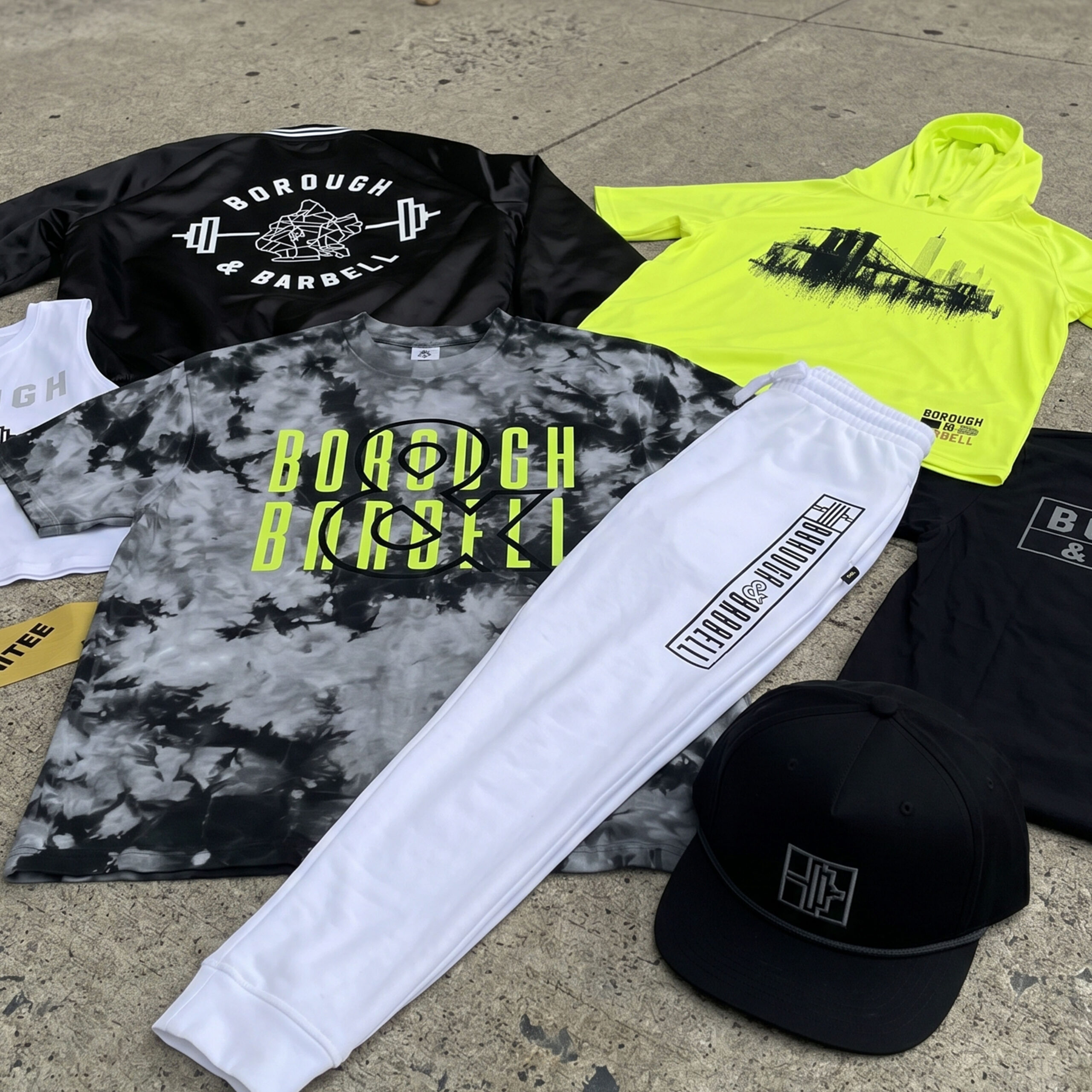
The Collection uses a bridge hoodie, boxed gym marks, white joggers, black training pieces, a rope hat, a coach tank, and a cropped tee to turn Brooklyn structure into a full apparel system.
Concept + Design Rationale
Borough & Barbell works because the name has two clear parts. Borough gives the place. Barbell gives the work.
But the Brooklyn story makes the name stronger. Brooklyn was once its own city, and the Brooklyn Bridge became the structure that connected it to Manhattan. That gave the collection a central idea: independent identity connected through strength.
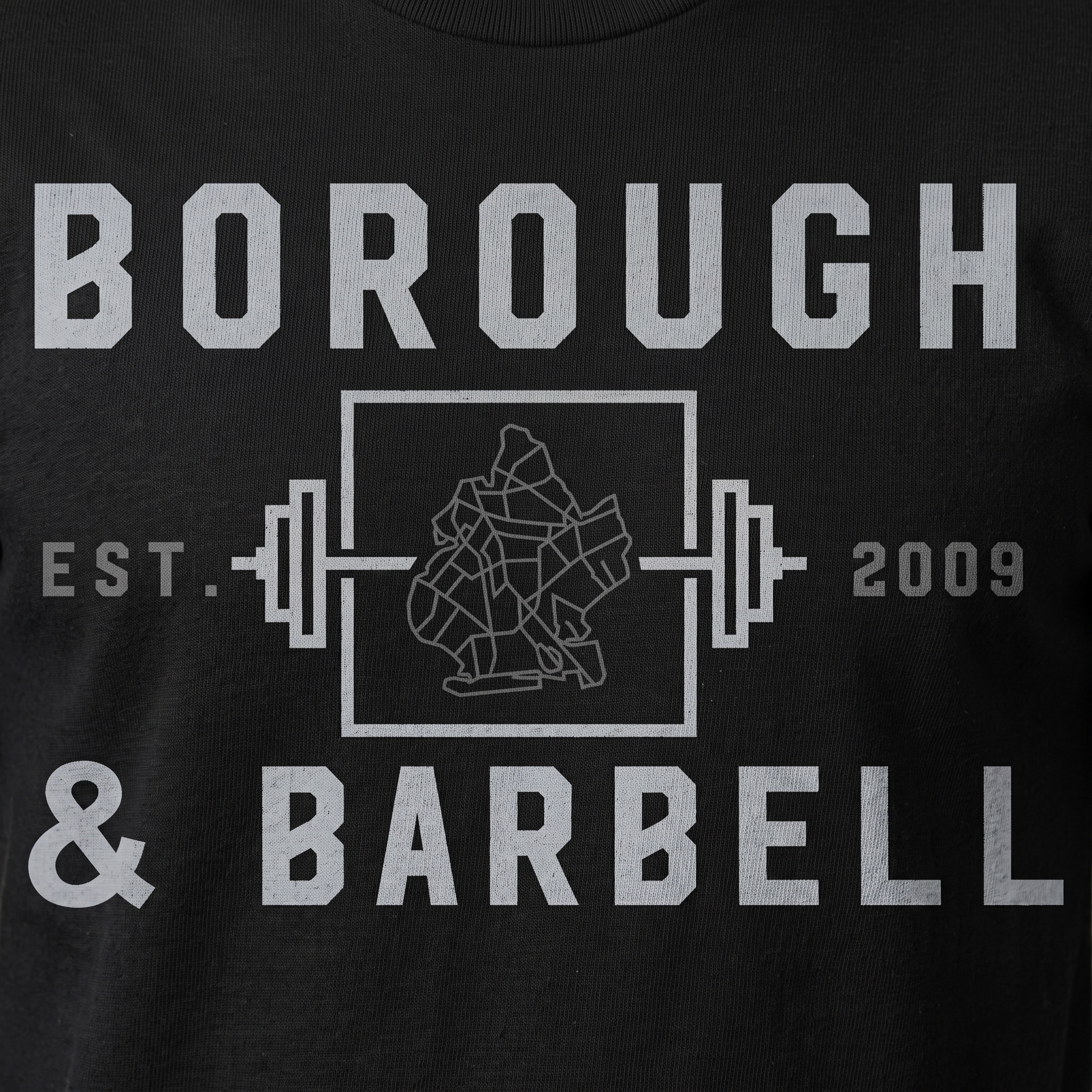
The main marks use boxes, bars, hard type, and bridge-like geometry because the system needed structure. The design language had to feel more like steel, signage, and stamped gym equipment than soft lifestyle merch.
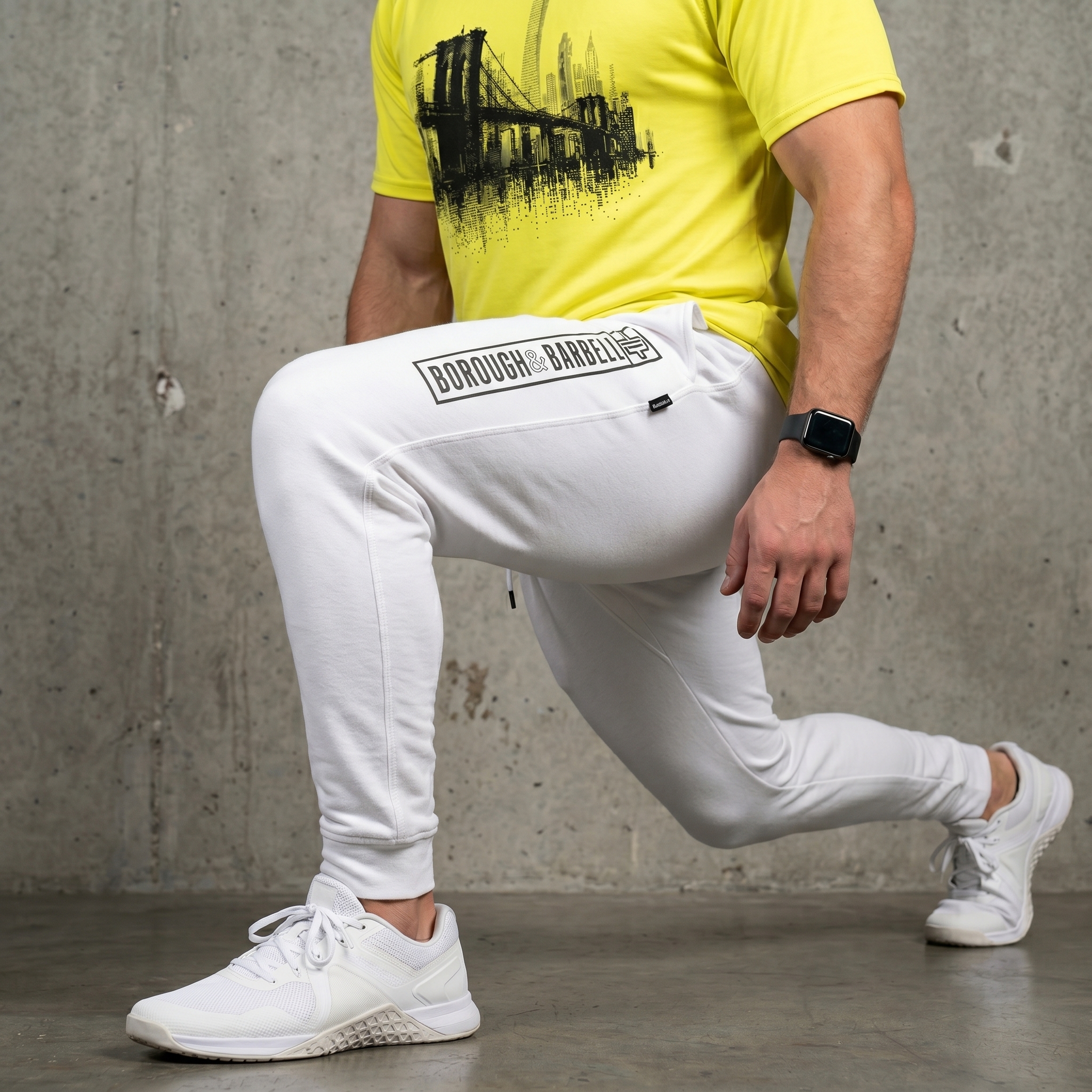
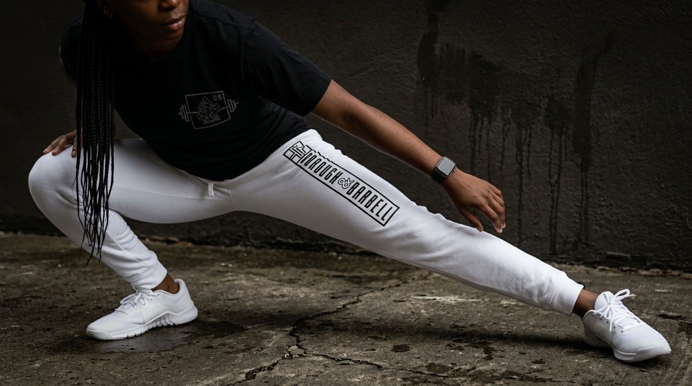
The bridge-and-skyline graphic gives the neon hoodie its loudest city moment. The boxed Borough & Barbell mark gives the black tee its core identity. The white jogger uses a vertical placement so the mark works with the body instead of sitting still.
The result is a drop that does not treat Brooklyn like a postcard. It treats Brooklyn like a load-bearing system: independent, connected, gritty, and built to carry weight.
Color System
Bridge Steel Black
Structure, shadow, and gym edge
East River White
Clean contrast and jogger base
Borough Signal Volt
City energy and high visibility
Brownstone Concrete
Street texture and city neutral
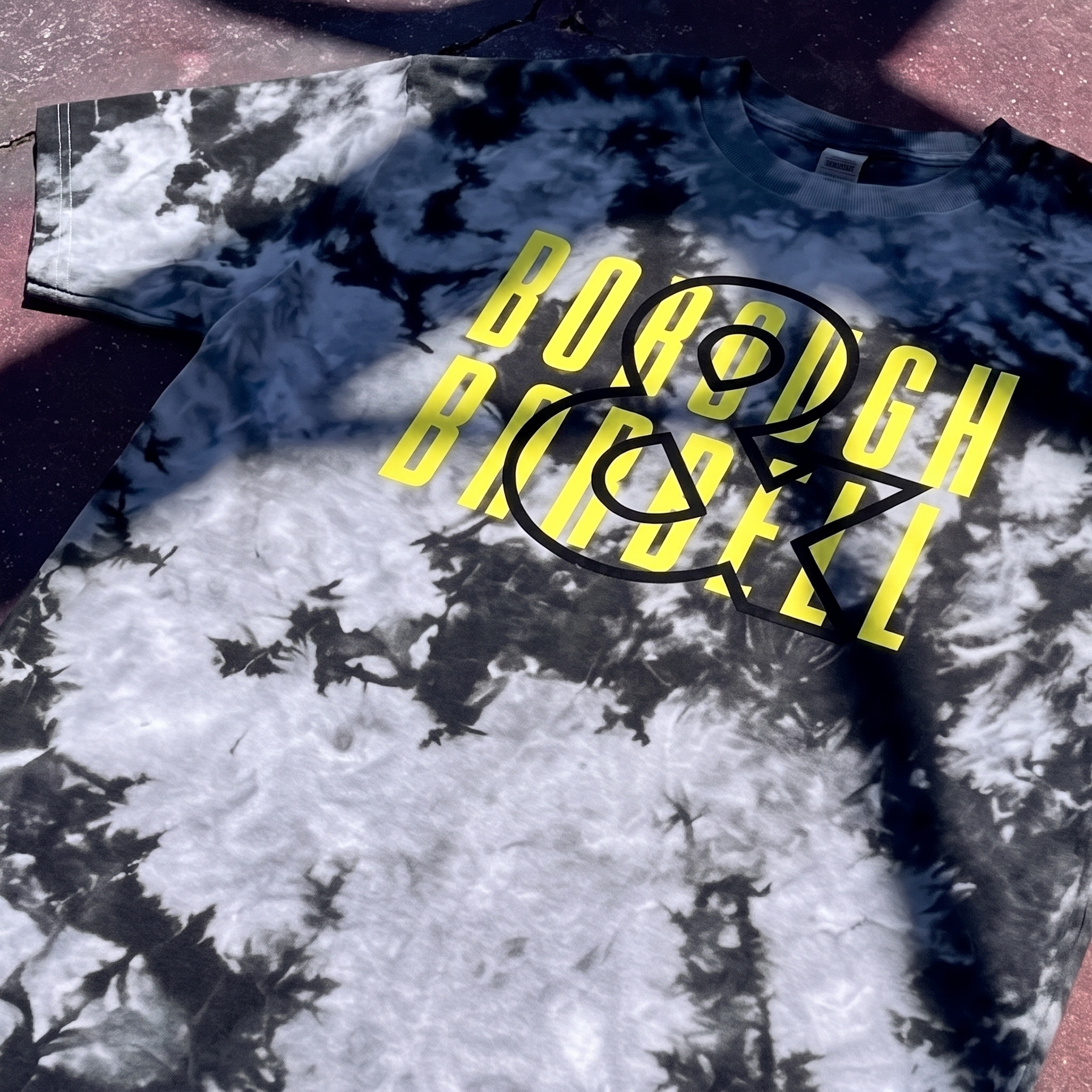
Pigment Dye Borough Tee
The pigment dye tee adds a washed streetwear layer to the system, using stacked yellow Borough Barbell type over the oversized BB bridge icon. The high-signal yellow was chosen to cut through the black-and-white dye pattern while the oversized icon creates a stronger overprint effect across the chest.
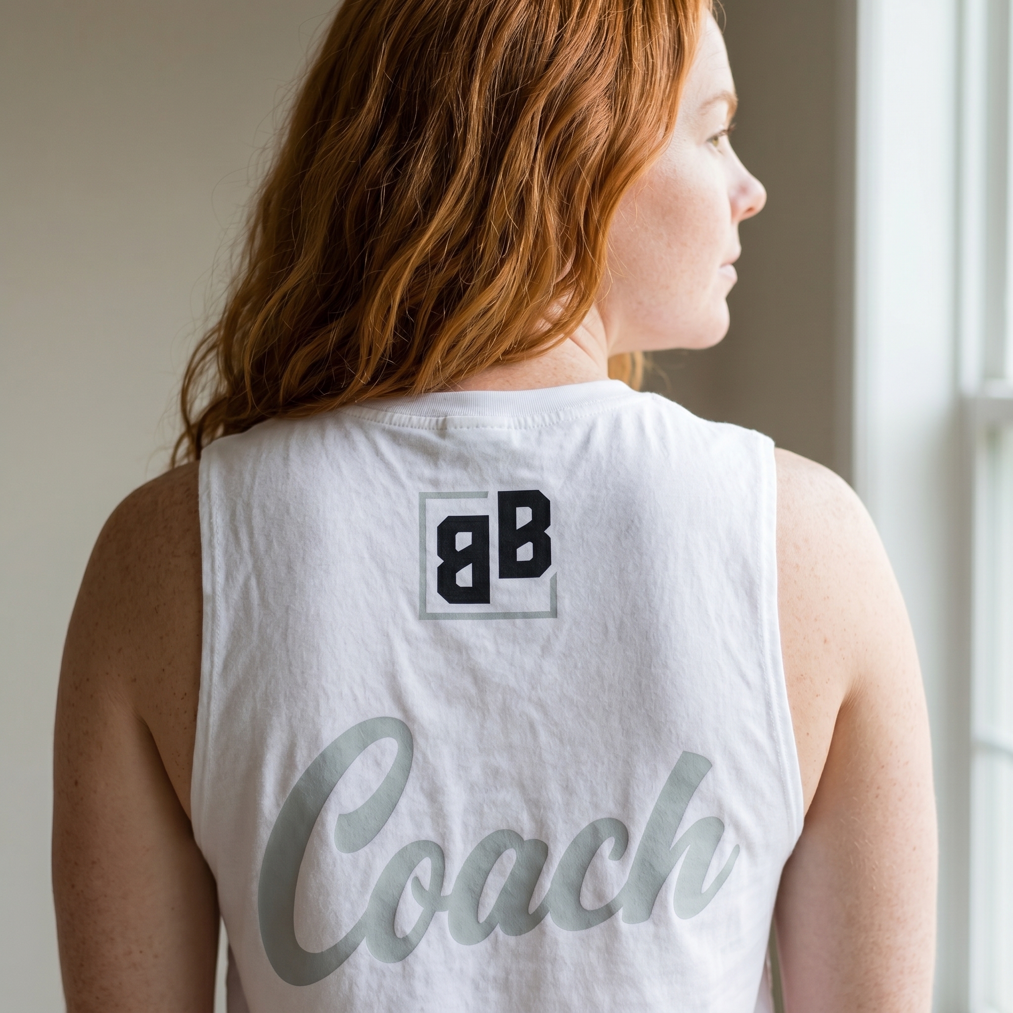
The Coach Tank
The coach tank keeps the back view clean, using the small BB mark near the collar and a large tonal Coach script to make the staff piece feel more editorial than standard team gear.

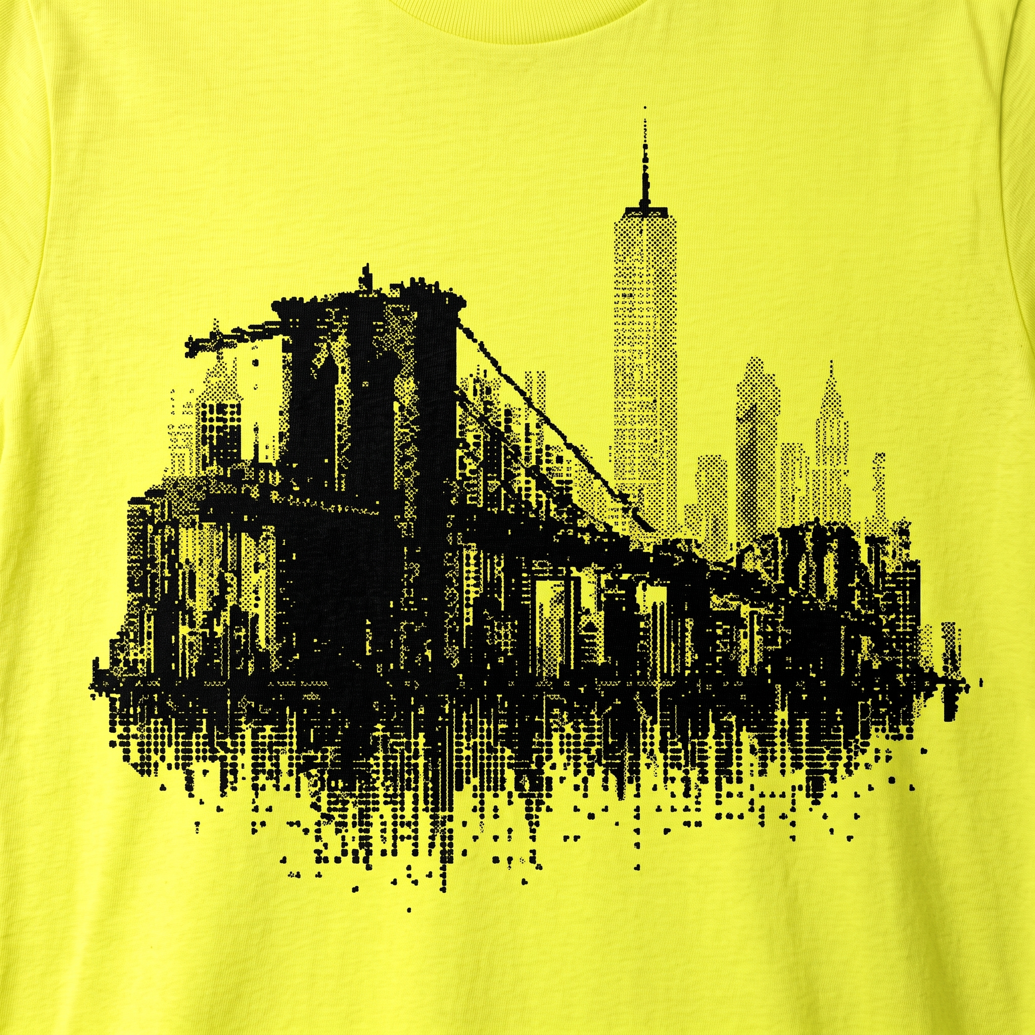
Glitch Bridge Neon Hoodie
The short sleeve hoodie features a modern glitch style rendering of the Brooklyn Bridge.
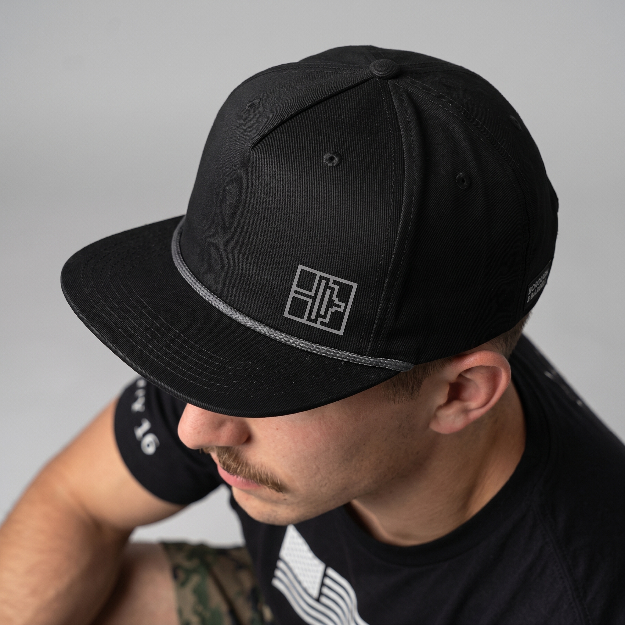
Rope Hat With Small B&B Icon
The rope hat strips the system down to a small BB bridge mark, giving the collection a quiet everyday piece with a stronger streetwear read.
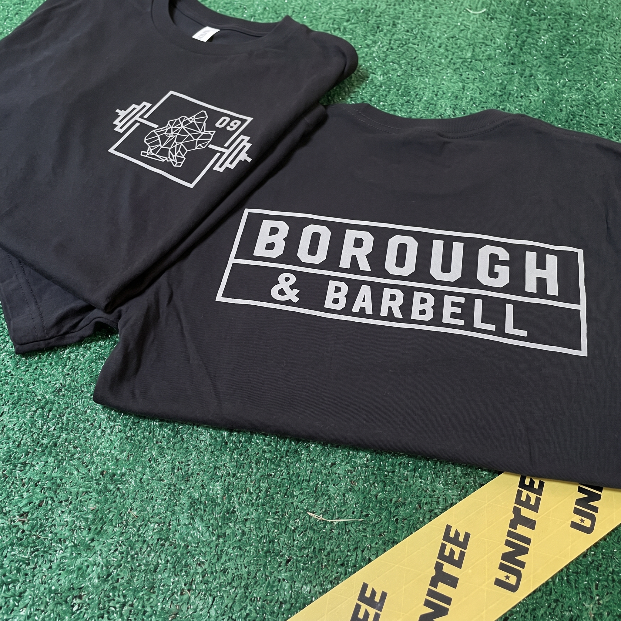
Black Drop In Shirt
A core staple for drop-ins
The White Jogger
The white jogger turns the identity into a vertical mark, letting the graphic travel with the athlete instead of staying locked to the chest.
UNITEE Design Lab
Concept cars for custom gym apparel.
The UNITEE Design Lab works like concept cars for gym apparel. We start with an idea, then turn it into a real concept people can see: a shirt, hat, hoodie, uniform set, or full merch drop. Then we explain the thinking behind it. Why this garment? Why this graphic? Why this placement? Why this kind of finish? The work is built to inspire, test new ideas, and give our clients better custom gym apparel before they ever place an order.
For larger fitness brands, multi-location gyms, event groups, and enterprise clients, the Design Lab is where brand kits and full merch programs take shape. We build the look, then we print the gear. That means the same team can help shape the brand story, plan the apparel, design the graphics, and produce the final pieces.
For an independent gym owner, the value is simple: you get the benefit of our research and development without needing to buy a full brand package. Your order may be a small run of tees, hats, hoodies, or event shirts, but the thinking behind it comes from a team that studies gym merch every day.
Need better gym merch?
Tell us what you are trying to make. We can help with one shirt, a full drop, or a larger apparel program.
Start a Design Lab Conversation