
UNITEE Design Lab / San Antonio, Texas
Fiesta Fitness
San Antonio gives this collection a strong place to stand: mission stone, River Walk movement, Fiesta color, Texas grit, Tejano identity, and the SATX shorthand locals know right away.
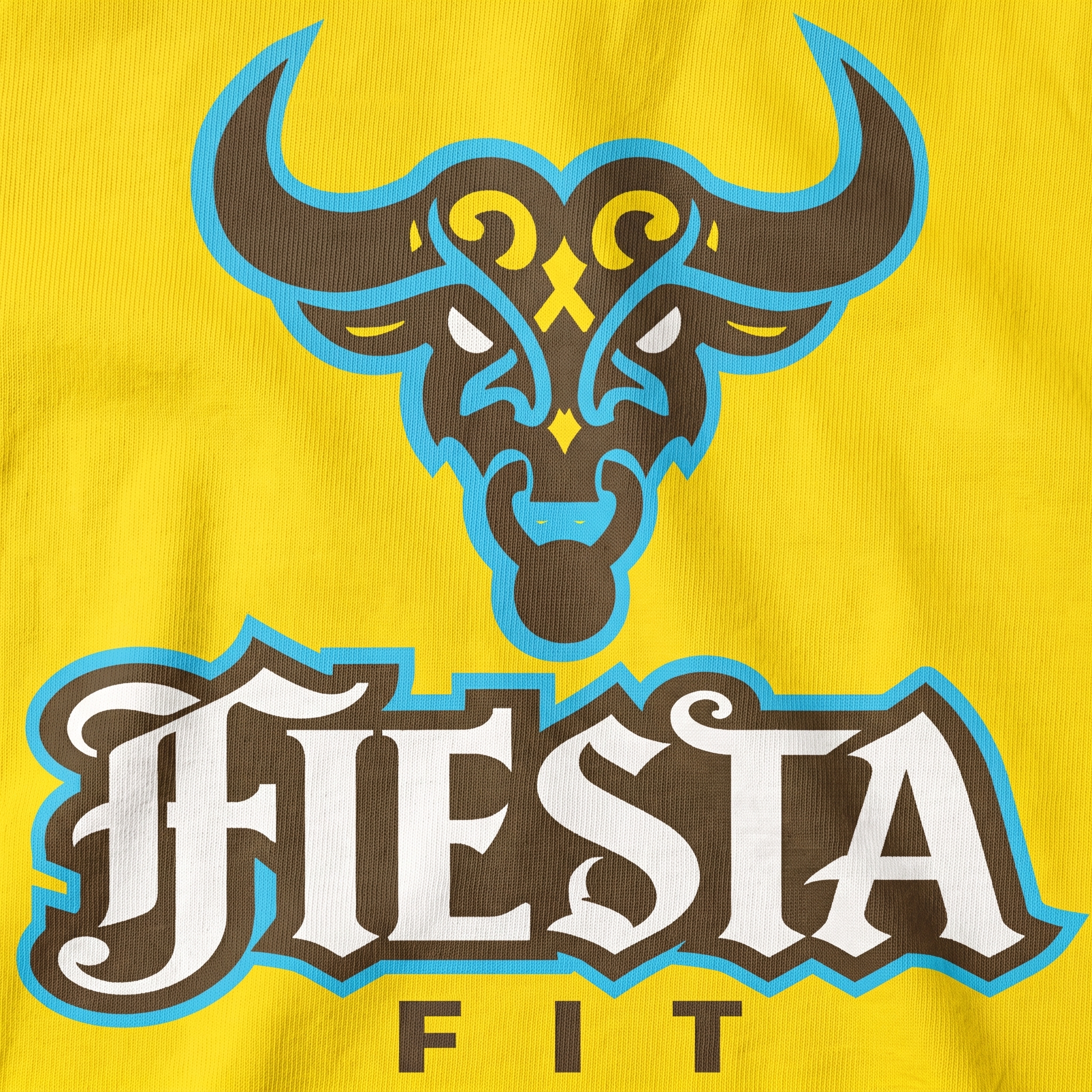
For Fiesta Fitness, the design system was built around a Tejana Gothic bull icon. The mark blends the strength of a Texas longhorn with darker ornamental linework, borderland tension, and Mexican-American visual influence, giving the collection a local edge that feels more specific than a standard western gym graphic.
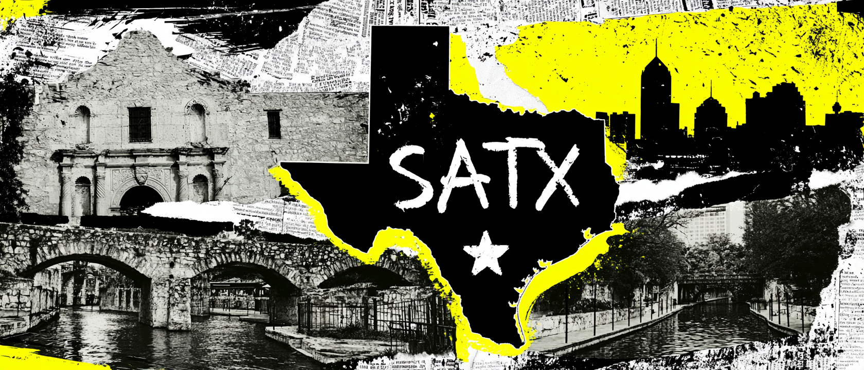
Mission Stone, Fiesta Color, Tejana Gothic, And SATX Identity
A Darker Read On City Pride.
San Antonio’s history starts with mission, river, and settlement. Mission San Antonio de Valero was founded in 1718, along with the nearby presidio and civil settlement that became San Antonio de Béxar. That early Spanish colonial layer still shapes the city visually through limestone walls, arched forms, mission facades, plazas, and stonework that feels old, public, and built by hand.
The Alamo gives the city one of its clearest symbols, but San Antonio’s identity is bigger than one landmark. The River Walk turned the city’s waterway into a civic space of bridges, walkways, shade, restaurants, and movement, with major river improvements tied to late-1930s public works. That mix of old stone and public flow gave the collection its balance of heritage, motion, and street-level energy.
Fiesta adds the loudest color note. The celebration traces back to the 1891 Battle of Flowers Parade, originally created to honor the memory of the Alamo and the Battle of San Jacinto. Over time, that civic memory grew into a citywide expression of music, medals, parades, bright color, local pride, and Mexican-American influence.
The graphic system pulls from those layers through a Tejana Gothic lens. Tejana Gothic blends dark, macabre, or Gothic motifs with Mexican-American culture in Texas, often touching folklore, borderland struggle, identity, and the supernatural. That is why the bull icon is not treated as a clean western mascot; it uses shadow, sharp curves, ornamental detail, turquoise glow, Fiesta yellow, mission cream, SATX type, and bold coach placements to make the collection feel festive, local, and slightly ominous.
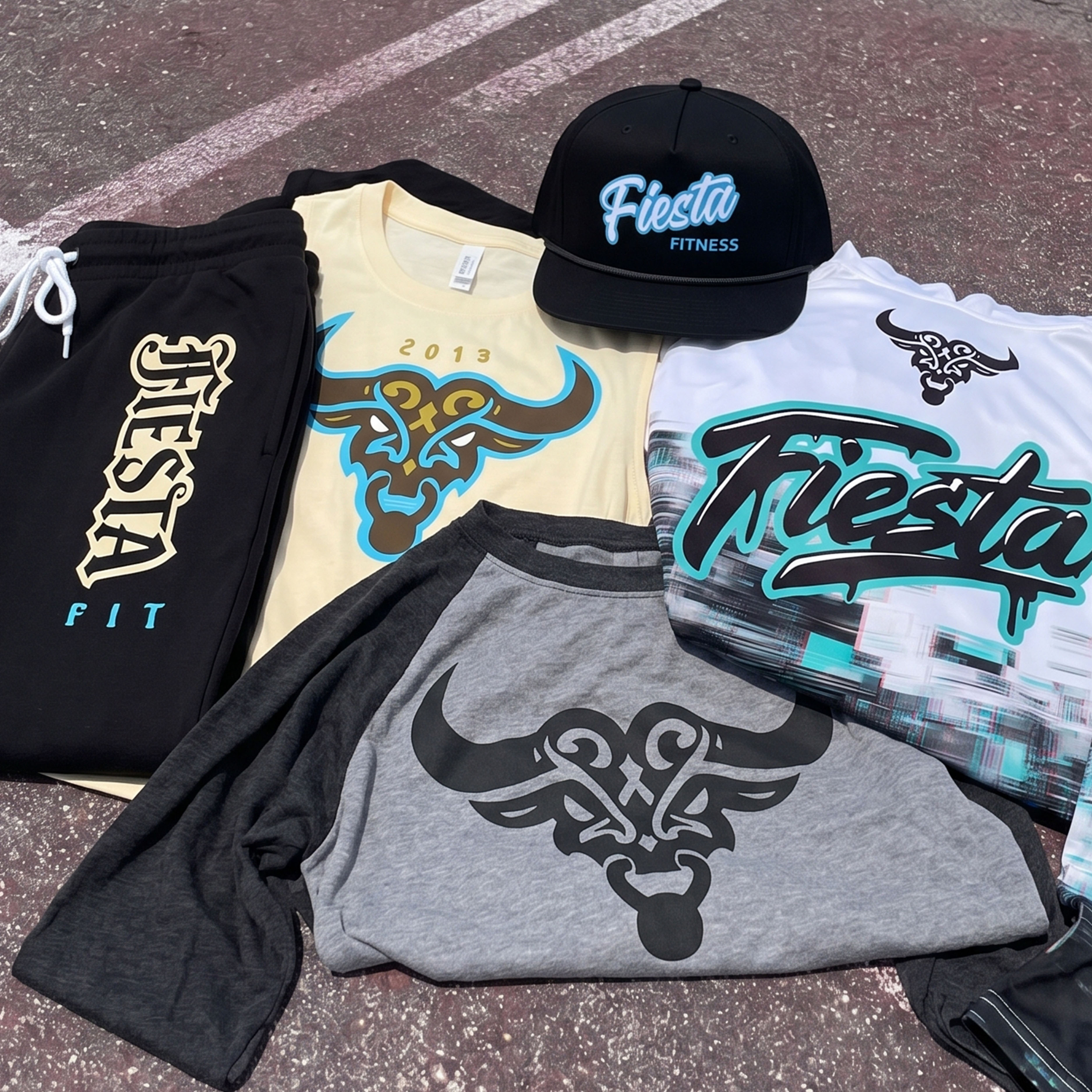
The collection brings the system together through Fiesta script marks, SATX utility type, coach apparel, joggers, hoodie graphics, rope cap embroidery, and the Tejana Gothic bull icon as the central character of the drop.
Concept + Design Rationale
The collection starts with a tension inside the name. “Fiesta Fitness” sounds bright, social, and celebratory, but San Antonio also has deeper visual layers: mission stone, folklore, borderland history, religious architecture, and darker western symbols. The design direction lets both sides exist at the same time.
The bull became the anchor because it could carry strength without feeling generic. Instead of drawing it as a standard Texas longhorn, the mark was built in a Tejana Gothic style, using heavy shadow, ornamental curves, pointed horn shapes, and an intense face structure to give the gym a darker regional mascot.
The type system keeps the collection from becoming too heavy. The Fiesta script brings movement and local celebration. The SATX shorthand gives the work a clear city stamp. The coach lettering, sleeve hits, jogger print, and smaller support type keep the system useful on real gym apparel.
The final result is a San Antonio collection with two clear moods: bright Fiesta energy on the surface, and a darker Tejano Gothic undercurrent inside the main icon. That contrast gives the apparel more story, more attitude, and a stronger reason to exist as a full drop.
Color System
River Turquoise
Used as a glow color around the bull mark to add contrast, movement, and River Walk energy
Gothic Black
Grounds the bull icon, rope cap, joggers, shadows, and darker Tejana Gothic mood
Mission Cream
References stone, aged signage, and vintage athletic wear while softening the system
Fiesta Yellow
Adds civic celebration, heat, and high visibility across tees, stripes, and graphic accents
Stone Grey
Used for the raglan body to connect the mascot piece back to mission walls and street texture
River Walk White
Creates a clean technical base for the hoodie and keeps the brighter marks readable
Fiesta Rope Cap
The rope cap reduces the full system to a compact embroidered Fiesta mark on black. The turquoise border was used to lift the white script off the crown and keep the accessory tied to the River Walk color note in the larger collection.
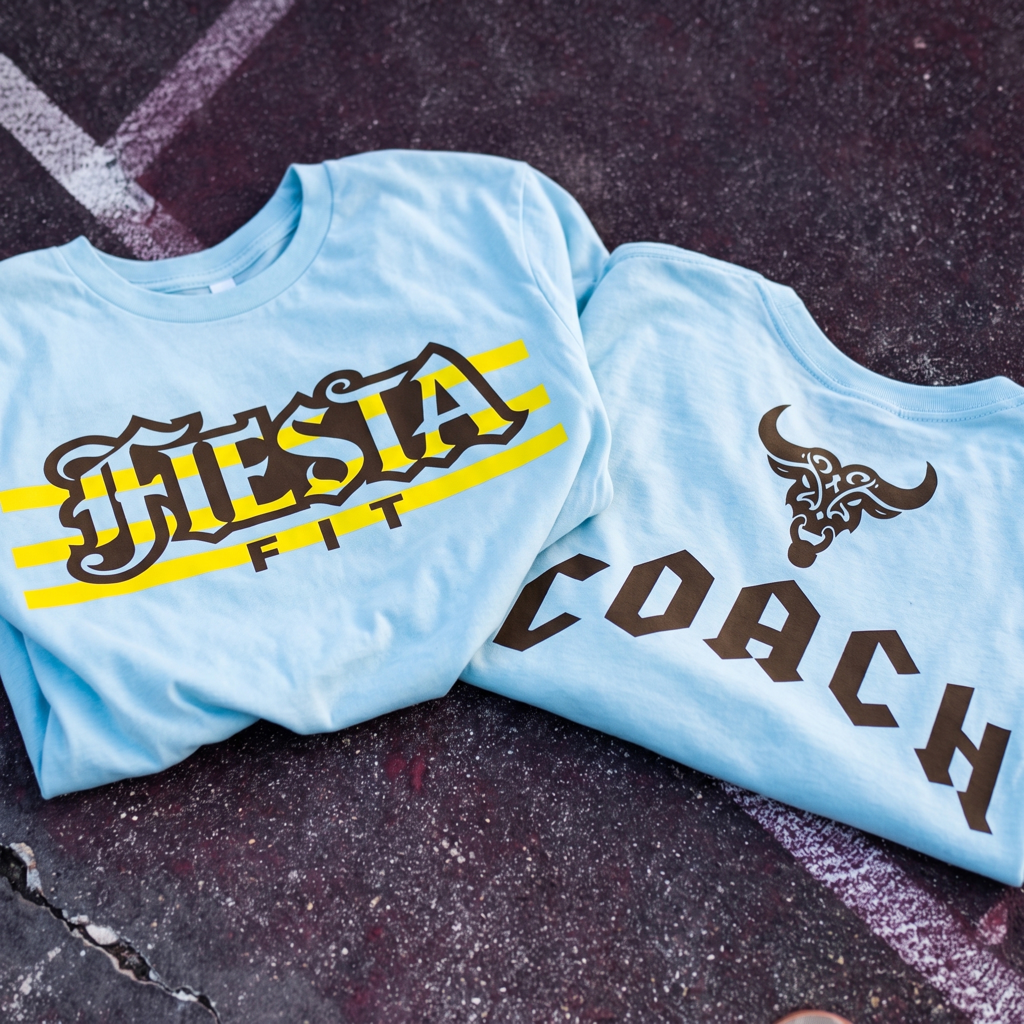
Coach's T Shirt
The coach tee uses large dark lettering with the bull icon placed above it, giving staff apparel a clear role inside the system. The lighter blue garment was selected to give the coach piece a calmer training feel while the dark type keeps it readable from across the gym.
River Walk Performance Hoodie
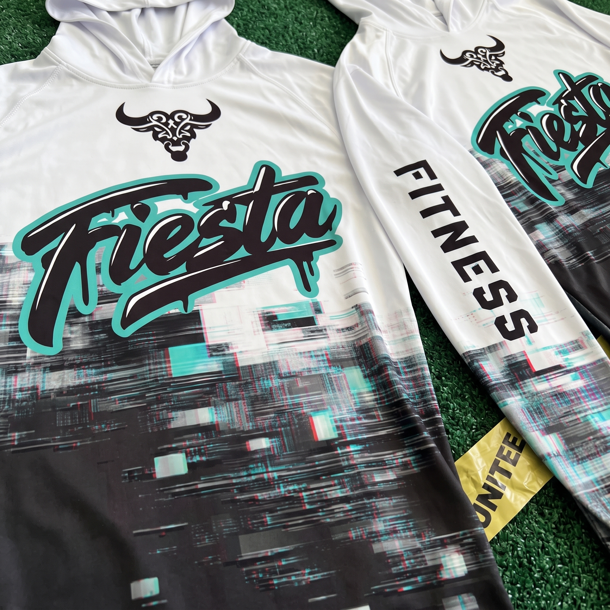
The performance hoodie brings the Fiesta script into a cleaner technical garment, using the bull at the chest and fitness type down the sleeve. The broken black lower texture adds motion and shadow so the white hoodie still carries some of the Tejana Gothic attitude.
Fiesta Fit Jogger
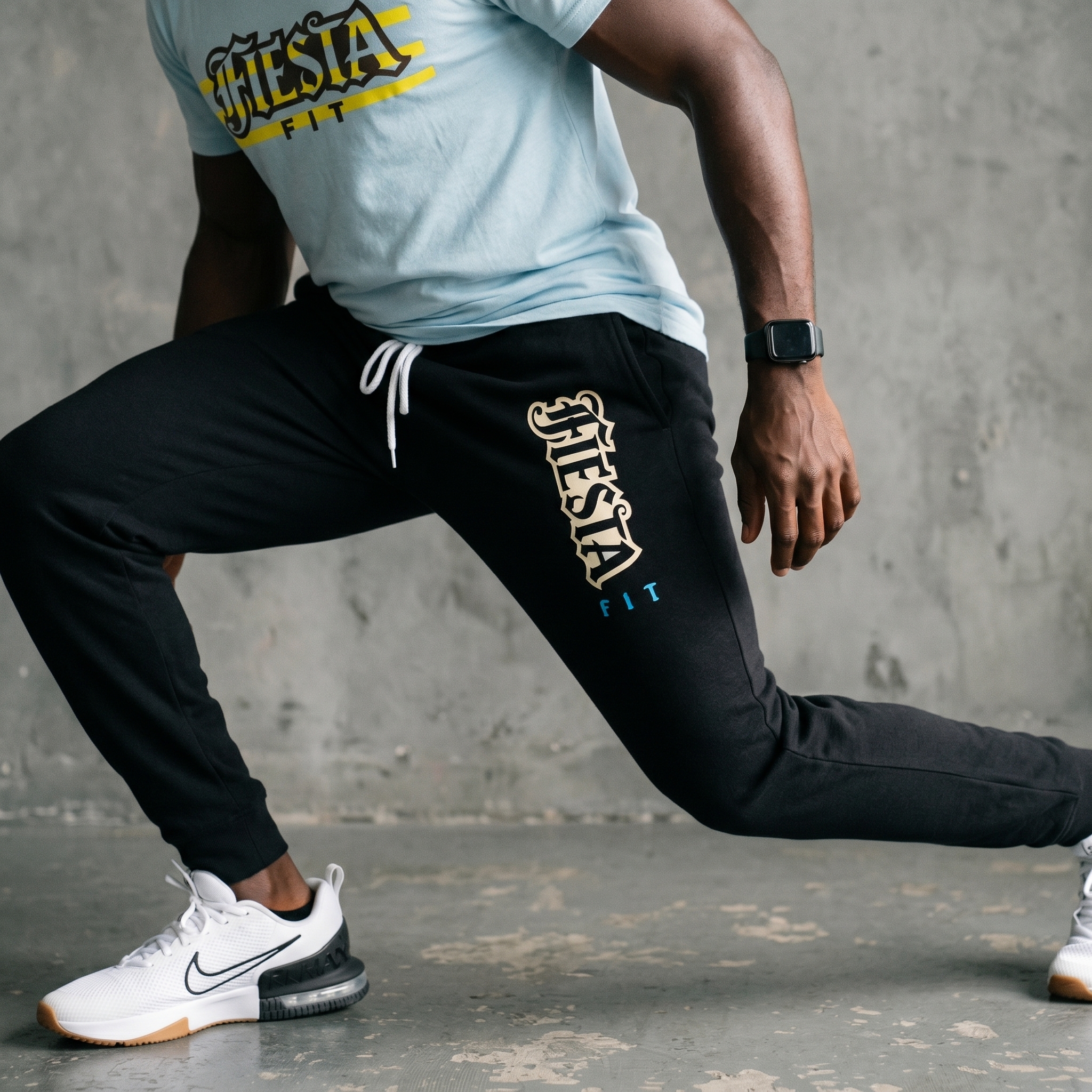
The jogger carries the decorative Fiesta lettering down the leg, turning the lower-body piece into a designed part of the drop. The cream print was used instead of pure white to soften the contrast against black and connect the piece back to mission stone and vintage signage.
Tejana Gothic Bull Raglan
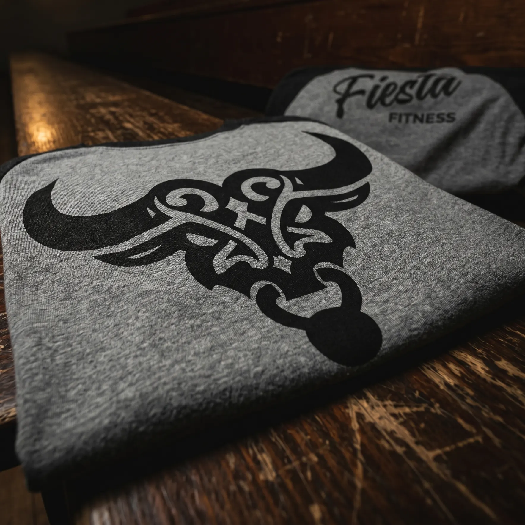
The raglan gives the collection its strongest character piece, placing the Tejana Gothic bull large on a grey athletic body with black sleeves. The one-color print was used to keep the ornamental linework readable while making the bull feel darker, tougher, and more wearable for training.
UNITEE Design Lab
Concept cars for custom gym apparel.
The UNITEE Design Lab works like concept cars for gym apparel. We start with an idea, then turn it into a real concept people can see: a shirt, hat, hoodie, uniform set, or full merch drop. Then we explain the thinking behind it. Why this garment? Why this graphic? Why this placement? Why this kind of finish? The work is built to inspire, test new ideas, and give our clients better custom gym apparel before they ever place an order.
For larger fitness brands, multi-location gyms, event groups, and enterprise clients, the Design Lab is where brand kits and full merch programs take shape. We build the look, then we print the gear. That means the same team can help shape the brand story, plan the apparel, design the graphics, and produce the final pieces.
For an independent gym owner, the value is simple: you get the benefit of our research and development without needing to buy a full brand package. Your order may be a small run of tees, hats, hoodies, or event shirts, but the thinking behind it comes from a team that studies gym merch every day.
Need better gym merch?
Tell us what you are trying to make. We can help with one shirt, a full drop, or a larger apparel program.
Start a Design Lab Conversation