
UNITEE Design Lab / New York, New York
New York Strength & Conditioning
New York Strength & Conditioning started with a name that already felt like a city idea. NY S&C echoes NYSE, turning the New York Stock Exchange into a gym-language hook built around pressure, numbers, trust, repetition, and return.
Wall Street began as a real street near a real wall in Dutch New Amsterdam. In 1792, the Buttonwood Agreement helped formalize a young securities market. That history gave the collection a stronger starting point than a typical gym acronym: the exchange floor and the training floor both reward measured effort before the payoff is obvious.
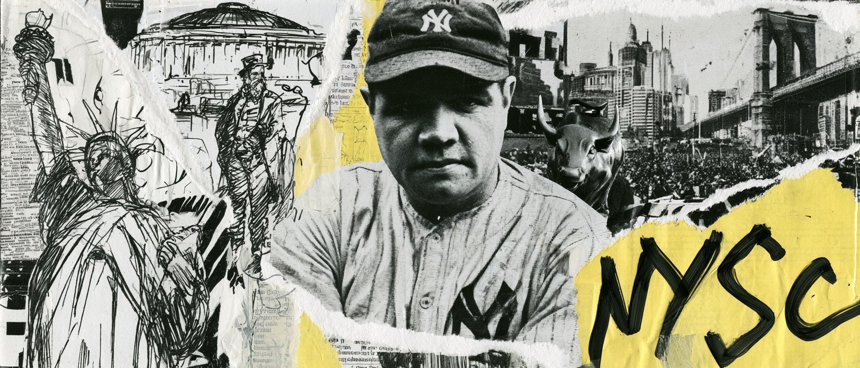
Wall Street, New Amsterdam, And Athletic Return
The exchange floor and the training floor.
The NY S&C name creates an immediate echo of NYSE, so the identity could start with a real New York idea instead of a generic strength symbol. An exchange and a gym seem far apart, but both run on pressure, trust, repetition, numbers, confidence, and long-term return.
You show up, put something in, track the result, and come back again before the payoff is obvious. That became the project’s central design logic: market language translated into training apparel, Wall Street confidence translated into wearable marks, and New York color memory translated into a full collection.
Blue and orange were chosen because they already belong to the city. The colors connect to New York’s civic memory and to the familiar athletic language of teams like the Mets and Knicks. That gave the apparel local recognition without needing to lean on a skyline souvenir treatment.
The mascot adds an older New York layer. A Knickerbocker points back to Dutch New York and the knee-length pants associated with that era. Instead of treating the character as a museum piece, the collection puts him under a barbell, turning old civic history into a training graphic.
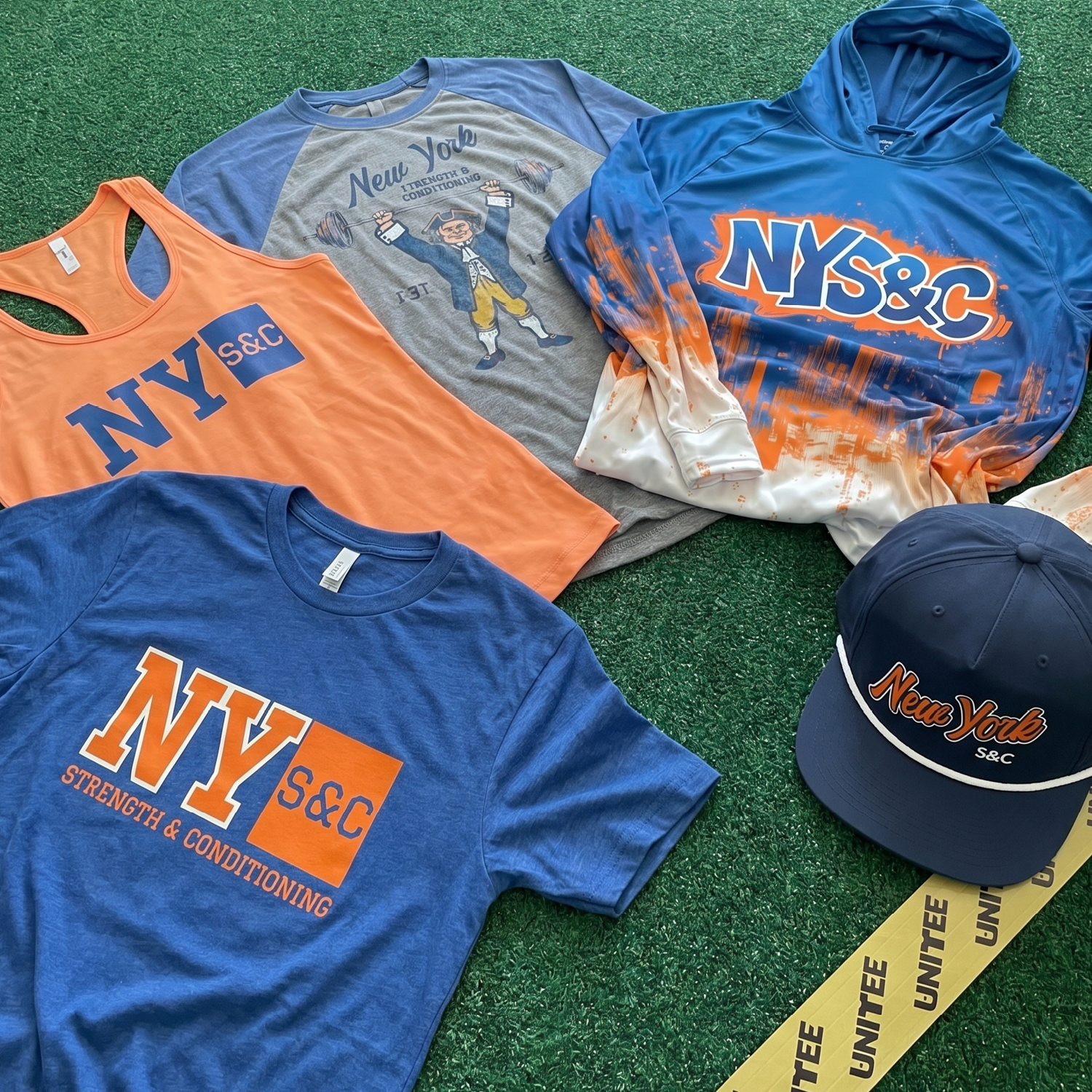
The Collection brings the system together: primary tees, coach tanks, a performance hoodie, joggers, rope cap, Knickerbocker raglan, blue-orange marks, cityscape graphics, and a Wall Street-inspired identity built for real gym wear.
Concept + Design Rationale
The concept starts with the name. NY S&C sounds close to NYSE, and that gave the brand a sharp local hook. The challenge was restraint: the apparel needed to carry Wall Street pressure, civic color, and gym utility without becoming a finance costume.
The primary lockup uses large NY letters, an S&C block, and a blue-orange field that reads quickly from a distance. It feels market-board direct, but still belongs on training apparel.
The supporting system spreads the idea across different garment roles. The cap uses script embroidery to soften the harder block mark. The joggers use vertical placement to create motion. The performance hoodie turns the cityscape into a full-body production piece. The Knickerbocker raglan carries the oldest New York story in the drop.
The goal was to create a retail-ready language with room for members, coaches, events, and future drops: New York ambition, Wall Street tension, blue-orange memory, and strength culture working as one system.
Color System
Exchange Blue
Primary New York base color for tees, joggers, and performance pieces
Market Orange
High-energy contrast color tied to New York sports memory and urgency
Trading Floor Navy
Headwear and embroidery neutral that keeps the system classic
Coach Tank Peach
Warm apparel base that gives the women’s coach lane its own read
Industrial Grey
Raglan and production neutral for old-city texture and mascot pieces
City White
Contrast color for rope details, outlines, skyline fade, and production clarity
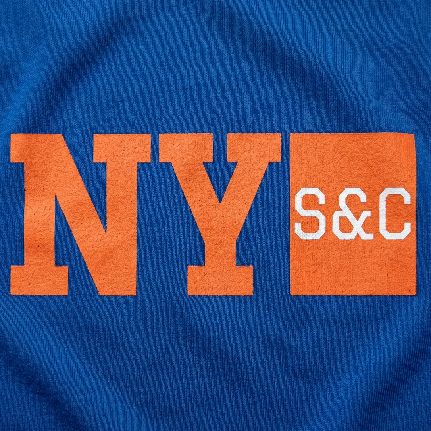
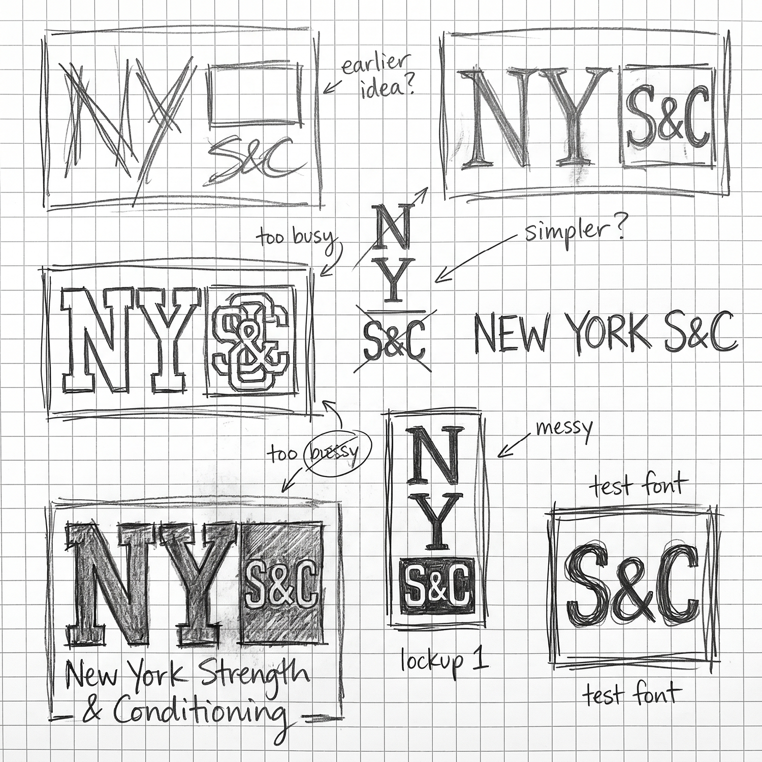
Thumbnail Sketches
The sketch phase explored stacked letters, tight logo blocks, athletic type, and more corporate-looking structures before the system was simplified into something bold enough to wear and clean enough to produce.
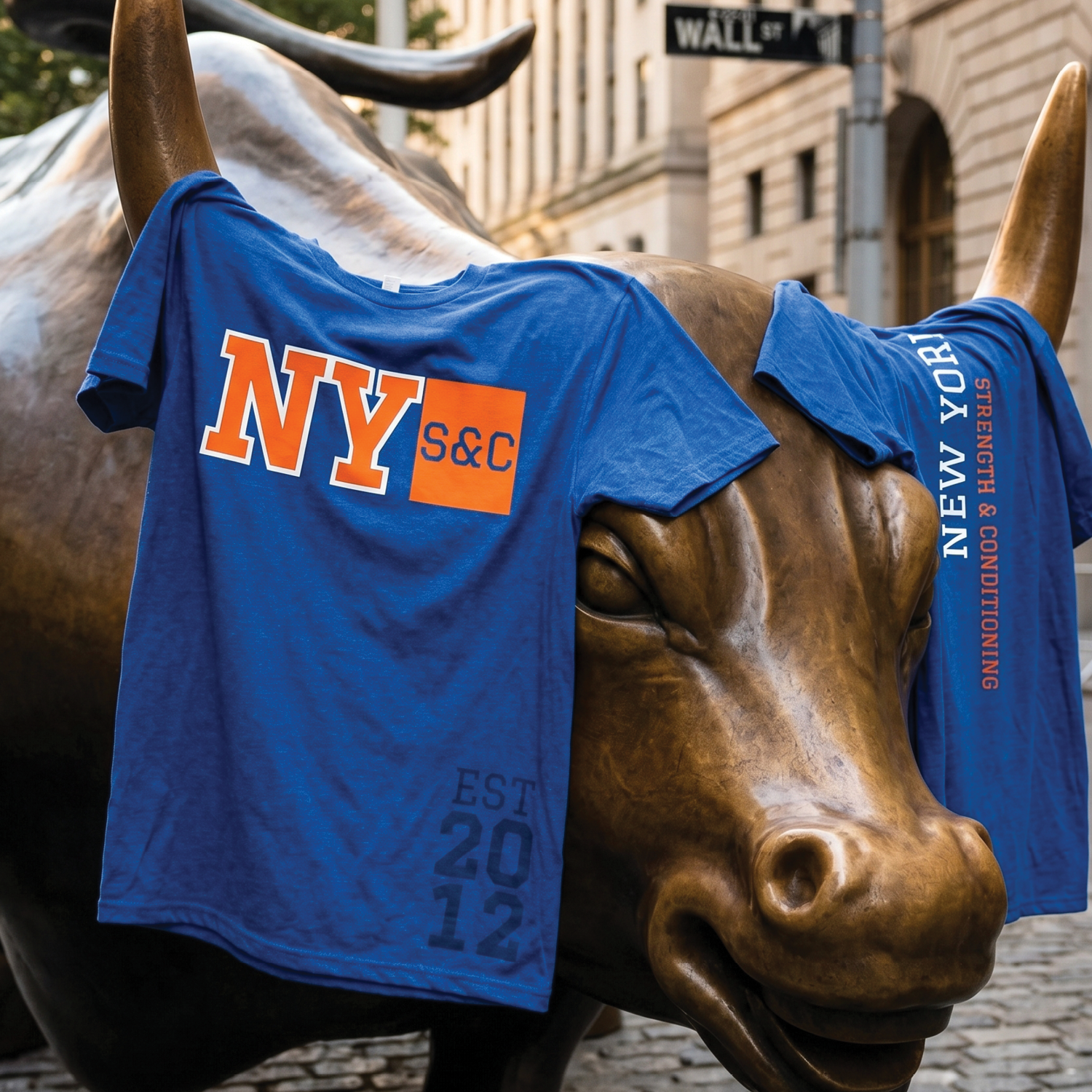
Wall Street Bull Tee Set
The bull placement connects the apparel back to force, risk, confidence, and forward motion, all ideas that sit naturally beside a strength and conditioning organization built around measured progress.
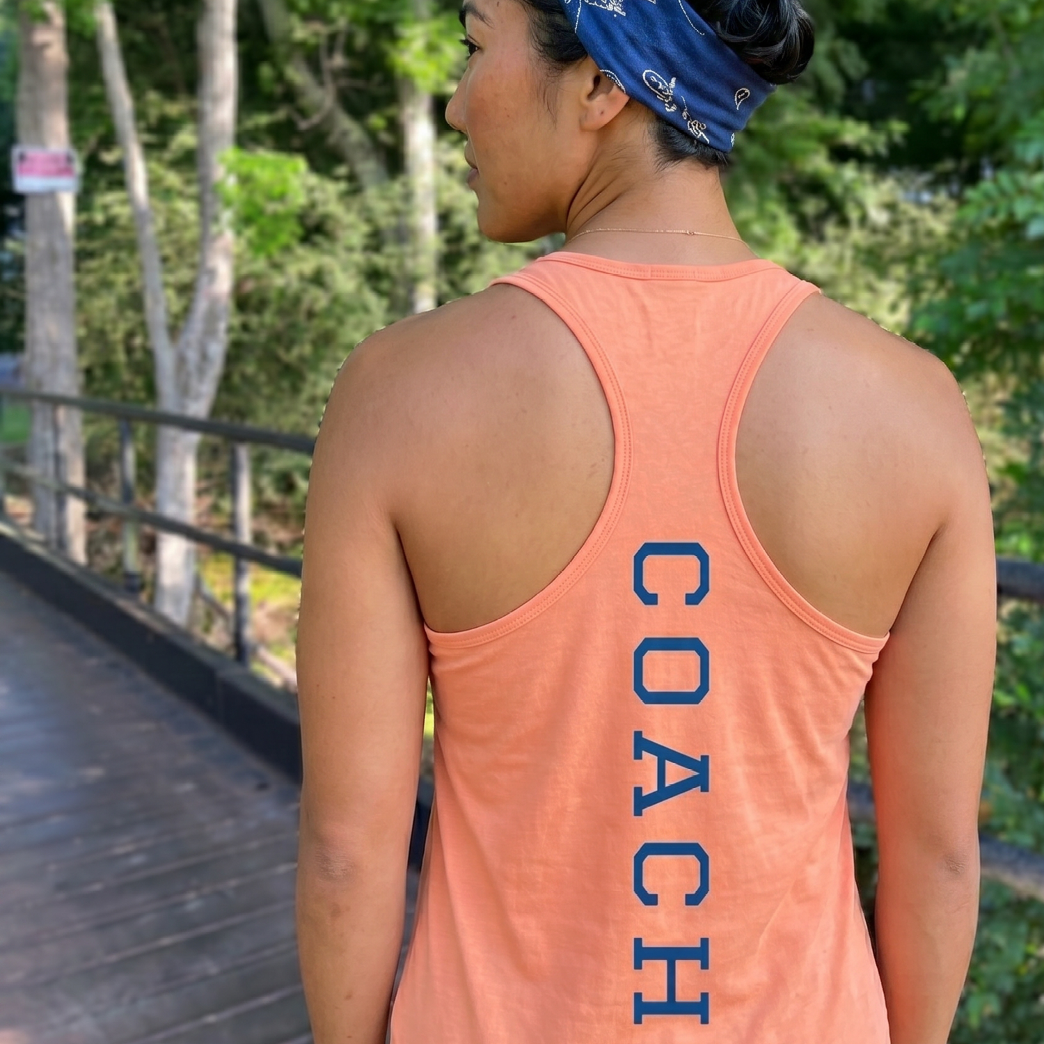
Peach Coach Racerback
The coach tank keeps the front clean and lets the back detail do more of the work, giving staff apparel a clear role without repeating the main NY S&C lockup.
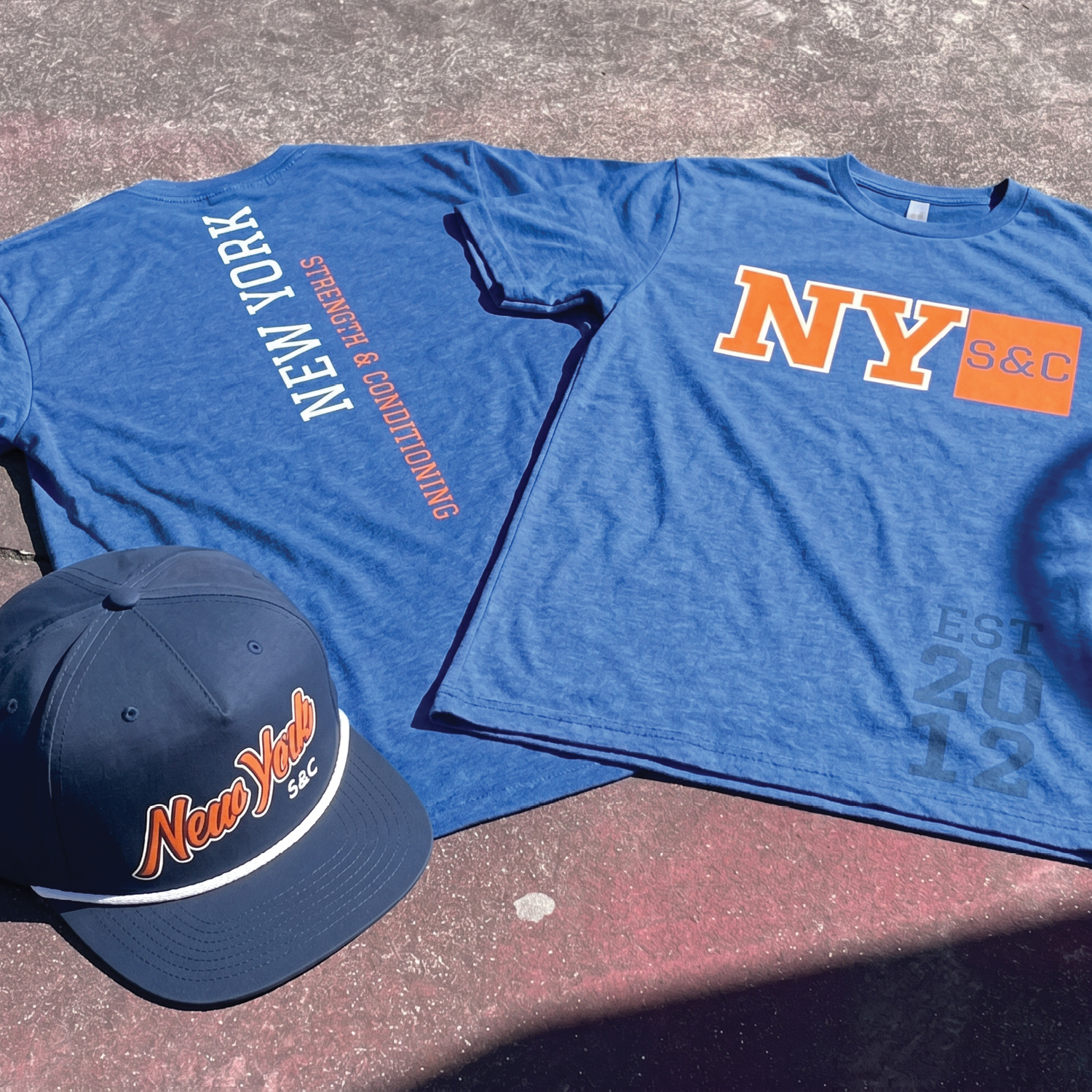
Primary Blue Tee + Rope Cap
The primary tee carries the clearest NY S&C lockup, while the rope cap gives the same identity a smaller everyday format with classic New York attitude.
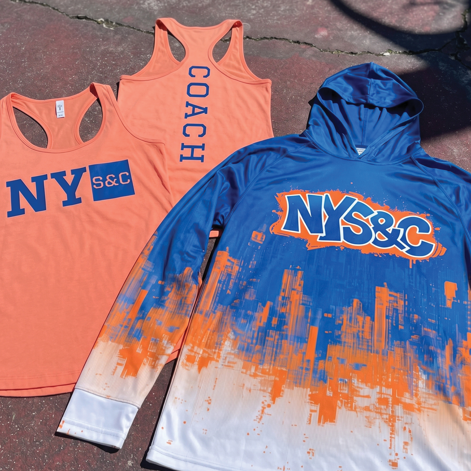
NYSC Glitch City Hoodie + Coaches Shirt
Made to be bold, inspired by color systems that New Yorkers already know and love
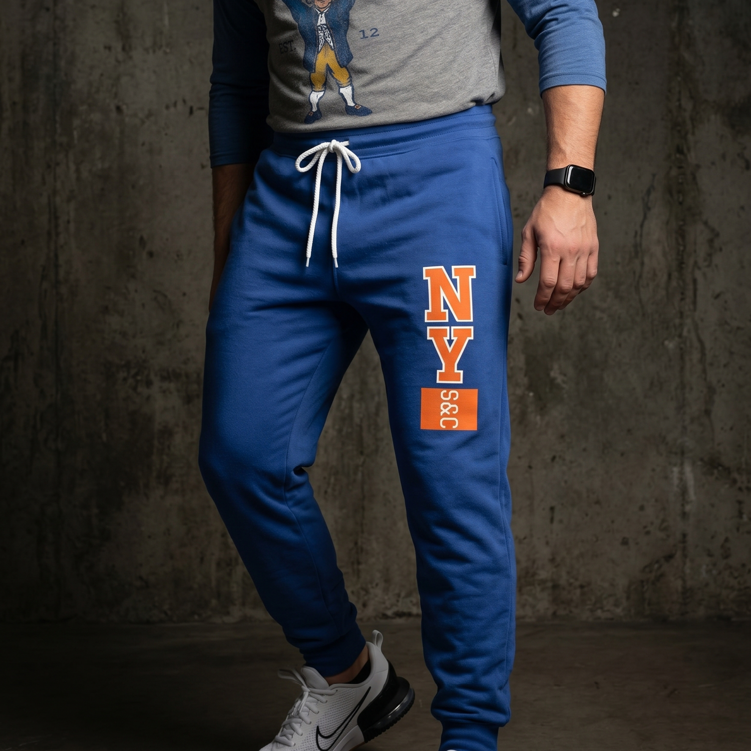
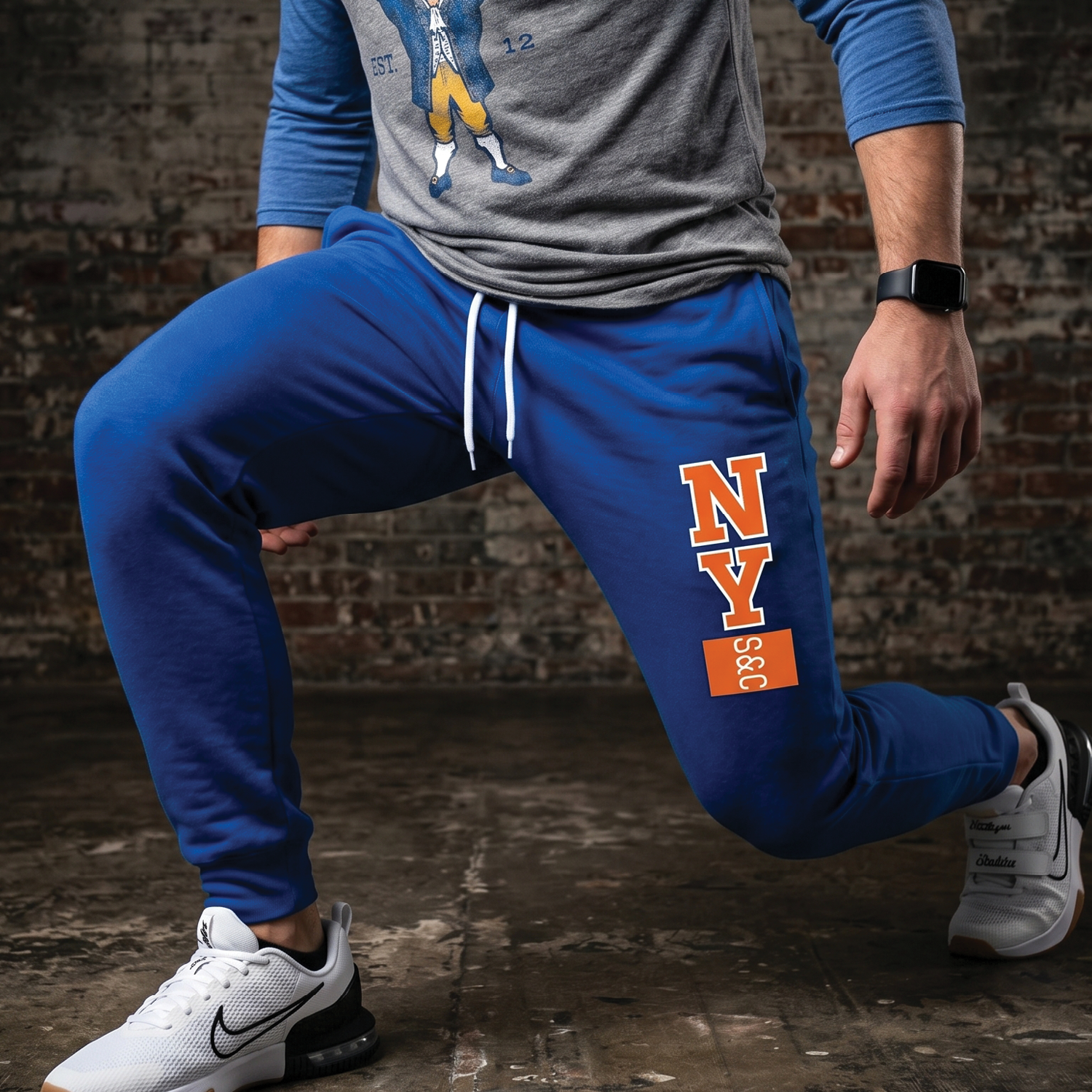
Exchange Floor Training Jogger
The vertical leg mark borrows from ticker movement, stacked information, and athletic utility, giving the identity another point of contact when the apparel is seen in motion.
The jogger placement keeps the logo visible without crowding the main shirt graphics, making the lower-body piece feel like part of the system instead of a blank add-on.
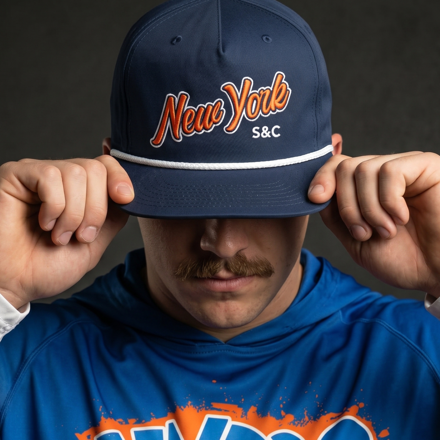
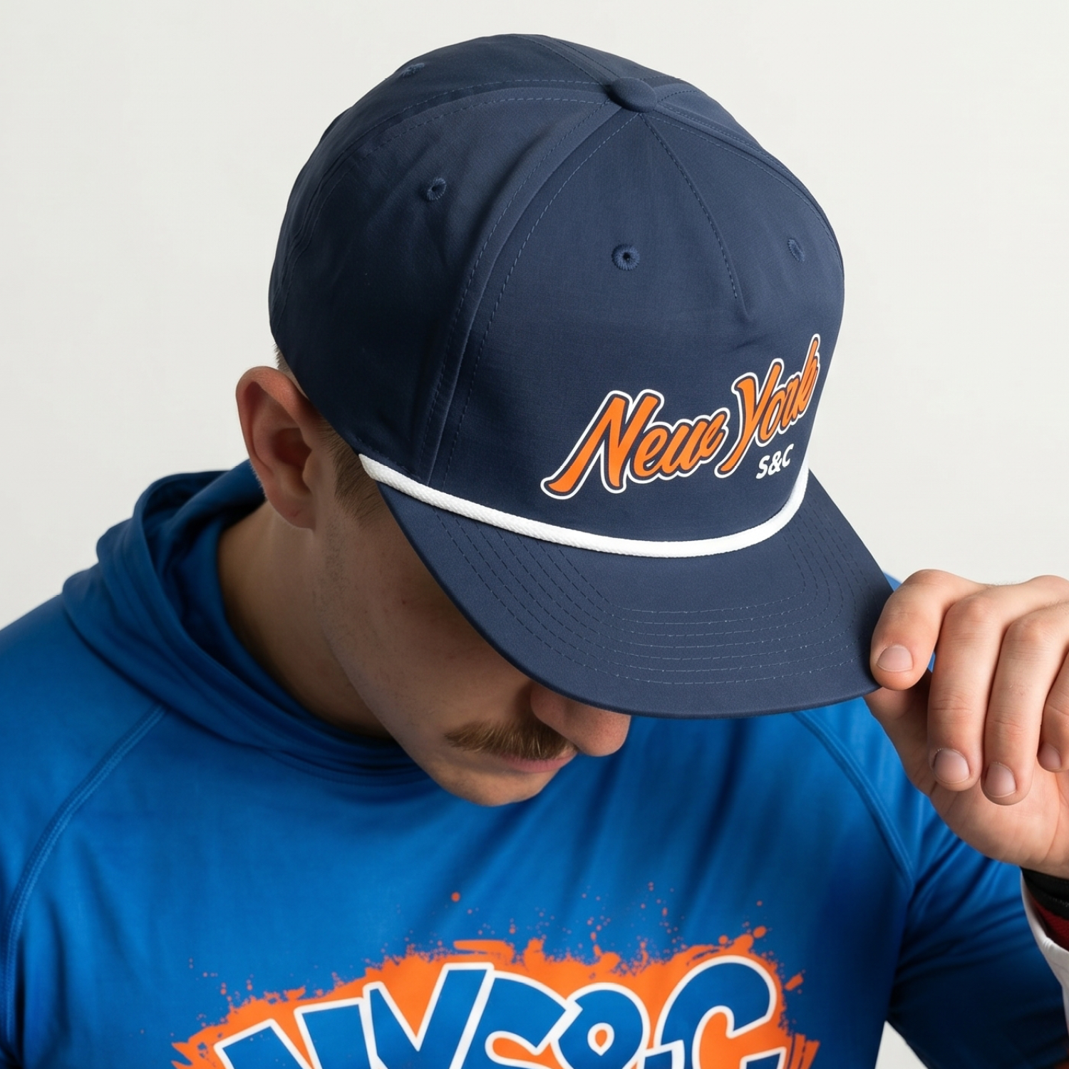
Navy Script Rope Cap
The cap brings the identity into a format that feels classic, wearable, and immediate, with script embroidery softening the harder block language of the main logo.
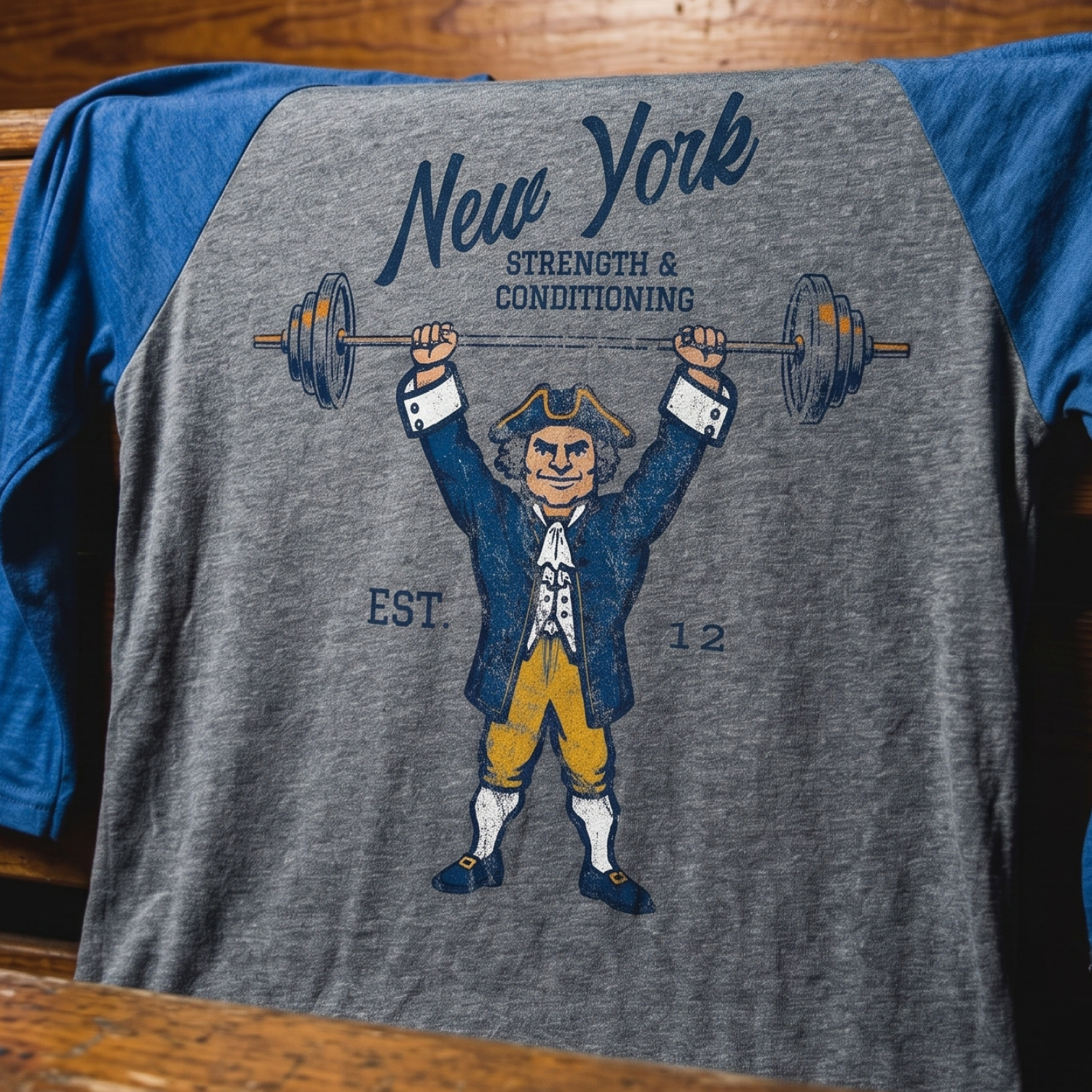
Old New York Knickerbocker Raglan
The raglan introduces the collection’s most historic character: a classic Knickerbocker put to work under a barbell, connecting New Amsterdam, New York athletic color, and modern strength culture.
The mascot gives NY S&C a heritage character that can extend into raglans, event tees, stickers, youth pieces, and future drops without replacing the main NY S&C identity.
UNITEE Design Lab
Concept cars for custom gym apparel.
The UNITEE Design Lab works like concept cars for gym apparel. We start with an idea, then turn it into a real concept people can see: a shirt, hat, hoodie, uniform set, or full merch drop. Then we explain the thinking behind it. Why this garment? Why this graphic? Why this placement? Why this kind of finish? The work is built to inspire, test new ideas, and give our clients better custom gym apparel before they ever place an order.
For larger fitness brands, multi-location gyms, event groups, and enterprise clients, the Design Lab is where brand kits and full merch programs take shape. We build the look, then we print the gear. That means the same team can help shape the brand story, plan the apparel, design the graphics, and produce the final pieces.
For an independent gym owner, the value is simple: you get the benefit of our research and development without needing to buy a full brand package. Your order may be a small run of tees, hats, hoodies, or event shirts, but the thinking behind it comes from a team that studies gym merch every day.
Need better gym merch?
Tell us what you are trying to make. We can help with one shirt, a full drop, or a larger apparel program.
Start a Design Lab Conversation