Inspired by what you see?

Need A Design Like This In Your Life?

CrossFit 404: Signal Repeat

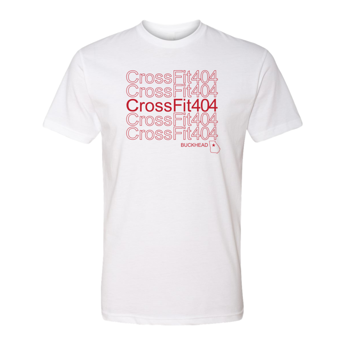
CrossFit 404 Buckhead said their name five times on one shirt and somehow made it look like high fashion.

Overview

Printed in red on a white tee, the design repeats "CrossFit404" five times in a stacked grid with the center row in solid red and the rows above and below in outline only, fading toward the edges. "Buckhead" sits below with the Georgia state outline and a star marking Atlanta. The outline to solid gradient effect pulls from modern streetwear typography trends. Front center placement gives the repeating grid the full chest to work with.

Results

The repeat pattern treatment is one of those design moves that looks simple but requires real intention to execute well. The fade from outline to solid keeps the eye moving and makes it feel more dynamic than a standard wordmark. White tees with a clean graphic like this one get worn constantly because they go with everything.

View More Work:

Love What You See? Make This Layout Yours!

Tell us what to swap, and our team will send you a digital proof and quote ASAP!*


*Some of the artwork presented in our portfolio is our client’s actual logos. While you are free to use anything you see as inspiration, out of respect for that client we’d obviously revise any artwork and make it more individual to your specific group or event.