Inspired by what you see?

Need A Design Like This In Your Life?

CrossFit Amite: Challenges Defeated

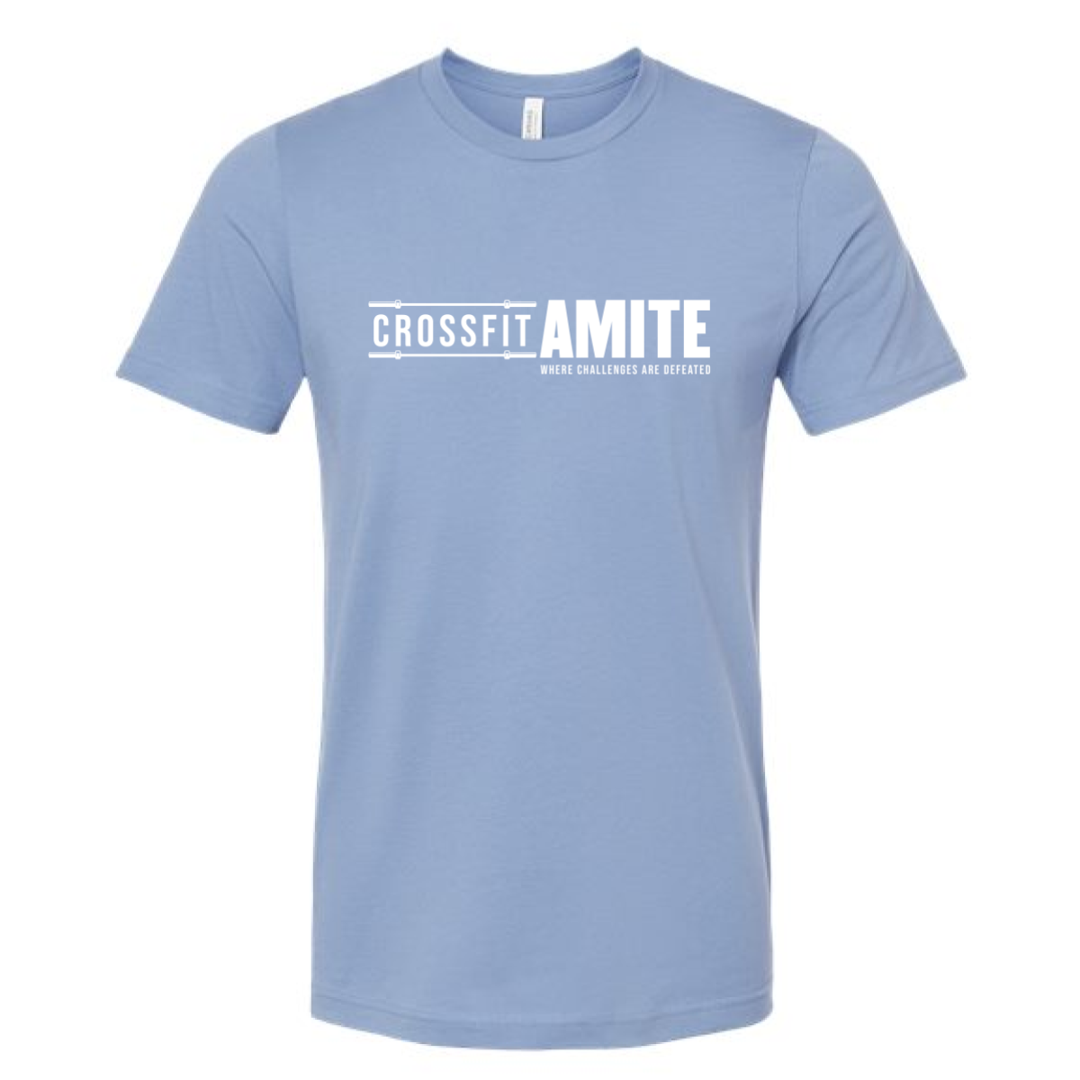
Clean wordmark, sky blue tee, five-word tagline. CrossFit Amite made their everyday shirt and got the messaging exactly right.

Overview

Printed in white on a slate blue tee, the design pairs a smaller "CrossFit" in a barbell-accented frame with a larger bold "AMITE" and "Where Challenges Are Defeated" as a small subtitle beneath. The barbell rule lines above and below the wordmark are a subtle design detail that ties the gym's identity to the sport without being heavy-handed about it. Front center placement keeps it clean and confident.

Results

The tagline is the quiet star of this shirt. It is direct, it means something, and it fits on one line without trying to explain itself. The slate blue base makes it wearable every day of the week and the clean layout means it ages well. This is the CrossFit Amite shirt members will still be wearing in five years.

View More Work:

Love What You See? Make This Layout Yours!

Tell us what to swap, and our team will send you a digital proof and quote ASAP!*


*Some of the artwork presented in our portfolio is our client’s actual logos. While you are free to use anything you see as inspiration, out of respect for that client we’d obviously revise any artwork and make it more individual to your specific group or event.