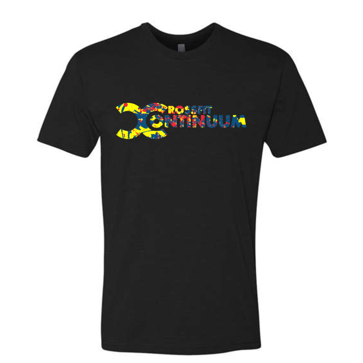
CrossFit Continuum: Primary Splatter
CrossFit Continuum took their logo, filled it with paint, and somehow made black feel like the most colorful shirt in the room.
Overview
Full color ink on a black tee. The Continuum logo mark and wordmark are filled with a bold paint splatter pattern in red, yellow, and blue — primary colors that pop hard against the black base. The splatter texture bleeds through every letter and the oversized "C" icon, giving the whole design a raw, energetic feel. Front center placement.
Results
The paint splatter treatment is one of those techniques that looks effortless but takes real design judgment to execute without going messy. Filling the actual letterforms keeps it controlled while the splatter does the expressive work. Primary colors on black is a combination that photographs extremely well and holds up season after season. These are the gym shirts that look like they belong in a streetwear drop as much as a CrossFit class.
View More Work:
CF Cayenne: Murph Flag Sweep
Urban Camo Black
Flag and Reps
U Can CrossFit: Murph Thin Line
Reno Power House Fitness: Murph We Honor
Industrial Athletics: Murph Camo Flag
Grid Lock
Yellow Tape
Coyote Run
Born Free Tan
CF Cayenne: Murph Stencil Field
Never Forget
Soldier Coin Copper
Centerville CrossFit: Two to Attention