

CrossFit
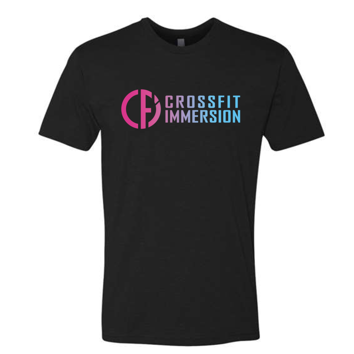
Immersion Gradient Logo Tee
For this project, we used high-contrast color treatment to make the shirt feel lighter and more seasonal while keeping the client branding easy to recognize.
CrossFit
For this project, we used high-contrast color treatment to make the shirt feel lighter and more seasonal while keeping the client branding easy to recognize.
