Inspired by what you see?

Need A Design Like This In Your Life?

The Boot CrossFit Badge Tee

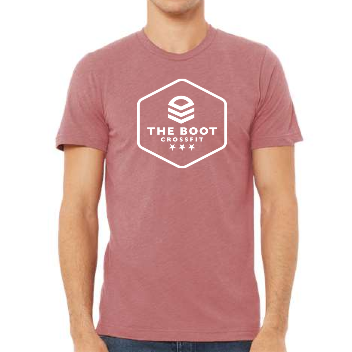
This design used a badge style to give the brand a strong and clean look.

Overview

We used a heather rose tee to create a soft spring base. The front featured a bold badge layout with “The Boot CrossFit” centered inside a hex shape. Simple stars and clean lines added structure without making it busy. The white print gave strong contrast while keeping the design easy to read. The overall style felt balanced, modern, and athletic.

Results

The badge design made the brand feel more official and established. The clean layout improved readability from a distance. The soft garment color kept it wearable for all day use. It became a solid core piece for members.

Love What You See? Make This Layout Yours!

Tell us what to swap, and our team will send you a digital proof and quote ASAP!*


*Some of the artwork presented in our portfolio is our client’s actual logos. While you are free to use anything you see as inspiration, out of respect for that client we’d obviously revise any artwork and make it more individual to your specific group or event.