BC Fit Gradient Tee
This shirt used color to bring energy to a simple brand mark.
Overview
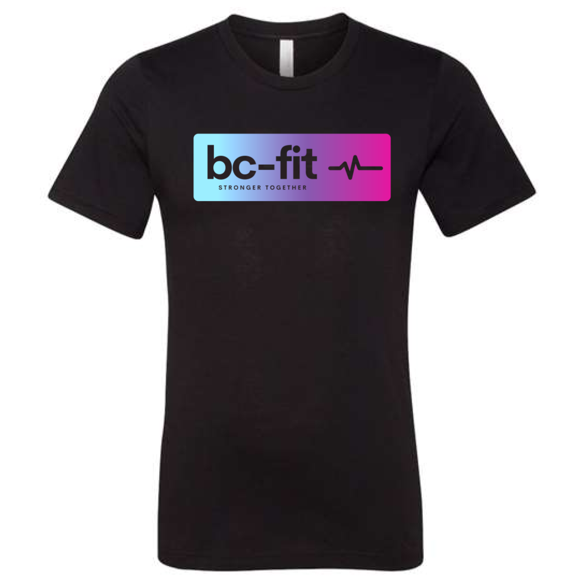
We used a black tee to make the design stand out. The front featured a bold bc-fit logo inside a soft gradient block. The color fade moved from blue to pink for a modern feel. A small heartbeat line added motion and energy. The print was centered on the chest for a clean layout.
Results
The bright color caught attention right away. Members liked the modern look. The design worked well for both gym and casual wear. It helped give the brand a fresh and updated feel.