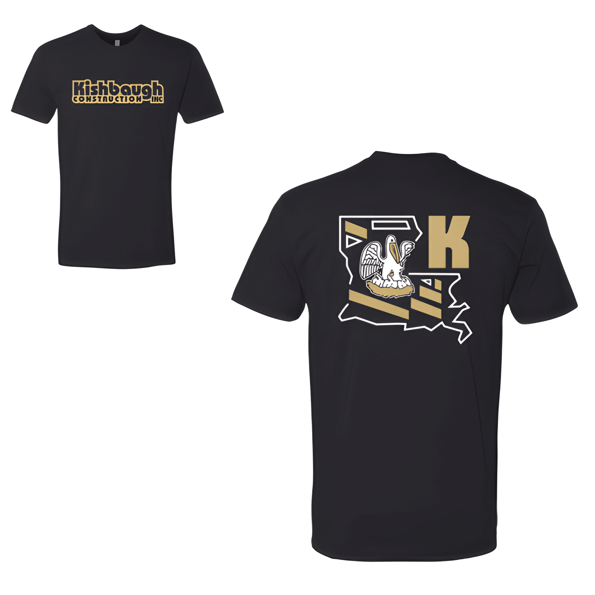
Garden City Construction: Kishbaugh Construction Ink Tee
Two names one crew. This team brought the construction game to the competition floor with a shirt that repped both sides of their world.
Overview
We stacked Kishbaugh bold with Construction Ink for a clean dual identity competition look. The tee was chosen for its comfortable fit and hard work energy. Centered chest placement keeps the name front and center.
Results
The stacked layout gives the shirt a partnership feel. Athletes get a piece that says they build by day and compete by choice and they do both with the same intensity.