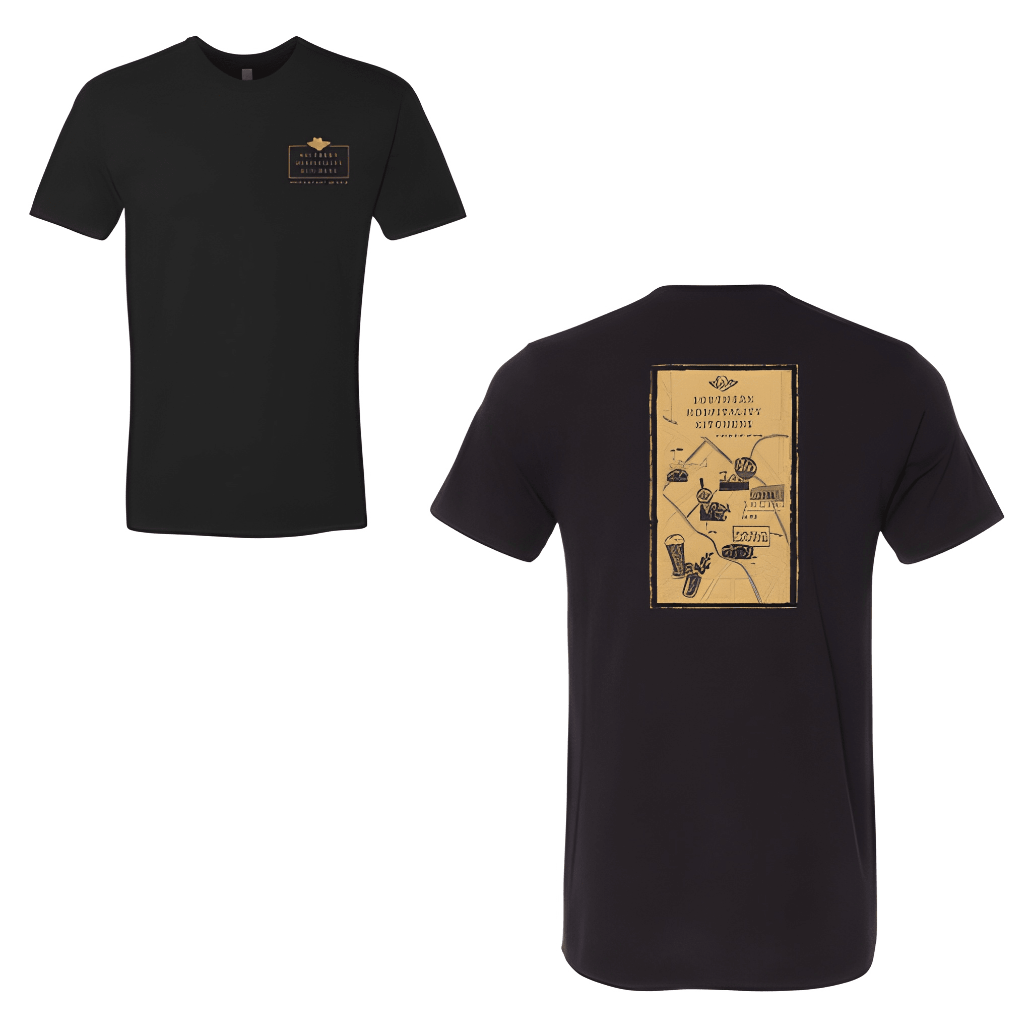
Southern Hospitality: Kitchens Tee
The name says it all before you even walk in. This crew stacked their identity bold and let the kitchen speak for the whole operation.
Overview
We placed Southern Hospitality bold above Kitchens in a clean classic restaurant look. The tee was chosen for its comfortable fit and warm welcome energy. Centered chest placement keeps the name front and center.
Results
The stacked layout gives the shirt a full service feel. Staff get a piece that says Southern Hospitality isn't just a name it's what comes out of their kitchens every single day.