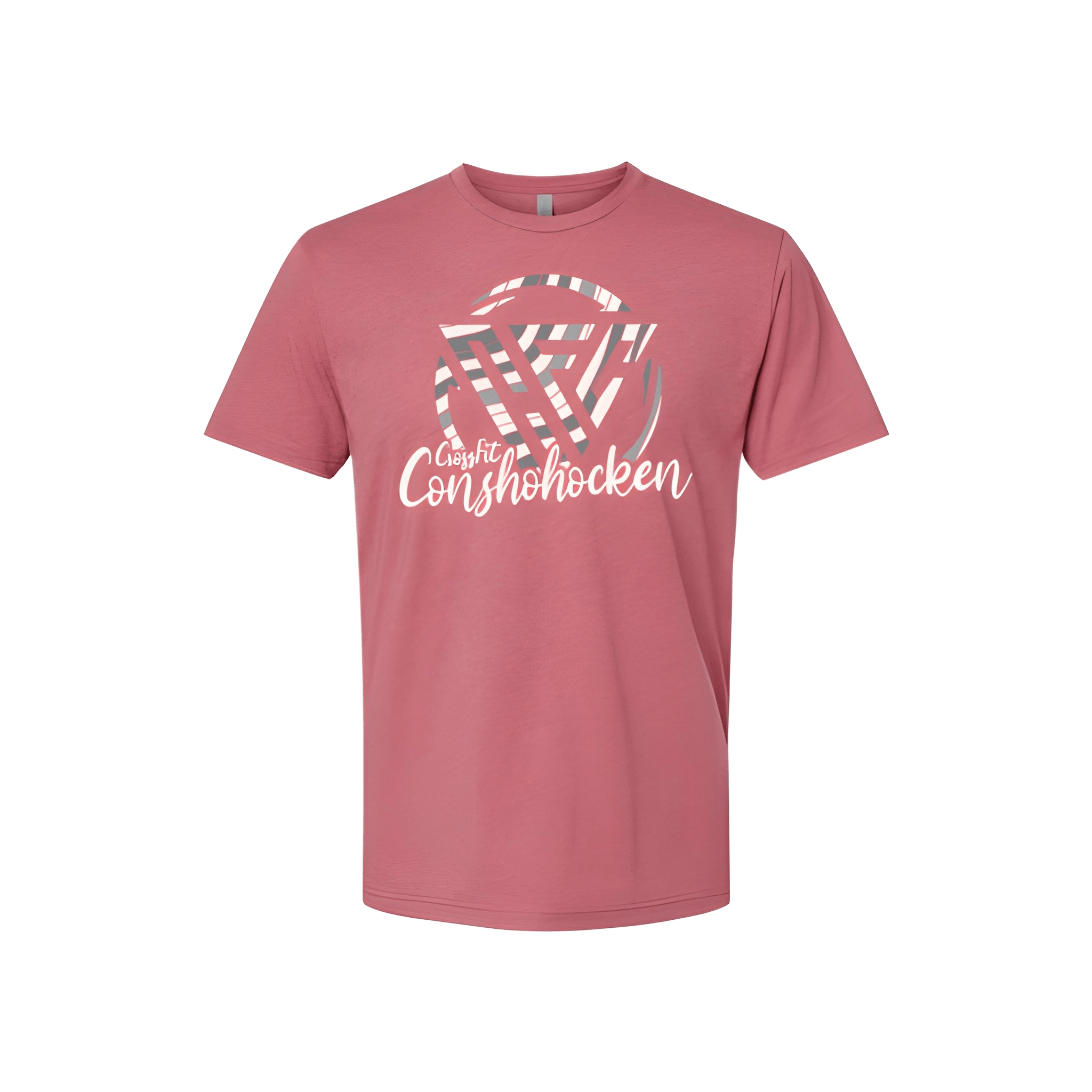
CF Conshohocken: Winter Tee
Crossfit on top. Conshohocken below. The town name is written with a softer sound on this version.
Overview
We printed a two line stack on the center chest of a winter tee. The white lettering reads "Crossfit" then "Conshohocken" with the location sized larger at the bottom. The spelling gives the town name a unique twist for this seasonal run.
Results
The final shirt puts Conshohocken where everyone sees it. Members wear the local name. CrossFit sits above it. It is clean, unique, and built for winter.