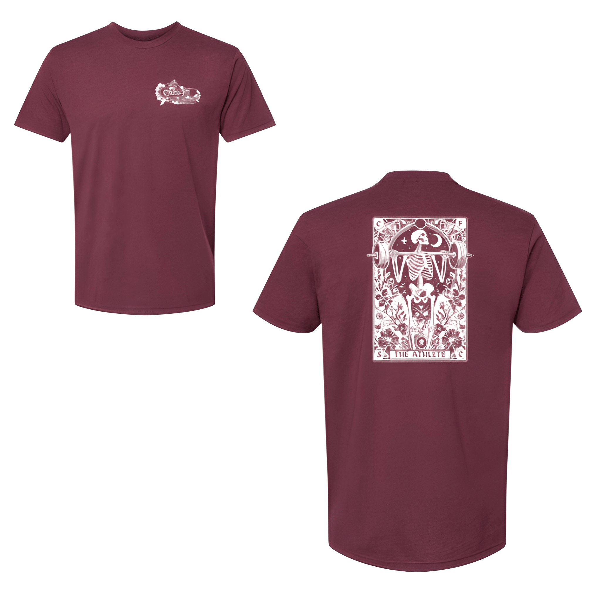
CrossFit Soda City: Fall Tee
EST 2014 on top. CROSSFIT in the middle. SODA CITY below. THE ATHLETE at the bottom. The year and the name stack above the brand and the title.
Overview
We printed a four line stack on the center chest of a fall tee. The white lettering reads "EST 2014" then "CROSSFIT" then "SODA CITY" then "THE ATHLETE" with "SODA CITY" sized largest. The year 2014 and the word ATHLETE bookend the design.
Results
The final shirt puts SODA CITY where everyone sees it. Members rep the nickname. The year shows history, and THE ATHLETE reminds everyone who wears it. It is layered, clean, and built for fall.