

Fit Strong United CrossFit: Winter Shirt
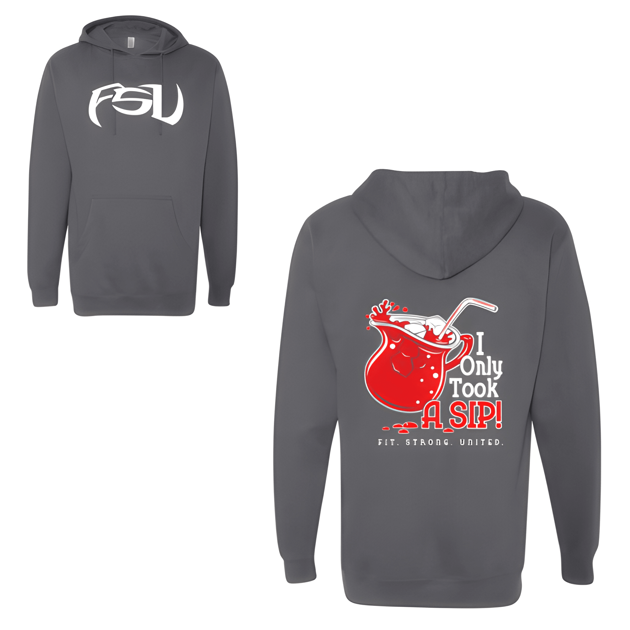
FCU sits on the front. Back stacks I on top, Only below, Took next, A SIP! next, FIT. STRONG. UNITED. at the bottom. The acronym leads up front, the full message rides in back.
Overview
We placed "FCU" on the front center chest for a clean, minimal look. On the back, we ran a five line stack with "I" on top, "Only" below, then "Took," then "A SIP!," and "FIT.STRONG.UNITED." at the bottom. The black shirt gives it a bold winter feel. The front stays subtle while the back carries the full message and mantra.
Results
This shirt does double duty. The front keeps it clean with the acronym while the back shares the full message. Members get the best of both worlds. It is bold, meaningful, and built for winter.
