

Glass City CrossFit
Fall Tee
Toledo, Ohio
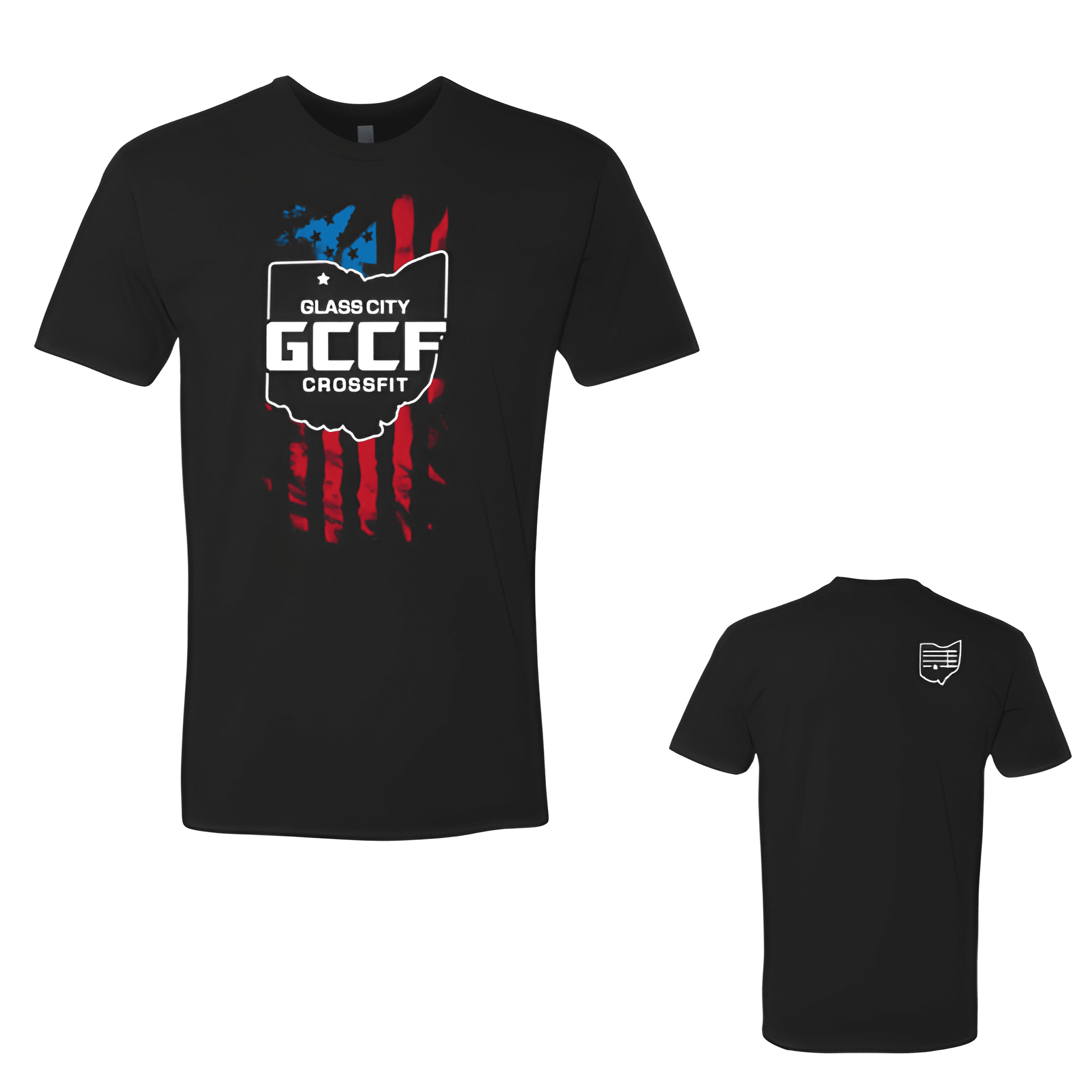
For this project, we chose to use clean graphic hierarchy to give the seasonal piece a warmer fall feel without forcing it into a Halloween theme.

Glass City CrossFit
Toledo, Ohio
For this project, we chose to use clean graphic hierarchy to give the seasonal piece a warmer fall feel without forcing it into a Halloween theme.
