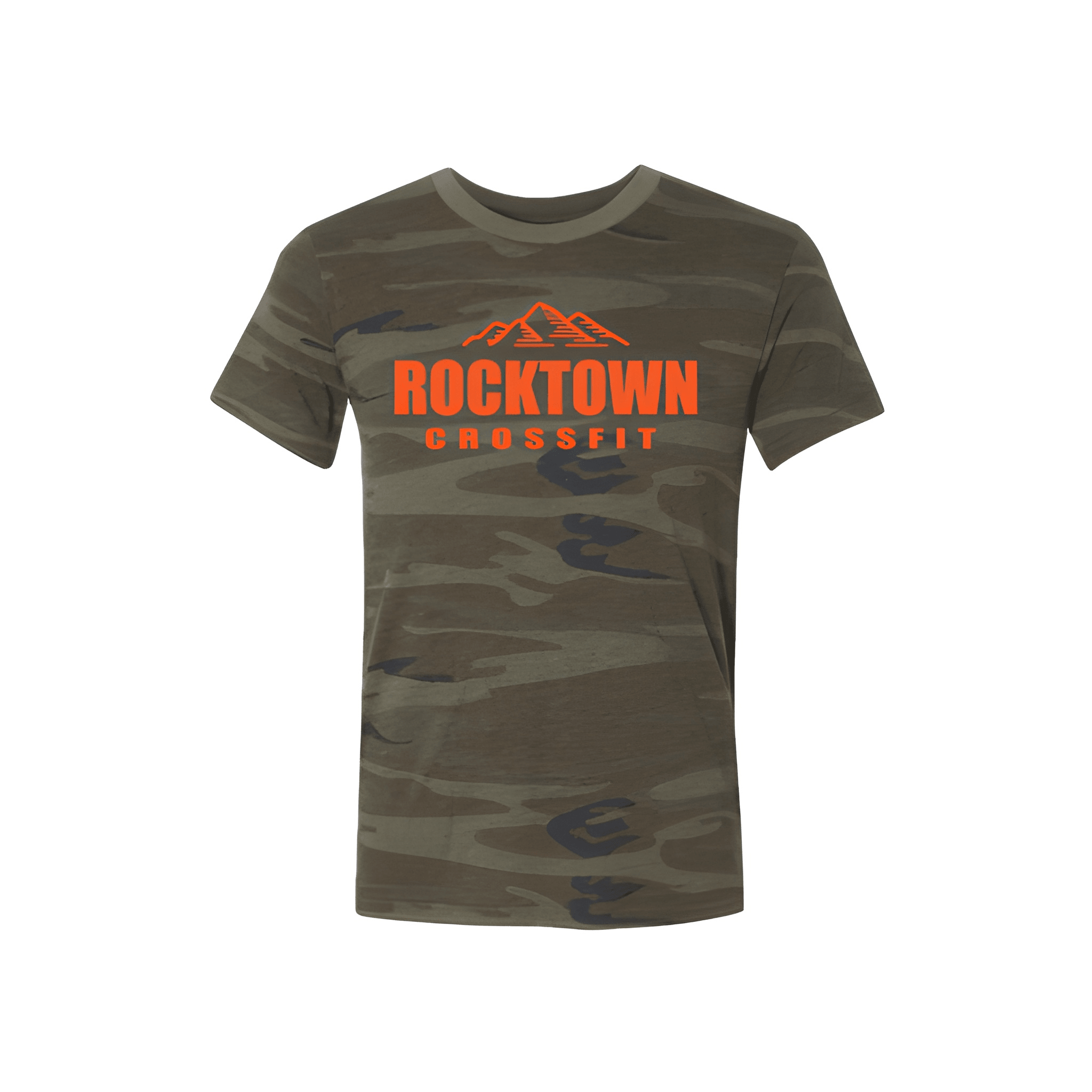
Rocktown CrossFit: Fall Tee
ROCKTOWN leads the charge. CROSSFIT stays close beneath. The name commands, the brand supports.
Overview
We put "ROCKTOWN" front and center with "CROSSFIT" stacked below in a bigger size. The white lettering pops against the black tee. The gym name takes the spotlight while the brand holds it down underneath.
Results
This tee puts the gym name where everyone sees it first. Members lead with their identity. CROSSFIT stays right there to back it up. It is bold, clean, and ready for fall.