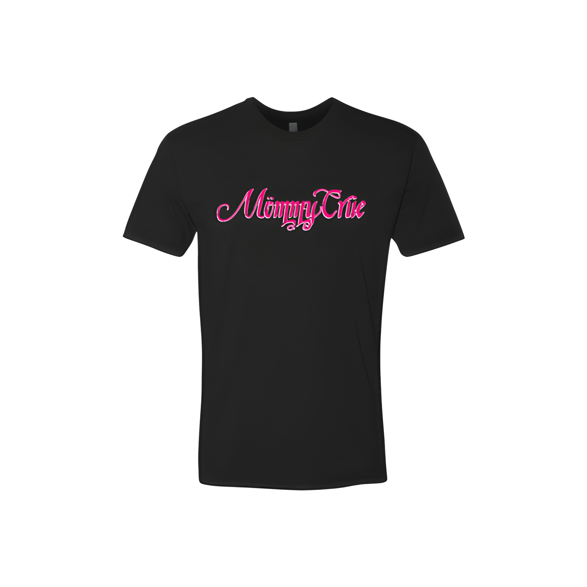
Bridgelakes CrossFit: Mommy Crue Feminine Tee
Mommy Crue wanted a look that matched their vibe. This squad asked for feminine Barbie energy and got a design that brought the pretty and the power.
Overview
We placed the Mommy Crue mark with a soft feminine Barbie inspired layout for a clean strong yet playful competition look. The tee was chosen for its comfortable fit and pink powerhouse energy. Centered chest placement keeps the squad identity front and center.
Results
The feminine design gives the shirt a don't underestimate this crew feel. Athletes get a piece that proves moms can lift heavy look great and have fun doing it all at the same time.