Inspired by what you see?

Need A Design Like This In Your Life?

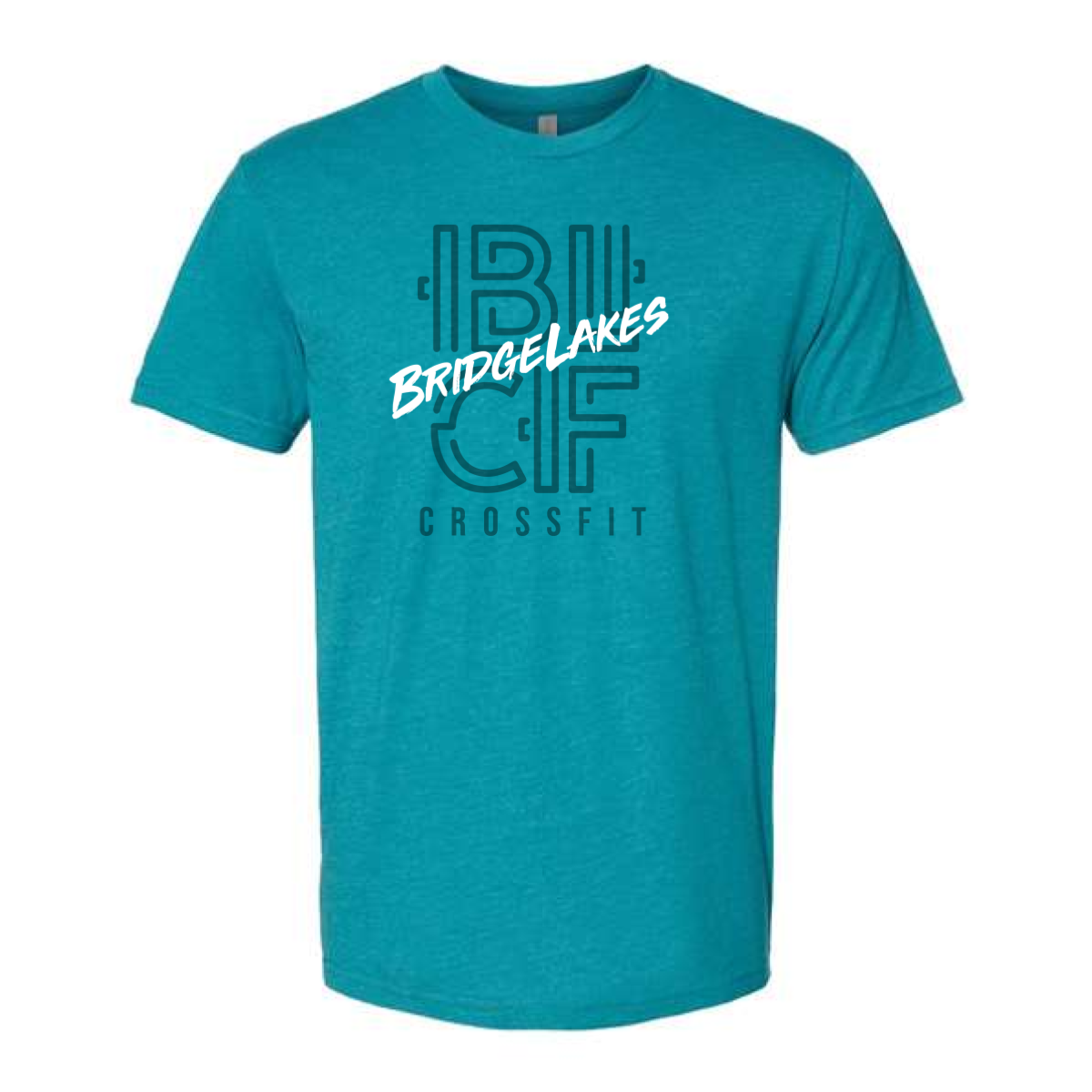
Bridgelakes CrossFit Monogram Tee

This design gave the gym a clean and modern identity.

Overview

We used a teal tee for a bright and fresh base. The design featured a bold monogram layout with layered line work. A script name overlay added contrast and movement. Dark ink kept the look sharp and easy to read. The layout stayed centered and balanced.

Results

The shirt felt modern and easy to wear. Members liked the simple but unique style. It worked well for daily training and events. The design helped build a strong brand look.

Love What You See? Make This Layout Yours!

Tell us what to swap, and our team will send you a digital proof and quote ASAP!*


*Some of the artwork presented in our portfolio is our client’s actual logos. While you are free to use anything you see as inspiration, out of respect for that client we’d obviously revise any artwork and make it more individual to your specific group or event.