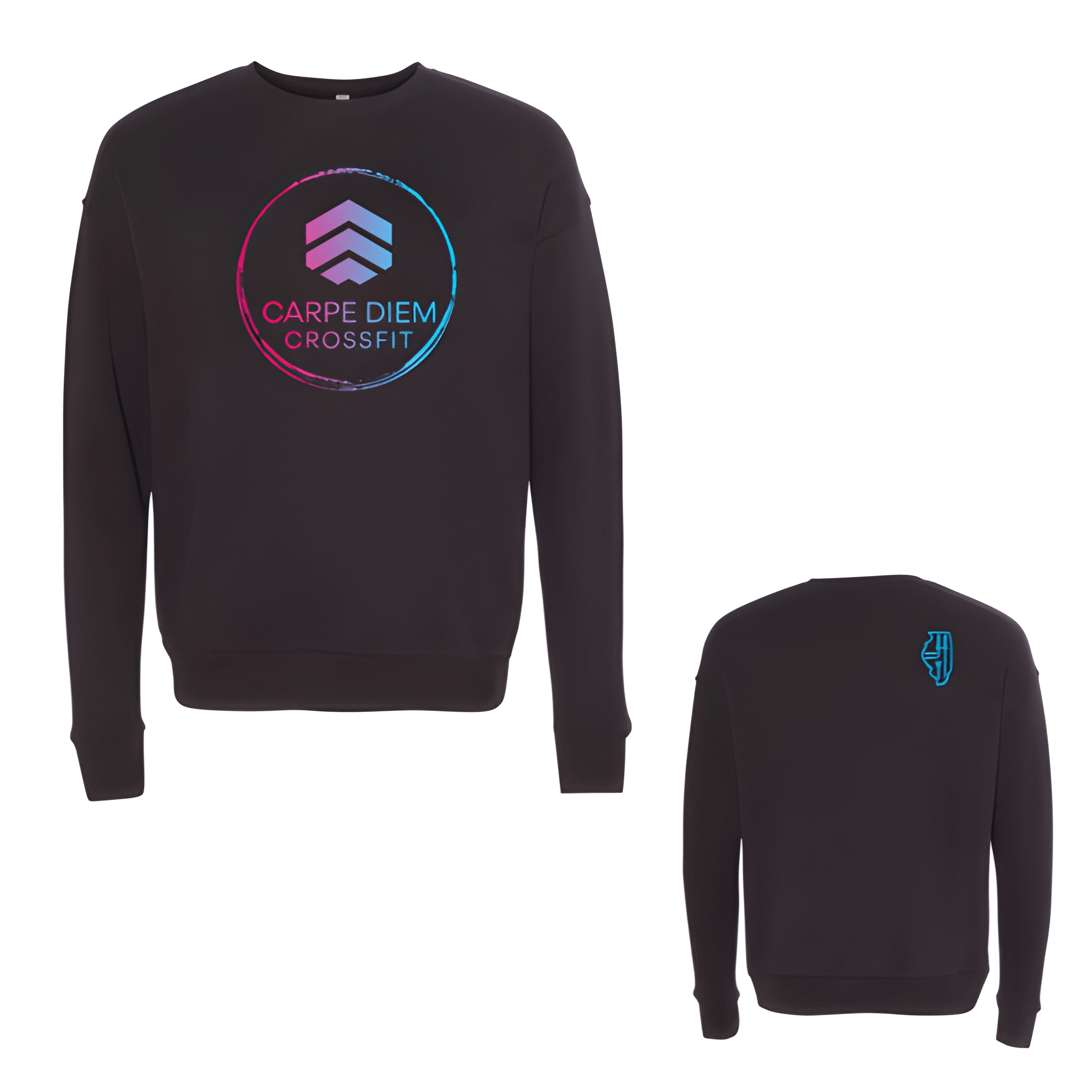
Carpe Diem Crossfit: Fall Shirt
CARPE DIEM on top. CROSSFIT below. The Latin phrase leads, then the brand follows underneath.
Overview
We printed a two line stack on the center chest of a fall shirt. The white lettering reads "CARPE DIEM" then "CROSSFIT" with the Latin phrase sized larger at the top. The message reminds members to seize the day every time they train.
Results
The final shirt puts Carpe Diem first. Members see the reminder. CrossFit sits right under it. It is clean, motivating, and built for fall.