Inspired by what you see?

Need A Design Like This In Your Life?

Centerville CrossFit: Stronger Together

Some gyms just work out. Others show up for the people in their community who are fighting something a lot harder than a workout. Centerville CrossFit is the second kind.

Overview

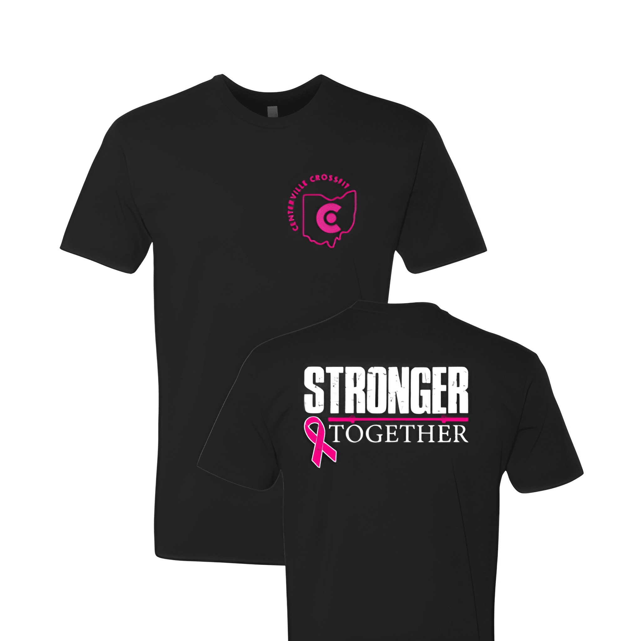
Printed on a black tee, the back leads with a distressed white "STRONGER" in heavy block type, with "TOGETHER" sitting beneath it in clean contrast lettering. A hot pink barbell line and breast cancer awareness ribbon tie the cause directly into the design. The front left chest carries the Centerville CrossFit logo, the Ohio state outline with the gym's "C" mark, in matching pink. Black was the right call here — it lets the white and pink do exactly what they need to do without any noise behind them.

Results

Gym shirts like this one are built to mean something beyond the gym floor, and this design earns that. The distressed type keeps it from feeling stiff or overly polished, which makes it something people actually want to wear. When the cause is real, the shirt tends to stick around a lot longer than a season.

View More Work:

Love What You See? Make This Layout Yours!

Tell us what to swap, and our team will send you a digital proof and quote ASAP!*


*Some of the artwork presented in our portfolio is our client’s actual logos. While you are free to use anything you see as inspiration, out of respect for that client we’d obviously revise any artwork and make it more individual to your specific group or event.