Inspired by what you see?

Need A Design Like This In Your Life?

CrossFit 30004: Shatter

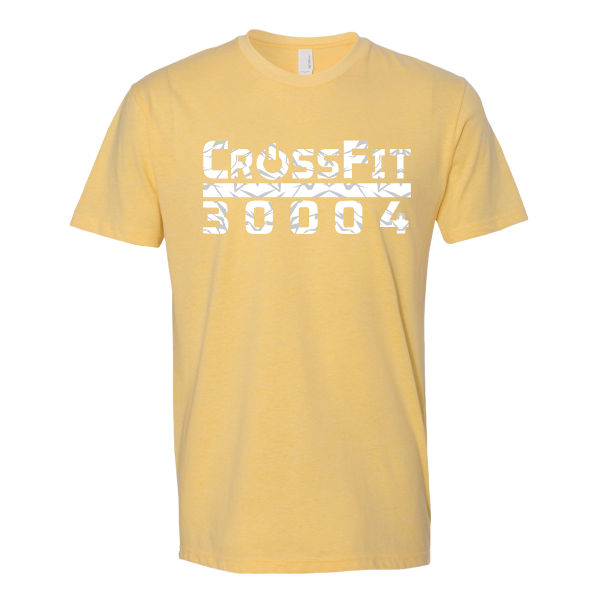
CrossFit 30004 used their zip code as their name and then put it on a butter yellow tee that looks like it's breaking apart in the best way possible.

Overview

Printed in white and gray on a butter yellow tee, "CrossFit" stacks above "30004" in bold type with a shattered geometric fill pattern running through both words and a dividing stripe between them. The broken glass treatment inside the letterforms gives the design a fractured, high-energy feel that contrasts nicely with the soft warm base. Front center placement lets the full two-line wordmark own the chest.

Results

The zip code as gym identity is a smart move for local pride and the shatter fill gives it a visual edge that plain wordmarks don't have. The yellow tee makes it immediately seasonal and members will reach for it on warm days well beyond the gym. It is the kind of crossfit shirt that doubles as a neighborhood rep piece.

View More Work:

Love What You See? Make This Layout Yours!

Tell us what to swap, and our team will send you a digital proof and quote ASAP!*


*Some of the artwork presented in our portfolio is our client’s actual logos. While you are free to use anything you see as inspiration, out of respect for that client we’d obviously revise any artwork and make it more individual to your specific group or event.