Inspired by what you see?

Need A Design Like This In Your Life?

CrossFit CE: Rainbow Script

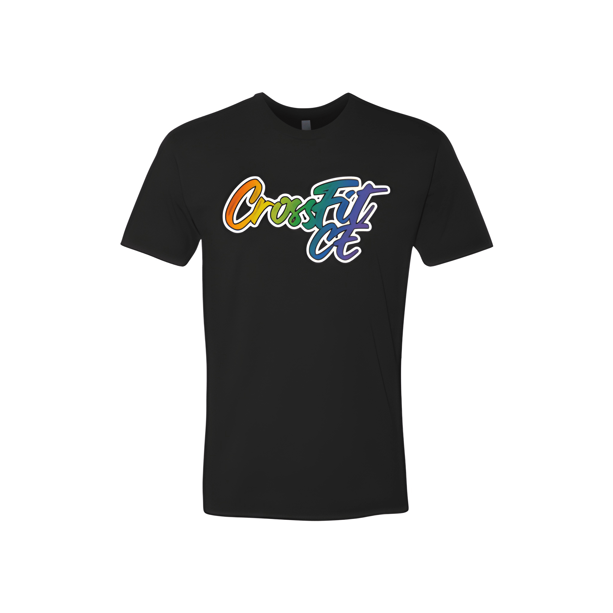
CrossFit CE made a Pride shirt that leads with the gym name and lets the colors speak for the rest.

Overview

The gym name is set in a bold flowing script with a white outline, styled to feel more like street art than sportswear. A full Pride rainbow gradient runs through the lettering from warm orange through greens into teal, blue, and violet. Printed center chest on a black crew neck tee, the placement is clean and the dark base makes the gradient pop without any extra effort.

Results

Pride shirts work best when they feel genuine rather than obligatory, and this one does. The script treatment gives the gym name real personality while the gradient carries the message without needing to say anything else. It is a gym shirt people will wear well past the month it was made for.

View More Work:

Love What You See? Make This Layout Yours!

Tell us what to swap, and our team will send you a digital proof and quote ASAP!*


*Some of the artwork presented in our portfolio is our client’s actual logos. While you are free to use anything you see as inspiration, out of respect for that client we’d obviously revise any artwork and make it more individual to your specific group or event.