Inspired by what you see?

Need A Design Like This In Your Life?

CrossFit Chesapeake: Shore Plate

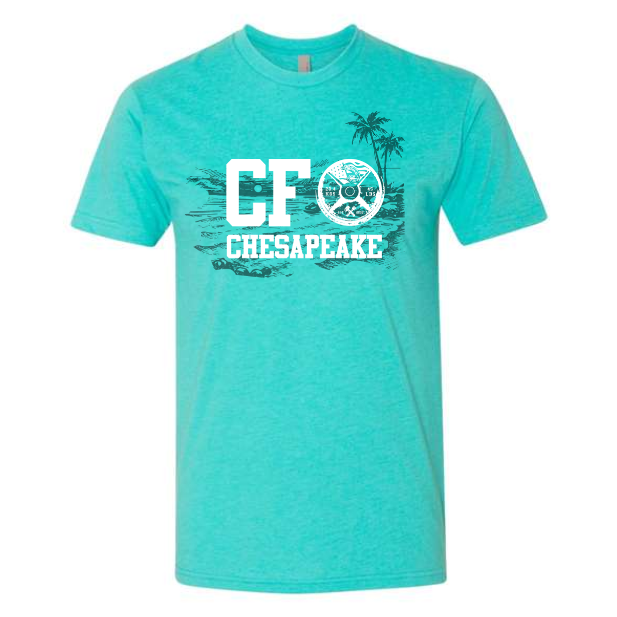
Palm trees, a barbell plate, and a beach scene — CrossFit Chesapeake put their whole vibe on one shirt.

Overview

White and tonal dark ink on a heather mint tee. Bold varsity "CF" anchors the left with a detailed barbell plate icon subbing in for the "O" in the layout. A hand-drawn tropical beach scene with palm trees stretches behind the letters as a tonal watercolor-style backdrop. "Chesapeake" runs below in clean varsity type. Front center placement.

Results

Using the barbell plate as a graphic element inside the lettering is a design move that rewards a second look. The beach illustration behind the type adds depth without cluttering the layout — the tonal ink keeps it from competing with the white foreground. Mint was the right call for a coastal gym name on a spring tee. These are the crossfit shirts that feel local and specific in a way most gym apparel never manages.

View More Work:

Love What You See? Make This Layout Yours!

Tell us what to swap, and our team will send you a digital proof and quote ASAP!*


*Some of the artwork presented in our portfolio is our client’s actual logos. While you are free to use anything you see as inspiration, out of respect for that client we’d obviously revise any artwork and make it more individual to your specific group or event.