Inspired by what you see?

Need A Design Like This In Your Life?

CrossFit Danbury: Mauve Tonal Tee

Gray ink on a mauve tee. CrossFit Danbury made a gym shirt that blends in on purpose — and somehow it's better for it.

Overview

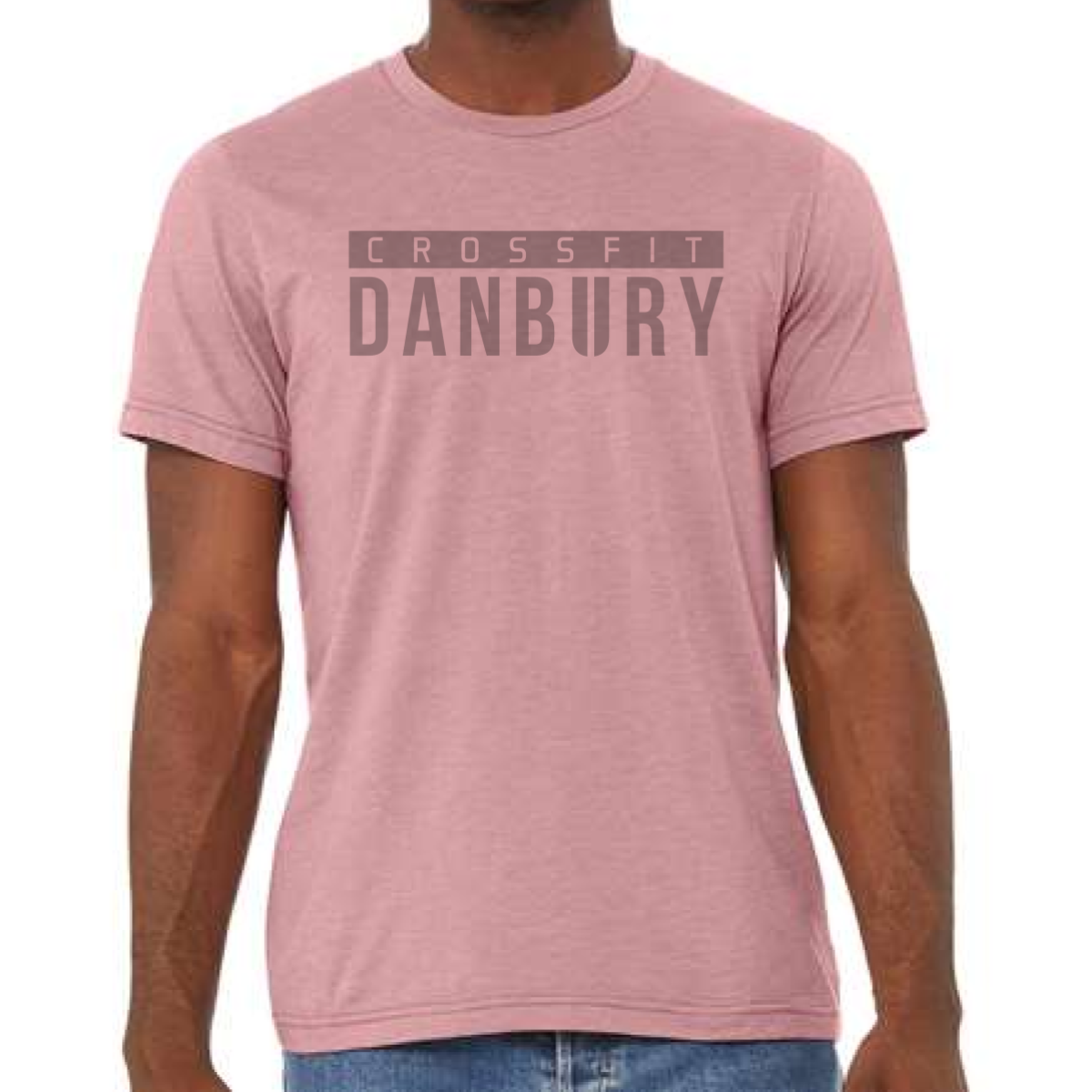
Gray tonal ink on a heather mauve tee. "Crossfit" sits in spaced caps inside a thin box, with "Danbury" stacked large below in bold block type. The near-matching ink and garment tones create a subtle, washed-out effect that feels more editorial than athletic. Front center placement.

Results

Tonal printing is a technique that communicates confidence — you're not trying to be seen from across the room, you're just well dressed. The mauve and gray combination sits in a color space that works across genders and ages, which widens the appeal of the shirt well beyond the typical gym tee buyer. It looks just as good under a jacket as it does in a workout. These are the crossfit shirts that make non-members ask where you got it.

View More Work:

Love What You See? Make This Layout Yours!

Tell us what to swap, and our team will send you a digital proof and quote ASAP!*


*Some of the artwork presented in our portfolio is our client’s actual logos. While you are free to use anything you see as inspiration, out of respect for that client we’d obviously revise any artwork and make it more individual to your specific group or event.