Inspired by what you see?

Need A Design Like This In Your Life?

CrossFit Deep: Teal Standard Tee

One color. One logo. One website on the back. CrossFit Deep kept it clean and let the teal do the talking.

Overview

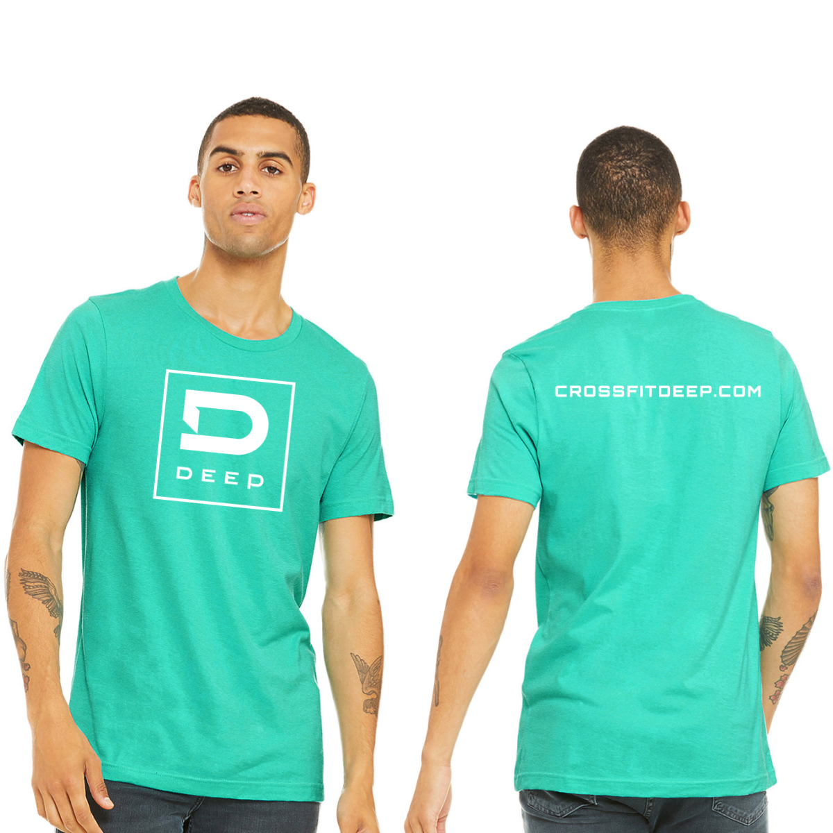
White ink on a teal tee. The front carries the bold "D" monogram inside a square with "Deep" below — same mark as the crop tank but in clean white on a solid teal base. The back adds the gym's website in small spaced caps across the upper back. Front center and upper back placement.

Results

The white-on-teal version of the logo reads with more confidence than the gradient — it's bold, unambiguous, and works from any distance. Adding the website to the back is a smart move for a gym still building name recognition in its market. The teal garment is distinctive enough that members stand out in a crowd without the shirt needing to do anything extra. These are the crossfit shirts that function as walking ads without ever feeling like one.

View More Work:

Love What You See? Make This Layout Yours!

Tell us what to swap, and our team will send you a digital proof and quote ASAP!*


*Some of the artwork presented in our portfolio is our client’s actual logos. While you are free to use anything you see as inspiration, out of respect for that client we’d obviously revise any artwork and make it more individual to your specific group or event.