Inspired by what you see?

Need A Design Like This In Your Life?

CrossFit Empire South: True North

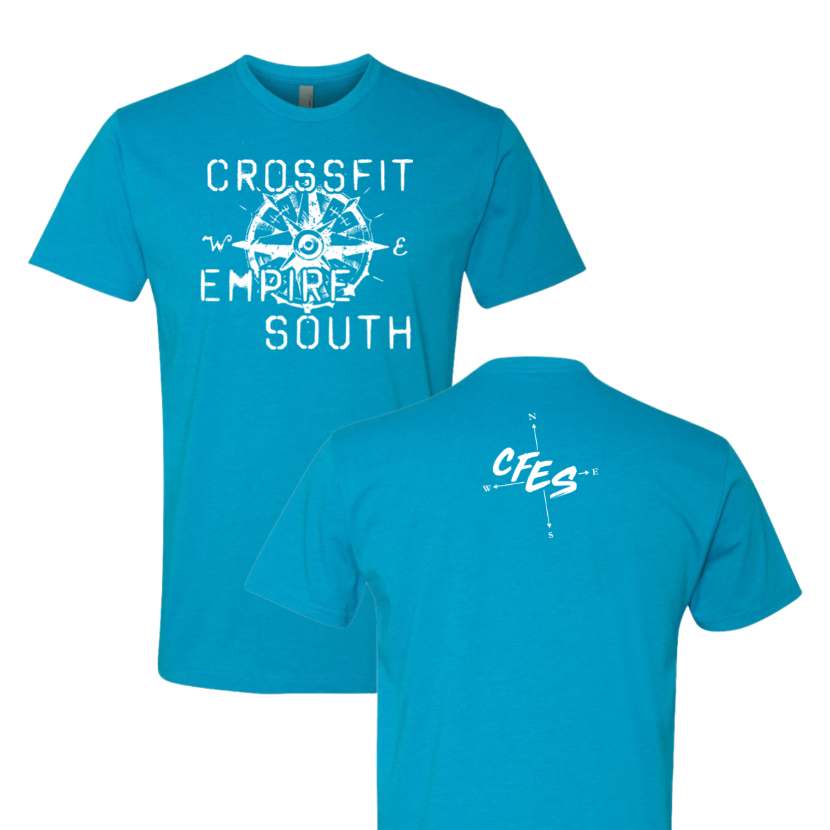
A distressed compass on a teal tee. CrossFit Empire South knows exactly where they're going.

Overview

White ink on a bright teal tee. A large distressed compass rose fills the center of the front with "Crossfit," "Empire," and "South" woven through its cardinal points in bold type. The back carries a smaller simple crosshair compass with "CFES" in bold script overlaid in the center. Front center and upper back placement.

Results

The compass motif does double duty — it's a navigation symbol that visually reinforces the "South" in the gym's name without spelling it out twice. The distressed treatment keeps a detailed illustration from feeling too polished or corporate. Bright teal is a strong seasonal color that photographs well and stands out in a stack of black and grey gym shirts. These are the crossfit shirts that feel like they belong to a gym with a real identity behind them.

View More Work:

Love What You See? Make This Layout Yours!

Tell us what to swap, and our team will send you a digital proof and quote ASAP!*


*Some of the artwork presented in our portfolio is our client’s actual logos. While you are free to use anything you see as inspiration, out of respect for that client we’d obviously revise any artwork and make it more individual to your specific group or event.