Inspired by what you see?

Need A Design Like This In Your Life?

CrossFit Equality: Raise the Bar

A gold crop tank that means exactly what it says — and looks good saying it.

Overview

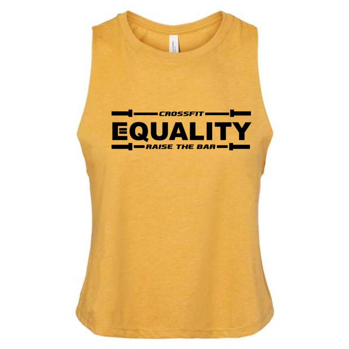
Black ink on a gold crop muscle tank. "Crossfit" sits small above a full-width barbell graphic that frames the layout top and bottom. "Equality" runs large in bold block type center stage, with "Raise the Bar" locked between barbell end caps below. The double barbell border gives the whole design a clean, structured feel. Front center placement.

Results

The barbell-as-border treatment is a design idea that only works when the gym name earns it — and CrossFit Equality earns it twice. "Raise the Bar" as a tagline lands differently when it's literally surrounded by barbells. Black on gold is a strong, wearable combination that photographs well year-round. These are the gym shirts that carry a message without needing to explain it.

View More Work:

Love What You See? Make This Layout Yours!

Tell us what to swap, and our team will send you a digital proof and quote ASAP!*


*Some of the artwork presented in our portfolio is our client’s actual logos. While you are free to use anything you see as inspiration, out of respect for that client we’d obviously revise any artwork and make it more individual to your specific group or event.