Inspired by what you see?

Need A Design Like This In Your Life?

CrossFit F9: Fight

Some shirts just say something. CrossFit F9 wanted their community wearing a shirt that actually meant it.

Overview

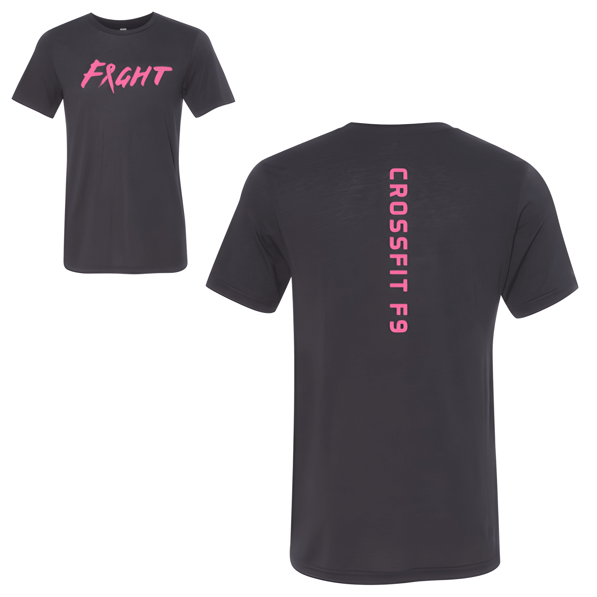
Printed in bold pink on a dark charcoal tee, the front reads "FIGHT" in a raw hand-styled script where a ribbon replaces the letter "I" — a breast cancer awareness nod that lands without needing a caption. The back runs "CROSSFIT F9" vertically down the spine in a clean condensed font. Charcoal keeps the shirt wearable anywhere. Pink on dark is a high contrast combination that reads strong on the gym floor and off it.

Results

Cause shirts live or die by whether the design earns the message. The ribbon integrated into the letterform does that work quietly, without screaming at anyone. This is the kind of gym shirt people hold onto because it stands for something real, not just an event. That is what makes it worth wearing long after the day it was made for.

View More Work:

Love What You See? Make This Layout Yours!

Tell us what to swap, and our team will send you a digital proof and quote ASAP!*


*Some of the artwork presented in our portfolio is our client’s actual logos. While you are free to use anything you see as inspiration, out of respect for that client we’d obviously revise any artwork and make it more individual to your specific group or event.