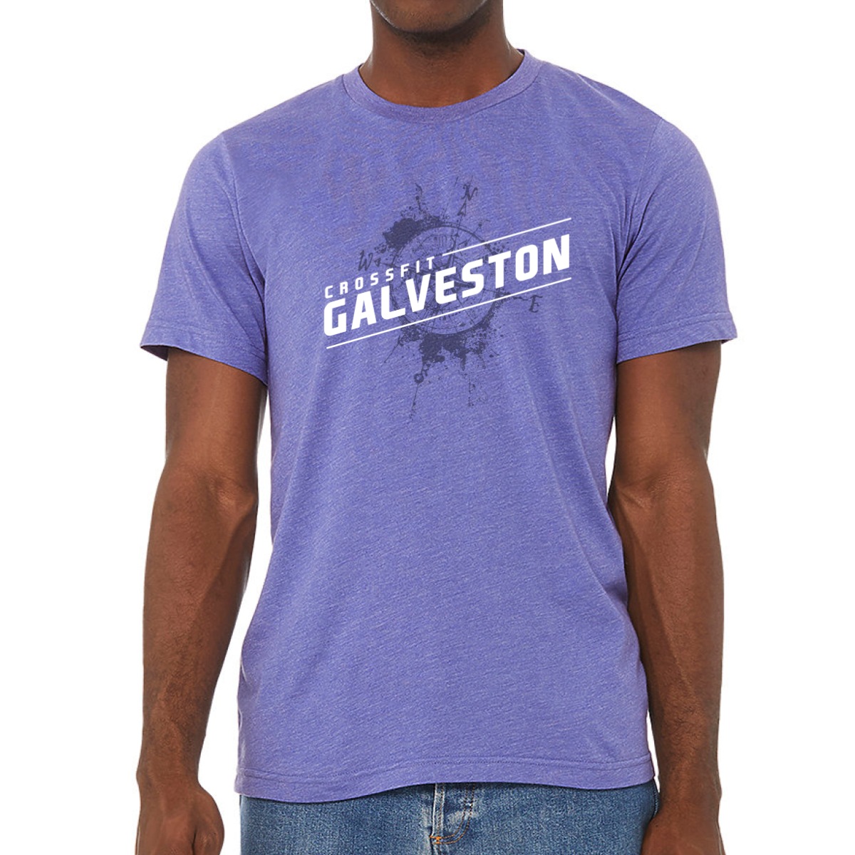
CrossFit Galveston: Purple Compass Tee
Same compass. Same splash. Heather purple changes the whole mood without changing a single line of the design.
Overview
White and tonal dark ink on a heather purple tee. The compass splash graphic carries over directly — the tonal ink reads as deep navy-purple against the heather base, giving the design a more subdued, layered feel than the hot pink version. White type on the diagonal slash stays crisp and readable. Front center placement.
Results
The tonal ink approach works especially well on heather purple — the splash texture blends into the garment in a way that makes it feel less like a print and more like part of the fabric. The result is a shirt that reads clean and effortless from a distance while rewarding a closer look. Heather purple broadens the appeal of the design to members who want something more muted than the hot pink. These are the gym shirts that make the Galveston collection feel like it was properly planned out.
View More Work:
CrossFit Buckhead: Murph Together We Honor
Carpe Diem CrossFit: Rank & File
Murph: ACU Vertical
Never Out The Fight
Portside Fitness: Murph Anchor Drop
CrossFit Be Someone: Murph Star Circle
CrossFit 104: Murph The Shield
Stone Camo
CrossFit Free State: Murph Stars and Stripes
Inside the Letters
CrossFit Thump: Murph Sky Blue Varsity
Bridgelakes CF: Murph Stencil
CrossFit Whiteboard: Murph Remember Why
Murph: Snakeskin