Inspired by what you see?

Need A Design Like This In Your Life?

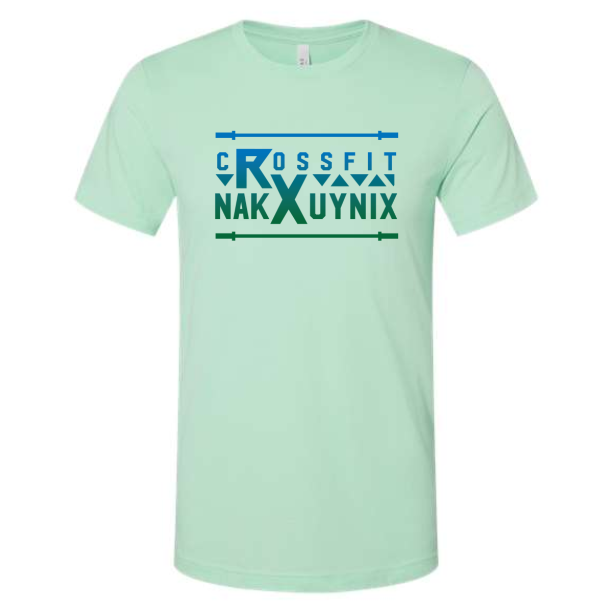
CrossFit NAKXUYNIX Tee

A clean, modern typographic design built around symmetry, structure, and bold identity.

Overview

This design leans into geometric shapes and strong letterforms to create a unique, almost coded visual language. The horizontal barbell elements frame the name, reinforcing the CrossFit identity without overcomplicating the graphic.

Results

The final piece feels sharp and intentional—perfect for gyms looking for something minimal, modern, and different from typical fitness graphics.

Love What You See? Make This Layout Yours!

Tell us what to swap, and our team will send you a digital proof and quote ASAP!*


*Some of the artwork presented in our portfolio is our client’s actual logos. While you are free to use anything you see as inspiration, out of respect for that client we’d obviously revise any artwork and make it more individual to your specific group or event.