

CrossFit Wheelhouse
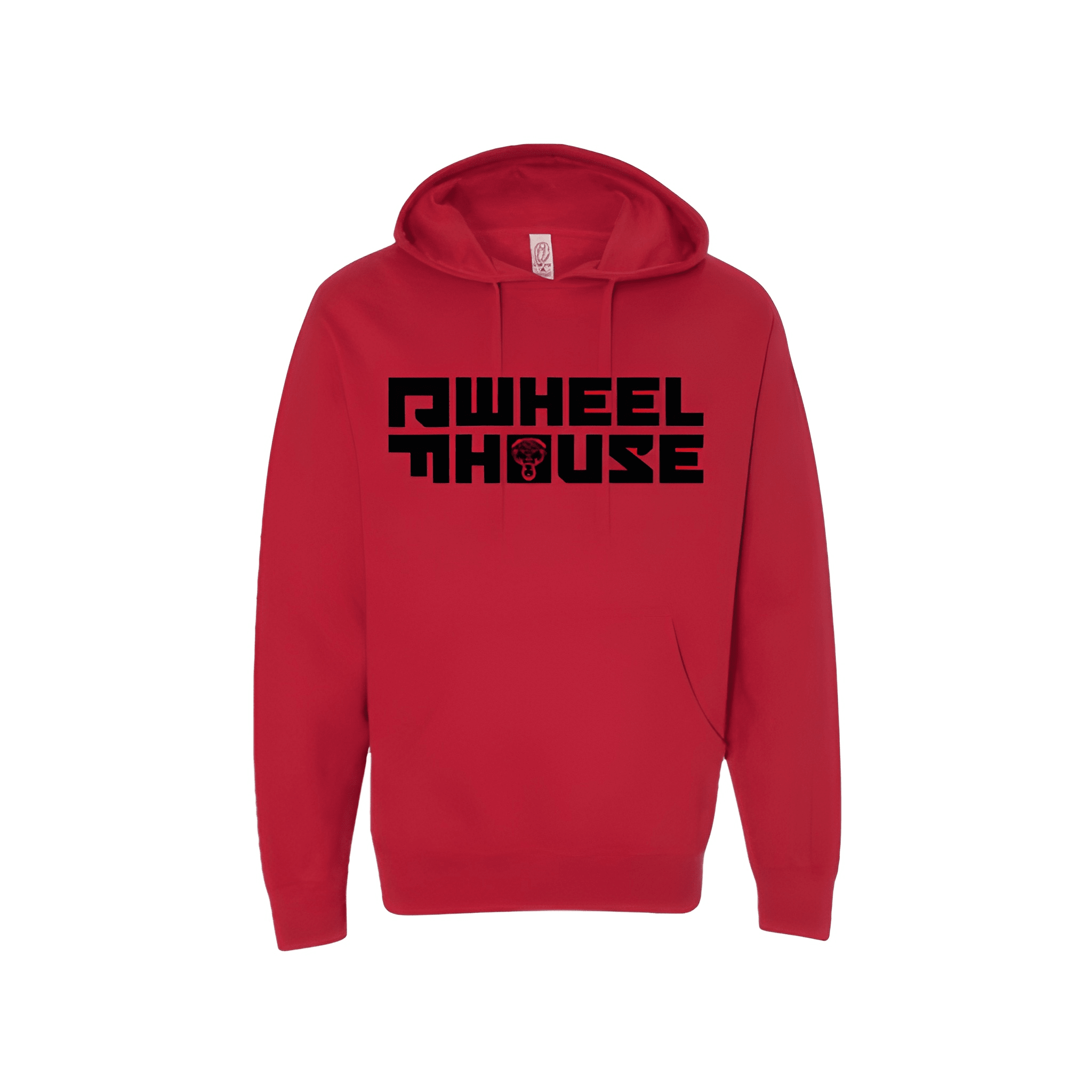
Winter Shirt
Avondale, Pennsylvania
Our team used clean graphic hierarchy to give the seasonal piece a colder-weather feel without losing the client’s everyday apparel identity.

CrossFit Wheelhouse
Avondale, Pennsylvania
Our team used clean graphic hierarchy to give the seasonal piece a colder-weather feel without losing the client’s everyday apparel identity.
