

CRU Fitness
Fall Tee
Ponchatoula, Louisiana
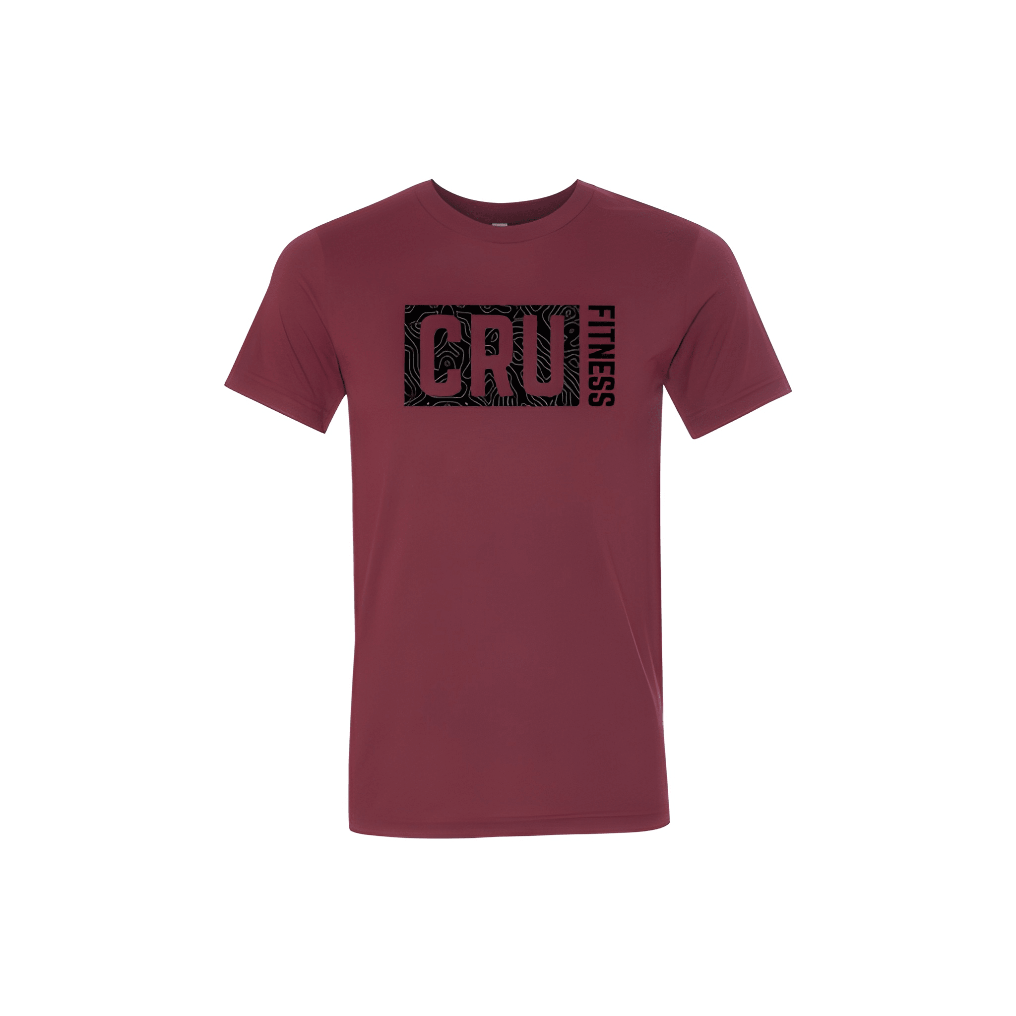
We leaned on clean graphic hierarchy to give the seasonal piece a warmer fall feel without forcing it into a Halloween theme.

CRU Fitness
Ponchatoula, Louisiana
We leaned on clean graphic hierarchy to give the seasonal piece a warmer fall feel without forcing it into a Halloween theme.
