Inspired by what you see?

Need A Design Like This In Your Life?

The District Map

When your studio wants to claim its territory, why not put it on a map?

Overview

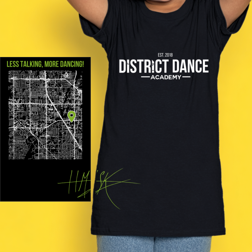
This design was printed on a black tee with clever dual-sided branding that tells a complete story. The front features "DISTRICT DANCE ACADEMY" in bold white block letters with "EST. 2018" up top, creating a clean, professional studio logo that works for everyday wear. The back is where things get interesting—a detailed white street map of the studio's neighborhood with a bright neon yellow-green pin marking the exact location, paired with the tagline "LESS TALKING, MORE DANCING!" in that same pop of color. Below the map sits a handwritten-style hashtag in matching neon. The map design gives the shirt a cool urban aesthetic that feels modern and location-specific, like exclusive merch you'd find at a trendy local shop. The contrast between the structured front logo and the detailed back map creates visual interest on both sides.

Results

These shirts became everyday favorites for District Dance Academy students, serving as both studio wear and casual streetwear they actually wanted to rock outside of class. The map on the back sparked conversations around town—"Hey, is that where your dance studio is?"—creating organic word-of-mouth marketing. The design helped establish the studio's identity as a community fixture while giving dancers something that felt more like cool neighborhood gear than typical dance studio merch.

View More Work::

Love What You See? Make This Layout Yours!

Tell us what to swap, and our team will send you a digital proof and quote ASAP!*


*Some of the artwork presented in our portfolio is our client’s actual logos. While you are free to use anything you see as inspiration, out of respect for that client we’d obviously revise any artwork and make it more individual to your specific group or event.