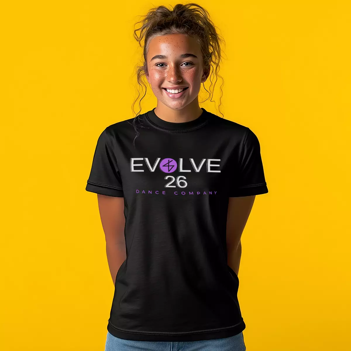
Evolve 26 Dance Company: The Wordmark Tee
No dancer silhouette. No flourish. Just a sharp wordmark and a logo that means business. Evolve 26 knew exactly what they wanted and it shows.
Overview
White lettering on a black performance tee, "EVOLVE" sits large across the chest in a clean modern sans serif with a purple circle lightning bolt icon dropped right into the O. Below it, "26" in the same weight and "Dance Company" in spaced-out purple type complete the stack. The whole thing is centered, restrained, and confident — closer to a sports brand identity than a typical dance studio shirt. Front center placement keeps the hierarchy tight and readable from across a room.
Results
Dance tshirts that lead with a strong wordmark instead of an illustration are harder to pull off but age a lot better. This design works because the logo icon does just enough without taking over — the lightning bolt in the O gives it personality while keeping the overall look clean. A shirt like this travels well outside the studio and builds name recognition everywhere it goes.
View More Work::