Flower City CF: Fall Shirt
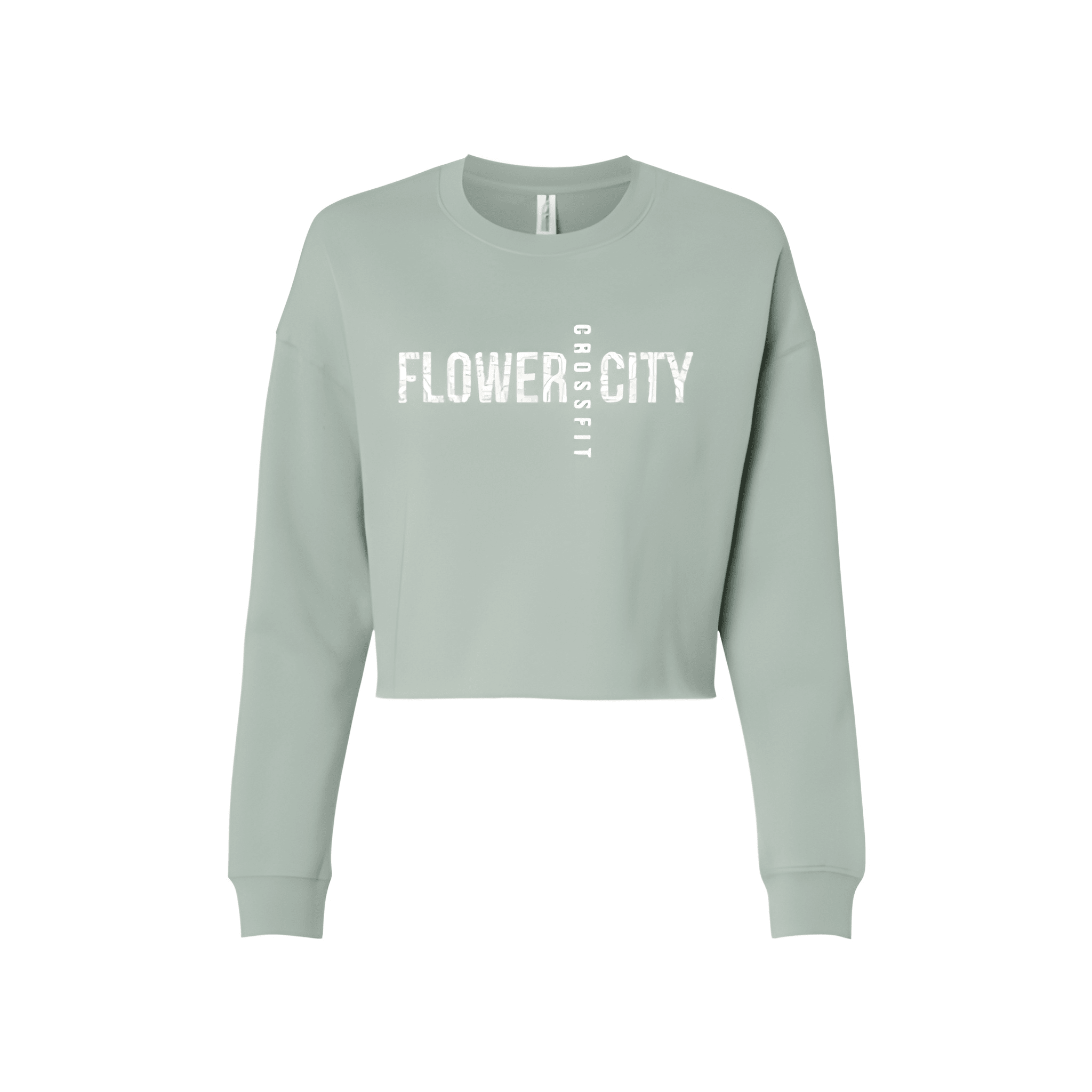
FLOWER opens it up. CROSSFIT holds the center. CITY closes it out. The name bookends the brand.
Overview
We built a three tier design with "FLOWER" at the top, "CROSSFIT" in the middle, and "CITY" at the base. The white lettering stands out against the black shirt. The name wraps around the brand for a clean, balanced look that feels intentional.
Results
The final shirt puts FLOWER CITY on display with CROSSFIT right in the middle. Members get a design that feels complete. It is clean, balanced, and built for fall.