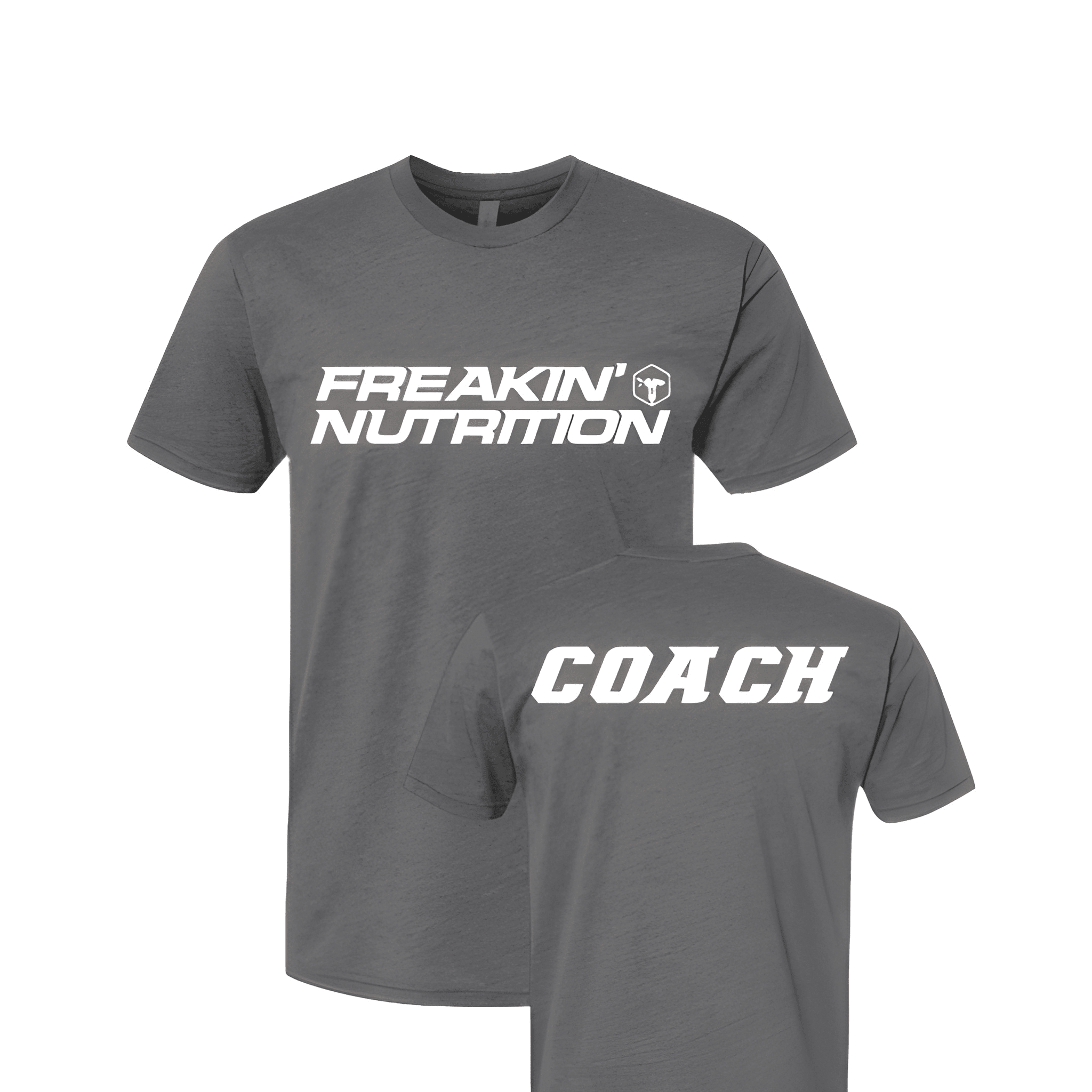
Freakin Nutrition: Coach Tee
FREAKIN' on top. NUTRITION in the middle. COACH at the bottom. The attitude leads, then the service, then the role.
Overview
We printed a three line stack on the center chest of a dark tee. The white lettering reads "FREAKIN'" then "NUTRITION" then "COACH" with the brand name "NUTRITION" sized largest. We kept the apostrophe in FREAKIN' so the attitude stays loud.
Results
The final shirt tells members this is not a boring nutrition shop. Coaches bring the energy. The word FREAKIN' makes sure no one misses it. It is bold, fun, and built for the brand.