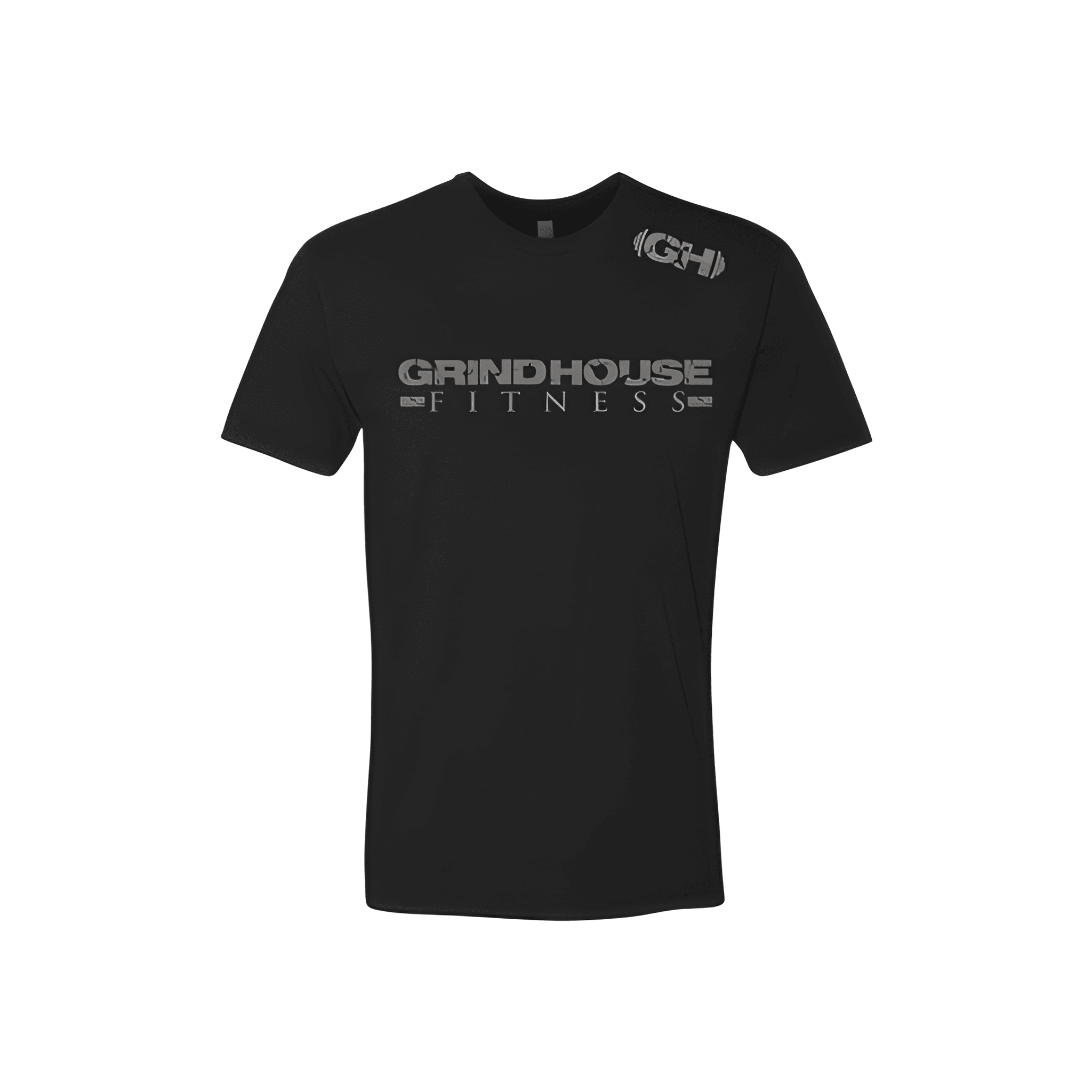
Grindhouse Fitness: Winter Tee
GH leads the charge. GRINDHOUSE holds the middle. FITNESS anchors the bottom. The acronym starts it, the full name builds it, the brand finishes it.
Overview
We stacked "GH" at the top, "GRINDHOUSE" in the center, and "FITNESS" at the base of a classic tee. The white lettering pops against the black fabric. The acronym gives it a streetwear edge while the full name and brand build a complete, layered look.
Results
This tee puts GRINDHOUSE FITNESS on display from top to bottom. Members get a design that feels modern and complete. The GH adds a cool insider nod. It is sharp, layered, and ready for winter.