

Hurricane CrossFit
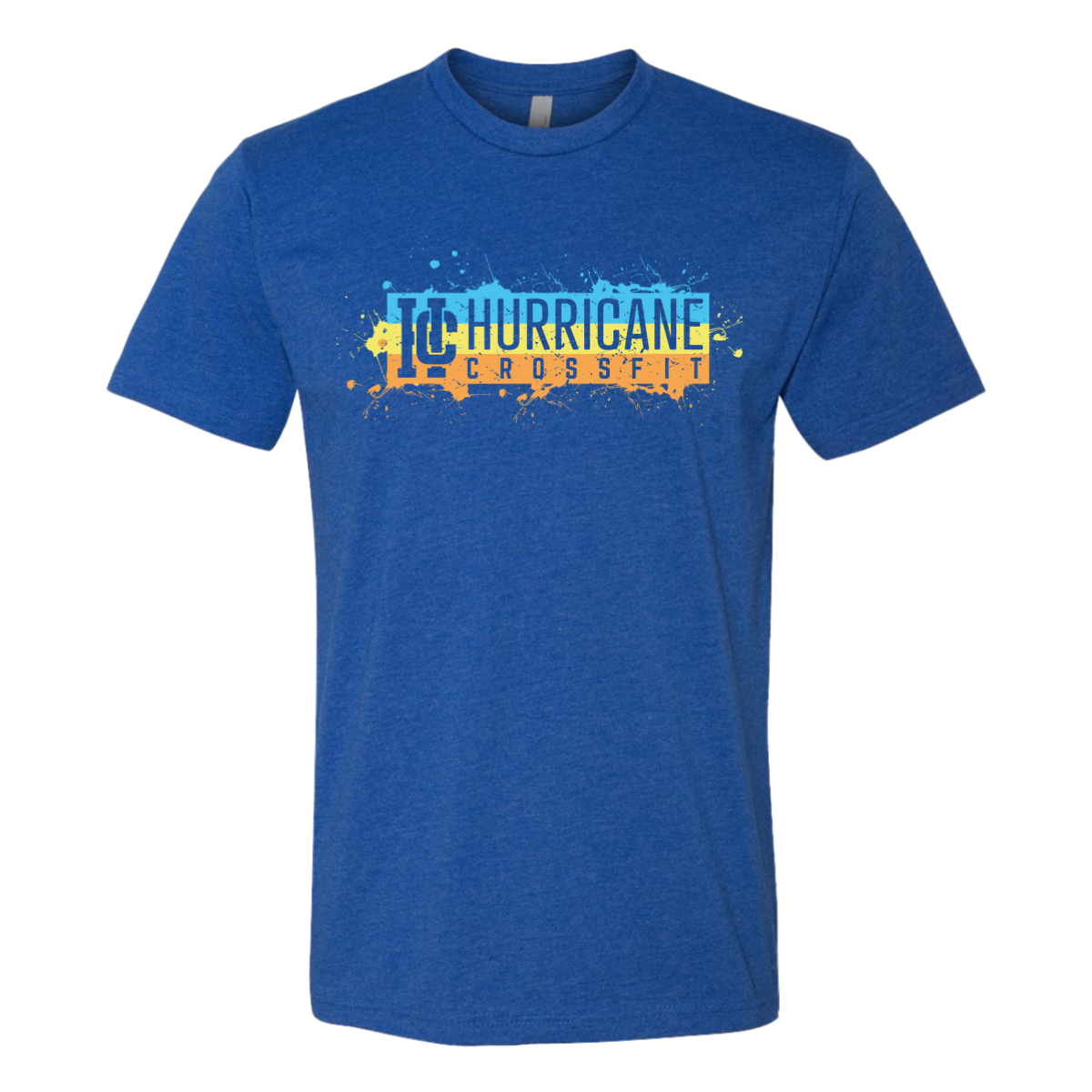
Paint Splash Tee Blue
Lake Charles, Louisiana
Our design team kept clean graphic hierarchy central to make the shirt feel lighter and more seasonal while keeping the client branding easy to recognize.

Hurricane CrossFit
Lake Charles, Louisiana
Our design team kept clean graphic hierarchy central to make the shirt feel lighter and more seasonal while keeping the client branding easy to recognize.
