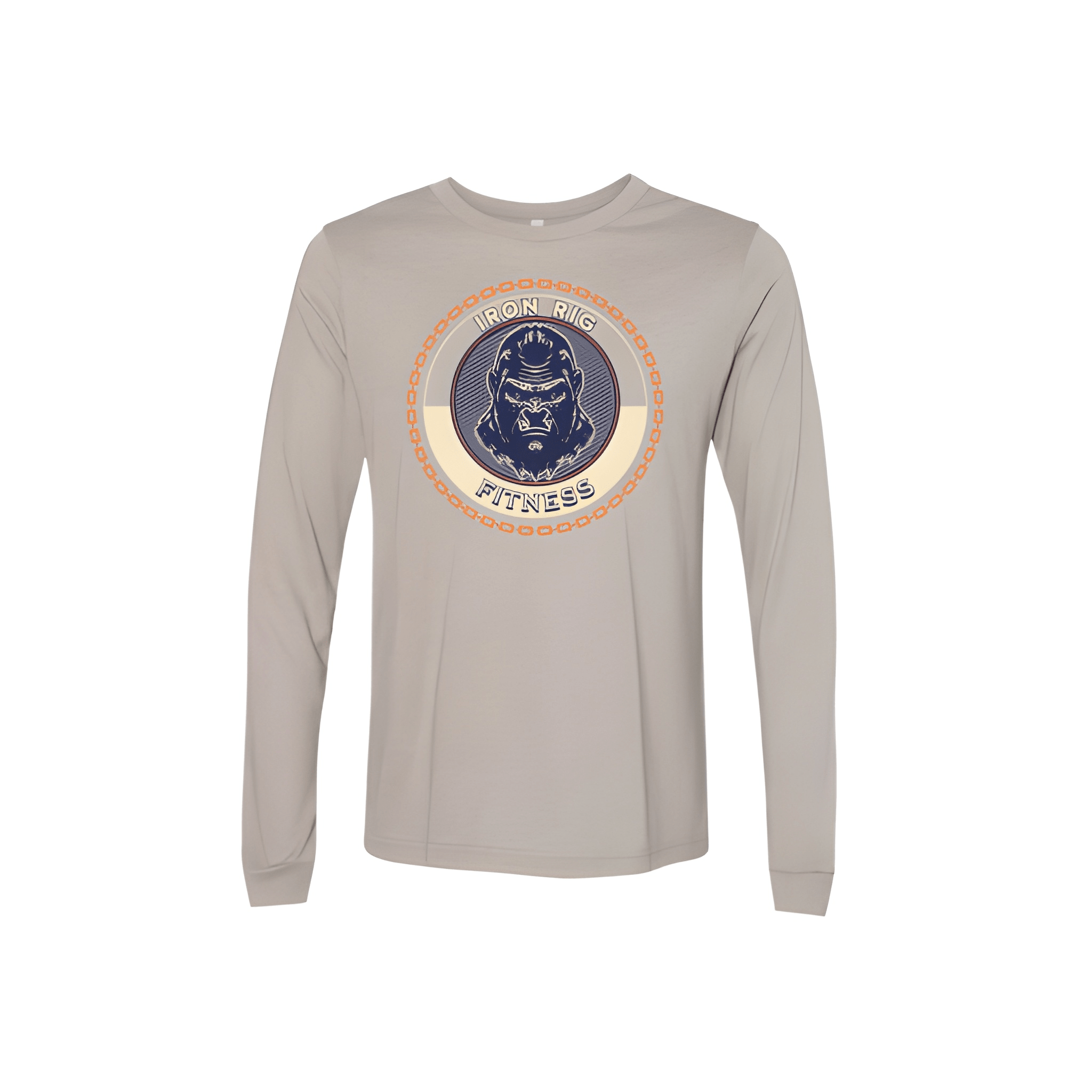
Iron Rig Fitness: Fall Shirt
IRON RIG takes the spotlight. FITNESS sits below. The name leads, the brand follows close.
Overview
We put "IRON RIG" front and center with "FITNESS" stacked below in a bigger size. The white lettering cuts sharp against the black shirt. The name owns the spotlight while the brand holds the foundation.
Results
This shirt puts the name where it belongs. Members wear it with pride. FITNESS stays right there beneath it. It is clean, sharp, and ready for fall.