Inspired by what you see?

Need A Design Like This In Your Life?

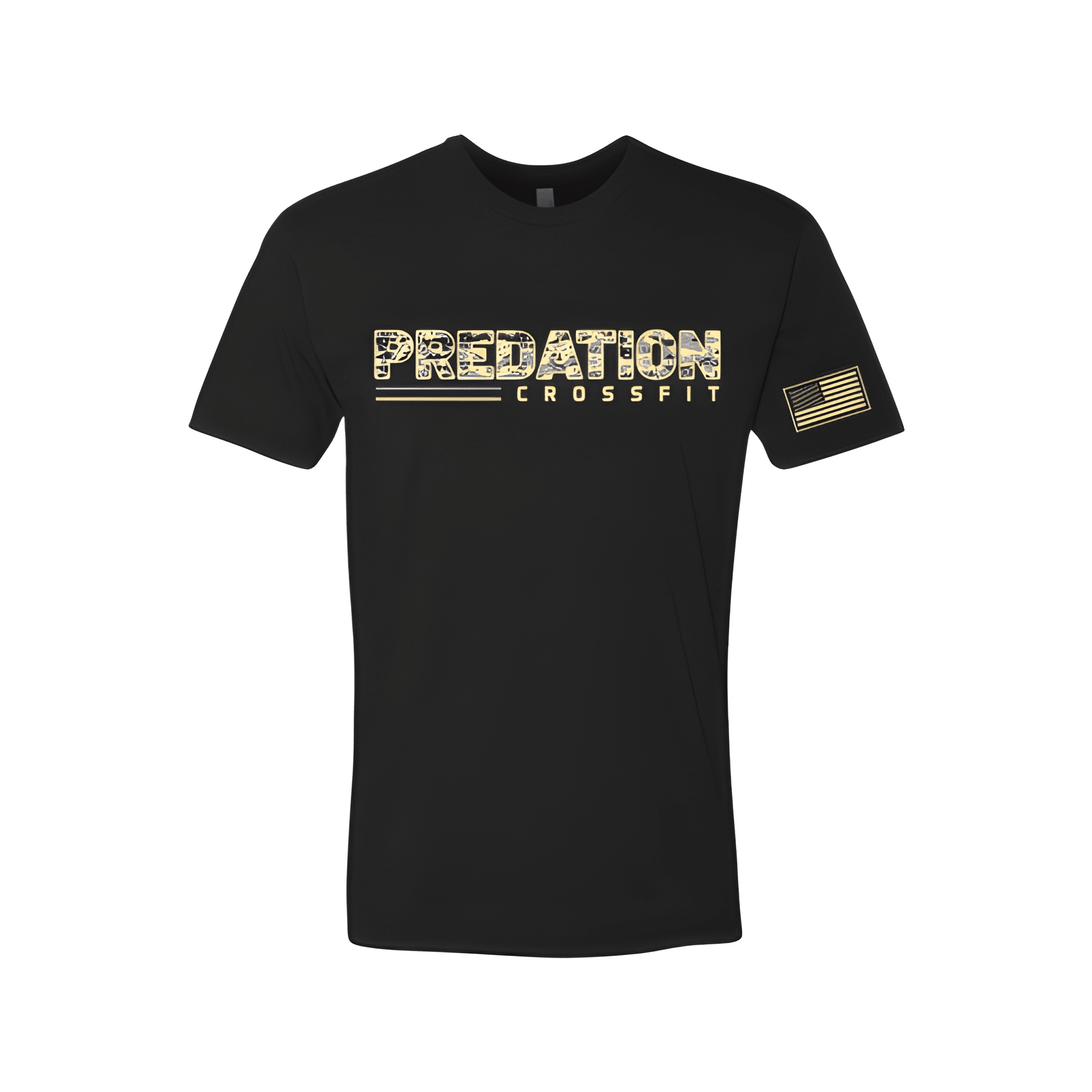
Predation CrossFit: Fall Tee

PREDATION on top. CROSSFIT below. The name leads, then the brand follows underneath.

Overview

We printed a two line stack on the center chest of a fall tee. The white lettering reads "PREDATION" then "CROSSFIT" with the gym name sized larger at the top. We let the word Predation stand out because that is what makes this gym different.

Results

The final shirt puts Predation first. Members see the name. CrossFit sits right under it. It is clean, bold, and built for fall.

Love What You See? Make This Layout Yours!

Tell us what to swap, and our team will send you a digital proof and quote ASAP!*


*Some of the artwork presented in our portfolio is our client’s actual logos. While you are free to use anything you see as inspiration, out of respect for that client we’d obviously revise any artwork and make it more individual to your specific group or event.