Inspired by what you see?

Need A Design Like This In Your Life?

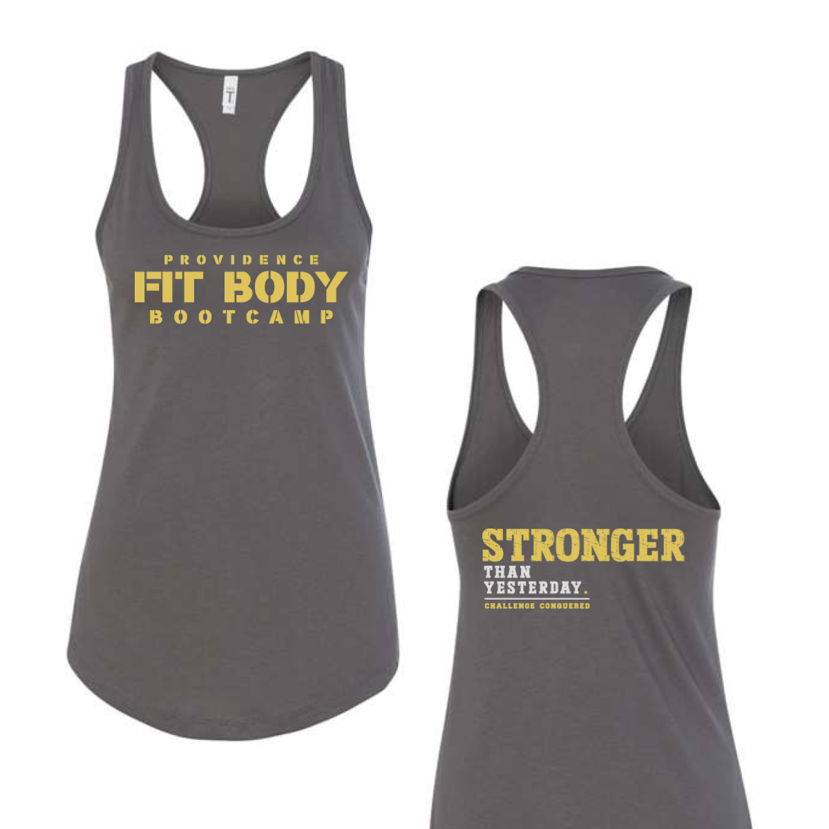
Providence Fit Body Bootcamp Tank

This tank felt strong and focused. It pushed a clear message.

Overview

We used a grey racerback tank for a clean athletic base. The front used bold stacked type in a strong yellow. The back used a large statement line with smaller support text to build impact.

Results

The tank stood out with high contrast and clear type. It felt motivating and easy to read. Members liked the strong message and simple layout.

Love What You See? Make This Layout Yours!

Tell us what to swap, and our team will send you a digital proof and quote ASAP!*


*Some of the artwork presented in our portfolio is our client’s actual logos. While you are free to use anything you see as inspiration, out of respect for that client we’d obviously revise any artwork and make it more individual to your specific group or event.